


Flutter底部导航栏插件circle_bottom_navigation的使用
Flutter底部导航栏插件circle_bottom_navigation的使用
概述
circle_bottom_navigation 是一个用于Flutter应用的底部导航栏插件,提供了一个圆形图标按钮和可选的文字标签。它支持自定义颜色、大小等属性。
开始使用
添加依赖
在 pubspec.yaml 文件中添加以下依赖:
dependencies:
  flutter:
    sdk: flutter
  circle_bottom_navigation: ^2.0.0
运行 flutter pub get 来安装依赖。
最小使用示例
import 'package:flutter/material.dart';
import 'package:circle_bottom_navigation/circle_bottom_navigation.dart';
import 'package:circle_bottom_navigation/widgets/tab_data.dart';
void main() => runApp(MyApp());
class MyApp extends StatelessWidget {
const MyApp({super.key});
@override
Widget build(BuildContext context) {
return MaterialApp(
debugShowCheckedModeBanner: false,
title: 'Flutter Demo',
theme: ThemeData(
colorSchemeSeed: Colors.purple,
),
home: MyHomePage(),
);
}
}
class MyHomePage extends StatefulWidget {
const MyHomePage({super.key});
@override
State<MyHomePage> createState() => _MyHomePageState();
}
class _MyHomePageState extends State<MyHomePage> {
int currentPage = 0;
final List<Widget> _pages = [
_Home(),
_History(),
_Search(),
_Alarm(),
];
@override
Widget build(BuildContext context) {
return Scaffold(
appBar: AppBar(
title: const Center(
child: Text(
'Circle Bottom Navigation Example',
),
),
),
body: _pages[currentPage],
bottomNavigationBar: CircleBottomNavigation(
barHeight: 70,
circleSize: 65,
initialSelection: currentPage,
inactiveIconColor: Colors.grey,
textColor: Colors.black,
hasElevationShadows: false,
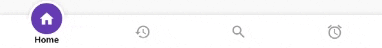
tabs: [
TabData(
icon: Icons.home,
iconSize: 35,
title: 'Home',
fontSize: 19,
fontWeight: FontWeight.bold,
),
TabData(
icon: Icons.history,
iconSize: 35,
title: 'History',
fontSize: 19,
fontWeight: FontWeight.bold,
),
TabData(
icon: Icons.search,
iconSize: 35,
title: 'Search',
fontSize: 19,
fontWeight: FontWeight.bold,
),
TabData(
icon: Icons.alarm,
iconSize: 35,
title: 'Alarm',
fontSize: 19,
fontWeight: FontWeight.bold,
),
],
onTabChangedListener: (index) => setState(() => currentPage = index),
),
);
}
}
class _Home extends StatelessWidget {
@override
Widget build(BuildContext context) {
return Scaffold(
body: const Center(
child: Text(
'Home',
style: TextStyle(
fontSize: 20.0,
fontWeight: FontWeight.bold,
),
),
),
);
}
}
class _History extends StatelessWidget {
@override
Widget build(BuildContext context) {
return Scaffold(
body: const Center(
child: Text(
'History',
style: TextStyle(
fontSize: 20.0,
fontWeight: FontWeight.bold,
),
),
),
);
}
}
class _Search extends StatelessWidget {
@override
Widget build(BuildContext context) {
return Scaffold(
body: const Center(
child: Text(
'Search',
style: TextStyle(
fontSize: 20.0,
fontWeight: FontWeight.bold,
),
),
),
);
}
}
class _Alarm extends StatelessWidget {
@override
Widget build(BuildContext context) {
return Scaffold(
body: const Center(
child: Text(
'Alarm ',
style: TextStyle(
fontSize: 20.0,
fontWeight: FontWeight.bold,
),
),
),
);
}
}属性说明
必需属性
- initialSelection - 初始选择的页面索引,类型为
int - tabs - 包含
TabData对象的列表 - onTabChangedListener - 处理点击事件的函数,接收
int position
可选属性
- circleColor - 圆形背景色,默认从主题获取
- activeIconColor - 激活状态下的图标颜色,默认从主题获取
- inactiveIconColor - 非激活状态下的图标颜色,默认从主题获取
- textColor - 文本颜色,默认从主题获取
- barBackgroundColor - 底部导航栏背景色,默认从主题获取
- circleSize - 内部圆圈的大小,默认值为
60.0 - barHeight - 导航栏的高度,默认值为
60.0 - arcHeight - 外部圆弧的高度,默认值为
70.0 - arcWidth - 外部圆弧的宽度,默认值为
90.0 - circleOutline - 圆形边框宽度,默认值为
10.0 - shadowAllowance - 图标阴影大小,默认值为
20.0 - hasElevationShadows - 是否显示阴影,默认值为
true - blurShadowRadius - 阴影模糊半径,默认值为
8.0
TabData 属性
必需属性
- icon - 用于
TabData的图标
可选属性
- title - 标签文本
- onClick - 点击圆形时触发的函数
- iconSize - 图标大小
- fontSize - 标签字体大小
- fontWeight - 标签字体粗细
通过以上示例和属性说明,您可以轻松地将 circle_bottom_navigation 插件集成到您的 Flutter 应用中,并根据需求进行自定义。
更多关于Flutter底部导航栏插件circle_bottom_navigation的使用的实战系列教程也可以访问 https://www.itying.com/category-92-b0.html

1 回复

更多关于Flutter底部导航栏插件circle_bottom_navigation的使用的实战系列教程也可以访问 https://www.itying.com/category-92-b0.html
当然,下面是一个使用 circle_bottom_navigation 插件在 Flutter 中实现底部导航栏的示例代码。这个插件允许你创建一个带有圆形图标和标签的底部导航栏。
首先,你需要在你的 pubspec.yaml 文件中添加 circle_bottom_navigation 依赖:
dependencies:
  flutter:
    sdk: flutter
  circle_bottom_navigation: ^x.y.z  # 替换为最新版本号
然后,运行 flutter pub get 来获取依赖。
接下来,是一个完整的 Flutter 应用示例,展示了如何使用 circle_bottom_navigation:
import 'package:flutter/material.dart';
import 'package:circle_bottom_navigation/circle_bottom_navigation.dart';

void main() {
  runApp(MyApp());
}

class MyApp extends StatelessWidget {
  @override
  Widget build(BuildContext context) {
    return MaterialApp(
      title: 'Circle Bottom Navigation Demo',
      theme: ThemeData(
        primarySwatch: Colors.blue,
      ),
      home: MainScreen(),
    );
  }
}

class MainScreen extends StatefulWidget {
  @override
  _MainScreenState createState() => _MainScreenState();
}

class _MainScreenState extends State<MainScreen> with SingleTickerProviderStateMixin {
  int _selectedIndex = 0;
  final List<Widget> _widgetOptions = <Widget>[
    HomeScreen(),
    SearchScreen(),
    ProfileScreen(),
  ];

  void _onItemTapped(int index) {
    setState(() {
      _selectedIndex = index;
    });
  }

  @override
  Widget build(BuildContext context) {
    return Scaffold(
      appBar: AppBar(
        title: Text('Circle Bottom Navigation Demo'),
      ),
      body: Center(
        child: _widgetOptions.elementAt(_selectedIndex),
      ),
      bottomNavigationBar: CircleBottomNavigation(
        backgroundColor: Colors.white,
        activeColor: Colors.blue,
        inactiveColor: Colors.grey,
        items: [
          CircleBottomNavigationItem(
            icon: Icons.home,
            title: 'Home',
          ),
          CircleBottomNavigationItem(
            icon: Icons.search,
            title: 'Search',
          ),
          CircleBottomNavigationItem(
            icon: Icons.person,
            title: 'Profile',
          ),
        ],
        currentIndex: _selectedIndex,
        onSelectionChanged: _onItemTapped,
      ),
    );
  }
}

class HomeScreen extends StatelessWidget {
  @override
  Widget build(BuildContext context) {
    return Center(
      child: Text('Home Screen'),
    );
  }
}

class SearchScreen extends StatelessWidget {
  @override
  Widget build(BuildContext context) {
    return Center(
      child: Text('Search Screen'),
    );
  }
}

class ProfileScreen extends StatelessWidget {
  @override
  Widget build(BuildContext context) {
    return Center(
      child: Text('Profile Screen'),
    );
  }
}
代码解释:
- 依赖引入:在
pubspec.yaml文件中添加circle_bottom_navigation依赖。 - 主应用:
MyApp类是应用的入口,它包含MaterialApp并设置home为MainScreen。 - 主屏幕:
MainScreen类是一个状态组件,它包含一个_selectedIndex变量来跟踪当前选中的页面索引,以及_widgetOptions列表来存储不同的页面小部件。 - 底部导航栏:
CircleBottomNavigation小部件用于创建底部导航栏,它包含三个导航项(主页、搜索、个人资料)。onSelectionChanged回调用于更新当前选中的页面。 - 页面小部件:
HomeScreen、SearchScreen和ProfileScreen是简单的页面小部件,分别显示不同的文本。
这个示例展示了如何使用 circle_bottom_navigation 插件创建一个具有圆形图标和标签的底部导航栏,并在点击不同导航项时切换页面。你可以根据需要进一步自定义和扩展这个示例。