


Flutter自适应布局插件adaptive_widgets_flutter的使用
Flutter自适应布局插件adaptive_widgets_flutter的使用
adaptive_widgets_flutter 是一个强大的Flutter插件,它可以帮助开发者轻松创建适应不同平台(如Android和iOS)的UI组件。通过这个插件,你可以创建美观、功能丰富且适应性强的UI元素,确保用户在不同平台上都能获得一致且流畅的体验。
✨ 主要特性
-
刷新滚动视图 (Refreshable ScrollView) 🌀
- 一个支持下拉刷新的滚动视图,其行为会根据平台自动调整。
-
警告对话框 (Alert Dialog) ⚠️
- 完全可定制的平台特定警告对话框。
-
底部操作表 (Bottom Action Sheet) 🛠️
- 原生风格的底部操作表,用于用户操作。
-
日期选择器 (Date Picker) 📅
- 直观且原生风格的日期选择器。
-
时间选择器 (Time Picker) (新功能!) ⏰
- 支持平台适应的时间选择器,提供无缝的时间选择体验。
🛠 使用示例
1. 刷新滚动视图 (Refreshable ScrollView)
你可以轻松创建一个支持下拉刷新的滚动视图。以下是代码示例:
AdaptiveRefreshableScrollView(
  padding: const EdgeInsets.all(20),
  onRefresh: () async {
    await Future.delayed(const Duration(seconds: 2)); // 模拟刷新操作
  },
  slivers: [
    // 在这里添加你的Sliver widgets
  ],
);
GIF 预览:
-
iOS:
-
Android:
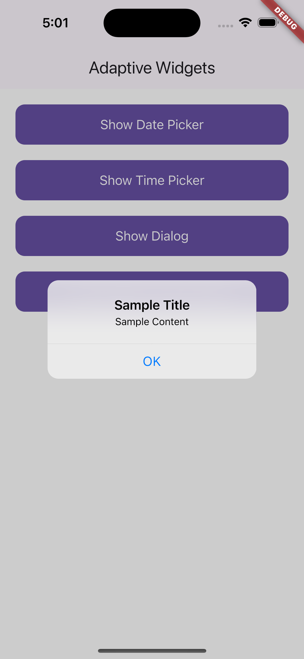
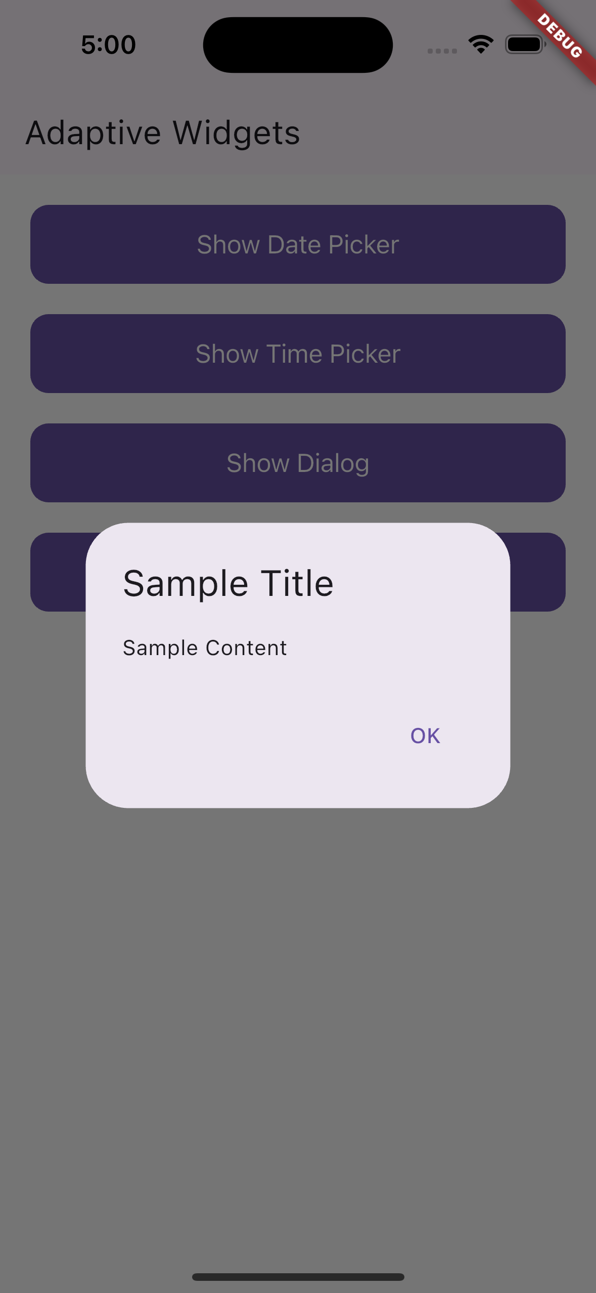
2. 警告对话框 (Alert Dialog)
显示平台原生的警告对话框非常简单。以下是代码示例:
CupertinoButton.filled(
  onPressed: () async {
    await AdaptiveWidgets.showDialog(
      context,
      title: '示例标题',
      content: '示例内容',
      actionButtons: [
        AdaptiveDialogButtonBuilder(
          text: '确定',
          onPressed: (context) {
            Navigator.of(context).pop(); // 关闭对话框
          },
        ),
      ],
    );
  },
  child: const Text('显示对话框'),
);
截图:
-
iOS:
-
Android:
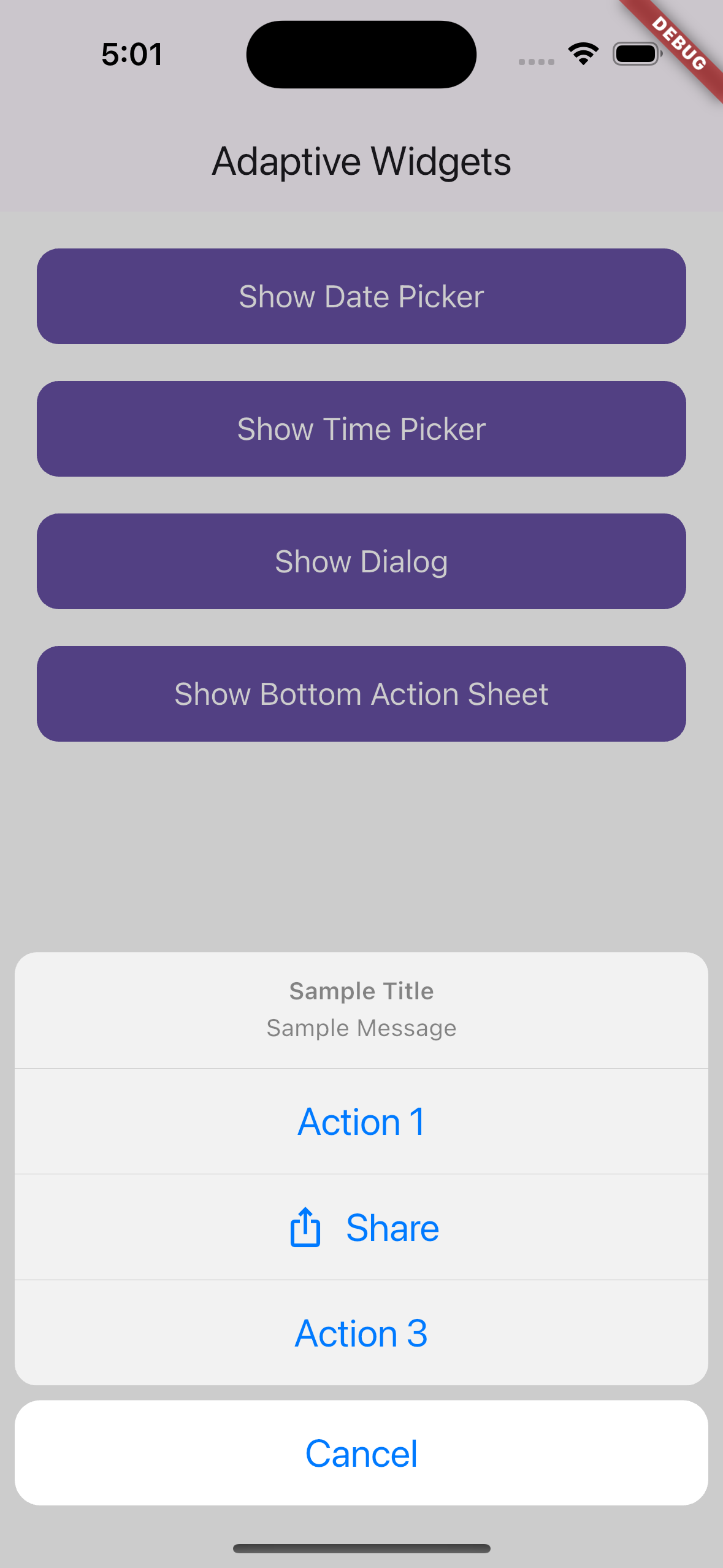
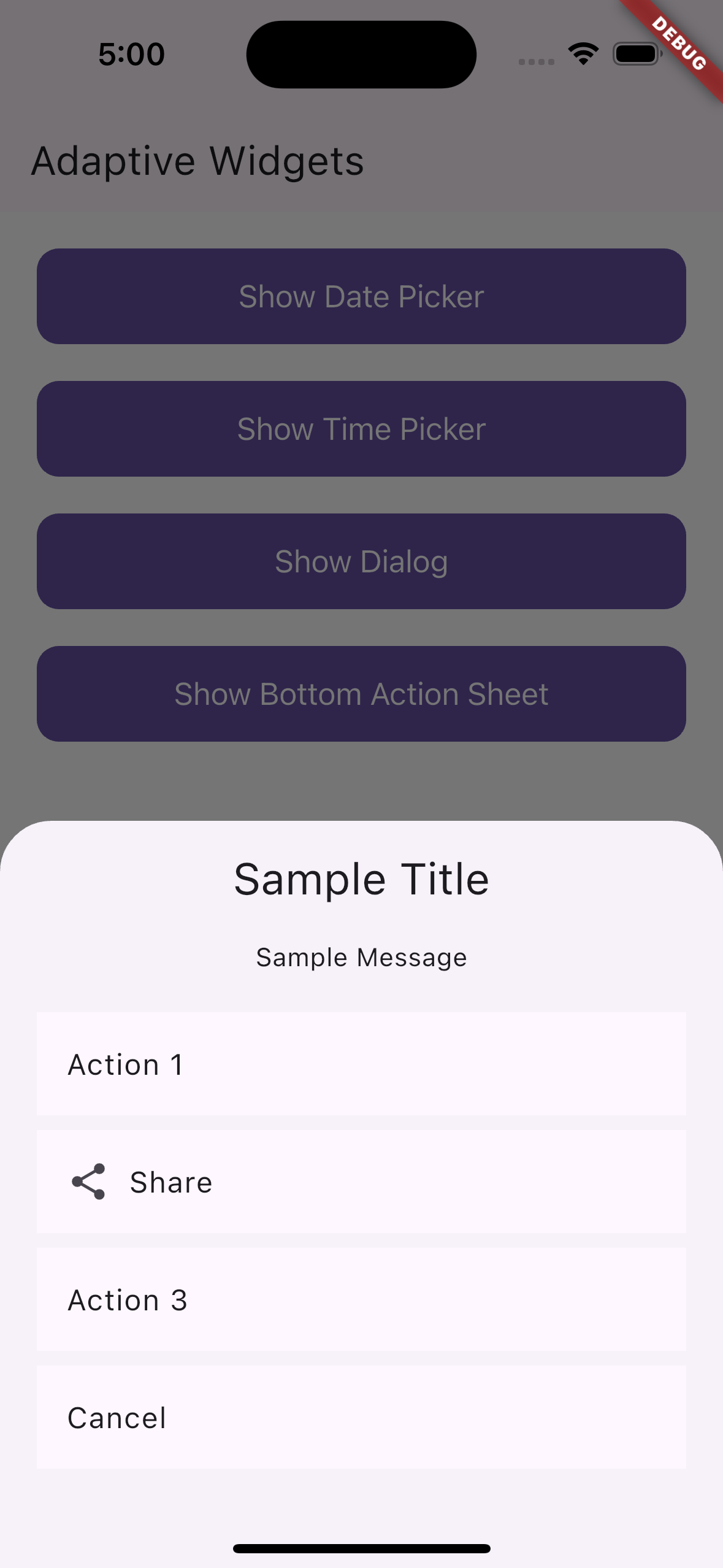
3. 底部操作表 (Bottom Action Sheet)
创建平台特定的底部操作表来处理用户操作。以下是代码示例:
CupertinoButton.filled(
  onPressed: () async {
    final actionButtons = [
      AdaptiveBottomSheetButtonBuilder(
        child: const Text('操作1'),
        onPressed: (context) => Navigator.of(context).pop('操作1'), // 关闭并返回结果
      ),
      AdaptiveBottomSheetButtonBuilder(
        child: Row(
          mainAxisSize: MainAxisSize.min,
          children: [
            Icon(Icons.adaptive.share), // 自适应图标
            const SizedBox(width: 10),
            const Text('分享'),
          ],
        ),
        onPressed: (context) => Navigator.of(context).pop('分享'),
      ),
      AdaptiveBottomSheetButtonBuilder(
        child: const Text('取消'),
        isCancelAction: true, // 标记为取消按钮
      ),
      AdaptiveBottomSheetButtonBuilder(
        child: const Text('操作3'),
        onPressed: (context) => Navigator.of(context).pop('操作3'),
      ),
    ];

    final result = await AdaptiveWidgets.showBottomActionSheet(
      context,
      actionButtons: actionButtons,
      title: const Text('示例标题'),
      message: const Text('示例消息'),
    );
    debugPrint(result); // 打印用户选择的结果
  },
  child: const Text('显示底部操作表'),
);
截图:
-
iOS:
-
Android:
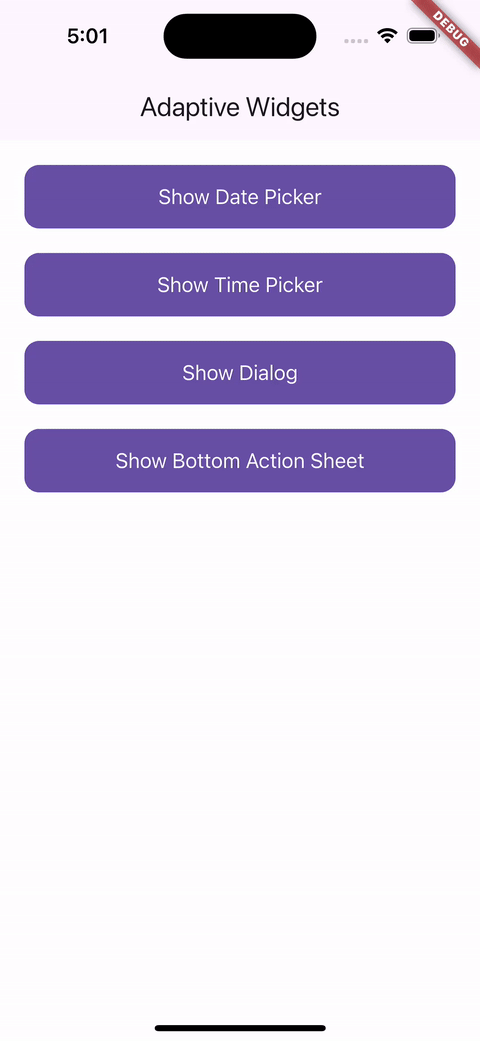
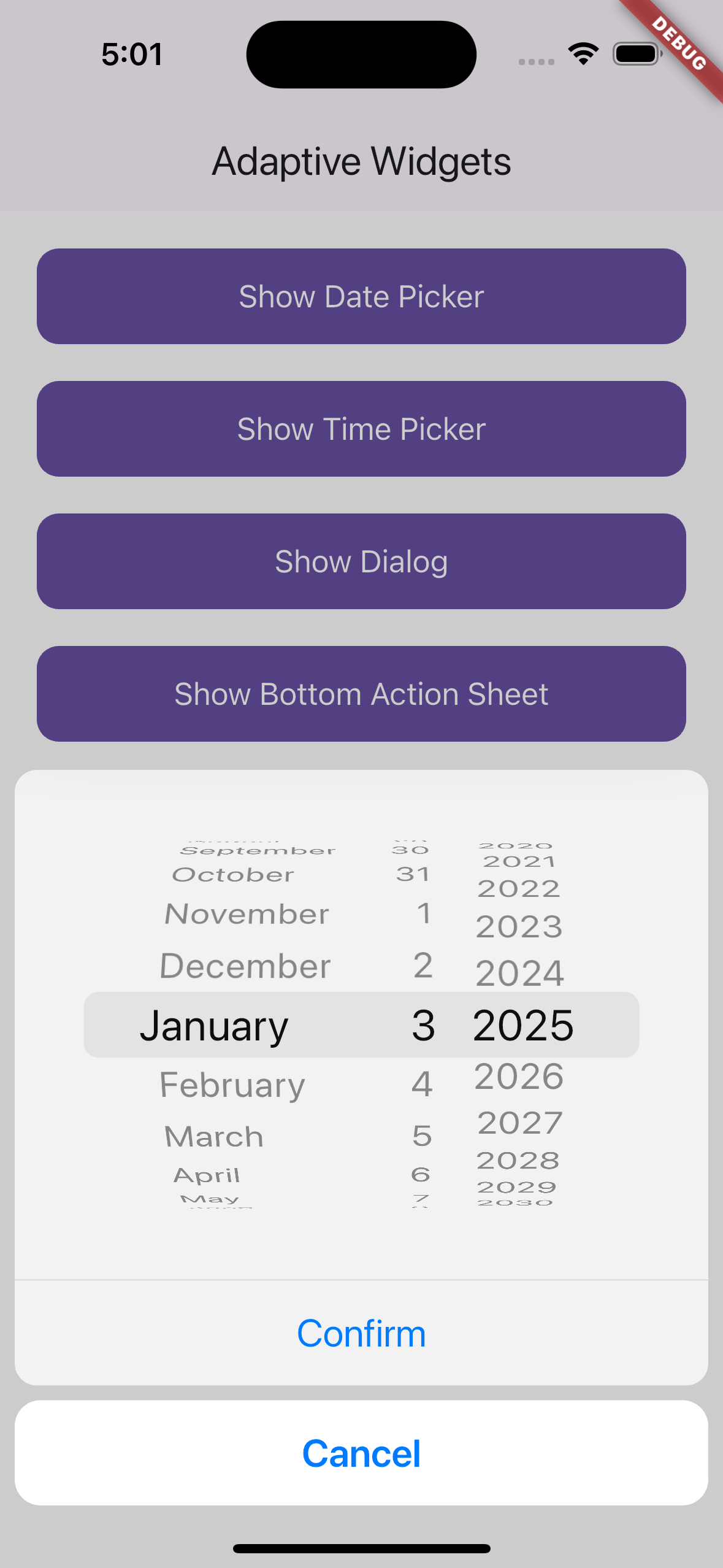
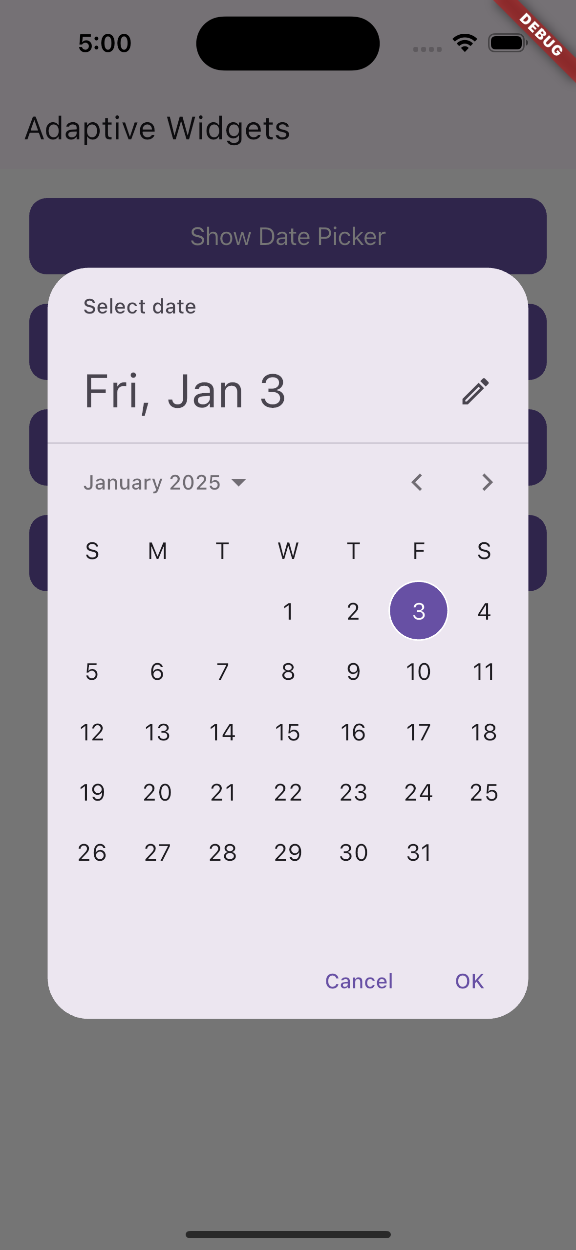
4. 日期选择器 (Date Picker)
使用平台原生的日期选择器来选择日期。以下是代码示例:
CupertinoButton.filled(
  onPressed: () async {
    await AdaptiveWidgets.showDatePicker(context);
  },
  child: const Text('显示日期选择器'),
);
截图:
-
iOS:
-
Android:
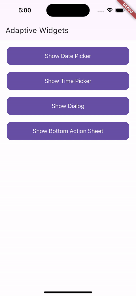
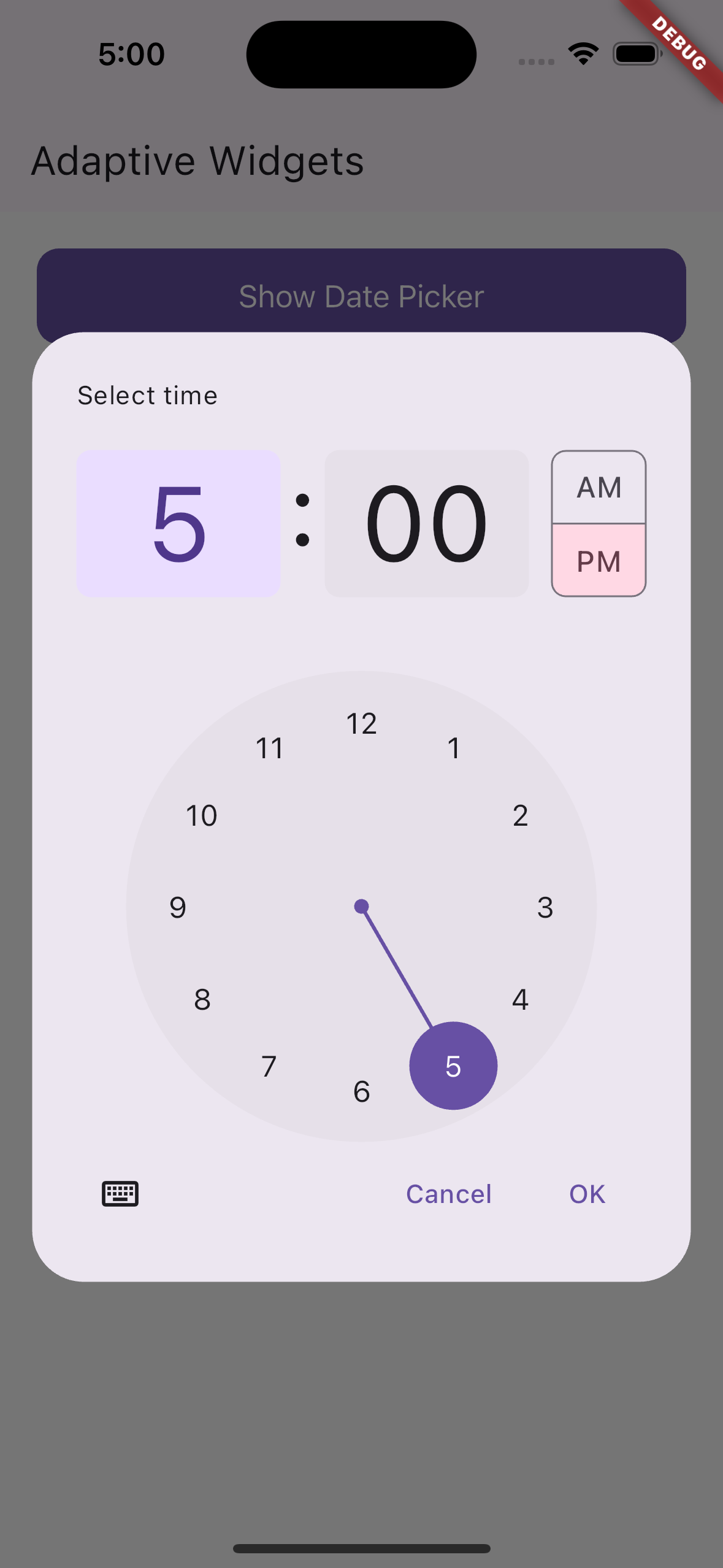
5. 时间选择器 (Time Picker) (新功能!)
使用平台原生的时间选择器来选择时间。以下是代码示例:
CupertinoButton.filled(
  onPressed: () async {
    await AdaptiveWidgets.showTimePicker(context);
  },
  child: const Text('显示时间选择器'),
);
GIF 预览:
-
iOS:
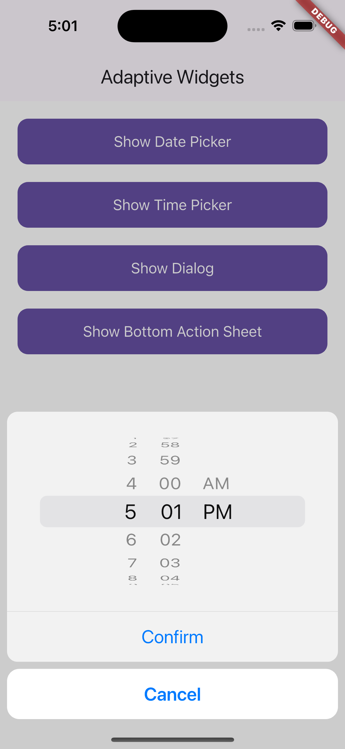
-
Android:
🚀 完整示例Demo
以下是一个完整的示例应用程序,展示了如何将上述所有功能集成到一个页面中:
import 'package:adaptive_widgets_flutter/adaptive_widgets.dart';
import 'package:flutter/cupertino.dart';
import 'package:flutter/material.dart';

void main() {
  runApp(const MyApp());
}

class MyApp extends StatelessWidget {
  const MyApp({super.key});

  [@override](/user/override)
  Widget build(BuildContext context) {
    return const MaterialApp(
      title: 'Adaptive Widgets',
      home: Home(),
    );
  }
}

class Home extends StatelessWidget {
  const Home({super.key});

  [@override](/user/override)
  Widget build(BuildContext context) {
    return Scaffold(
      backgroundColor: CupertinoColors.systemBackground.resolveFrom(context),
      appBar: AppBar(
        title: const Text('Adaptive Widgets'),
      ),
      body: AdaptiveRefreshableScrollView(
        padding: const EdgeInsets.all(20),
        onRefresh: () async {
          await Future.delayed(const Duration(seconds: 2)); // 模拟刷新操作
        },
        slivers: [
          SliverToBoxAdapter(
            child: CupertinoButton.filled(
              onPressed: () async {
                await AdaptiveWidgets.showDatePicker(context); // 显示日期选择器
              },
              child: const Text('显示日期选择器'),
            ),
          ),
          const SliverPadding(padding: EdgeInsets.only(top: 20)),
          SliverToBoxAdapter(
            child: CupertinoButton.filled(
              onPressed: () async {
                await AdaptiveWidgets.showTimePicker(context); // 显示时间选择器
              },
              child: const Text('显示时间选择器'),
            ),
          ),
          const SliverPadding(padding: EdgeInsets.only(top: 20)),
          SliverToBoxAdapter(
            child: CupertinoButton.filled(
              onPressed: () async {
                await AdaptiveWidgets.showDialog(
                  context,
                  title: '示例标题',
                  content: '示例内容',
                  actionButtons: [
                    AdaptiveDialogButtonBuilder(
                      text: '确定',
                      onPressed: (context) {
                        Navigator.of(context).pop(); // 关闭对话框
                      },
                    ),
                  ],
                );
              },
              child: const Text('显示对话框'),
            ),
          ),
          const SliverPadding(padding: EdgeInsets.only(top: 20)),
          SliverToBoxAdapter(
            child: CupertinoButton.filled(
              onPressed: () async {
                final actionButtons = [
                  AdaptiveBottomSheetButtonBuilder(
                    child: const Text('操作1'),
                    onPressed: (context) => Navigator.of(context).pop('操作1'), // 关闭并返回结果
                  ),
                  AdaptiveBottomSheetButtonBuilder(
                    child: Row(
                      mainAxisSize: MainAxisSize.min,
                      children: [
                        Icon(Icons.adaptive.share), // 自适应图标
                        const SizedBox(width: 10),
                        const Text('分享'),
                      ],
                    ),
                    onPressed: (context) => Navigator.of(context).pop('分享'),
                  ),
                  AdaptiveBottomSheetButtonBuilder(
                    child: const Text('取消'),
                    isCancelAction: true, // 标记为取消按钮
                  ),
                  AdaptiveBottomSheetButtonBuilder(
                    child: const Text('操作3'),
                    onPressed: (context) => Navigator.of(context).pop('操作3'),
                  ),
                ];

                final result = await AdaptiveWidgets.showBottomActionSheet(
                  context,
                  actionButtons: actionButtons,
                  title: const Text('示例标题'),
                  message: const Text('示例消息'),
                );
                debugPrint(result); // 打印用户选择的结果
              },
              child: const Text('显示底部操作表'),
            ),
          ),
        ],
      ),
    );
  }
}
更多关于Flutter自适应布局插件adaptive_widgets_flutter的使用的实战系列教程也可以访问 https://www.itying.com/category-92-b0.html


更多关于Flutter自适应布局插件adaptive_widgets_flutter的使用的实战系列教程也可以访问 https://www.itying.com/category-92-b0.html
当然,下面是一个关于如何使用 adaptive_widgets_flutter 插件来实现 Flutter 自适应布局的示例代码。这个插件可以帮助你根据不同的屏幕尺寸和方向创建响应式布局。
首先,确保你已经将 adaptive_widgets_flutter 添加到你的 pubspec.yaml 文件中:
dependencies:
  flutter:
    sdk: flutter
  adaptive_widgets_flutter: ^最新版本号  # 请替换为实际最新版本号
然后运行 flutter pub get 来安装依赖。
以下是一个简单的示例,展示如何使用 adaptive_widgets_flutter 插件:
import 'package:flutter/material.dart';
import 'package:adaptive_widgets_flutter/adaptive_widgets_flutter.dart';

void main() {
  runApp(MyApp());
}

class MyApp extends StatelessWidget {
  @override
  Widget build(BuildContext context) {
    return MaterialApp(
      title: 'Adaptive Widgets Flutter Demo',
      theme: ThemeData(
        primarySwatch: Colors.blue,
      ),
      home: MyHomePage(),
    );
  }
}

class MyHomePage extends StatelessWidget {
  @override
  Widget build(BuildContext context) {
    return Scaffold(
      appBar: AppBar(
        title: Text('Adaptive Widgets Flutter Demo'),
      ),
      body: AdaptiveLayoutBuilder(
        builder: (context, screenType) {
          if (screenType == ScreenType.mobileS) {
            return MobileSLayout();
          } else if (screenType == ScreenType.mobileM) {
            return MobileMLayout();
          } else if (screenType == ScreenType.mobileL) {
            return MobileLLayout();
          } else if (screenType == ScreenType.tablet) {
            return TabletLayout();
          } else if (screenType == ScreenType.desktop) {
            return DesktopLayout();
          }
          return Container(
            child: Text('Unknown screen type'),
          );
        },
      ),
    );
  }
}

class MobileSLayout extends StatelessWidget {
  @override
  Widget build(BuildContext context) {
    return Center(
      child: Text('This is MobileS Layout'),
    );
  }
}

class MobileMLayout extends StatelessWidget {
  @override
  Widget build(BuildContext context) {
    return Column(
      mainAxisAlignment: MainAxisAlignment.center,
      children: <Widget>[
        Text('This is MobileM Layout'),
        SizedBox(height: 20),
        ElevatedButton(
          onPressed: () {},
          child: Text('Button'),
        ),
      ],
    );
  }
}

class MobileLLayout extends StatelessWidget {
  @override
  Widget build(BuildContext context) {
    return Row(
      mainAxisAlignment: MainAxisAlignment.center,
      children: <Widget>[
        Text('This is MobileL Layout'),
        SizedBox(width: 20),
        ElevatedButton(
          onPressed: () {},
          child: Text('Button'),
        ),
      ],
    );
  }
}

class TabletLayout extends StatelessWidget {
  @override
  Widget build(BuildContext context) {
    return Padding(
      padding: const EdgeInsets.all(16.0),
      child: Column(
        crossAxisAlignment: CrossAxisAlignment.start,
        children: <Widget>[
          Text('This is Tablet Layout'),
          SizedBox(height: 20),
          Row(
            children: <Widget>[
              ElevatedButton(
                onPressed: () {},
                child: Text('Button 1'),
              ),
              SizedBox(width: 20),
              ElevatedButton(
                onPressed: () {},
                child: Text('Button 2'),
              ),
            ],
          ),
        ],
      ),
    );
  }
}

class DesktopLayout extends StatelessWidget {
  @override
  Widget build(BuildContext context) {
    return Padding(
      padding: const EdgeInsets.all(32.0),
      child: Row(
        crossAxisAlignment: CrossAxisAlignment.start,
        children: <Widget>[
          Expanded(
            child: Column(
              crossAxisAlignment: CrossAxisAlignment.start,
              children: <Widget>[
                Text('This is Desktop Layout'),
                SizedBox(height: 20),
                ElevatedButton(
                  onPressed: () {},
                  child: Text('Button'),
                ),
              ],
            ),
          ),
          SizedBox(width: 40),
          Expanded(
            child: Column(
              crossAxisAlignment: CrossAxisAlignment.start,
              children: <Widget>[
                Text('Additional Content'),
                SizedBox(height: 20),
                ElevatedButton(
                  onPressed: () {},
                  child: Text('Another Button'),
                ),
              ],
            ),
          ),
        ],
      ),
    );
  }
}
在这个示例中,我们使用 AdaptiveLayoutBuilder 根据屏幕类型构建不同的布局。ScreenType 枚举定义了不同的屏幕尺寸和方向,如 mobileS, mobileM, mobileL, tablet, 和 desktop。根据 screenType 的值,我们返回不同的布局组件。
希望这个示例能帮助你理解如何使用 adaptive_widgets_flutter 插件来实现自适应布局。