


Flutter日期选择插件simple_date_picker的使用
Flutter日期选择插件simple_date_picker的使用
SHOWCASE
获取开始
在终端运行以下命令以开始使用:
$ flutter pub add simple_date_picker
使用方法
完整的示例代码可以在 这里 查看。
设置
创建一个 SimpleDatePicker 实例,并定义各个时间选择器的初始值:
SimpleDatePicker simpleDatePicker = SimpleDatePicker();
DateTime yearMonthDayDateTime = DateTime.now();
DateTime yearMonthDateTime = DateTime.now();
DateTime yearDateTime = DateTime.now();
int firstYear = 1950;
int lastYear = 2050;
示例
下面是一个完整的示例,展示了如何使用 simple_date_picker 插件来选择年月日:
import 'package:flutter/material.dart';
import 'package:simple_date_picker/simple_date_picker.dart';
void main() {
runApp(const MyApp());
}
class MyApp extends StatelessWidget {
const MyApp({super.key});
[@override](/user/override)
Widget build(BuildContext context) {
return MaterialApp(
debugShowCheckedModeBanner: false,
theme: ThemeData(
primaryColor: Colors.white,
useMaterial3: true,
),
home: const MyHomePage(),
);
}
}
class MyHomePage extends StatefulWidget {
final double appBarHeight;
const MyHomePage({super.key, this.appBarHeight = 60});
[@override](/user/override)
State<MyHomePage> createState() => _MyHomePageState();
}
class _MyHomePageState extends State<MyHomePage> {
SimpleDatePicker simpleDatePicker = SimpleDatePicker();
DateTime yearMonthDayDateTime = DateTime.now();
DateTime yearMonthDateTime = DateTime.now();
DateTime yearDateTime = DateTime.now();
int firstYear = 1950;
int lastYear = 2050;
[@override](/user/override)
Widget build(BuildContext context) {
return Scaffold(
appBar: PreferredSize(
preferredSize: Size.fromHeight(widget.appBarHeight),
child: AppBar(
title: const Align(
alignment: Alignment.center,
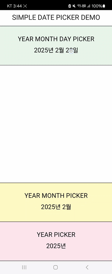
child: Text('SIMPLE DATE PICKER DEMO'),
),
),
),
body: SizedBox(
height: safeAreaHeight(context) - widget.appBarHeight,
child: Column(
mainAxisAlignment: MainAxisAlignment.spaceEvenly,
children: [
Align(
alignment: Alignment.center,
child: TextButton(
onPressed: () async {
await showCupertinoModalPopup(
context: context,
builder: (context) {
return simpleDatePicker.yearMonthDayPicker(
yearMonthDayDateTime: yearMonthDayDateTime,
monthCallback: (int index) {
setState(() {
yearMonthDayDateTime = DateTime(
yearMonthDayDateTime.year,
index + 1,
yearMonthDayDateTime.day);
});
},
dayCallback: (int index) {
setState(() {
yearMonthDayDateTime = DateTime(
yearMonthDayDateTime.year,
yearMonthDayDateTime.month,
index + 1);
});
},
yearCallback: (int index) {
setState(() {
yearMonthDayDateTime = DateTime(
firstYear + index,
yearMonthDayDateTime.month,
yearMonthDayDateTime.day);
});
},
firstYear: firstYear,
lastYear: lastYear,
);
},
);
},
child: Text(
'${yearMonthDayDateTime.year}年 ${yearMonthDayDateTime.month}月 ${yearMonthDayDateTime.day}日',
style: const TextStyle(
fontSize: 20,
color: Colors.black,
fontWeight: FontWeight.normal,
),
)),
),
const Text(
'YEAR MONTH DAY PICKER',
style: TextStyle(
color: Colors.black,
fontWeight: FontWeight.normal,
fontSize: 20),
),
Align(
alignment: Alignment.center,
child: TextButton(
onPressed: () async {
await showCupertinoModalPopup(
context: context,
builder: (context) {
return simpleDatePicker.yearMonthPicker(
yearMonthDateTime: yearMonthDateTime,
monthCallback: (int index) {
setState(() {
yearMonthDateTime =
DateTime(yearMonthDateTime.year, index + 1);
});
},
yearCallback: (int index) {
setState(() {
yearMonthDateTime = DateTime(
firstYear + index, yearMonthDateTime.month);
});
},
firstYear: firstYear,
lastYear: lastYear,
);
},
);
},
child: Text(
'${yearMonthDateTime.year}年 ${yearMonthDateTime.month}月',
style: const TextStyle(
fontSize: 20,
color: Colors.black,
fontWeight: FontWeight.normal,
),
)),
),
const Text(
'YEAR MONTH PICKER',
style: TextStyle(
color: Colors.black,
fontWeight: FontWeight.normal,
fontSize: 20),
),
Align(
alignment: Alignment.center,
child: TextButton(
onPressed: () async {
await showCupertinoModalPopup(
context: context,
builder: (context) {
return simpleDatePicker.yearPicker(
yearDateTime: yearDateTime,
yearCallback: (int index) {
setState(() {
yearDateTime = DateTime(firstYear + index);
});
},
firstYear: firstYear,
lastYear: lastYear,
);
},
);
},
child: Text(
'${yearDateTime.year}年',
style: const TextStyle(
fontSize: 20,
color: Colors.black,
fontWeight: FontWeight.normal,
),
)),
),
const Text(
'YEAR PICKER',
style: TextStyle(
color: Colors.black,
fontWeight: FontWeight.normal,
fontSize: 20),
),
],
),
),
);
}
}
更多关于Flutter日期选择插件simple_date_picker的使用的实战系列教程也可以访问 https://www.itying.com/category-92-b0.html

1 回复

更多关于Flutter日期选择插件simple_date_picker的使用的实战系列教程也可以访问 https://www.itying.com/category-92-b0.html
当然,以下是一个关于如何在Flutter项目中使用simple_date_picker插件的示例代码。这个插件允许用户在应用中方便地选择日期。
首先,你需要在你的pubspec.yaml文件中添加simple_date_picker依赖:
dependencies:
  flutter:
    sdk: flutter
  simple_date_picker: ^x.y.z  # 请替换为最新版本号
然后运行flutter pub get来安装依赖。
接下来,你可以在你的Flutter应用中使用这个插件。以下是一个完整的示例,展示如何在一个简单的Flutter应用中集成并使用simple_date_picker:
import 'package:flutter/material.dart';
import 'package:simple_date_picker/simple_date_picker.dart';

void main() {
  runApp(MyApp());
}

class MyApp extends StatelessWidget {
  @override
  Widget build(BuildContext context) {
    return MaterialApp(
      title: 'Flutter Date Picker Example',
      theme: ThemeData(
        primarySwatch: Colors.blue,
      ),
      home: MyHomePage(),
    );
  }
}

class MyHomePage extends StatefulWidget {
  @override
  _MyHomePageState createState() => _MyHomePageState();
}

class _MyHomePageState extends State<MyHomePage> {
  DateTime? selectedDate;

  void _selectDate(BuildContext context) async {
    final DateTime? pickedDate = await showDatePicker(
      context: context,
      initialDate: selectedDate ?? DateTime.now(),
      firstDate: DateTime(1900),
      lastDate: DateTime(2101),
      builder: (BuildContext context, Widget? child) {
        return SimpleDatePicker(
          datePicker: child!,
          locale: Localizations.localeOf(context),
        );
      },
    );

    if (pickedDate != null && pickedDate != selectedDate) {
      setState(() {
        selectedDate = pickedDate;
      });
    }
  }

  @override
  Widget build(BuildContext context) {
    return Scaffold(
      appBar: AppBar(
        title: Text('Date Picker Example'),
      ),
      body: Center(
        child: Column(
          mainAxisAlignment: MainAxisAlignment.center,
          children: <Widget>[
            Text(
              selectedDate == null
                  ? 'No date selected.'
                  : 'Selected Date: ${selectedDate!.toLocal()}',
            ),
            SizedBox(height: 20),
            ElevatedButton(
              onPressed: () => _selectDate(context),
              child: Text('Select Date'),
            ),
          ],
        ),
      ),
    );
  }
}
在这个示例中,我们做了以下事情:
- 在
pubspec.yaml中添加了simple_date_picker依赖。 - 创建了一个简单的Flutter应用,其中包含一个按钮,用于选择日期。
- 使用
showDatePicker函数显示日期选择器,并通过builder参数将SimpleDatePicker包装在默认的日期选择器周围。 - 当用户选择日期后,更新应用的状态以显示所选日期。
注意:simple_date_picker插件实际上并不是Flutter官方或广泛使用的插件,可能是一个自定义插件或第三方库。如果上述插件名不存在或无法找到,你可以考虑使用官方的showDatePicker方法,如上代码所示,它已经提供了非常灵活的日期选择功能。如果你确实需要特定的自定义日期选择器,请确保使用正确且维护良好的第三方库。