


Flutter动画卡片轮播插件animated_cards_carousel的使用
Flutter动画卡片轮播插件animated_cards_carousel的使用
animated_cards_carousel 是一个为 Flutter 提供可自定义动画卡片轮播的插件。它可以实现平滑滚动和视觉上吸引人的动画效果,当卡片进入或离开视口时。
特性
- 平滑滚动 带有动画效果。
- 自定义卡片宽高比 和 间距。
- 可以轻松集成任何小部件列表。
- 动画属性包括 平移、缩放 和 透明度。
安装
在 pubspec.yaml 文件中添加 animated_cards_carousel:
dependencies:
  animated_cards_carousel: ^1.0.2
然后,在终端运行以下命令来获取包:
flutter pub get
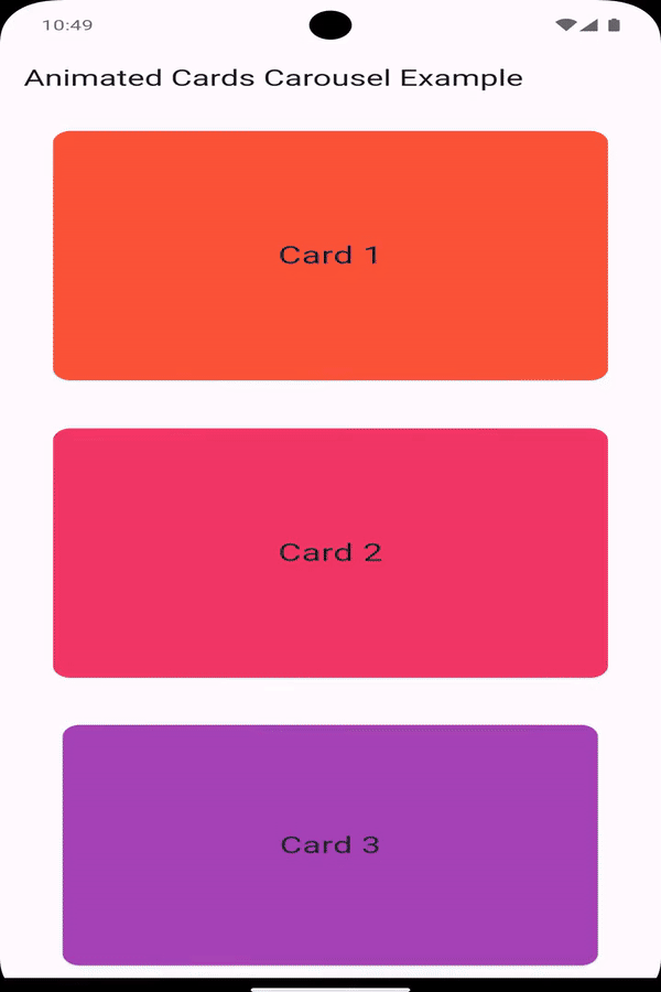
预览
使用
要使用 AnimatedCardsCarousel,导入该包并在你的小部件树中包含它。以下是一个如何设置它的示例:
重要提示
- 不要包裹在
SingleChildScrollView中:将AnimatedCardsCarousel包裹在SingleChildScrollView中可能会导致渲染问题。建议使用固定高度的SizedBox或Container。
import 'package:flutter/material.dart';
import 'package:animated_cards_carousel/animated_cards_carousel.dart';

void main() {
  runApp(const MyApp());
}

class MyApp extends StatelessWidget {
  const MyApp({super.key});

  @override
  Widget build(BuildContext context) {
    return MaterialApp(
      home: Scaffold(
        appBar: AppBar(
          title: const Text('Animated Cards Carousel Example'),
        ),
        body: Padding(
          padding: const EdgeInsets.symmetric(horizontal: 32),
          child: AnimatedCardsCarousel(
            cardsList: List.generate(
              10,
              (index) => Card(
                color: Colors.primaries[index % Colors.primaries.length],
                child: Center(
                  child: Text(
                    'Card ${index + 1}',
                    style: const TextStyle(fontSize: 24),
                  ),
                ),
              ),
            ),
          ),
        ),
      ),
    );
  }
}
属性
cardAspectRatio: (可选)卡片的宽高比。默认情况下,纵向模式为黄金比例(1.61803399),横向模式为10。cardMargin: (可选)卡片周围的间距。默认情况下,纵向模式为16.0,横向模式为8.0。cardsList: 要显示为卡片的小部件列表。
自定义
你可以通过调整提供的属性来自定义轮播的外观和行为:
- 宽高比:控制卡片的高度与宽度之比。
- 间距:调整卡片之间的垂直间距。
例如,创建一个正方形宽高比且无间距的轮播:
AnimatedCardsCarousel(
  cardAspectRatio: 1.0, // 正方形卡片
  cardMargin: 0.0, // 卡片之间无间距
  cardsList: yourListOfCards,
);
更多关于Flutter动画卡片轮播插件animated_cards_carousel的使用的实战系列教程也可以访问 https://www.itying.com/category-92-b0.html


更多关于Flutter动画卡片轮播插件animated_cards_carousel的使用的实战系列教程也可以访问 https://www.itying.com/category-92-b0.html
当然,以下是如何在Flutter中使用animated_cards_carousel插件来实现动画卡片轮播的一个示例代码。这个插件允许你创建一个具有动画效果的卡片轮播组件。
首先,你需要在你的pubspec.yaml文件中添加animated_cards_carousel依赖:
dependencies:
  flutter:
    sdk: flutter
  animated_cards_carousel: ^x.y.z  # 请替换为最新版本号
然后运行flutter pub get来安装依赖。
接下来,你可以在你的Flutter应用中使用这个插件。以下是一个完整的示例代码:
import 'package:flutter/material.dart';
import 'package:animated_cards_carousel/animated_cards_carousel.dart';

void main() {
  runApp(MyApp());
}

class MyApp extends StatelessWidget {
  @override
  Widget build(BuildContext context) {
    return MaterialApp(
      title: 'Animated Cards Carousel Demo',
      theme: ThemeData(
        primarySwatch: Colors.blue,
      ),
      home: AnimatedCardsCarouselDemo(),
    );
  }
}

class AnimatedCardsCarouselDemo extends StatefulWidget {
  @override
  _AnimatedCardsCarouselDemoState createState() => _AnimatedCardsCarouselDemoState();
}

class _AnimatedCardsCarouselDemoState extends State<AnimatedCardsCarouselDemo> {
  final List<String> cardImages = [
    'https://via.placeholder.com/300x200?text=Card+1',
    'https://via.placeholder.com/300x200?text=Card+2',
    'https://via.placeholder.com/300x200?text=Card+3',
    'https://via.placeholder.com/300x200?text=Card+4',
  ];

  @override
  Widget build(BuildContext context) {
    return Scaffold(
      appBar: AppBar(
        title: Text('Animated Cards Carousel Demo'),
      ),
      body: Center(
        child: AnimatedCardsCarousel(
          cards: cardImages.map((image) {
            return AnimatedCardsCarouselCard(
              image: NetworkImage(image),
              title: Text('Card Title'),
              description: Text('This is a description of the card.'),
            );
          }).toList(),
          animationDuration: Duration(milliseconds: 800),
          height: 400,
          width: double.infinity,
          alignment: Alignment.center,
          borderRadius: BorderRadius.circular(16),
          cardElevation: 8,
          cardShadowColor: Colors.black.withOpacity(0.2),
          autoPlay: true,
          autoPlayInterval: Duration(seconds: 3),
          pauseAutoPlayOnTouch: true,
          indicator: true,
          indicatorColor: Colors.blue,
          indicatorActiveColor: Colors.white,
          indicatorPosition: AnimatedCardsCarouselIndicatorPosition.bottomCenter,
        ),
      ),
    );
  }
}
在这个示例中,我们创建了一个简单的Flutter应用,其中包含一个动画卡片轮播组件。以下是代码的关键点:
- 依赖引入:在
pubspec.yaml文件中添加了animated_cards_carousel依赖。 - 数据准备:我们准备了一个包含卡片图片URL的列表
cardImages。 - 构建卡片轮播组件:使用
AnimatedCardsCarousel组件,并将图片、标题和描述映射到每个卡片上。 - 自定义动画和样式:设置了动画持续时间、卡片高度、宽度、对齐方式、边框半径、卡片阴影颜色、自动播放间隔等参数。
这个示例展示了如何使用animated_cards_carousel插件来创建一个具有动画效果的卡片轮播组件。你可以根据自己的需求进一步自定义和扩展这个示例。