


Flutter高效组件库插件taha_effortless_widgets的使用
Flutter高效组件库插件taha_effortless_widgets的使用
taha_effortless_widgets 是一个Flutter包,提供了可重用且可定制的小部件集合,以简化和增强您的Flutter开发过程。这些小部件旨在节省时间和精力,让您专注于构建出色的应用程序。


特性
- TButton:具有多种状态(空闲、加载、成功、失败)的可定制按钮。
- TContainer:带有渐变、阴影和形状选项的灵活容器。
- TCarouselIndicators:带可定制活动和非活动状态的轮播指示器。
- TDottedLine:带有可定制虚线长度、间距和颜色的虚线小部件。
- TExpandableWidget:带有动画效果的可展开容器,用于隐藏/显示内容。
- TGridViewBuilder:具有灵活的交叉轴计数和间距的简化网格视图。
- TGridView:固定数量的网格视图,用于排列项目。
- TListView:具有可选分隔符和滚动方向的可定制列表视图。
- TPageView:带有可定制滚动方向和页面控制器的页面视图小部件。
- TPageViewBuilder:带有可定制滚动方向和页面控制器的页面视图构建器小部件。
- TRichText:组合多种文本样式的富文本小部件。
- TTextFormField:具有广泛自定义选项的灵活文本表单字段。
- TText:具有样式和阴影选项的简化文本小部件。
- TVisibility:条件可见性小部件,用于显示或隐藏内容。
- Notch:用于UI分离的装饰性凹口。
- VerticalSpace & HorizontalSpace:用于添加垂直或水平间距的小部件。
- VerticalLine & HorizontalLine:用于绘制垂直或水平线的小部件。
- TCircularProgress:可定制的圆形进度指示器。
安装
在 pubspec.yaml 文件中添加 taha_effortless_widgets:
dependencies:
  taha_effortless_widgets: ^0.0.1
示例
我们将通过两种不同的方式实现以下设计:
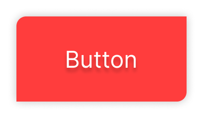
1. 正常代码(使用Flutter原生组件)
GestureDetector(
  onTap: () {
    // 点击事件处理
  },
  child: Container(
    padding: const EdgeInsets.symmetric(
      horizontal: 20,
      vertical: 10,
    ),
    decoration: BoxDecoration(
      color: Colors.redAccent,
      borderRadius: const BorderRadius.only(
        topLeft: Radius.circular(10),
        bottomRight: Radius.circular(10),
      ),
      boxShadow: [
        BoxShadow(
            blurRadius: 5,
            spreadRadius: 3,
            color: Colors.black.withOpacity(0.05))
      ],
    ),
    child: const Text(
      "Button",
      style: TextStyle(
        color: Colors.white,
        fontSize: 18,
        fontWeight: FontWeight.w300,
        shadows: [
          BoxShadow(
            color: Colors.black26,
            blurRadius: 5,
            blurStyle: BlurStyle.outer,
            spreadRadius: 2,
            offset: Offset(3, 0),
          ),
        ],
      ),
    ),
  ),
)
2. 使用Effortless Widgets
TButton(
  onTap: () {},
  backgroundColor: Colors.redAccent,
  radius: 10,
  withShadow: true,
  radiusSides: const [RadiusSides.topLeft, RadiusSides.bottomRight],
  child: const TText(
    "Button",
    color: Colors.white,
  ),
)
示例代码
import 'package:flutter/material.dart';
import 'package:taha_effortless_widgets/taha_effortless_widgets.dart';

void main() {
  runApp(const MyApp());
}

class MyApp extends StatelessWidget {
  const MyApp({super.key});

  [@override](/user/override)
  Widget build(BuildContext context) {
    return MaterialApp(
      theme: ThemeData(
        colorScheme: ColorScheme.fromSeed(seedColor: Colors.deepPurple),
        useMaterial3: true,
      ),
      home: const MyHomePage(),
    );
  }
}

class MyHomePage extends StatefulWidget {
  const MyHomePage({
    super.key,
  });

  [@override](/user/override)
  State<MyHomePage> createState() => _MyHomePageState();
}

class _MyHomePageState extends State<MyHomePage> {
  TextEditingController controller = TextEditingController();
  int carouselIndex = 0;

  [@override](/user/override)
  Widget build(BuildContext context) {
    return Scaffold(
      appBar: AppBar(
        title: const TText("Examples"),
      ),
      body: SingleChildScrollView(
        child: Column(
          mainAxisAlignment: MainAxisAlignment.center,
          children: [
            // T Button
            TButton(
              onTap: () {},
              backgroundColor: Colors.redAccent,
              radius: 10,
              withShadow: true,
              radiusSides: const [RadiusSides.topLeft, RadiusSides.bottomRight],
              child: const TText(
                "Button",
                color: Colors.white,
              ),
            ),
            // T Vertical Space
            const TVerticalSpace(20),
            // T Container
            const TContainer(
              height: 50,
              width: 100,
              radius: 5,
              color: Colors.green,
              child: TText(
                "Hello",
                color: Colors.white,
              ),
            ),
            // T Vertical Space
            const TVerticalSpace(20),
            // T Text Form Field
            TTextFormField(
              controller: controller,
              title: "Name",
              isRequired: true,
            ),
            // T Vertical Space
            const TVerticalSpace(20),
            // T Dotted line
            const TDottedLine(
              lineLength: 100,
              isHorizontal: true,
            ),
            // T Vertical Space
            const TVerticalSpace(20),
            // T Grid View
            Padding(
              padding: const EdgeInsets.all(20),
              child: TGridViewBuilder(
                length: 4,
                verticalSpacing: 10,
                horizontalSpacing: 10,
                maxCrossAxisCount: 2,
                builder: (context, index) => TContainer(
                  height: 80,
                  width: 80,
                  color: index % 2 == 0 ? Colors.amberAccent : Colors.redAccent,
                ),
              ),
            ),
            // Carousel indicators
            TCarouselIndicators(
              activeIndex: carouselIndex,
              length: 3,
            ),
            // T Vertical Space
            const TVerticalSpace(20),
            // T Notch
            const TNotch(),
            // T Rich Text
            const TRichText(
              "First name:",
              "Taha",
              firstTextWeight: FontWeight.normal,
              firstTextSize: 18,
              secondTextWeight: FontWeight.w200,
            ),
            // T Vertical Space
            const TVerticalSpace(20),
            // T Circular Progress
            const TCircularProgress(
              color: Colors.black,
            ),
            // T Vertical Space
            const TVerticalSpace(20),
            // T ExpandableWidget
            const TExpandableWidget(
              title: TText("Expandable"),
              animatedTitleIcon: AnimatedIcons.list_view,
              expandedContent: TContainer(
                //height: 100,
                width: 200,
                child: Column(
                  children: [
                    TText(
                      "Expandable Content Expandable Content Expandable Content Expandable Content Expandable Content",
                      maxWidth: 180,
                      maxLines: 10,
                    )
                  ],
                ),
              ),
            ),
            // T Vertical Space
            const TVerticalSpace(100),
          ],
        ),
      ),
    );
  }
}
更多关于Flutter高效组件库插件taha_effortless_widgets的使用的实战系列教程也可以访问 https://www.itying.com/category-92-b0.html

1 回复

更多关于Flutter高效组件库插件taha_effortless_widgets的使用的实战系列教程也可以访问 https://www.itying.com/category-92-b0.html
当然,下面是一个关于如何在Flutter项目中使用taha_effortless_widgets高效组件库插件的代码示例。这个库提供了多种预构建的组件,可以大大简化开发过程。
首先,你需要在你的pubspec.yaml文件中添加taha_effortless_widgets依赖:
dependencies:
  flutter:
    sdk: flutter
  taha_effortless_widgets: ^最新版本号  # 请替换为最新的版本号
然后运行flutter pub get来安装依赖。
以下是一个简单的示例,展示如何使用taha_effortless_widgets中的一些组件。假设我们要创建一个包含按钮、对话框和一些布局组件的简单界面。
import 'package:flutter/material.dart';
import 'package:taha_effortless_widgets/taha_effortless_widgets.dart';

void main() {
  runApp(MyApp());
}

class MyApp extends StatelessWidget {
  @override
  Widget build(BuildContext context) {
    return MaterialApp(
      title: 'Taha Effortless Widgets Demo',
      theme: ThemeData(
        primarySwatch: Colors.blue,
      ),
      home: MyHomePage(),
    );
  }
}

class MyHomePage extends StatefulWidget {
  @override
  _MyHomePageState createState() => _MyHomePageState();
}

class _MyHomePageState extends State<MyHomePage> {
  bool isLoading = false;

  void showLoadingDialog() {
    setState(() {
      isLoading = true;
    });

    Future.delayed(Duration(seconds: 2), () {
      setState(() {
        isLoading = false;
      });
      Navigator.of(context).pop();
    });

    showDialog(
      context: context,
      builder: (context) => EffortlessLoadingDialog(
        title: 'Loading...',
        message: 'Please wait...',
      ),
    );
  }

  @override
  Widget build(BuildContext context) {
    return Scaffold(
      appBar: AppBar(
        title: Text('Taha Effortless Widgets Demo'),
      ),
      body: Padding(
        padding: const EdgeInsets.all(16.0),
        child: Column(
          mainAxisAlignment: MainAxisAlignment.center,
          children: <Widget>[
            EffortlessCard(
              title: 'Card Example',
              content: Text('This is an example of an EffortlessCard.'),
              margin: EdgeInsets.symmetric(vertical: 16.0),
            ),
            EffortlessButton(
              text: 'Show Loading Dialog',
              onPressed: () {
                if (!isLoading) {
                  showLoadingDialog();
                }
              },
              color: Colors.blue,
              textColor: Colors.white,
              margin: EdgeInsets.only(top: 16.0),
            ),
            EffortlessSpacer(), // A helper widget to add space between widgets
            EffortlessExpansionTile(
              title: 'Expandable Tile',
              leading: Icon(Icons.expand_more),
              children: <Widget>[
                Text('First item in the expandable tile.'),
                Text('Second item in the expandable tile.'),
              ],
            ),
          ],
        ),
      ),
    );
  }
}
在这个示例中,我们使用了taha_effortless_widgets库中的以下组件:
- EffortlessCard:一个带有标题和内容的卡片组件。
- EffortlessButton:一个带有自定义颜色和文本的按钮组件。
- EffortlessLoadingDialog:一个显示加载指示器的对话框组件。
- EffortlessSpacer:一个用于在组件之间添加间距的辅助组件。
- EffortlessExpansionTile:一个可展开的列表项组件。
这些组件都大大简化了布局和样式的工作,使得开发过程更加高效。你可以根据需要进一步自定义这些组件以满足你的应用需求。