


Flutter自定义字段样式插件custom_field_styles的使用
Flutter自定义字段样式插件custom_field_styles的使用
如果你厌倦了在Flutter应用中重复设计表单字段,或者希望在多个项目中保持相同的表单设计,那么Flutter custom Form Fields插件可以帮你解决这些问题。
Flutter custom Form Fields是一个轻量级的包,它提供了预定义的表单字段样式,帮助你编写更简洁的代码,并且可以重用已经设计好的表单字段。
使用
设置依赖
在你的pubspec.yaml文件中添加以下依赖:
dependencies:
  custom_field_styles: <latest-version>
安装
在终端中运行以下命令以安装依赖:
flutter pub get
导入
在你的Dart文件中导入插件:
import 'package:custom_field_styles/custom_field_styles.dart';
使用
以下是一个完整的示例,展示了如何使用CustomTextField和CustomButtons组件:
import 'package:flutter/material.dart';
import 'package:custom_field_styles/custom_field_styles.dart';
void main() {
runApp(const MyApp());
}
class MyApp extends StatelessWidget {
const MyApp({Key? key}) : super(key: key);
@override
Widget build(BuildContext context) {
return MaterialApp(
debugShowCheckedModeBanner: false,
title: 'Flutter Demo',
theme: ThemeData(
primarySwatch: Colors.blue,
),
home: const HomePage(),
);
}
}
class HomePage extends StatefulWidget {
const HomePage({Key? key}) : super(key: key);
@override
State<HomePage> createState() => _HomePageState();
}
class _HomePageState extends State<HomePage> {
final controller = TextEditingController();
@override
Widget build(BuildContext context) {
return Scaffold(
body: SafeArea(
child: Center(
child: Container(
margin: const EdgeInsets.symmetric(vertical: 20, horizontal: 10),
child: Column(
mainAxisAlignment: MainAxisAlignment.center,
children: [
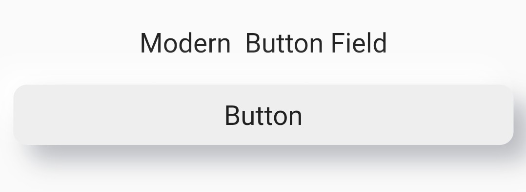
const Text(
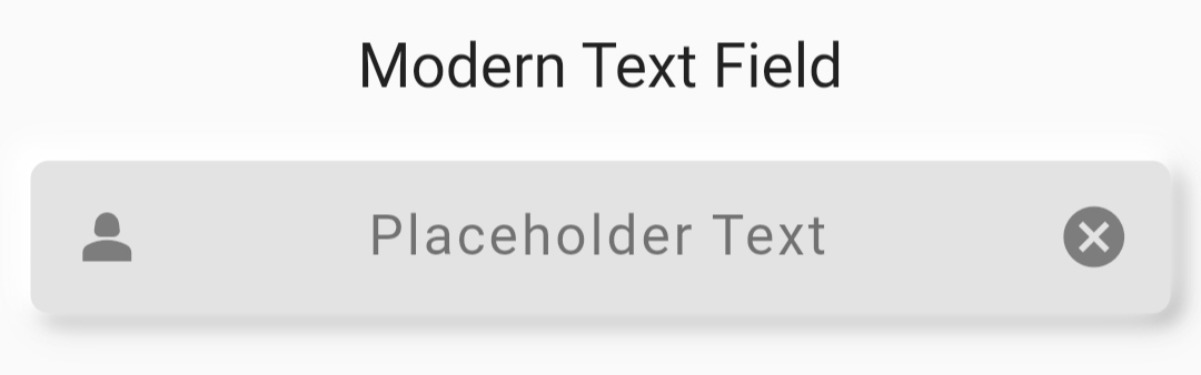
"Modern Text Field",
style: TextStyle(fontSize: 20),
),
const SizedBox(
height: 20,
),
/// 自定义表单文本字段,通过更改[fieldStyle]来改变设计
/// 必需字段:[controller]
CustomTextField(
controller: controller,
fieldStyle: FieldStyle.modern,
prefixIcon: const Icon(Icons.person_2),
suffixIcon: const Icon(Icons.cancel),
),
const SizedBox(
height: 20,
),
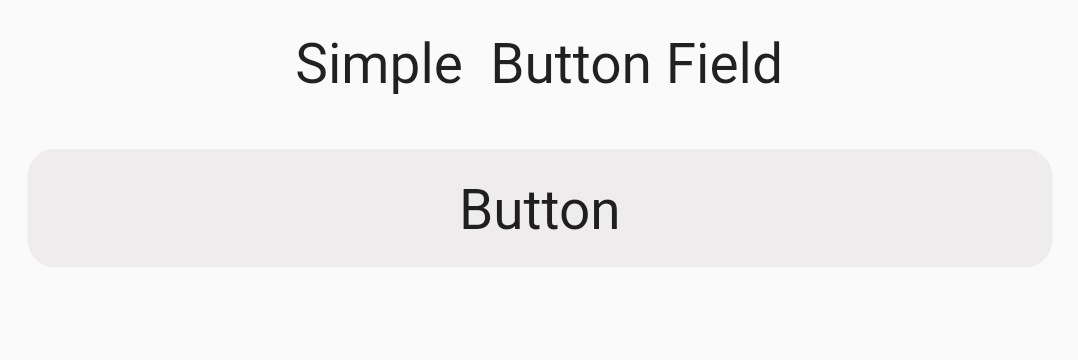
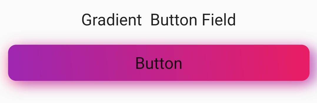
const Text(
"Gradient Button Field",
style: TextStyle(fontSize: 20),
),
const SizedBox(
height: 20,
),
/// 自定义表单按钮,通过更改[buttonStyle]来改变设计
/// 必需字段:[child]
CustomButtons(
onTap: () {
debugPrint("Hello, Button Pressed");
},
buttonStyle: CustomStyle.gradient,
firstGradientColor: Colors.purple,
secondGradientColor: Colors.pink,
enableShadow: true,
child: const Text(
"Button",
style: TextStyle(
fontSize: 20,
),
),
),
],
),
),
),
),
);
}
}
必需字段
TextFields需要controllerButtons需要child
图片
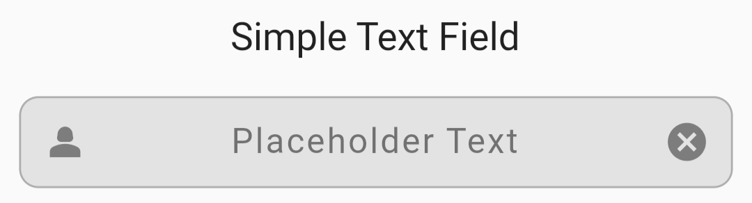
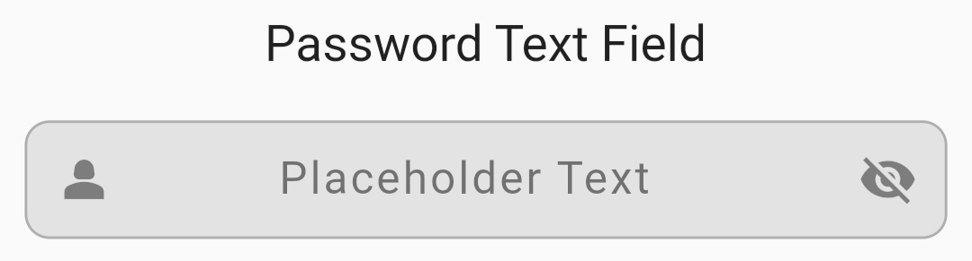
表单字段
- 简单文本字段
- 现代文本字段
- 密码文本字段
表单按钮
- 简单按钮
- 现代按钮
- 渐变按钮
贡献
贡献总是受欢迎的!
查看CONTRIBUTING.md了解如何开始。
常见问题
样式是否预设?
是的,一些基本样式是预设的,以便简化开发。你也可以手动更改特定样式。
为什么某些样式在某些FieldStyle中不起作用?
为了保持每个FieldStyle的独特性,我们限制了一些样式在某些特定的FieldStyle中使用。
我有一些创意样式的想法,如何将它们添加到此包中?
请参阅CONTRIBUTING.md。
只有这些样式可用吗?
不,我正在开发更多样式。很快就会添加更多样式。
反馈
如果你有任何反馈,请联系我们:developer.dextrix@gmail.com
支持

更多关于Flutter自定义字段样式插件custom_field_styles的使用的实战系列教程也可以访问 https://www.itying.com/category-92-b0.html


更多关于Flutter自定义字段样式插件custom_field_styles的使用的实战系列教程也可以访问 https://www.itying.com/category-92-b0.html
在Flutter中,自定义字段样式通常是指对文本字段(如TextField、TextFormField)的样式进行自定义。虽然Flutter本身提供了一些内置的样式选项,但如果你需要更高级的定制,可以使用一些第三方插件或手动自定义样式。
使用 custom_field_styles 插件
假设 custom_field_styles 是一个用于自定义文本字段样式的插件,以下是如何使用它的基本步骤:
-
添加依赖: 首先,你需要在
pubspec.yaml文件中添加custom_field_styles插件的依赖。dependencies: flutter: sdk: flutter custom_field_styles: ^1.0.0 # 请确保使用最新版本然后运行
flutter pub get来获取依赖。 -
导入插件: 在你的 Dart 文件中导入插件:
import 'package:custom_field_styles/custom_field_styles.dart'; -
使用自定义样式: 使用
CustomTextField或类似的组件,并应用自定义样式。class MyCustomTextField extends StatelessWidget { @override Widget build(BuildContext context) { return Scaffold( appBar: AppBar( title: Text('Custom Field Styles Example'), ), body: Padding( padding: const EdgeInsets.all(16.0), child: CustomTextField( decoration: CustomInputDecoration( labelText: 'Enter your text', border: CustomOutlineInputBorder( borderRadius: BorderRadius.circular(10.0), borderSide: BorderSide(color: Colors.blue, width: 2.0), ), enabledBorder: CustomOutlineInputBorder( borderRadius: BorderRadius.circular(10.0), borderSide: BorderSide(color: Colors.grey, width: 1.0), ), focusedBorder: CustomOutlineInputBorder( borderRadius: BorderRadius.circular(10.0), borderSide: BorderSide(color: Colors.blue, width: 2.0), ), filled: true, fillColor: Colors.grey[200], ), ), ), ); } } -
自定义更多属性: 你可以进一步自定义其他属性,如文本样式、提示文本样式、光标颜色等。
CustomTextField(
  style: TextStyle(fontSize: 16.0, color: Colors.black),
  cursorColor: Colors.blue,
  decoration: CustomInputDecoration(
    hintText: 'Type something...',
    hintStyle: TextStyle(color: Colors.grey),
    labelText: 'Your Text',
    labelStyle: TextStyle(color: Colors.blue),
    // 其他样式属性
  ),
);
注意事项
- 插件文档:确保查阅
custom_field_styles插件的官方文档,了解所有可用属性和方法。 - 版本兼容性:确保插件版本与你的 Flutter SDK 版本兼容。
- 自定义组件:如果插件提供的功能不足以满足你的需求,你可以考虑手动自定义文本字段组件。
手动自定义文本字段样式
如果你不想使用插件,Flutter 也允许你手动自定义 TextField 或 TextFormField 的样式。
TextField(
  decoration: InputDecoration(
    labelText: 'Enter your text',
    border: OutlineInputBorder(
      borderRadius: BorderRadius.circular(10.0),
      borderSide: BorderSide(color: Colors.blue, width: 2.0),
    ),
    enabledBorder: OutlineInputBorder(
      borderRadius: BorderRadius.circular(10.0),
      borderSide: BorderSide(color: Colors.grey, width: 1.0),
    ),
    focusedBorder: OutlineInputBorder(
      borderRadius: BorderRadius.circular(10.0),
      borderSide: BorderSide(color: Colors.blue, width: 2.0),
    ),
    filled: true,
    fillColor: Colors.grey[200],
  ),
);