


HarmonyOS鸿蒙Next中实现可滑动面板示例代码
HarmonyOS鸿蒙Next中实现可滑动面板示例代码
介绍
本示例实现了一个可滑动面板的体验,轻量的内容展示窗口,方便在不同尺寸中切换。
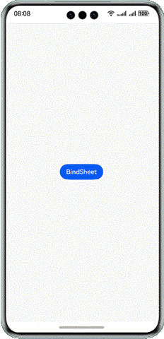
效果预览
使用说明
点击按钮即可从底部弹出面板,弹出后点击空白处可返回面板,拖动面板可继续展开二级面板、三级面板。
实现思路
通过bindSheet属性为组件绑定半模态页面,在组件插入时可通过设置自定义或默认的内置高度确定半模态大小。为了使isShow参数值与半模态界面的状态同步,使用$$双向绑定isShow参数。
核心代码如下:
@Entry
@Component
struct Index {
  @State isShow: boolean = false;

  @Builder
  myBuilder() {
    Column() {
      Column()
        .backgroundColor('#FFE4E1')
        .height(220)
        .width('100%')
      Column()
        .backgroundColor('#FFE4B5')
        .height(220)
        .width('100%')
    }
  }

  build() {
    Column() {
      Button('BindSheet')
        .onClick(() => {
          this.isShow = true;
        })
        .bindSheet($$this.isShow, this.myBuilder(), {
          detents: [300, 520, 740],
          uiContext: this.getUIContext(),
          mode: SheetMode.OVERLAY,
          scrollSizeMode: ScrollSizeMode.CONTINUOUS,
          backgroundColor: '#FF7F50',
          title: {
            title: 'Title',
            subtitle: 'Subtitle'
          }
        })
    }
    .justifyContent(FlexAlign.Center)
      .width('100%')
      .height('100%')
      .backgroundColor('#FFFAFA')
  }
}
更多关于HarmonyOS鸿蒙Next中实现可滑动面板示例代码的实战系列教程也可以访问 https://www.itying.com/category-93-b0.html

2 回复


在HarmonyOS鸿蒙Next中,实现可滑动面板可以通过ScrollView组件来完成。以下是一个简单的示例代码:
import ohos.agp.components.ComponentContainer;
import ohos.agp.components.ScrollView;
import ohos.agp.components.Text;
import ohos.agp.utils.LayoutAlignment;
import ohos.agp.window.dialog.ToastDialog;
import ohos.app.Context;

public class SlidingPanelExample {
    public static void createSlidingPanel(Context context, ComponentContainer rootLayout) {
        // 创建ScrollView
        ScrollView scrollView = new ScrollView(context);
        scrollView.setLayoutConfig(new ComponentContainer.LayoutConfig(
                ComponentContainer.LayoutConfig.MATCH_PARENT,
                ComponentContainer.LayoutConfig.MATCH_PARENT
        ));

        // 创建内容组件
        Text contentText = new Text(context);
        contentText.setText("这是一个可滑动的面板内容。\n".repeat(20)); // 模拟长文本
        contentText.setMultipleLine(true);

        // 将内容添加到ScrollView
        scrollView.addComponent(contentText);

        // 将ScrollView添加到根布局
        rootLayout.addComponent(scrollView);
    }
}在这个示例中,ScrollView用于创建一个可滑动的面板,Text组件用于显示长文本内容。通过setMultipleLine(true)允许文本换行,repeat(20)模拟长文本内容。最后,将ScrollView添加到根布局中即可实现可滑动效果。