


HarmonyOS鸿蒙Next中实现自定义tabbar滚动示例代码
HarmonyOS鸿蒙Next中实现自定义tabbar滚动示例代码
介绍
本示例实现自定义tabbar滚动功能。
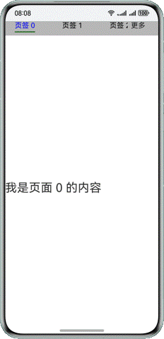
效果预览
使用说明
通过触发动画实现滑动切换,通过回调实现内容切换和tabbar切换的联动。
实现思路
自定义tabbar
 Text(tabName)
   .fontSize(18)
   .fontColor(tabIndex === this.focusIndex ? Color.Blue : Color.Black)
   .id(tabIndex.toString())
   .onAreaChange((oldValue: Area, newValue: Area) => {
     if (this.focusIndex === tabIndex && (this.indicatorLeftMargin === 0 || this.indicatorWidth === 0)) {
       if (newValue.position.x !== undefined) {
         let positionX = Number.parseFloat(newValue.position.x.toString())
         this.indicatorLeftMargin = Number.isNaN(positionX) ? 0 : positionX
       }
       let width = Number.parseFloat(newValue.width.toString())
       this.tabWidth = Number.isNaN(width) ? 0 : width
       this.indicatorWidth = this.tabWidth
     }
   })
更多关于HarmonyOS鸿蒙Next中实现自定义tabbar滚动示例代码的实战系列教程也可以访问 https://www.itying.com/category-93-b0.html

1 回复

更多关于HarmonyOS鸿蒙Next中实现自定义tabbar滚动示例代码的实战系列教程也可以访问 https://www.itying.com/category-93-b0.html
在HarmonyOS鸿蒙Next中实现自定义TabBar滚动功能,可以通过使用TabList和PageSlider组件来实现。以下是一个简单的示例代码:
import { TabList, PageSlider, TabContent, TabBar } from '@ohos/tab';
import { View, Text } from '@ohos/ui';

@Entry
@Component
struct CustomTabBar {
  private tabList: TabList = new TabList();
  private pageSlider: PageSlider = new PageSlider();

  build() {
    Column() {
      // 创建TabBar
      TabBar({ tabList: this.tabList })
        .onChange((index: number) => {
          this.pageSlider.setCurrentPage(index);
        })

      // 创建PageSlider
      PageSlider({ controller: this.pageSlider })
        .onPageChange((index: number) => {
          this.tabList.setSelectedIndex(index);
        })
        .children([
          // 添加页面内容
          TabContent({ tab: 'Tab 1' }, () => {
            Text('Tab 1 Content').fontSize(20);
          }),
          TabContent({ tab: 'Tab 2' }, () => {
            Text('Tab 2 Content').fontSize(20);
          }),
          TabContent({ tab: 'Tab 3' }, () => {
            Text('Tab 3 Content').fontSize(20);
          })
        ])
    }
  }
}在这个示例中,TabBar用于显示标签栏,PageSlider用于管理页面的滑动。通过onChange和onPageChange事件,实现了TabBar和PageSlider的同步。用户点击TabBar时,PageSlider会滑动到对应的页面;用户滑动PageSlider时,TabBar的选中状态也会更新。