


HarmonyOS鸿蒙Next中实现自定义弹窗封装示例代码
HarmonyOS鸿蒙Next中实现自定义弹窗封装示例代码
介绍
基于Navigation.Dialog的透明页面特性,可以用于实现弹窗效果,而且Navigation.Dialog存在于路由栈中,天然可以实现切换页面弹窗不消失。
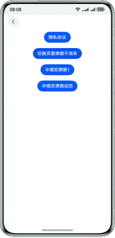
效果预览

使用说明
实现了隐私弹窗不关闭,点击Button后弹出的隐私弹窗点击弹窗外其他位置均不会使弹窗关闭,只有点击同意或不同意才会关闭弹窗。 实现了半模态弹窗与半模态弹窗动态。
实现思路
切换页面不消失弹窗
@Component
export struct PrivacyDialog {

  build() {
    NavDestination() {
      Stack({ alignContent: Alignment.Center }) {
        Column() {}
        .width('100%')
        .height('100%')
        .backgroundColor('rgba(0,0,0,0.5)')
        .transition(
          TransitionEffect.OPACITY.animation({
            duration: 300,
            curve: Curve.Friction
          })
        )
        .onClick(() => {
          AppRouter.pop();
        })

        Column() {
          Text('弹窗')
            .fontColor(Color.White)
          Button('新页面', { stateEffect: true, type: ButtonType.Capsule })
            .onClick(() => {
              AppRouter.push('privacyPage')
            })
        }
        .width('50%')
        .height('30%')
        .backgroundColor(Color.Blue)
        .transition(
          TransitionEffect.scale({ x: 0, y: 0 }).animation({
            duration: 300,
            curve: Curve.Friction
          })
        )
      }
      .width('100%')
      .height('100%')
    }
    .mode(NavDestinationMode.DIALOG)
    .hideTitleBar(true)
  }
}
2 回复

在HarmonyOS鸿蒙Next中实现自定义弹窗,可以通过CustomDialog类进行封装。以下是一个简单的示例代码:
import { CustomDialog, CommonDialogParam, CommonDialogStyle, DialogType } from '@ohos.commonDialog';

class MyCustomDialog extends CustomDialog {
    constructor(context: common.Context, dialogType: DialogType) {
        super(context, dialogType);
    }

    onInit() {
        this.setWidth(300);
        this.setHeight(200);
        this.setTitle("自定义弹窗");
        this.setMessage("这是一个自定义弹窗示例");
        this.setPositiveButton("确定", () => {
            console.log("点击了确定按钮");
        });
        this.setNegativeButton("取消", () => {
            console.log("点击了取消按钮");
        });
    }
}

// 使用示例
let dialog = new MyCustomDialog(this.context, DialogType.NORMAL);
dialog.show();在这个示例中,MyCustomDialog继承自CustomDialog,并在onInit方法中设置了弹窗的宽度、高度、标题、消息内容以及确定和取消按钮的回调函数。通过调用show方法可以显示这个自定义弹窗。
更多关于HarmonyOS鸿蒙Next中实现自定义弹窗封装示例代码的实战系列教程也可以访问 https://www.itying.com/category-93-b0.html

在HarmonyOS鸿蒙Next中,可以通过自定义组件实现弹窗的封装。以下是一个简单的示例代码,展示如何创建一个自定义弹窗组件:
import { Component, Builder, ViewBuilder, Text, Button, AlertDialog } from '@ohos.arkui';

@Component
export class CustomDialog {
  @Builder
  build() {
    ViewBuilder()
      .width('80%')
      .height('40%')
      .backgroundColor('#FFFFFF')
      .borderRadius(10)
      .justifyContent('center')
      .alignItems('center')
      .child(
        Text('自定义弹窗内容')
          .fontSize(20)
          .marginBottom(20)
      )
      .child(
        Button('关闭')
          .onClick(() => {
            AlertDialog.hide();
          })
      );
  }
}

// 使用自定义弹窗
const dialog = new AlertDialog.Builder()
  .setCustomComponent(new CustomDialog())
.show();这段代码定义了一个CustomDialog组件,并在build方法中使用ViewBuilder构建了弹窗的布局。通过AlertDialog.Builder可以展示这个自定义弹窗。