


Flutter弹出窗口插件klcpopup的使用
Flutter弹出窗口插件klcpopup的使用
KLCPopup 是一个灵活且易于使用的弹出窗口插件,灵感来源于 iOS 原生弹窗库 KLCPopup。
使用方法
此插件实现了 KLCPopup 的所有功能,并且 API 几乎完全相同。
该弹窗可以通过 useRoute 参数控制是否使用基于路由的弹窗。
案例 1
final popupController = KLCPopupController();
showKLCPopup(
  context,
  controller: popupController,
  child: Material(
    color: Colors.transparent,
    child: Container(
      padding: const EdgeInsets.all(32),
      decoration: BoxDecoration(
        color: Colors.greenAccent,
        borderRadius: BorderRadius.circular(10),
      ),
      child: Column(
        mainAxisSize: MainAxisSize.min,
        children: [
          const Text(
            "Hi.",
            style: TextStyle(
              color: Colors.white,
              fontSize: 42,
              fontWeight: FontWeight.bold,
            ),
          ),
          TextButton(
            onPressed: () {
              popupController.dismiss();
            },
            child: const Text("Bye"),
          )
        ],
      ),
    ),
  ),
);
案例 2

final popupController = KLCPopupController();
showKLCPopup(
  context,
  controller: popupController,
  horizontalLayout: KLCPopupHorizontalLayout.left,
  verticalLayout: KLCPopupVerticalLayout.center,
  showType: KLCPopupShowType.slideInFromLeft,
  dismissType: KLCPopupDismissType.slideOutToLeft,
  child: Material(
    color: Colors.transparent,
    child: Container(
      width: MediaQuery.of(context).size.width * 0.8,
      height: MediaQuery.of(context).size.height,
      decoration: BoxDecoration(
        color: Colors.redAccent,
        borderRadius: BorderRadius.circular(10),
      ),
      child: Column(
        mainAxisSize: MainAxisSize.min,
        children: [
          SafeArea(child: Container()),
          const Text(
            "Hi.",
            style: TextStyle(
              color: Colors.white,
              fontSize: 42,
              fontWeight: FontWeight.bold,
            ),
          ),
          TextButton(
            onPressed: () {
              popupController.dismiss();
            },
            child: const Text("Bye"),
          )
        ],
      ),
    ),
  ),
);
案例 3
final popupController = KLCPopupController();
showKLCPopup(
  context,
  controller: popupController,
  horizontalLayout: KLCPopupHorizontalLayout.center,
  verticalLayout: KLCPopupVerticalLayout.bottom,
  showType: KLCPopupShowType.slideInFromBottom,
  dismissType: KLCPopupDismissType.slideOutToBottom,
  child: Material(
    color: Colors.transparent,
    child: Container(
      width: MediaQuery.of(context).size.width,
      height: MediaQuery.of(context).size.height * 0.4,
      decoration: BoxDecoration(
        color: Colors.redAccent,
        borderRadius: BorderRadius.circular(10),
      ),
      child: Column(
        mainAxisSize: MainAxisSize.min,
        children: [
          SafeArea(child: Container()),
          const Text(
            "Hi.",
            style: TextStyle(
              color: Colors.white,
              fontSize: 42,
              fontWeight: FontWeight.bold,
            ),
          ),
          TextButton(
            onPressed: () {
              popupController.dismiss();
            },
            child: const Text("Bye"),
          )
        ],
      ),
    ),
  ),
);
完整示例代码
以下是一个完整的示例代码,展示了如何使用 KLCPopup 插件:
import 'package:flutter/material.dart';
import 'package:klcpopup/klcpopup.dart';
void main() {
runApp(const MyApp());
}
class MyApp extends StatelessWidget {
const MyApp({super.key});
[@override](/user/override)
Widget build(BuildContext context) {
return MaterialApp(
title: 'KLCPopup Example',
theme: ThemeData(
colorScheme: ColorScheme.fromSeed(seedColor: Colors.deepPurple),
useMaterial3: true,
),
home: const MyHomePage(),
);
}
}
class MyHomePage extends StatefulWidget {
const MyHomePage({super.key});
[@override](/user/override)
State<MyHomePage> createState() => _MyHomePageState();
}
class _MyHomePageState extends State<MyHomePage> {
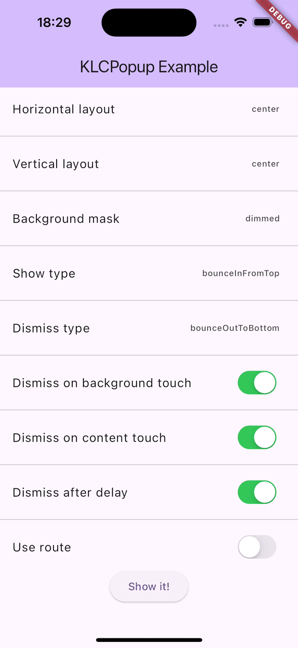
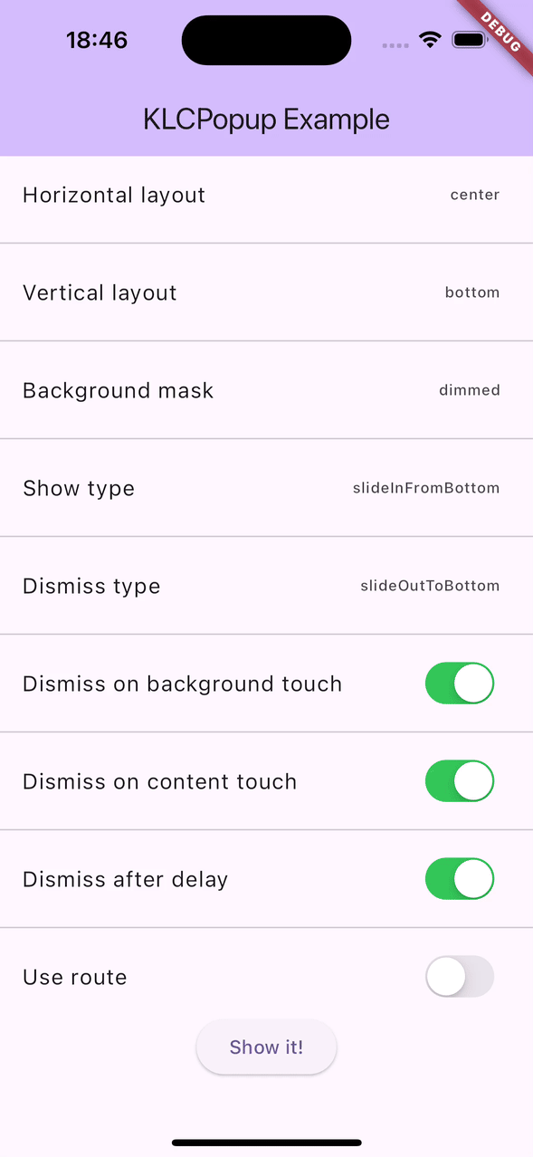
KLCPopupHorizontalLayout horizontalLayout = KLCPopupHorizontalLayout.center;
KLCPopupVerticalLayout verticalLayout = KLCPopupVerticalLayout.center;
KLCPopupMaskType maskType = KLCPopupMaskType.dimmed;
KLCPopupShowType showType = KLCPopupShowType.slideInFromTop;
KLCPopupDismissType dismissType = KLCPopupDismissType.slideOutToTop;
bool shouldDismissOnBackgroundTouch = true;
bool shouldDismissOnContentTouch = false;
bool dismissAfterDelay = false;
bool useRoute = false;
late final KLCPopupController popupController = KLCPopupController();
[@override](/user/override)
Widget build(BuildContext context) {
return Scaffold(
appBar: AppBar(
backgroundColor: Theme.of(context).colorScheme.inversePrimary,
title: const Text('KLCPopup Example'),
),
body: ListView(
children: <Widget>[
ListTile(
title: const Text('Horizontal layout'),
trailing: Text(horizontalLayout.name),
onTap: () async {
_showPropertyPicker<KLCPopupHorizontalLayout>(
title: 'Horizontal Layout',
initialSelection: horizontalLayout,
items: KLCPopupHorizontalLayout.values,
itemBuilder: (item) => Text(item.name),
onSelected: (item) {
setState(() => horizontalLayout = item);
popupController.dismiss();
},
);
},
),
const Divider(),
ListTile(
title: const Text('Vertical layout'),
trailing: Text(verticalLayout.name),
onTap: () async {
_showPropertyPicker<KLCPopupVerticalLayout>(
title: 'Vertical layout',
initialSelection: verticalLayout,
items: KLCPopupVerticalLayout.values,
itemBuilder: (item) => Text(item.name),
onSelected: (item) {
setState(() => verticalLayout = item);
popupController.dismiss();
},
);
},
),
const Divider(),
ListTile(
title: const Text('Background mask'),
trailing: Text(maskType.name),
onTap: () async {
_showPropertyPicker<KLCPopupMaskType>(
title: 'Background mask',
initialSelection: maskType,
items: KLCPopupMaskType.values,
itemBuilder: (item) => Text(item.name),
onSelected: (item) {
setState(() => maskType = item);
popupController.dismiss();
},
);
},
),
const Divider(),
ListTile(
title: const Text('Show type'),
trailing: Text(showType.name),
onTap: () async {
_showPropertyPicker<KLCPopupShowType>(
title: 'Show type',
initialSelection: showType,
items: KLCPopupShowType.values,
itemBuilder: (item) => Text(item.name),
onSelected: (item) {
setState(() => showType = item);
popupController.dismiss();
},
);
},
),
const Divider(),
ListTile(
title: const Text('Dismiss type'),
trailing: Text(dismissType.name),
onTap: () async {
_showPropertyPicker<KLCPopupDismissType>(
title: 'Dismiss type',
initialSelection: dismissType,
items: KLCPopupDismissType.values,
itemBuilder: (item) => Text(item.name),
onSelected: (item) {
setState(() => dismissType = item);
popupController.dismiss();
},
);
},
),
const Divider(),
ListTile(
title: const Text('Dismiss on background touch'),
trailing: Switch.adaptive(value: shouldDismissOnBackgroundTouch, onChanged: (value) => setState(() => shouldDismissOnBackgroundTouch = value)),
),
const Divider(),
ListTile(
title: const Text('Dismiss on content touch'),
trailing: Switch.adaptive(value: shouldDismissOnContentTouch, onChanged: (value) => setState(() => shouldDismissOnContentTouch = value)),
),
const Divider(),
ListTile(
title: const Text('Dismiss after delay'),
trailing: Switch.adaptive(value: dismissAfterDelay, onChanged: (value) => setState(() => dismissAfterDelay = value)),
),
const Divider(),
ListTile(
title: const Text('Use route'),
trailing: Switch.adaptive(value: useRoute, onChanged: (value) => setState(() => useRoute = value)),
),
Center(
child: ElevatedButton(
onPressed: () {
final popupController = KLCPopupController();
showKLCPopup(
context,
controller: popupController,
horizontalLayout: KLCPopupHorizontalLayout.center,
verticalLayout: KLCPopupVerticalLayout.bottom,
showType: KLCPopupShowType.slideInFromBottom,
dismissType: KLCPopupDismissType.slideOutToBottom,
child: Material(
color: Colors.transparent,
child: Container(
width: MediaQuery.of(context).size.width,
height: MediaQuery.of(context).size.height * 0.4,
decoration: BoxDecoration(
color: Colors.redAccent,
borderRadius: BorderRadius.circular(10),
),
child: Column(
mainAxisSize: MainAxisSize.min,
children: [
SafeArea(child: Container()),
const Text(
"Hi.",
style: TextStyle(
color: Colors.white,
fontSize: 42,
fontWeight: FontWeight.bold,
),
),
TextButton(
onPressed: () {
popupController.dismiss();
},
child: const Text("Bye"),
)
],
),
),
),
);
},
child: const Text('Show it!'),
),
)
],
),
);
}
Widget _buildBottomContent(BuildContext context) {
return Container(
height: MediaQuery.of(context).size.height * 0.4,
width: MediaQuery.of(context).size.width,
decoration: BoxDecoration(
color: Colors.blueAccent,
borderRadius: BorderRadius.circular(10),
),
child: Column(
mainAxisSize: MainAxisSize.min,
children: [
const Text(
"Hi.",
style: TextStyle(
color: Colors.white,
fontSize: 42,
fontWeight: FontWeight.bold,
),
),
TextButton(
onPressed: () {
popupController.dismiss();
},
child: const Text("Bye"),
)
],
),
);
}
Widget _buildLeftContent(BuildContext context) {
return Container(
width: MediaQuery.of(context).size.width * 0.8,
height: MediaQuery.of(context).size.height,
decoration: BoxDecoration(
color: Colors.redAccent,
borderRadius: BorderRadius.circular(10),
),
child: Column(
mainAxisSize: MainAxisSize.min,
children: [
SafeArea(child: Container()),
const Text(
"Hi.",
style: TextStyle(
color: Colors.white,
fontSize: 42,
fontWeight: FontWeight.bold,
),
),
TextButton(
onPressed: () {
popupController.dismiss();
},
child: const Text("Bye"),
)
],
),
);
}
Widget _buildCenterContent(BuildContext context) {
return Container(
padding: const EdgeInsets.all(32),
decoration: BoxDecoration(
color: Colors.greenAccent,
borderRadius: BorderRadius.circular(10),
),
child: Column(
mainAxisSize: MainAxisSize.min,
children: [
const Text(
"Hi.",
style: TextStyle(
color: Colors.white,
fontSize: 42,
fontWeight: FontWeight.bold,
),
),
TextButton(
onPressed: () {
popupController.dismiss();
},
child: const Text("Bye"),
)
],
),
);
}
void _showPropertyPicker<T>({
required String title,
required T initialSelection,
required List<T> items,
required Widget Function(T item) itemBuilder,
required void Function(T item) onSelected,
}) {
showKLCPopup(
context,
controller: popupController,
child: _PropertyPickPage<T>(
title: title,
initialSelection: initialSelection,
items: items,
itemBuilder: itemBuilder,
onSelected: onSelected,
didClickCancel: () => popupController.dismiss(),
),
);
}
}
class _PropertyPickPage<T> extends StatefulWidget {
const _PropertyPickPage({
required this.title,
required this.initialSelection,
required this.items,
required this.itemBuilder,
this.onSelected,
this.didClickCancel,
super.key,
});
final String title;
final T? initialSelection;
final List<T> items;
final Widget Function(T item) itemBuilder;
final void Function(T item)? onSelected;
final void Function()? didClickCancel;
[@override](/user/override)
State<_PropertyPickPage<T>> createState() => _PropertyPickPageState<T>();
}
class _PropertyPickPageState<T> extends State<_PropertyPickPage<T>> {
T? selected;
[@override](/user/override)
void initState() {
super.initState();
selected = widget.initialSelection;
}
[@override](/user/override)
Widget build(BuildContext context) {
return Material(
color: Colors.transparent,
child: Container(
constraints: BoxConstraints(
maxHeight: 420,
maxWidth: MediaQuery.of(context).size.width * 0.8,
),
decoration: BoxDecoration(
borderRadius: BorderRadius.circular(10),
color: Theme.of(context).dialogBackgroundColor,
boxShadow: [
BoxShadow(
color: Theme.of(context).shadowColor.withOpacity(0.2),
blurRadius: 10,
offset: const Offset(0, 5),
),
],
),
child: Column(
children: [
Container(
padding: const EdgeInsets.all(16),
decoration: BoxDecoration(
color: Theme.of(context).colorScheme.primary,
borderRadius: const BorderRadius.only(
topLeft: Radius.circular(10),
topRight: Radius.circular(10),
),
),
child: Row(
mainAxisAlignment: MainAxisAlignment.spaceBetween,
children: [
Text(
widget.title,
style: Theme.of(context).textTheme.titleMedium?.copyWith(color: Theme.of(context).colorScheme.onPrimary),
),
IconButton(
icon: const Icon(Icons.close),
onPressed: () {
widget.didClickCancel?.call();
},
),
],
),
),
Expanded(
child: ListView.builder(
shrinkWrap: true,
padding: EdgeInsets.zero,
itemCount: widget.items.length,
itemBuilder: (BuildContext context, int index) {
return ListTile(
title: widget.itemBuilder(widget.items[index]),
onTap: () {
setState(
() {
selected = widget.items[index];
},
);
widget.onSelected?.call(widget.items[index]);
},
trailing: selected == widget.items[index] ? const Icon(Icons.check) : null,
);
},
),
)
],
),
),
);
}
}更多关于Flutter弹出窗口插件klcpopup的使用的实战系列教程也可以访问 https://www.itying.com/category-92-b0.html


更多关于Flutter弹出窗口插件klcpopup的使用的实战系列教程也可以访问 https://www.itying.com/category-92-b0.html
klcpopup 是一个用于在 Flutter 应用中弹出自定义窗口的插件。它提供了简单易用的 API,可以帮助开发者快速实现各种弹出窗口的效果。以下是如何在 Flutter 项目中使用 klcpopup 插件的详细步骤。
1. 添加依赖
首先,你需要在 pubspec.yaml 文件中添加 klcpopup 插件的依赖。
dependencies:
  flutter:
    sdk: flutter
  klcpopup: ^1.0.0  # 请根据实际情况使用最新版本
然后运行 flutter pub get 来获取依赖。
2. 导入包
在你的 Dart 文件中导入 klcpopup 包。
import 'package:klcpopup/klcpopup.dart';3. 使用 klcpopup
klcpopup 提供了多种弹出窗口的方式,以下是一些常见的用法示例。
3.1 基本弹出窗口
你可以使用 KlcPopup.showPopup 方法来显示一个简单的弹出窗口。
KlcPopup.showPopup(
  context,
  builder: (BuildContext context) {
    return Container(
      width: 200,
      height: 200,
      color: Colors.white,
      child: Center(
        child: Text('这是一个弹出窗口'),
      ),
    );
  },
);
3.2 带按钮的弹出窗口
你可以在弹出窗口中添加按钮,并处理按钮的点击事件。
KlcPopup.showPopup(
  context,
  builder: (BuildContext context) {
    return Container(
      width: 200,
      height: 200,
      color: Colors.white,
      child: Column(
        mainAxisAlignment: MainAxisAlignment.center,
        children: [
          Text('这是一个弹出窗口'),
          SizedBox(height: 20),
          ElevatedButton(
            onPressed: () {
              Navigator.of(context).pop(); // 关闭弹出窗口
            },
            child: Text('关闭'),
          ),
        ],
      ),
    );
  },
);
3.3 自定义动画和位置
klcpopup 允许你自定义弹出窗口的动画和位置。
KlcPopup.showPopup(
  context,
  animationType: KlcPopupAnimationType.scale, // 缩放动画
  position: KlcPopupPosition.center, // 居中显示
  builder: (BuildContext context) {
    return Container(
      width: 200,
      height: 200,
      color: Colors.white,
      child: Center(
        child: Text('这是一个弹出窗口'),
      ),
    );
  },
);
3.4 带背景遮罩的弹出窗口
你可以为弹出窗口添加背景遮罩,并自定义遮罩的颜色和透明度。
KlcPopup.showPopup(
  context,
  barrierColor: Colors.black.withOpacity(0.5), // 背景遮罩颜色
  builder: (BuildContext context) {
    return Container(
      width: 200,
      height: 200,
      color: Colors.white,
      child: Center(
        child: Text('这是一个弹出窗口'),
      ),
    );
  },
);
4. 关闭弹出窗口
你可以通过 Navigator.of(context).pop() 来关闭弹出窗口。
ElevatedButton(
  onPressed: () {
    Navigator.of(context).pop(); // 关闭弹出窗口
  },
  child: Text('关闭'),
);
5. 其他功能
klcpopup 还支持更多高级功能,如自定义动画、拖拽关闭、点击外部关闭等。你可以参考插件的官方文档或源码来了解更多细节。
6. 示例代码
以下是一个完整的示例代码,展示了如何使用 klcpopup 插件显示一个带按钮的弹出窗口。
import 'package:flutter/material.dart';
import 'package:klcpopup/klcpopup.dart';

void main() {
  runApp(MyApp());
}

class MyApp extends StatelessWidget {
  [@override](/user/override)
  Widget build(BuildContext context) {
    return MaterialApp(
      home: Scaffold(
        appBar: AppBar(
          title: Text('klcpopup 示例'),
        ),
        body: Center(
          child: ElevatedButton(
            onPressed: () {
              KlcPopup.showPopup(
                context,
                builder: (BuildContext context) {
                  return Container(
                    width: 200,
                    height: 200,
                    color: Colors.white,
                    child: Column(
                      mainAxisAlignment: MainAxisAlignment.center,
                      children: [
                        Text('这是一个弹出窗口'),
                        SizedBox(height: 20),
                        ElevatedButton(
                          onPressed: () {
                            Navigator.of(context).pop(); // 关闭弹出窗口
                          },
                          child: Text('关闭'),
                        ),
                      ],
                    ),
                  );
                },
              );
            },
            child: Text('显示弹出窗口'),
          ),
        ),
      ),
    );
  }
}