


封装自定义组件,快速实现HarmonyOS鸿蒙Next系统下的统一弹窗解决方案
封装自定义组件,快速实现HarmonyOS鸿蒙Next系统下的统一弹窗解决方案 弹窗是应用开发中使用的非常多的一个组件,为了统一设计和整体美观的目的,弹窗往往会使用一套设计统一,交互相近的设计方案。如果每个弹窗都手动创建的话,需要消耗开发者大量的精力,为了能够快速开发不同的弹窗方案,我们可以尝试在开发初期就构建一个底层的弹窗逻辑。
弹窗效果如下:
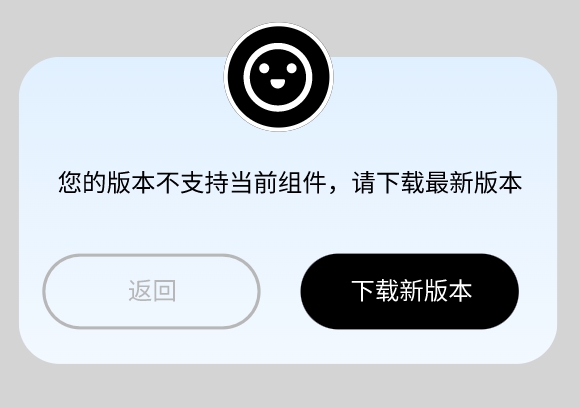
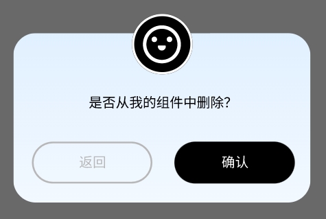
简单分析可以发现,弹窗的设计是相似的,相同背景的基础上增加一个图标,一行文字和两个按钮。
因此这里可以开发一个通用的底层组件来搭建弹窗的基本架构。
代码如下:
/**
 * 标准弹窗使用的统一设计
 */
@Component
export struct dialogDesign {
  @State imageUrl: Resource = $r("app.media.icon_dialog_cardDesignRetain")//顶部的悬浮图标
  @Prop Title: string//弹窗中显示的文本
  @Prop cancelText: string//取消按钮的文本
  @Prop acceptText: string//确认按钮的文本
  cancelAction(): void = () => {
  }//取消按钮的点击事件
  acceptAction(): void = () => {
  }//确认按钮的点击事件

  build() {
    Column() {
      Stack() {
        Column() {
          Text() {
            Span(this.Title)//弹窗显示的文本
              .fontColor($r('app.color.textColor'))
              .fontSize(12)
          }
          .margin({ top: 35, bottom: 20 })
          .padding({ left: 8, right: 8 })

          Flex({ justifyContent: FlexAlign.SpaceAround }) {
            Button(this.cancelText)//左侧的取消按钮
              .type(ButtonType.Normal)// .borderRadius(20)
              .height(45)
              .width(130)// .backgroundColor('#000000')
              .backgroundColor('rgba(0,0,0,0)')
              .border({ width: 1, color: $r('app.color.remarkTextColor'), radius: 20 })
              .fontColor($r('app.color.remarkTextColor'))
              .fontSize(12)
              .onClick(() => {
                this.cancelAction()
              })
            Button(this.acceptText)//右侧的确认按钮
              .type(ButtonType.Normal)
              .borderRadius(20)
              .height(45)
              .width(130)
              .backgroundColor($r('app.color.ButtonBackgroundColor02'))
              .fontColor($r('app.color.textColor04'))
              .fontSize(12)

              .onClick(() => {
                this.acceptAction()
              })
          }.margin({ bottom: 20 })
        }
        .borderRadius(20)

        Image(this.imageUrl)//顶部的悬浮图标
          .height($r('app.integer.dialogIconSize'))
          .width($r('app.integer.dialogIconSize'))
          .offset({ y: $r('app.integer.dialogIconYMovie') })
      }
      .align(Alignment.Top)
      .width('80%')
      .borderRadius(20)
      .linearGradient({
        angle: 180,
        colors: [[$r('app.color.cardColor_Start'), 0], [$r('app.color.cardColor_End'), 1]]
      })
      .backgroundImagePosition(Alignment.Center)
      .backgroundImageSize(ImageSize.Cover)
    }
    .backgroundColor($r('app.color.masksColor'))
    .justifyContent(FlexAlign.Center)
    .height('100%')
    .width('100%')
    .onClick(() => {
      this.cancelAction()
    })
  }
}
封装了底层结构以后,我们就可以通过非常简单的代码复用,快速开发不同的弹窗。
/**
* 广告看了一部分,但还没拿到的时候退出给的弹窗
*/
@Component
export struct dialog_returnButAdNoReady {
@Link showReturnButAdNoReadyDialog: boolean//使用link来控制弹窗是否显示
build() {
dialogDesign({
Title: '马上就要获得壁纸了,退出广告将重新统计',
cancelText: '返回',
cancelAction: () => {
//点击取消按钮的事件
...
this.showReturnFromCardDesignDialog = false
},
acceptText: '确认退出',
acceptAction: () => {
//点击确认按钮的事件
...
this.showReturnFromCardDesignDialog = false
}
})
}
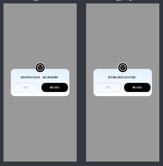
}/**
* 退出卡片编辑页时的弹窗
*/
@Component
@Preview
export struct dialog_returnFromCardDesign {
@Link showReturnFromCardDesignDialog: boolean
build() {
dialogDesign({
Title: '你的组件还未保存,确认要返回嘛?',
cancelText: '返回',
cancelAction: () => {
//点击取消按钮的事件
...
this.showReturnFromCardDesignDialog = false
},
acceptText: '确认退出',
acceptAction: () => {
//点击确认按钮的事件
...
this.showReturnFromCardDesignDialog = false
}
})
}
}运行效果如下:
更多关于封装自定义组件,快速实现HarmonyOS鸿蒙Next系统下的统一弹窗解决方案的实战系列教程也可以访问 https://www.itying.com/category-93-b0.html


