


Flutter键盘操作优化插件ux_keyboard_actions的使用
Flutter键盘操作优化插件ux_keyboard_actions的使用
概述
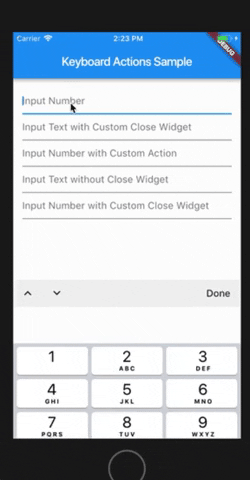
ux_keyboard_actions 是一个用于优化 Flutter 应用程序中键盘操作的插件。它通过为 Android 和 iOS 键盘添加功能来提升用户体验,例如自定义完成按钮、在文本框之间导航等。
特性
- 完成按钮:可以自定义键盘上的完成按钮。
- 文本框导航:可以在文本框之间移动(可以通过设置
nextFocus: false来禁用)。 - 键盘栏自定义:支持自定义键盘栏。
- 底部自定义小部件:可以在键盘下方添加自定义小部件。
- 轻松创建自定义键盘:支持快速创建自定义键盘。
- 跨平台支持:适用于 Android、iOS 或两者。
- 对话框兼容性:支持在对话框中使用。
自定义底部小部件示例

使用自定义输入作为键盘示例

开始使用
添加依赖
在你的 Flutter 项目中添加以下依赖:
dependencies:
  ux_keyboard_actions: "^4.1.0"
然后运行以下命令以更新依赖项:
flutter packages upgrade示例项目
你可以在项目的 example 文件夹中找到完整的示例项目。你可以克隆该项目并运行它以了解其功能。
基本用法
以下是一个简单的示例,展示如何使用 ux_keyboard_actions 插件。
示例代码
import 'package:flutter/material.dart';
import 'package:ux_keyboard_actions/keyboard_actions.dart';

class Content extends StatefulWidget {
  const Content({Key key}) : super(key: key);

  [@override](/user/override)
  _ContentState createState() => _ContentState();
}

class _ContentState extends State<Content> {
  final FocusNode _nodeText1 = FocusNode();
  final FocusNode _nodeText2 = FocusNode();
  final FocusNode _nodeText3 = FocusNode();

  /// 创建 KeyboardActionsConfig 配置
  KeyboardActionsConfig _buildConfig(BuildContext context) {
    return KeyboardActionsConfig(
      keyboardActionsPlatform: KeyboardActionsPlatform.ALL,
      keyboardBarColor: Colors.grey[200],
      nextFocus: true,
      actions: [
        KeyboardActionsItem(
          focusNode: _nodeText1,
        ),
        KeyboardActionsItem(
          focusNode: _nodeText2,
          toolbarButtons: [
            (node) {
              return GestureDetector(
                onTap: () => node.unfocus(),
                child: Padding(
                  padding: EdgeInsets.all(8.0),
                  child: Icon(Icons.close),
                ),
              );
            }
          ],
        ),
        KeyboardActionsItem(
          focusNode: _nodeText3,
          onTapAction: () {
            showDialog(
              context: context,
              builder: (context) {
                return AlertDialog(
                  content: Text("Custom Action"),
                  actions: <Widget>[
                    FlatButton(
                      child: Text("OK"),
                      onPressed: () => Navigator.of(context).pop(),
                    )
                  ],
                );
              },
            );
          },
        ),
      ],
    );
  }

  [@override](/user/override)
  Widget build(BuildContext context) {
    return KeyboardActions(
      config: _buildConfig(context),
      child: Center(
        child: Padding(
          padding: const EdgeInsets.all(15.0),
          child: Column(
            crossAxisAlignment: CrossAxisAlignment.stretch,
            children: <Widget>[
              TextField(
                keyboardType: TextInputType.number,
                focusNode: _nodeText1,
                decoration: InputDecoration(hintText: "Input Number"),
              ),
              TextField(
                keyboardType: TextInputType.text,
                focusNode: _nodeText2,
                decoration: InputDecoration(hintText: "Input Text with Custom Done Button"),
              ),
              TextField(
                keyboardType: TextInputType.text,
                focusNode: _nodeText3,
                decoration: InputDecoration(hintText: "Input Text with Custom Action"),
              ),
            ],
          ),
        ),
      ),
    );
  }
}
解释
- KeyboardActionsConfig:配置键盘行为,包括键盘栏颜色、焦点节点等。
- KeyboardActionsItem:每个
KeyboardActionsItem对应一个文本框,可以设置自定义按钮或操作。 - KeyboardActions:包裹整个表单,应用配置。
使用自定义键盘
示例代码
import 'package:flutter/material.dart';
import 'package:ux_keyboard_actions/keyboard_actions.dart';

class Content extends StatelessWidget {
  final FocusNode _nodeText7 = FocusNode();
  final FocusNode _nodeText8 = FocusNode();

  // 自定义通知器
  final custom1Notifier = ValueNotifier<String>("0");
  final custom2Notifier = ValueNotifier<Color>(Colors.blue);

  /// 创建 KeyboardActionsConfig 配置
  KeyboardActionsConfig _buildConfig(BuildContext context) {
    return KeyboardActionsConfig(
      keyboardActionsPlatform: KeyboardActionsPlatform.ALL,
      keyboardBarColor: Colors.grey[200],
      nextFocus: true,
      actions: [
        KeyboardActionsItem(
          focusNode: _nodeText7,
          footerBuilder: (_) => CounterKeyboard(notifier: custom1Notifier),
        ),
        KeyboardActionsItem(
          focusNode: _nodeText8,
          footerBuilder: (_) => ColorPickerKeyboard(notifier: custom2Notifier),
        ),
      ],
    );
  }

  [@override](/user/override)
  Widget build(BuildContext context) {
    return KeyboardActions(
      config: _buildConfig(context),
      child: Center(
        child: Container(
          padding: const EdgeInsets.all(15.0),
          child: Column(
            crossAxisAlignment: CrossAxisAlignment.stretch,
            children: <Widget>[
              KeyboardCustomInput<String>(
                focusNode: _nodeText7,
                height: 65,
                notifier: custom1Notifier,
                builder: (context, val, hasFocus) {
                  return Container(
                    alignment: Alignment.center,
                    color: hasFocus ? Colors.grey[300] : Colors.white,
                    child: Text(
                      val,
                      style: TextStyle(fontSize: 30, fontWeight: FontWeight.bold),
                    ),
                  );
                },
              ),
              KeyboardCustomInput<Color>(
                focusNode: _nodeText8,
                height: 65,
                notifier: custom2Notifier,
                builder: (context, val, hasFocus) {
                  return Container(
                    width: double.maxFinite,
                    color: val ?? Colors.transparent,
                  );
                },
              ),
            ],
          ),
        ),
      ),
    );
  }
}

/// 自定义颜色选择键盘
class ColorPickerKeyboard extends StatelessWidget
    with KeyboardCustomPanelMixin<Color>
    implements PreferredSizeWidget {
  final ValueNotifier<Color> notifier;

  static const double _kKeyboardHeight = 200;

  ColorPickerKeyboard({Key key, this.notifier}) : super(key: key);

  [@override](/user/override)
  Widget build(BuildContext context) {
    final double rows = 3;
    final double screenWidth = MediaQuery.of(context).size.width;
    final int colorsCount = Colors.primaries.length;
    final int colorsPerRow = (colorsCount / rows).ceil();
    final double itemWidth = screenWidth / colorsPerRow;
    final double itemHeight = _kKeyboardHeight / rows;

    return Container(
      height: _kKeyboardHeight,
      child: Wrap(
        children: <Widget>[
          for (final color in Colors.primaries)
            GestureDetector(
              onTap: () {
                updateValue(color);
              },
              child: Container(
                color: color,
                width: itemWidth,
                height: itemHeight,
              ),
            )
        ],
      ),
    );
  }

  [@override](/user/override)
  Size get preferredSize => Size.fromHeight(_kKeyboardHeight);
}

/// 自定义计数键盘
class CounterKeyboard extends StatelessWidget
    with KeyboardCustomPanelMixin<String>
    implements PreferredSizeWidget {
  final ValueNotifier<String> notifier;

  CounterKeyboard({Key key, this.notifier}) : super(key: key);

  [@override](/user/override)
  Size get preferredSize => Size.fromHeight(200);

  [@override](/user/override)
  Widget build(BuildContext context) {
    return Container(
      height: preferredSize.height,
      child: Row(
        children: [
          Expanded(
            child: InkWell(
              onTap: () {
                int value = int.tryParse(notifier.value) ?? 0;
                value--;
                updateValue(value.toString());
              },
              child: FittedBox(
                child: Text(
                  "-",
                  style: TextStyle(fontWeight: FontWeight.bold),
                ),
              ),
            ),
          ),
          Expanded(
            child: InkWell(
              onTap: () {
                int value = int.tryParse(notifier.value) ?? 0;
                value++;
                updateValue(value.toString());
              },
              child: FittedBox(
                child: Text(
                  "+",
                  style: TextStyle(fontWeight: FontWeight.bold),
                ),
              ),
            ),
          ),
        ],
      ),
    );
  }
}

更多关于Flutter键盘操作优化插件ux_keyboard_actions的使用的实战系列教程也可以访问 https://www.itying.com/category-92-b0.html
ux_keyboard_actions 是一个用于优化 Flutter 应用中键盘操作的插件。它可以帮助开发者更轻松地处理键盘事件,特别是在表单输入、焦点管理等方面。以下是如何使用 ux_keyboard_actions 插件的详细步骤:
1. 添加依赖
首先,你需要在 pubspec.yaml 文件中添加 ux_keyboard_actions 插件的依赖:
dependencies:
  flutter:
    sdk: flutter
  ux_keyboard_actions: ^latest_version
然后运行 flutter pub get 来获取依赖。
2. 导入包
在你的 Dart 文件中导入 ux_keyboard_actions 包:
import 'package:ux_keyboard_actions/ux_keyboard_actions.dart';3. 使用 KeyboardActions 组件
KeyboardActions 是一个用于包裹需要处理键盘操作的组件的 Widget。你可以将 KeyboardActions 包裹在 Scaffold 或其他容器中。
class MyForm extends StatelessWidget {
  [@override](/user/override)
  Widget build(BuildContext context) {
    return Scaffold(
      appBar: AppBar(
        title: Text('Keyboard Actions Example'),
      ),
      body: KeyboardActions(
        config: KeyboardActionsConfig(
          actions: [
            KeyboardActionsItem(
              focusNode: _focusNode1,
              onTapAction: () {
                // 处理键盘操作
              },
            ),
            KeyboardActionsItem(
              focusNode: _focusNode2,
              onTapAction: () {
                // 处理键盘操作
              },
            ),
          ],
        ),
        child: Column(
          children: [
            TextField(
              focusNode: _focusNode1,
              decoration: InputDecoration(labelText: 'Field 1'),
            ),
            TextField(
              focusNode: _focusNode2,
              decoration: InputDecoration(labelText: 'Field 2'),
            ),
          ],
        ),
      ),
    );
  }

  final FocusNode _focusNode1 = FocusNode();
  final FocusNode _focusNode2 = FocusNode();
}
4. 配置 KeyboardActionsConfig
KeyboardActionsConfig 用于配置键盘操作的行为。你可以为每个 KeyboardActionsItem 指定一个 FocusNode 和一个 onTapAction 回调函数,当用户按下键盘上的“完成”或“下一步”按钮时,会触发这个回调。
KeyboardActionsConfig(
  actions: [
    KeyboardActionsItem(
      focusNode: _focusNode1,
      onTapAction: () {
        // 处理键盘操作
      },
    ),
    KeyboardActionsItem(
      focusNode: _focusNode2,
      onTapAction: () {
        // 处理键盘操作
      },
    ),
  ],
)
5. 处理焦点切换
你可以通过 FocusNode 来管理焦点的切换。例如,当用户按下“下一步”按钮时,你可以将焦点移动到下一个输入框:
onTapAction: () {
  FocusScope.of(context).requestFocus(_focusNode2);
}
6. 自定义键盘操作按钮
你还可以自定义键盘操作按钮的文本和行为。例如,将“完成”按钮改为“提交”:
KeyboardActionsConfig(
  actions: [
    KeyboardActionsItem(
      focusNode: _focusNode1,
      displayActionBar: true,
      toolbarButtons: [
        (node) {
          return GestureDetector(
            onTap: () {
              // 处理提交操作
            },
            child: Text('Submit'),
          );
        },
      ],
    ),
  ],
)
7. 处理键盘遮挡问题
ux_keyboard_actions 还可以帮助你处理键盘遮挡输入框的问题。你可以通过 KeyboardActionsConfig 的 autoScroll 属性来自动滚动视图,以确保输入框可见。
KeyboardActionsConfig(
  autoScroll: true,
  actions: [
    KeyboardActionsItem(
      focusNode: _focusNode1,
      onTapAction: () {
        // 处理键盘操作
      },
    ),
  ],
)
8. 完整示例
以下是一个完整的示例,展示了如何使用 ux_keyboard_actions 插件:
import 'package:flutter/material.dart';
import 'package:ux_keyboard_actions/ux_keyboard_actions.dart';

void main() {
  runApp(MyApp());
}

class MyApp extends StatelessWidget {
  [@override](/user/override)
  Widget build(BuildContext context) {
    return MaterialApp(
      home: MyForm(),
    );
  }
}

class MyForm extends StatelessWidget {
  [@override](/user/override)
  Widget build(BuildContext context) {
    return Scaffold(
      appBar: AppBar(
        title: Text('Keyboard Actions Example'),
      ),
      body: KeyboardActions(
        config: KeyboardActionsConfig(
          autoScroll: true,
          actions: [
            KeyboardActionsItem(
              focusNode: _focusNode1,
              onTapAction: () {
                FocusScope.of(context).requestFocus(_focusNode2);
              },
            ),
            KeyboardActionsItem(
              focusNode: _focusNode2,
              onTapAction: () {
                // 处理提交操作
              },
              toolbarButtons: [
                (node) {
                  return GestureDetector(
                    onTap: () {
                      // 处理提交操作
                    },
                    child: Text('Submit'),
                  );
                },
              ],
            ),
          ],
        ),
        child: Padding(
          padding: const EdgeInsets.all(16.0),
          child: Column(
            children: [
              TextField(
                focusNode: _focusNode1,
                decoration: InputDecoration(labelText: 'Field 1'),
              ),
              TextField(
                focusNode: _focusNode2,
                decoration: InputDecoration(labelText: 'Field 2'),
              ),
            ],
          ),
        ),
      ),
    );
  }

  final FocusNode _focusNode1 = FocusNode();
  final FocusNode _focusNode2 = FocusNode();
}