


HarmonyOS鸿蒙Next应用开发中input多选效果实现
HarmonyOS鸿蒙Next应用开发中input多选效果实现
这里用input组件敲了个案例
Type为text时为输入框
Type为button时为按钮
Type为checkbox为多选按钮
Type为radio为单选按钮
Type为checkbox为多选按钮
Type为radio为单选按钮
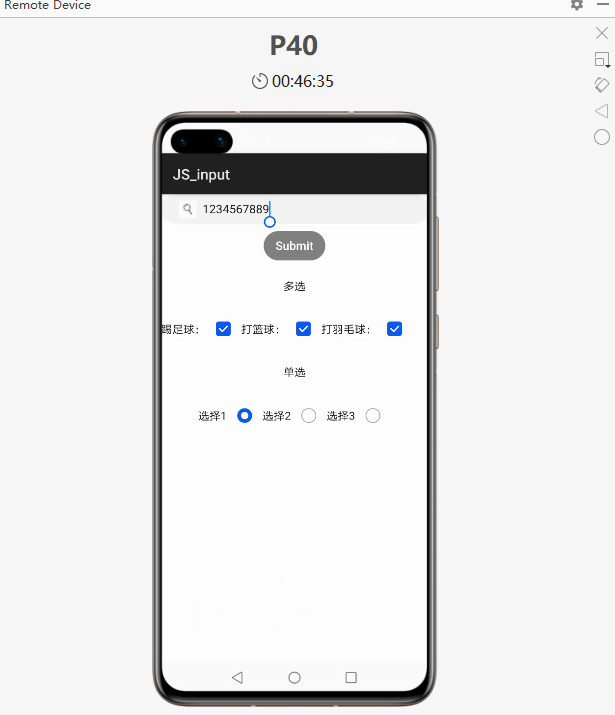
Html代码如下:
<div class="content">
    <input id="input" class="input" type="text" maxlength="20" enterkeytype="send"
        headericon="/image/soushuo.jpeg" placeholder="Please input text" onchange="change"
        onenterkeyclick="enterkeyClick">
    <input class="button" type="button" value="Submit" onclick="buttonClick">
    <text style="margin-top: 50px;">多选</text>
    <div class="check">
        <text>踢足球:</text>
        <input onchange="checkboxOnChange_one" checked="true" type="checkbox">
        <text>打篮球:</text>
        <input onchange="checkboxOnChange_two" checked="true" type="checkbox">
        <text>打羽毛球:</text>
        <input onchange="checkboxOnChange_three" checked="true" type="checkbox">
    </div>
    <text style="margin-top: 50px;">单选</text>
    <div class="radio_button">
        <div>
            <text>选择1</text>
            <input type="radio" checked='true' name="radioSample" value="按钮1" onchange="onRadioChange('按钮1')">
        </div>
        <div>
            <text>选择2</text>
            <input type="radio" checked='false' name="radioSample" value="按钮2" onchange="onRadioChange('按钮2')">
        </div>
        <div>
            <text>选择3</text>
            <input type="radio" checked='false' name="radioSample" value="按钮3" onchange="onRadioChange('按钮3')">
        </div>
    </div>
</div>
Css样式如下:
.content {
    width: 100%;
    flex-direction: column;
    align-items: center;
}

.input {
    placeholder-color: gray;
    align-items: center;
}

.button {
    background-color: gray;
    margin-top: 20px;
    align-items: center;
}

.check{
    margin-top: 50px;
}

.radio_button{
    width: 100%;
    height: 200px;
    justify-content: center;
    align-items: center;
}
Js代码如下:
import prompt from '@system.prompt'
export default {
    change(e){
        prompt.showToast({
            message: "value: " + e.value,
            duration: 3000,
        })
    },
    enterkeyClick(e){
        prompt.showToast({
            message: "enterkey clicked",
            duration: 3000,
        })
    },
    buttonClick(e){
        this.$element("input").showError({
            error: 'error text'
        });
    },
    checkboxOnChange_one(e) {
        prompt.showToast({
            message: '足球为: ' + e.checked,
            duration: 3000,
        })
    },
    checkboxOnChange_two(e) {
        prompt.showToast({
            message: '篮球为: ' + e.checked,
            duration: 3000,
        })
    },
    checkboxOnChange_three(e) {
        prompt.showToast({
            message: '羽毛球为: ' + e.checked,
            duration: 3000,
        })
    },
    onRadioChange(inputValue, e) {
        if (inputValue === e.value) {
            prompt.showToast({
                message: '当前按钮为:' + e.value,
                duration: 3000,
            });
        }
    }
}
完整代码地址: https://gitee.com/jltfcloudcn/jump_to/tree/master/JS_input

3 回复

感谢楼主热情洋溢的分享
更多关于HarmonyOS鸿蒙Next应用开发中input多选效果实现的实战系列教程也可以访问 https://www.itying.com/category-93-b0.html

在HarmonyOS鸿蒙Next应用开发中,实现input多选效果可以通过使用Checkbox组件或ListContainer组件结合Checkbox来实现。以下是具体实现方式:
-
使用Checkbox组件:
- 在布局文件中添加多个
Checkbox组件,每个Checkbox代表一个选项。 - 通过
Checkbox的setChecked方法设置默认选中状态。 - 使用
setOnCheckedChangeListener监听Checkbox的状态变化,获取用户选择的结果。
- 在布局文件中添加多个
-
使用ListContainer组件:
- 创建一个
ListContainer,并在其适配器中绑定Checkbox组件。 - 在适配器中处理
Checkbox的选中状态,并通过回调函数将用户选择的结果传递给主界面。 - 通过
ListContainer的setItemProvider方法设置数据源,动态生成多选列表。
- 创建一个
-
数据绑定:
- 使用
DataAbility或SharedPreferences存储用户选择的结果,确保数据持久化。 - 通过
DataBinding将Checkbox的状态与数据模型绑定,实现数据的双向同步。
- 使用
-
样式定制:
- 通过
XML或Java代码自定义Checkbox的样式,如颜色、大小、形状等,以满足UI设计需求。 - 使用
ResourceTable管理资源文件,确保样式的统一性和可维护性。
- 通过
-
事件处理:
- 在
onClick事件中处理Checkbox的点击逻辑,更新选中状态。 - 使用
EventBus或Handler进行组件间通信,确保多选结果的实时更新。
- 在
通过以上方法,可以在HarmonyOS鸿蒙Next应用中实现input多选效果,满足用户交互需求。

在HarmonyOS鸿蒙Next应用开发中,实现input多选效果可以通过Checkbox组件或Select组件结合List或Grid布局来实现。以下是使用Checkbox的简单示例:
- 布局文件:使用
Checkbox组件。
<Checkbox ohos:id="$+id/checkbox1" ohos:text="选项1"/>
<Checkbox ohos:id="$+id/checkbox2" ohos:text="选项2"/>- 逻辑代码:监听
Checkbox状态变化。
Checkbox checkbox1 = (Checkbox) findComponentById(ResourceTable.Id_checkbox1);
Checkbox checkbox2 = (Checkbox) findComponentById(ResourceTable.Id_checkbox2);

checkbox1.setCheckedStateChangedListener((component, isChecked) -> {
    // 处理选项1的状态变化
});

checkbox2.setCheckedStateChangedListener((component, isChecked) -> {
    // 处理选项2的状态变化
});
通过这种方式,可以轻松实现多选功能。