


Flutter分段按钮滑动插件segmented_button_slide的使用
Flutter分段按钮滑动插件segmented_button_slide的使用
Segmented Button Slide
Segmented Button Slide 是一个从iOS分段按钮获得灵感并适应Material设计风格的Flutter插件。它允许用户通过滑动来选择不同的选项,提供了丰富的自定义选项,包括样式、动画等。
如何使用
安装插件
首先,在你的项目中安装此插件,可以通过以下命令:
flutter pub add segmented_button_slide
示例代码
下面是一个完整的示例代码,展示了如何在应用中使用 SegmentedButtonSlide 组件:
import 'package:flutter/material.dart';
import 'package:segmented_button_slide/segmented_button_slide.dart';
void main() {
runApp(const SegmentedButtonDemo());
}
class SegmentedButtonDemo extends StatefulWidget {
const SegmentedButtonDemo({super.key});
@override
State<SegmentedButtonDemo> createState() => _SegmentedButtonDemoState();
}
class _SegmentedButtonDemoState extends State<SegmentedButtonDemo> {
int _selected = 0;
@override
Widget build(BuildContext context) {
return MaterialApp(
title: 'Segmented Button Demo',
home: Scaffold(
appBar: AppBar(title: const Text('Segmented Button Slide Demo')),
body: Center(
child: FractionallySizedBox(
widthFactor: 0.5,
child: SegmentedButtonSlide(
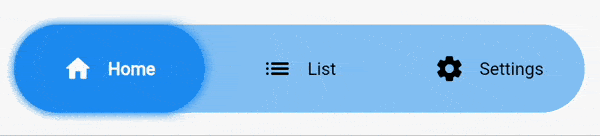
entries: const [
SegmentedButtonSlideEntry(
icon: Icons.home_rounded,
label: "Home",
),
SegmentedButtonSlideEntry(
icon: Icons.list_rounded,
label: "List",
),
SegmentedButtonSlideEntry(
icon: Icons.settings_rounded,
label: "Settings",
),
],
selectedEntry: _selected,
onChange: (selected) => setState(() => _selected = selected),
colors: SegmentedButtonSlideColors(
barColor: Theme.of(context)
.colorScheme
.primaryContainer
.withOpacity(0.5),
backgroundSelectedColor:
Theme.of(context).colorScheme.primaryContainer,
),
slideShadow: [
BoxShadow(
color: Colors.blue.withOpacity(1),
blurRadius: 5,
spreadRadius: 1,
)
],
margin: const EdgeInsets.all(16),
height: 70,
padding: const EdgeInsets.all(16),
borderRadius: BorderRadius.circular(8),
selectedTextStyle: const TextStyle(
fontWeight: FontWeight.w700,
color: Colors.green,
),
unselectedTextStyle: const TextStyle(
fontWeight: FontWeight.w400,
color: Colors.red,
),
hoverTextStyle: const TextStyle(
color: Colors.orange,
),
),
),
),
),
);
}
}
参数详解
entries:必须提供,接受一个SegmentedButtonSlideEntry列表。每个条目可以包含图标和标签。selectedEntry:必须提供,表示当前选中的项的索引。onChange:必须提供,当用户选择不同项时触发,并返回所选的索引。colors:必须提供,用于配置整体背景色和选中项的背景色。slideShadow:可选,为滑动条设置阴影效果。barShadow:可选,为整个栏设置阴影效果。margin:可选,设置组件外边距。height:可选,设置组件高度。fontSize:可选,设置文本字体大小(不影响图标)。iconSize:可选,设置图标大小(不影响文本)。textOverflow:可选,定义文本溢出方式。animationDuration:可选,默认250毫秒,定义所有动画的持续时间。curve:可选,默认为ease,定义所有动画的缓动曲线。padding:可选,设置内部填充。borderRadius:可选,设置圆角半径。selectedTextStyle:可选,设置选中项的文本样式。unselectedTextStyle:可选,设置未选中项的文本样式。hoverTextStyle:可选,设置悬停时的文本样式。
迁移指南
从v1迁移到v2时需要注意一些破坏性更改:
- 移除了
foregroundSelectedColor,foregroundUnselectedColor和hoverColor属性。 - 新增了
selectedTextStyle,unselectedTextStyle和hoverTextStyle来替代上述属性的功能。
希望以上内容能帮助你更好地理解和使用 segmented_button_slide 插件!如果有任何问题或需要进一步的帮助,请随时提问。
更多关于Flutter分段按钮滑动插件segmented_button_slide的使用的实战教程也可以访问 https://www.itying.com/category-92-b0.html
1 回复

更多关于Flutter分段按钮滑动插件segmented_button_slide的使用的实战系列教程也可以访问 https://www.itying.com/category-92-b0.html
当然,下面是一个关于如何在Flutter中使用segmented_button_slide插件的示例代码。这个插件允许你创建分段按钮,并且可以在这些按钮之间进行滑动切换。
首先,确保你已经在pubspec.yaml文件中添加了segmented_button_slide依赖:
dependencies:
  flutter:
    sdk: flutter
  segmented_button_slide: ^最新版本号  # 请替换为当前最新版本号
然后运行flutter pub get来获取依赖。
接下来是一个完整的示例代码,展示了如何使用segmented_button_slide插件:
import 'package:flutter/material.dart';
import 'package:segmented_button_slide/segmented_button_slide.dart';

void main() {
  runApp(MyApp());
}

class MyApp extends StatelessWidget {
  @override
  Widget build(BuildContext context) {
    return MaterialApp(
      title: 'Segmented Button Slide Demo',
      theme: ThemeData(
        primarySwatch: Colors.blue,
      ),
      home: MyHomePage(),
    );
  }
}

class MyHomePage extends StatefulWidget {
  @override
  _MyHomePageState createState() => _MyHomePageState();
}

class _MyHomePageState extends State<MyHomePage> with SingleTickerProviderStateMixin {
  int selectedIndex = 0;

  @override
  Widget build(BuildContext context) {
    return Scaffold(
      appBar: AppBar(
        title: Text('Segmented Button Slide Demo'),
      ),
      body: Padding(
        padding: const EdgeInsets.all(16.0),
        child: Column(
          children: [
            SizedBox(height: 20),
            SegmentedButtonSlide(
              selectedIndex: selectedIndex,
              onValueChanged: (index) {
                setState(() {
                  selectedIndex = index;
                });
              },
              items: [
                SegmentedButtonItem(
                  title: 'Item 1',
                  icon: Icons.home,
                ),
                SegmentedButtonItem(
                  title: 'Item 2',
                  icon: Icons.star,
                ),
                SegmentedButtonItem(
                  title: 'Item 3',
                  icon: Icons.settings,
                ),
              ],
              style: SegmentedButtonStyle(
                backgroundColor: Colors.grey[200],
                activeBackgroundColor: Colors.blue,
                textStyle: TextStyle(color: Colors.black),
                activeTextStyle: TextStyle(color: Colors.white),
                iconColor: Colors.black,
                activeIconColor: Colors.white,
                borderRadius: BorderRadius.circular(20),
                itemWidth: 100,
                itemHeight: 50,
              ),
            ),
            SizedBox(height: 20),
            Text('Selected Index: $selectedIndex'),
          ],
        ),
      ),
    );
  }
}
代码解释
- 依赖引入:在
pubspec.yaml中引入segmented_button_slide依赖。 - 主应用:
MyApp类创建了一个MaterialApp,并设置了主页面为MyHomePage。 - 主页面:
MyHomePage是一个StatefulWidget,它维护了一个selectedIndex状态,用于跟踪当前选中的分段按钮。 - SegmentedButtonSlide:使用
SegmentedButtonSlide小部件来创建分段按钮。selectedIndex:当前选中的按钮索引。onValueChanged:当按钮选中状态改变时的回调函数。items:分段按钮的列表,每个按钮都包含标题和图标。style:自定义按钮的样式,包括背景颜色、激活背景颜色、文本样式、激活文本样式、图标颜色和激活图标颜色等。
- 显示选中索引:在页面底部显示当前选中的按钮索引。
这样,你就可以在你的Flutter应用中使用segmented_button_slide插件来创建分段按钮,并且可以通过滑动在这些按钮之间进行切换。