


Flutter日历滑动选择插件calendar_slider的使用
Flutter日历滑动选择插件calendar_slider的使用
Getting Started
1. Depend on it
在你的项目的 pubspec.yaml 文件中添加依赖:
dependencies:
  flutter:
    sdk: flutter
  calendar_slider: ^最新版本号
2. Install it
从命令行安装依赖包:
flutter pub get
3. Import it
在你的项目中导入 calendar_slider 包:
import 'package:calendar_slider/calendar_slider.dart';
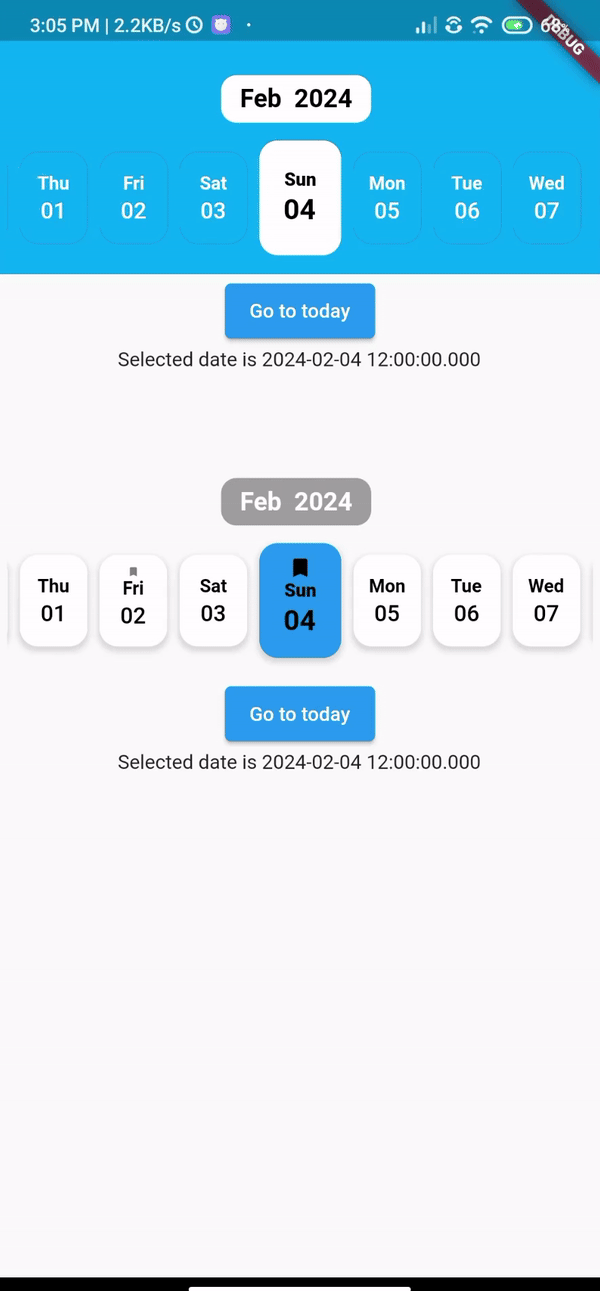
Demo
以下是 calendar_slider 插件的一些示例图片,展示了不同的配置选项:
| SelectedDayPosition.center | SelectedDayPosition.Left | SelectedDayPosition.Right |
|---|---|---|
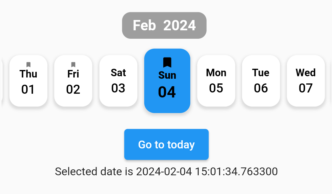 |
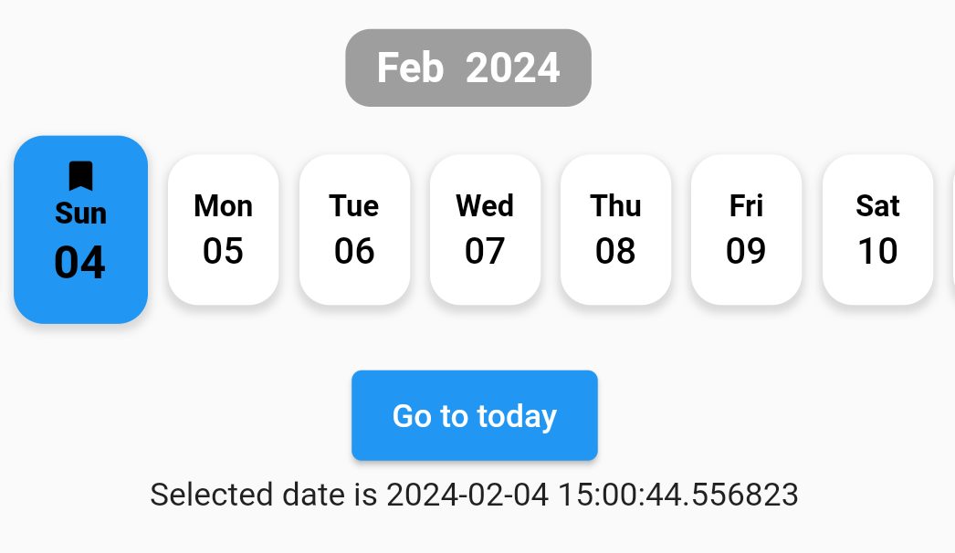 |
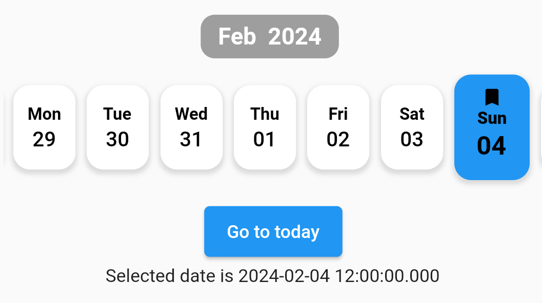 |
| FullCalendarScroll.vertical | FullCalendarScroll.horizontal |
|---|---|
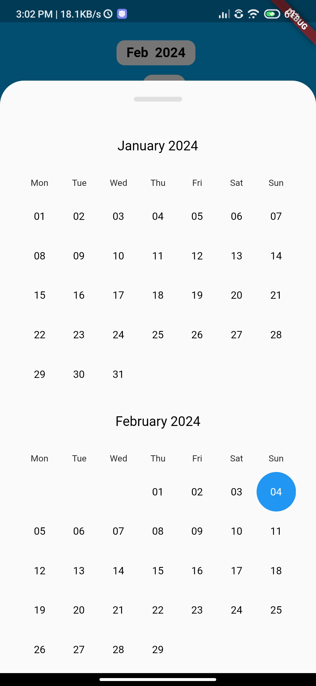 |
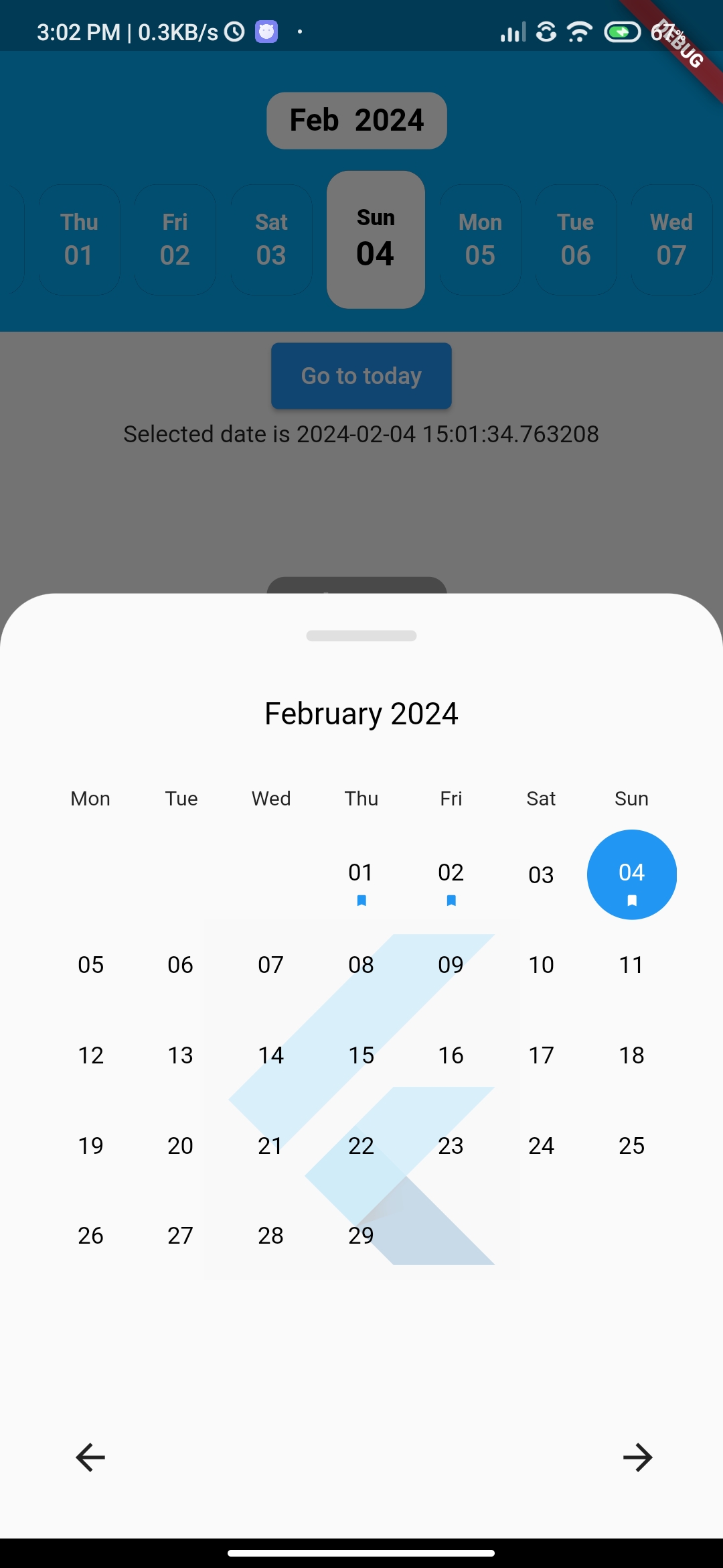 |
动态演示
How to use?
基本用法
使用 CalendarSlider 小部件:
CalendarSlider(
  initialDate: DateTime.now(),
  firstDate: DateTime.now().subtract(Duration(days: 140)),
  lastDate: DateTime.now().add(Duration(days: 4)),
  onDateSelected: (date) {
    print(date);
  },
)
Props
以下是一些常用的属性及其默认值:
| Props | Types | Required | defaultValues |
|---|---|---|---|
| initialDate | DateTime | True | |
| firstDate | DateTime | True | |
| lastDate | DateTime | True | |
| onDateSelected | Function | False | |
| controller | CalendarAgendaController? | False | |
| backgroundColor | Color? | False | Colors.transparent |
| tileHeight | double? | False | 60.0 |
| selectedTileHeight | double? | False | 75.0 |
| dateColor | Color? | False | Colors.black |
| selectedDateColor | Color? | False | Colors.black |
| tileShadow | BoxShadow? | False | BoxShadow(color: Colors.black.withOpacity(0.13), spreadRadius: 1, blurRadius: 2, offset: const Offset(0, 2)), |
| tileBackgroundColor | Color? | False | Colors.white |
| selectedTileBackgroundColor | Color? | False | Colors.blue |
| monthYearTextColor | Color? | False | Colors.black |
| monthYearButtonBackgroundColor | Color? | False | Colors.grey |
| calendarEventSelectedColor | Color? | False | Colors.white |
| calendarEventColor | Color? | False | Colors.blue |
| fullCalendarBackgroundImage | DecorationImage? | False | null |
| locale | String? | False | ‘en’ |
| events | List<DateTime>? | False | [] |
| fullCalendar | bool | False | True |
| fullCalendarScroll | FullCalendarScroll | False | FullCalendarScroll.horizontal |
| weekDay | WeekDay | False | WeekDay.short |
| fullCalendarWeekDay | WeekDay | False | WeekDay.short |
| selectedDayPosition | SelectedDayPosition | False | SelectedDayPosition.center |
示例代码
以下是一个完整的示例代码,展示了如何在 Flutter 应用中使用 calendar_slider 插件:
import 'dart:math';
import 'package:calendar_slider/calendar_slider.dart';
import 'package:flutter/material.dart';

void main() {
  runApp(const MyApp());
}

class MyApp extends StatelessWidget {
  const MyApp({super.key});

  @override
  Widget build(BuildContext context) {
    return MaterialApp(
      title: 'Flutter Example for Calendar Slider',
      theme: ThemeData(
        primarySwatch: Colors.blue,
      ),
      darkTheme: ThemeData(
        brightness: Brightness.dark,
        primarySwatch: Colors.blue,
      ),
      home: const ExamplePage(),
    );
  }
}

class ExamplePage extends StatefulWidget {
  const ExamplePage({Key? key}) : super(key: key);

  @override
  State<ExamplePage> createState() => _ExamplePageState();
}

class _ExamplePageState extends State<ExamplePage> {
  final CalendarSliderController _firstController = CalendarSliderController();
  final CalendarSliderController _secondController = CalendarSliderController();

  late DateTime _selectedDateAppBBar;
  late DateTime _selectedDateNotAppBBar;

  Random random = Random();

  @override
  void initState() {
    super.initState();
    _selectedDateAppBBar = DateTime.now();
    _selectedDateNotAppBBar = DateTime.now();
  }

  @override
  Widget build(BuildContext context) {
    return Scaffold(
      appBar: CalendarSlider(
        controller: _firstController,
        selectedDayPosition: SelectedDayPosition.center,
        fullCalendarScroll: FullCalendarScroll.vertical,
        backgroundColor: Colors.lightBlue,
        fullCalendarWeekDay: WeekDay.short,
        selectedTileBackgroundColor: Colors.white,
        monthYearButtonBackgroundColor: Colors.white,
        monthYearTextColor: Colors.black,
        tileBackgroundColor: Colors.lightBlue,
        selectedDateColor: Colors.black,
        dateColor: Colors.white,
        tileShadow: BoxShadow(
          color: Colors.black.withOpacity(1),
        ),
        locale: 'en',
        initialDate: DateTime.now(),
        firstDate: DateTime.now().subtract(const Duration(days: 100)),
        lastDate: DateTime.now().add(const Duration(days: 100)),
        onDateSelected: (date) {
          setState(() {
            _selectedDateAppBBar = date;
          });
        },
      ),
      body: Center(
        child: Column(
          children: [
            ElevatedButton(
              onPressed: () {
                _firstController.goToDay(DateTime.now());
              },
              child: const Text("Go to today"),
            ),
            Text('Selected date is $_selectedDateAppBBar'),
            const SizedBox(
              height: 20.0,
            ),
            CalendarSlider(
              controller: _secondController,
              selectedDayPosition: SelectedDayPosition.center,
              locale: 'en',
              selectedDateColor: Colors.black,
              initialDate: DateTime.now(),
              firstDate: DateTime.now().subtract(const Duration(days: 140)),
              lastDate: DateTime.now().add(const Duration(days: 400)),
              events: List.generate(
                  100,
                  (index) => DateTime.now()
                      .subtract(Duration(days: index * random.nextInt(5)))),
              onDateSelected: (date) {
                setState(() {
                  _selectedDateNotAppBBar = date;
                });
              },
              fullCalendarBackgroundImage: Image.network(
                'https://www.kindpng.com/picc/m/355-3557482_flutter-logo-png-transparent-png.png',
                scale: 5.0,
              ),
            ),
            ElevatedButton(
              onPressed: () {
                _secondController.goToDay(DateTime.now());
              },
              child: const Text("Go to today"),
            ),
            Text('Selected date is $_selectedDateNotAppBBar'),
          ],
        ),
      ),
    );
  }
}
Thank you
特别感谢所有为这个包做出贡献的人。确保查看他们的贡献。
希望这个插件能帮助你在 Flutter 应用中实现日历滑动选择功能!如果有任何问题或建议,请随时联系作者。
更多关于Flutter日历滑动选择插件calendar_slider的使用的实战教程也可以访问 https://www.itying.com/category-92-b0.html
1 回复

更多关于Flutter日历滑动选择插件calendar_slider的使用的实战系列教程也可以访问 https://www.itying.com/category-92-b0.html
当然,以下是如何在Flutter项目中使用calendar_slider插件的一个简单示例。calendar_slider是一个用于在日历上滑动选择的插件,非常适合用于日期范围选择等场景。
首先,确保你的pubspec.yaml文件中包含了calendar_slider依赖项:
dependencies:
  flutter:
    sdk: flutter
  calendar_slider: ^x.y.z  # 请使用最新版本号
然后,运行flutter pub get来安装依赖项。
接下来是一个完整的示例代码,展示了如何使用calendar_slider插件:
import 'package:flutter/material.dart';
import 'package:calendar_slider/calendar_slider.dart';

void main() {
  runApp(MyApp());
}

class MyApp extends StatelessWidget {
  @override
  Widget build(BuildContext context) {
    return MaterialApp(
      title: 'Calendar Slider Demo',
      theme: ThemeData(
        primarySwatch: Colors.blue,
      ),
      home: CalendarSliderScreen(),
    );
  }
}

class CalendarSliderScreen extends StatefulWidget {
  @override
  _CalendarSliderScreenState createState() => _CalendarSliderScreenState();
}

class _CalendarSliderScreenState extends State<CalendarSliderScreen> {
  DateTime? startDate;
  DateTime? endDate;

  @override
  Widget build(BuildContext context) {
    return Scaffold(
      appBar: AppBar(
        title: Text('Calendar Slider Demo'),
      ),
      body: Padding(
        padding: const EdgeInsets.all(16.0),
        child: Column(
          crossAxisAlignment: CrossAxisAlignment.start,
          children: [
            Text(
              'Selected Date Range:',
              style: TextStyle(fontSize: 20),
            ),
            SizedBox(height: 16),
            startDate != null && endDate != null
                ? Text(
                    '${startDate!.toLocal().toDateString()} - ${endDate!.toLocal().toDateString()}',
                    style: TextStyle(fontSize: 18, fontWeight: FontWeight.bold),
                  )
                : Text('No date range selected'),
            SizedBox(height: 32),
            Expanded(
              child: CalendarSlider(
                startDate: DateTime.now().subtract(Duration(days: 30)),
                endDate: DateTime.now().add(Duration(days: 30)),
                initialSelectedRange: {
                  DateTime.now().subtract(Duration(days: 7)): DateTime.now(),
                },
                onDateRangeSelected: (start, end) {
                  setState(() {
                    startDate = start;
                    endDate = end;
                  });
                },
                weekdayTextStyle: TextStyle(color: Colors.black, fontSize: 14),
                selectedDayTextStyle: TextStyle(color: Colors.white, fontSize: 16),
                todayTextStyle: TextStyle(color: Colors.red, fontSize: 16),
                dayTextStyle: TextStyle(color: Colors.grey, fontSize: 14),
                headerStyle: HeaderStyle(
                  backgroundColor: Colors.blue,
                  textStyle: TextStyle(color: Colors.white, fontSize: 18),
                ),
                dayContainerDecorator: (day, selected) {
                  if (selected) {
                    return Container(
                      decoration: BoxDecoration(
                        color: Colors.blue.withOpacity(0.3),
                        borderRadius: BorderRadius.circular(10),
                      ),
                    );
                  }
                  return null;
                },
              ),
            ),
          ],
        ),
      ),
    );
  }
}
代码解释:
- 依赖项:在
pubspec.yaml文件中添加calendar_slider依赖项。 - 主应用:
MyApp是一个简单的MaterialApp,它定义了应用程序的主题和主页。 - 状态管理:
CalendarSliderScreen是一个有状态的Widget,用于管理选中的日期范围。 - UI布局:
- 使用
Column来排列文本和CalendarSlider。 - 显示选中的日期范围。
CalendarSlider的配置包括:startDate和endDate定义了可选择的日期范围。initialSelectedRange设置了初始选择的日期范围。onDateRangeSelected是一个回调函数,当日期范围改变时会被调用。- 自定义了日期显示的样式。
- 使用
这样,你就可以在你的Flutter应用中集成并使用calendar_slider插件来实现日期滑动选择功能了。