


Flutter可按压按钮插件pushable_button的使用
Flutter可按压按钮插件 pushable_button 的使用
pushable_button 是一个用于创建3D效果的可按压按钮的Flutter插件,非常适合在应用中实现重要的CTA(Call to Action)按钮。以下是该插件的详细介绍和使用示例。
介绍
pushable_button 插件提供了一个具有3D按压效果的按钮,使得用户交互更加生动有趣。你可以通过配置不同的属性来定制按钮的外观和行为。
使用方法
添加依赖
首先,在你的 pubspec.yaml 文件中添加 pushable_button 依赖:
dependencies:
  flutter:
    sdk: flutter
  pushable_button: ^最新版本号
然后运行 flutter pub get 来安装依赖。
基本用法
下面是一个简单的例子,展示了如何使用 PushableButton:
import 'package:flutter/material.dart';
import 'package:pushable_button/pushable_button.dart';
void main() {
runApp(const MyApp());
}
class MyApp extends StatelessWidget {
const MyApp({super.key});
@override
Widget build(BuildContext context) {
return const MaterialApp(
debugShowCheckedModeBanner: false,
home: MyHomePage(),
);
}
}
class MyHomePage extends StatefulWidget {
const MyHomePage({super.key});
@override
State<MyHomePage> createState() => _MyHomePageState();
}
class _MyHomePageState extends State<MyHomePage> {
String _selection = 'none';
@override
Widget build(BuildContext context) {
const textStyle = TextStyle(
color: Colors.white,
fontSize: 24,
fontWeight: FontWeight.bold,
);
final shadow = BoxShadow(
color: Colors.grey.withOpacity(0.5),
spreadRadius: 5,
blurRadius: 7,
offset: const Offset(0, 2),
);
return Scaffold(
body: Center(
child: Padding(
padding: const EdgeInsets.all(24.0),
child: Column(
mainAxisSize: MainAxisSize.min,
mainAxisAlignment: MainAxisAlignment.center,
children: [
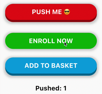
PushableButton(
height: 60,
elevation: 8,
hslColor: const HSLColor.fromAHSL(1.0, 356, 1.0, 0.43),
shadow: shadow,
onPressed: () => setState(() => _selection = '1'),
child: const Text('PUSH ME 😎', style: textStyle),
),
const SizedBox(height: 32),
PushableButton(
height: 60,
elevation: 8,
hslColor: const HSLColor.fromAHSL(1.0, 120, 1.0, 0.37),
shadow: shadow,
onPressed: () => setState(() => _selection = '2'),
child: const Text('ENROLL NOW', style: textStyle),
),
const SizedBox(height: 32),
PushableButton(
height: 60,
elevation: 8,
hslColor: const HSLColor.fromAHSL(1.0, 195, 1.0, 0.43),
shadow: shadow,
onPressed: () => setState(() => _selection = '3'),
child: const Text('ADD TO BASKET', style: textStyle),
),
const SizedBox(height: 32),
Text(
'Pushed: $_selection',
style: textStyle.copyWith(color: Colors.black),
),
],
),
),
),
);
}
}
可配置属性
- child: 子部件,通常是一个
Text或Icon。 - height: 按钮的高度。
- elevation: 按钮的阴影高度或“间隙”,即顶部层与底部层之间的距离。
- hslColor: 顶部层的颜色。使用
HSLColor而不是Color,这样可以自动计算底部层的亮度。 - shadow: 可选的阴影效果,使按钮看起来更美观。
- onPressed: 按钮点击时的回调函数。
License
MIT License
通过以上步骤,你就可以在自己的Flutter项目中使用 pushable_button 插件了。希望这个指南对你有所帮助!
更多关于Flutter可按压按钮插件pushable_button的使用的实战教程也可以访问 https://www.itying.com/category-92-b0.html

更多关于Flutter可按压按钮插件pushable_button的使用的实战系列教程也可以访问 https://www.itying.com/category-92-b0.html
当然,下面是一个关于如何在Flutter中使用pushable_button插件的示例代码。这个插件允许你创建一个可按压的按钮,通过动画和颜色变化来增强用户体验。
首先,确保你已经在pubspec.yaml文件中添加了pushable_button依赖:
dependencies:
  flutter:
    sdk: flutter
  pushable_button: ^x.y.z  # 请将x.y.z替换为当前最新版本号
然后,运行flutter pub get来安装依赖。
接下来,在你的Dart文件中使用PushableButton组件。以下是一个完整的示例代码:
import 'package:flutter/material.dart';
import 'package:pushable_button/pushable_button.dart';

void main() {
  runApp(MyApp());
}

class MyApp extends StatelessWidget {
  @override
  Widget build(BuildContext context) {
    return MaterialApp(
      title: 'Pushable Button Demo',
      theme: ThemeData(
        primarySwatch: Colors.blue,
      ),
      home: MyHomePage(),
    );
  }
}

class MyHomePage extends StatefulWidget {
  @override
  _MyHomePageState createState() => _MyHomePageState();
}

class _MyHomePageState extends State<MyHomePage> {
  bool isPressed = false;

  @override
  Widget build(BuildContext context) {
    return Scaffold(
      appBar: AppBar(
        title: Text('Pushable Button Demo'),
      ),
      body: Center(
        child: PushableButton(
          onPressed: () {
            setState(() {
              isPressed = !isPressed;
            });
            // 这里可以添加其他点击后的逻辑处理
          },
          onReleased: () {
            setState(() {
              isPressed = !isPressed;
            });
            // 这里可以添加释放后的逻辑处理
          },
          child: Text(
            isPressed ? 'Released' : 'Press',
            style: TextStyle(fontSize: 24),
          ),
          decoration: BoxDecoration(
            color: isPressed ? Colors.red : Colors.blue,
            borderRadius: BorderRadius.circular(10),
          ),
          animationDuration: Duration(milliseconds: 200),
          pressElevation: 5.0,
        ),
      ),
    );
  }
}
在这个示例中:
- 我们创建了一个简单的Flutter应用,其中包含一个
PushableButton。 PushableButton有几个重要的参数:onPressed:当按钮被按下时调用。onReleased:当按钮被释放时调用。child:按钮中显示的子组件,这里是一个文本。decoration:按钮的装饰,包括颜色和圆角等。animationDuration:动画持续时间。pressElevation:按钮按下时的阴影高度。
通过setState方法,我们能够在按钮按下和释放时改变按钮的显示状态(例如,改变文本和颜色)。
这个示例展示了如何使用pushable_button插件来创建一个具有按压效果的按钮,并通过动画和颜色变化来增强用户体验。你可以根据自己的需求进一步自定义按钮的样式和行为。