


Flutter滑动面板插件sliding_up_panel2的使用
Flutter滑动面板插件sliding_up_panel2的使用
简介
sliding_up_panel2 是一个基于Material Design底部抽屉组件的可拖动Flutter小部件,它使实现SlidingUpPanel变得更加容易!适用于Android和iOS平台。
安装
在您的 pubspec.yaml 文件中添加以下内容:
dependencies:
  sliding_up_panel2: ^3.2.0+2
注意:v1.0.0 引入了一些破坏性变更,详情请参见此处。
简单用法
SlidingUpPanel作为根节点(推荐)
此方法被推荐因为它允许对其他UI元素的行为进行最少的干扰。例如:
@override
Widget build(BuildContext context) {
  return Scaffold(
    appBar: AppBar(
      title: Text("SlidingUpPanelExample"),
    ),
    body: SlidingUpPanel(
      panel: Center(
        child: Text("This is the sliding Widget"),
      ),
      body: Center(
        child: Text("This is the Widget behind the sliding panel"),
      ),
    ),
  );
}
嵌套SlidingUpPanel
仅当要避免重构大量代码或实现自定义滚动行为时才使用此方法。例如,SlidingUpPanel可以嵌套在Stack中(注意有许多其他可能的实现方式,具体情况具体分析)。
@override
Widget build(BuildContext context) {
  return Scaffold(
    appBar: AppBar(
      title: Text("SlidingUpPanelExample"),
    ),
    body: Stack(
      children: <Widget>[
        Center(child: Text("This is the Widget behind the sliding panel"),),
        SlidingUpPanel(
          panel: Center(child: Text("This is the sliding Widget"),),
        )
      ],
    )
  );
}
自定义用法
以下是SlidingUpPanel的一些属性说明:
| 属性名 | 描述 |
|---|---|
panelBuilder |
返回滑动到视图中的小部件。当panel折叠且collapsed为null时,将显示此小部件顶部的内容;否则,collapsed会覆盖在此小部件上。 |
collapsed |
折叠时显示的小部件。随着panel打开,此小部件会逐渐消失。 |
body |
滑动面板下方的小部件。此小部件自动调整大小以填满屏幕。 |
header |
可选的持久化小部件,位于panel顶部并附着在其上。panel顶部的内容会被此小部件覆盖。可以在panel顶部添加内边距以避免覆盖。 |
footer |
可选的持久化小部件,位于panel底部并附着在其上。panel底部的内容会被此小部件覆盖。可以在panel底部添加内边距以避免覆盖。 |
minHeight |
滑动面板完全折叠时的高度。 |
maxHeight |
滑动面板完全打开时的高度。 |
snapPoint [beta] |
滑动动画过程中面板停留的一个点。快速滑动面板会忽略此点直接到达开/关位置。此值表示为总动画距离(maxHeight - minHeight)的百分比,因此必须在0.0和1.0之间(不包括)。 |
border |
绘制在滑动面板表单周围的边框。 |
borderRadius |
如果非空,则滑动面板表单的角按此值圆角处理。 |
boxShadow |
在滑动面板表单后面投射的一系列阴影。 |
color |
用于填充滑动面板表单背景的颜色。 |
padding |
滑动面板表单子项的内边距。 |
margin |
滑动面板表单的外边距。 |
renderPanelSheet |
设置为false以不渲染panel所在的表单。这意味着只有body、collapsed和panel小部件会被渲染。如果想要实现浮动效果或对滑动面板外观进行更多自定义,请设置此属性为false。 |
panelSnapping |
设置为false以禁用面板自动弹出或关闭。 |
backdropEnabled |
如果非空,则当面板滑动打开时,在body上显示变暗阴影。 |
backdropColor |
当面板滑动打开时,在body上显示此颜色的阴影。 |
backdropOpacity |
面板完全打开时的背景透明度。此值范围为0.0到1.0,其中0.0是完全透明,1.0是完全不透明。 |
backdropTapClosesPanel |
标记指示点击背景是否关闭面板,默认为true。 |
controller |
如果非空,可用于控制面板状态。 |
onPanelSlide |
如果非空,当面板滑动时调用此回调,并传递当前面板位置。位置是一个介于0.0和1.0之间的double,其中0.0是完全折叠,1.0是完全打开。 |
onPanelOpened |
如果非空,当面板完全打开时调用此回调。 |
onPanelClosed |
如果非空,当面板完全折叠时调用此回调。 |
parallaxEnabled |
如果非空且为true,则滑动面板在滑动时会展现出视差效果。本质上,主体随面板一起滑动。 |
parallaxOffset |
允许指定视差效果的程度,以面板滑动的距离百分比表示。建议值在0.0和1.0之间,其中0.0是没有视差,1.0模仿一对一滚动效果。默认为10%的视差。 |
isDraggable |
允许切换SlidingUpPanel的可拖动性。将其设置为false以防止用户能够上下拖动面板。默认为true。 |
slideDirection |
SlideDirection.UP或SlideDirection.DOWN之一。指示面板应该向哪个方向滑动。默认为UP。如果设置为DOWN,则面板会附着在屏幕顶部,并在用户向下滑动面板时完全打开。 |
defaultPanelState |
面板的默认状态;为PanelState.OPEN或PanelState.CLOSED。此值默认为PanelState.CLOSED,表示面板处于关闭位置,必须由用户打开。PanelState.OPEN表示默认情况下面板是打开的,必须由用户滑动关闭。 |
示例Demo
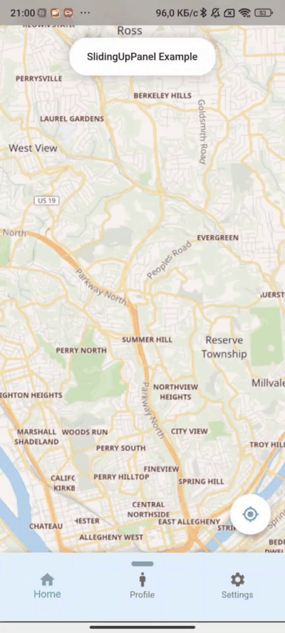
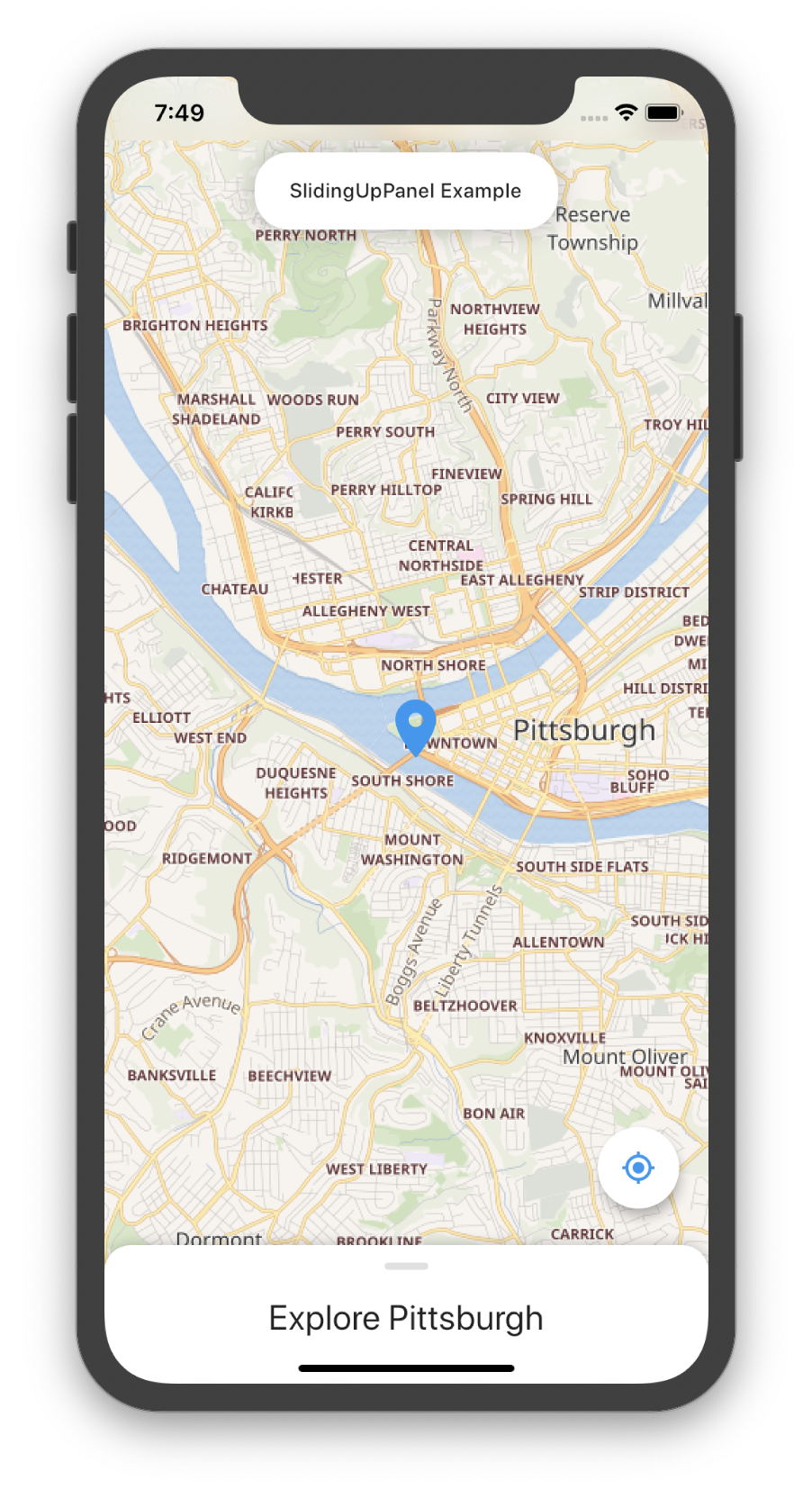
下面是一个完整的示例demo,展示了如何使用sliding_up_panel2创建一个带有地图和按钮的滑动面板:
import 'package:flutter/material.dart';
import 'package:sliding_up_panel2/sliding_up_panel2.dart';
void main() => runApp(SlidingUpPanelExample());
class SlidingUpPanelExample extends StatelessWidget {
@override
Widget build(BuildContext context) {
return MaterialApp(
debugShowCheckedModeBanner: false,
title: 'SlidingUpPanel Example',
theme: ThemeData(
primarySwatch: Colors.blue,
),
home: HomePage(),
);
}
}
class HomePage extends StatefulWidget {
@override
_HomePageState createState() => _HomePageState();
}
class _HomePageState extends State<HomePage> {
final double _initFabHeight = 120.0;
double _fabHeight = 0;
double _panelHeightOpen = 0;
double _panelHeightClosed = 95.0;
late final ScrollController scrollController;
late final PanelController panelController;
@override
void initState() {
scrollController = ScrollController();
panelController = PanelController();
super.initState();
_fabHeight = _initFabHeight;
}
@override
Widget build(BuildContext context) {
_panelHeightOpen = MediaQuery.of(context).size.height * .80;
return Material(
child: Stack(
alignment: Alignment.topCenter,
children: <Widget>[
SlidingUpPanel(
snapPoint: .5,
disableDraggableOnScrolling: false,
footer: SizedBox(
width: MediaQuery.of(context).size.width,
height: 100,
child: IgnoreDraggableWidget(
child: BottomNavigationBar(
backgroundColor: Colors.blue[50],
items: [
BottomNavigationBarItem(
icon: Icon(Icons.home), label: 'Home'),
BottomNavigationBarItem(
icon: Icon(Icons.man), label: 'Profile'),
BottomNavigationBarItem(
icon: Icon(Icons.settings), label: 'Settings'),
],
),
),
),
header: SizedBox(
width: MediaQuery.of(context).size.width,
child: Row(
mainAxisAlignment: MainAxisAlignment.center,
children: [
ForceDraggableWidget(
child: Container(
width: 100,
height: 40,
child: Column(
mainAxisSize: MainAxisSize.min,
children: [
SizedBox(
height: 12.0,
),
Row(
mainAxisAlignment: MainAxisAlignment.center,
children: <Widget>[
Container(
width: 30,
height: 7,
decoration: BoxDecoration(
color: Colors.blueAccent,
borderRadius: BorderRadius.all(
Radius.circular(12.0))),
),
],
),
],
),
),
),
],
),
),
maxHeight: _panelHeightOpen,
minHeight: _panelHeightClosed,
parallaxEnabled: true,
parallaxOffset: .5,
body: _body(),
controller: panelController,
scrollController: scrollController,
panelBuilder: () => _panel(),
borderRadius: BorderRadius.only(
topLeft: Radius.circular(18.0),
topRight: Radius.circular(18.0)),
onPanelSlide: (double pos) => setState(() {
_fabHeight = pos * (_panelHeightOpen - _panelHeightClosed) +
_initFabHeight;
}),
),
// 浮动按钮
Positioned(
right: 20.0,
bottom: _fabHeight,
child: FloatingActionButton(
child: Icon(
Icons.gps_fixed,
color: Theme.of(context).primaryColor,
),
onPressed: () {},
backgroundColor: Colors.white,
),
),
// 模糊顶部栏
Positioned(
top: 0,
child: ClipRRect(
child: BackdropFilter(
filter: ImageFilter.blur(sigmaX: 10, sigmaY: 10),
child: Container(
width: MediaQuery.of(context).size.width,
height: MediaQuery.of(context).padding.top,
color: Colors.transparent,
)))),
// 滑动面板标题
Positioned(
top: 52.0,
child: Container(
padding: const EdgeInsets.fromLTRB(24.0, 18.0, 24.0, 18.0),
child: Text(
"SlidingUpPanel Example",
style: TextStyle(fontWeight: FontWeight.w500),
),
decoration: BoxDecoration(
color: Colors.white,
borderRadius: BorderRadius.circular(24.0),
boxShadow: [
BoxShadow(
color: Color.fromRGBO(0, 0, 0, .25), blurRadius: 16.0)
],
),
),
),
],
),
);
}
Widget _panel() {
return MediaQuery.removePadding(
context: context,
removeTop: true,
child: ListView(
physics: PanelScrollPhysics(controller: panelController),
controller: scrollController,
children: <Widget>[
SizedBox(
height: 12.0,
),
SizedBox(
height: 18.0,
),
Row(
mainAxisAlignment: MainAxisAlignment.center,
children: <Widget>[
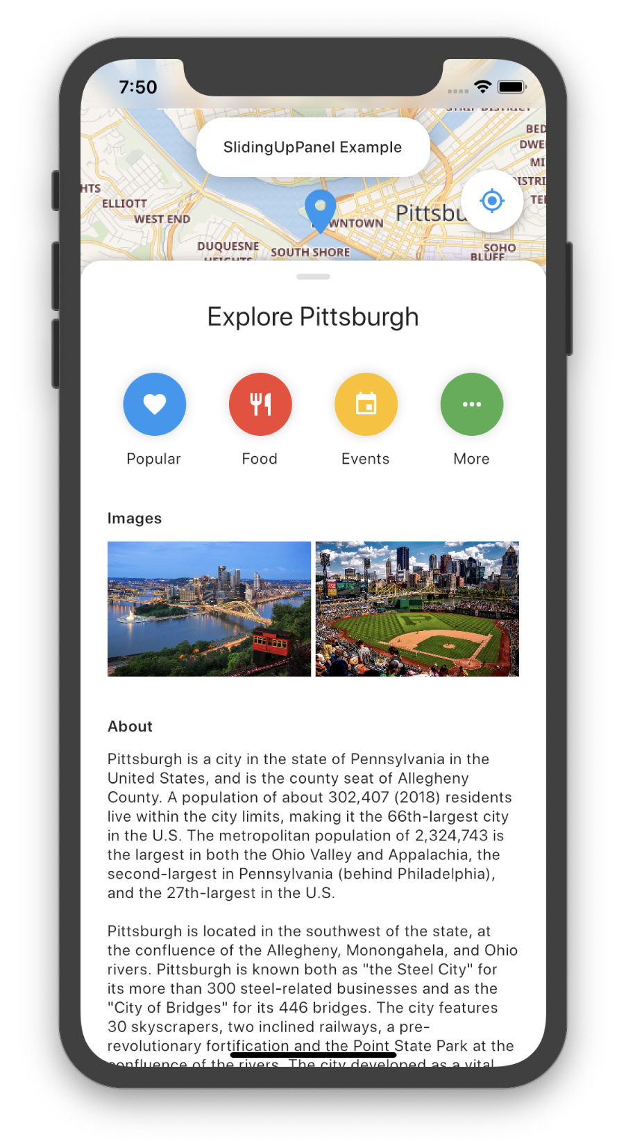
Text(
"Explore Pittsburgh",
style: TextStyle(
fontWeight: FontWeight.normal,
fontSize: 24.0,
),
),
],
),
SizedBox(
height: 36.0,
),
Row(
mainAxisAlignment: MainAxisAlignment.spaceEvenly,
children: <Widget>[
_button(
"Popular",
Icons.favorite,
Colors.blue,
() => {
panelController.forseScrollChange(
scrollController.animateTo(100,
duration: Duration(milliseconds: 400),
curve: Curves.ease))
}),
_button("Food", Icons.restaurant, Colors.red, () => {}),
_button("Events", Icons.event, Colors.amber, () => {}),
_button("More", Icons.more_horiz, Colors.green, () => {}),
],
),
SizedBox(
height: 36.0,
),
SizedBox(
height: 100,
child: HorizontalScrollableWidget(
child: ListView.builder(
scrollDirection: Axis.horizontal,
itemBuilder: (context, i) => SizedBox(
width: 100,
height: 100,
child: Placeholder(),
),
),
),
),
Container(
padding: const EdgeInsets.only(left: 24.0, right: 24.0),
child: Column(
crossAxisAlignment: CrossAxisAlignment.start,
children: <Widget>[
Text("Images",
style: TextStyle(
fontWeight: FontWeight.w600,
)),
SizedBox(
height: 12.0,
),
Row(
mainAxisAlignment: MainAxisAlignment.spaceBetween,
children: <Widget>[
Expanded(
child: ForceDraggableWidget(
child: Placeholder(
fallbackHeight: 120,
child: Center(
child: Padding(
padding: const EdgeInsets.all(8.0),
child: Text('ForceDraggableWidget'),
)),
),
),
),
Expanded(
child: IgnoreDraggableWidget(
child: Placeholder(
fallbackHeight: 120,
child: Center(
child: Padding(
padding: const EdgeInsets.all(8.0),
child: Text('IgnoreDraggableWidget'),
),
),
),
),
)
],
),
],
),
),
SizedBox(
height: 36.0,
),
Container(
padding: const EdgeInsets.only(left: 24.0, right: 24.0),
child: Column(
crossAxisAlignment: CrossAxisAlignment.start,
children: <Widget>[
Text("About",
style: TextStyle(
fontWeight: FontWeight.w600,
)),
SizedBox(
height: 12.0,
),
Text(
bigText,
softWrap: true,
),
],
),
),
SizedBox(
height: 24,
),
],
));
}
Widget _button(
String label, IconData icon, Color color, void Function()? onTap) {
return GestureDetector(
onTap: onTap,
child: Column(
children: <Widget>[
Container(
padding: const EdgeInsets.all(16.0),
child: Icon(
icon,
color: Colors.white,
),
decoration:
BoxDecoration(color: color, shape: BoxShape.circle, boxShadow: [
BoxShadow(
color: Color.fromRGBO(0, 0, 0, 0.15),
blurRadius: 8.0,
)
]),
),
SizedBox(
height: 12.0,
),
Text(label),
],
),
);
}
Widget _body() {
return FlutterMap(
options: MapOptions(
center: LatLng(40.441589, -80.010948),
zoom: 13,
maxZoom: 15,
),
layers: [
TileLayerOptions(
urlTemplate: "https://maps.wikimedia.org/osm-intl/{z}/{x}/{y}.png"),
MarkerLayerOptions(markers: [
Marker(
point: LatLng(40.441753, -80.011476),
builder: (ctx) => Icon(
Icons.location_on,
color: Colors.blue,
size: 48.0,
),
height: 60),
]),
],
);
}
}
const bigText =
"""Pittsburgh is a city in the state of Pennsylvania in the United States, and is the county seat of Allegheny County. A population of about 302,407 (2018) residents live within the city limits, making it the 66th-largest city in the U.S. The metropolitan population of 2,324,743 is the largest in both the Ohio Valley and Appalachia, the second-largest in Pennsylvania (behind Philadelphia), and the 27th-largest in the U.S.\n\nPittsburgh is located in the southwest of the state, at the confluence of the Allegheny, Monongahela, and Ohio rivers. Pittsburgh is known both as "the Steel City" for its more than 300 steel-related businesses and as the "City of Bridges" for its 446 bridges. The city features 30 skyscrapers, two inclined railways, a pre-revolutionary fortification and the Point State Park at the confluence of the rivers. The city developed as a vital link of the Atlantic coast and Midwest, as the mineral-rich Allegheny Mountains made the area coveted by the French and British empires, Virginians, Whiskey Rebels, and Civil War raiders.\n\nAside from steel, Pittsburgh has led in manufacturing of aluminum, glass, shipbuilding, petroleum, foods, sports, transportation, computing, autos, and electronics. For part of the 20th century, Pittsburgh was behind only New York City and Chicago in corporate headquarters employment; it had the most U.S. stockholders per capita. Deindustrialization in the 1970s and 80s laid off area blue-collar workers as steel and other heavy industries declined, and thousands of downtown white-collar workers also lost jobs when several Pittsburgh-based companies moved out. The population dropped from a peak of 675,000 in 1950 to 370,000 in 1990. However, this rich industrial history left the area with renowned museums, medical centers, parks, research centers, and a diverse cultural district.\n\nAfter the deindustrialization of the mid-20th century, Pittsburgh has transformed into a hub for the health care, education, and technology industries. Pittsburgh is a leader in the health care sector as the home to large medical providers such as University of Pittsburgh Medical Center (UPMC). The area is home to 68 colleges and universities, including research and development leaders Carnegie Mellon University and the University of Pittsburgh. Google, Apple Inc., Bosch, Facebook, Uber, Nokia, Autodesk, Amazon, Microsoft and IBM are among 1,600 technology firms generating .7 billion in annual Pittsburgh payrolls. The area has served as the long-time federal agency headquarters for cyber defense, software engineering, robotics, energy research and the nuclear navy. The nation's eighth-largest bank, eight Fortune 500 companies, and six of the top 300 U.S. law firms make their global headquarters in the area, while RAND Corporation (RAND), BNY Mellon, Nova, FedEx, Bayer, and the National Institute for Occupational Safety and Health (NIOSH) have regional bases that helped Pittsburgh become the sixth-best area for U.S. job growth.
""";
以上代码展示了一个包含地图和按钮的滑动面板示例,您可以根据需要进行修改和扩展。
更多关于Flutter滑动面板插件sliding_up_panel2的使用的实战教程也可以访问 https://www.itying.com/category-92-b0.html

更多关于Flutter滑动面板插件sliding_up_panel2的使用的实战系列教程也可以访问 https://www.itying.com/category-92-b0.html
当然,以下是一个关于如何在Flutter中使用sliding_up_panel2插件的示例代码。这个插件允许你创建一个可以滑动展开和收缩的面板。
首先,你需要在你的pubspec.yaml文件中添加sliding_up_panel2依赖项:
dependencies:
  flutter:
    sdk: flutter
  sliding_up_panel: ^2.0.0+7  # 请检查最新版本号
然后运行flutter pub get来获取依赖项。
接下来,你可以在你的Flutter应用中使用这个插件。以下是一个完整的示例代码,展示了如何使用SlidingUpPanel:
import 'package:flutter/material.dart';
import 'package:sliding_up_panel/sliding_up_panel.dart';

void main() {
  runApp(MyApp());
}

class MyApp extends StatelessWidget {
  @override
  Widget build(BuildContext context) {
    return MaterialApp(
      title: 'Sliding Up Panel Example',
      theme: ThemeData(
        primarySwatch: Colors.blue,
      ),
      home: MyHomePage(),
    );
  }
}

class MyHomePage extends StatefulWidget {
  @override
  _MyHomePageState createState() => _MyHomePageState();
}

class _MyHomePageState extends State<MyHomePage> with SingleTickerProviderStateMixin {
  AnimationController _controller;
  Animation<double> _heightAnimation;

  @override
  void initState() {
    super.initState();
    _controller = AnimationController(
      duration: const Duration(milliseconds: 300),
      vsync: this,
    );
    _heightAnimation = Tween<double>(begin: 0.0, end: 1.0).animate(_controller);
  }

  @override
  void dispose() {
    _controller.dispose();
    super.dispose();
  }

  void togglePanel() {
    setState(() => _controller.reverse());
    Future.delayed(const Duration(milliseconds: 300), () {
      setState(() => _controller.forward());
    });
  }

  @override
  Widget build(BuildContext context) {
    return Scaffold(
      appBar: AppBar(
        title: Text('Sliding Up Panel Example'),
      ),
      body: SlidingUpPanel(
        panel: Center(
          child: Column(
            mainAxisAlignment: MainAxisAlignment.center,
            children: <Widget>[
              Text('This is the sliding panel'),
              SizedBox(height: 10),
              ElevatedButton(
                onPressed: togglePanel,
                child: Text('Toggle Panel'),
              ),
            ],
          ),
        ),
        body: Center(
          child: Column(
            mainAxisAlignment: MainAxisAlignment.center,
            children: <Widget>[
              Text('This is the main content area'),
              SizedBox(height: 20),
              ElevatedButton(
                onPressed: () => _controller.reverse(),
                child: Text('Collapse Panel'),
              ),
              SizedBox(height: 20),
              ElevatedButton(
                onPressed: () => _controller.forward(),
                child: Text('Expand Panel'),
              ),
            ],
          ),
        ),
        anchorOffset: 0.2,
        panelSnapSize: 200.0,
        borderRadius: BorderRadius.only(
          topLeft: Radius.circular(20),
          topRight: Radius.circular(20),
        ),
        parallaxOffset: _heightAnimation,
        parallaxEnabled: true,
        draggable: true,
      ),
    );
  }
}
在这个示例中:
SlidingUpPanel组件有两个主要部分:panel和body。panel是你希望滑动展开的面板,body是主内容区域。anchorOffset控制面板在完全折叠时的高度占整个屏幕高度的比例。panelSnapSize控制面板在展开和折叠时的“吸附”高度。parallaxOffset、parallaxEnabled、draggable等参数控制面板的其他行为。
你可以通过点击按钮来展开、折叠面板,也可以拖动面板来查看其滑动效果。希望这个示例能帮助你理解如何在Flutter中使用sliding_up_panel2插件。