


Flutter表情弹窗插件emoji_alert的使用
Flutter表情弹窗插件emoji_alert的使用
插件简介
emoji_alert 是一个全新的、时尚的表情弹窗插件,提供了多种表情选择,简单易用且高度可定制。以下是该插件的主要功能和使用方法。
功能特性
- 单行基础弹窗:支持默认表情的简单弹窗。
- 动态添加小部件:不仅可以添加文本,还可以添加任何你想要的小部件。
- 按钮支持:可以添加带有点击事件处理的按钮。
- 显示行为选择:可以选择正常弹窗或底部弹出层(Bottom Sheet)。
- 多种表情选择:提供多种表情供选择。
- 动画效果:在弹窗显示时添加动画效果。
使用步骤
1. 添加依赖
在 pubspec.yaml 文件中添加 emoji_alert 依赖:
dependencies:
  emoji_alert: ^1.1.0
或者直接引用 GitHub 仓库:
dependencies:
  emoji_alert:
    git: https://github.com/koukibadr/Emoji_Alert.git
2. 参数说明
| 属性 | 类型 | 默认值 | 是否必填 | 描述 |
|---|---|---|---|---|
| description | Widget | N/A | 是 | 弹窗主体内容 |
| alertTitle | Widget | N/A | 否 | 弹窗顶部内容 |
| enableMainButton | bool | false | 否 | 是否显示主按钮 |
| enableSecondaryButton | bool | false | 否 | 是否显示次按钮 |
| onSecondaryButtonPressed | Function | null | 否 | 次按钮点击事件处理函数 |
| onMainButtonPressed | Function | null | 否 | 主按钮点击事件处理函数 |
| emojiType | EMOJI_TYPE | HAPPY | 否 | 显示的表情类型,可选值:[ANGRY, CONFUSED, COOL, HAPPY, JOYFUL, LAUGHING, SAD, SCARED, SHOCKED, SMILE, WINK] |
| height | double | 200 | 否 | 弹窗高度 |
| emojiSize | double | 80 | 否 | 表情大小 |
| background | Color | Colors.white | 否 | 弹窗背景颜色 |
| mainButtonColor | Color | Colors.blue | 否 | 主按钮背景颜色 |
| secondaryButtonColor | Color | Colors.blue | 否 | 次按钮背景颜色(会添加透明度) |
| mainButtonText | Text | Text(“Confirm”) | 否 | 主按钮文本 |
| secondaryButtonText | Text | Text(“Cancel”) | 否 | 次按钮文本 |
| buttonSize | double | 200 | 否 | 按钮宽度 |
| cancelButtonColorOpacity | double | 0.2 | 否 | 次按钮背景颜色的透明度 |
| cancelable | bool | true | 否 | 是否可以通过点击外部区域关闭弹窗 |
| cornerRadiusType | CORNER_RADIUS_TYPES | BOTTOM_ONLY | 否 | 圆角类型,可选值:[BOTTOM_ONLY, TOP_ONLY, ALL_CORNERS, NONE] |
| width | double | null | 否 | 弹窗宽度,默认为null |
| animationType | ANIMATION_TYPE | ANIMATION_TYPE.NONE | 否 | 动画类型,可选值:[NONE, FADEIN, TRANSITION, ROTATION] |
3. 示例代码
简单弹窗示例
EmojiAlert(
description: Column(
children: [
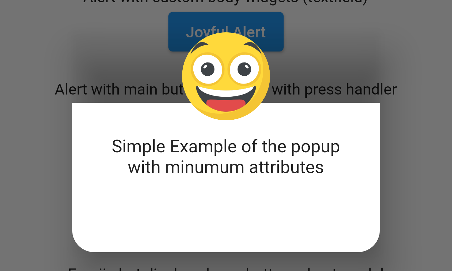
Text("Simple Example of the popup"),
Text("with minimum attributes"),
],
),
).displayAlert(context);
自定义小部件弹窗示例
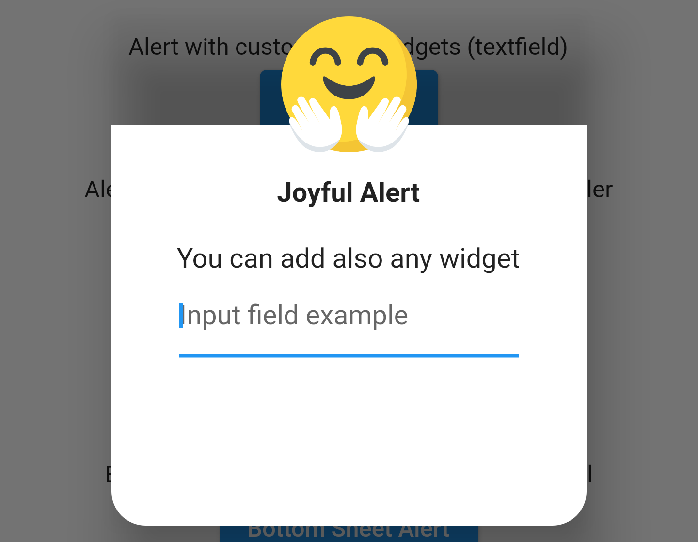
EmojiAlert(
  alertTitle: Text("Joyful Alert", style: TextStyle(fontWeight: FontWeight.bold)),
  description: Column(
    children: [
      Text("You can add also any widget"),
      Container(
        width: 200,
        child: TextField(
          decoration: InputDecoration(hintText: "Input field example"),
        ),
      ),
    ],
  ),
  cancelable: true,
  emojiType: EMOJI_TYPE.JOYFUL,
  height: 300,
).displayAlert(context);
带有主按钮的弹窗示例
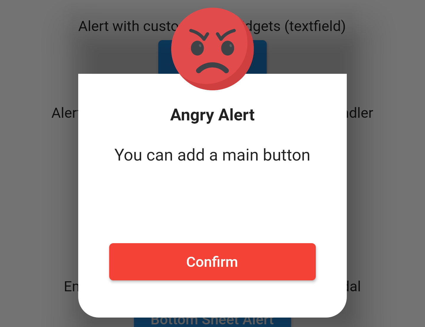
EmojiAlert(
  alertTitle: Text("Angry Alert", style: TextStyle(fontWeight: FontWeight.bold)),
  description: Column(
    children: [
      Text("You can add a main button"),
    ],
  ),
  enableMainButton: true,
  mainButtonColor: Colors.red,
  onMainButtonPressed: () {
    print("Hello");
    Navigator.pop(context);
  },
  cancelable: false,
  emojiType: EMOJI_TYPE.ANGRY,
  height: 300,
).displayAlert(context);
底部弹出层示例
EmojiAlert(
  alertTitle: Text("Bottom Sheet Modal", style: TextStyle(fontWeight: FontWeight.bold)),
  description: Column(
    children: [
      Text(
        "And this is a bottom sheet modal with different Radius",
        style: TextStyle(color: Colors.blue),
        textAlign: TextAlign.center,
      ),
    ],
  ),
  enableMainButton: true,
  cornerRadiusType: CORNER_RADIUS_TYPES.TOP_ONLY,
  mainButtonColor: Colors.green,
  mainButtonText: Text("Save"),
  onMainButtonPressed: () {
    Navigator.pop(context);
  },
  cancelable: true,
  emojiType: EMOJI_TYPE.SMILE,
  width: 300,
  height: 300,
).displayBottomSheet(context);
带有动画效果的弹窗示例
EmojiAlert(
  description: Column(
    children: [
      Text("Simple Example with animation"),
      Text("This is a transition animation"),
    ],
  ),
  animationType: ANIMATION_TYPE.TRANSITION,
).displayAlert(context);
4. 完整示例Demo
以下是一个完整的示例代码,展示了如何在应用中使用 emoji_alert 插件:
import 'package:emoji_alert/emoji_alert.dart';
import 'package:flutter/material.dart';
void main() {
runApp(MyApp());
}
class MyApp extends StatelessWidget {
[@override](/user/override)
Widget build(BuildContext context) {
return MaterialApp(
title: 'Flutter Demo',
theme: ThemeData(
primarySwatch: Colors.blue,
),
home: HomeScreen(),
);
}
}
class HomeScreen extends StatelessWidget {
[@override](/user/override)
Widget build(BuildContext context) {
return Scaffold(
body: Container(
width: MediaQuery.of(context).size.width,
child: Column(
mainAxisAlignment: MainAxisAlignment.center,
children: [
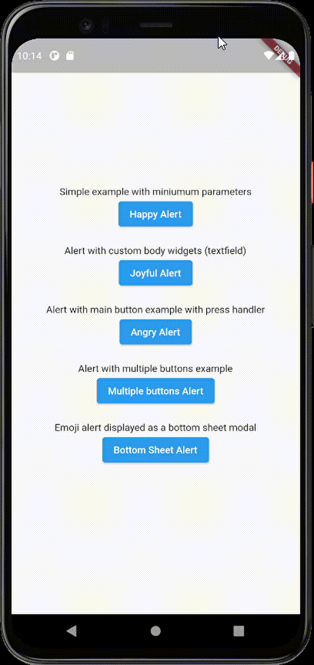
Text("Simple example with minimum parameters"),
ElevatedButton(
onPressed: () {
displayAlert(context);
},
child: Text("Happy Alert"),
),
SizedBox(height: 20),
Text("Alert with custom body widgets (textfield)"),
ElevatedButton(
onPressed: () {
displayShockedAlert(context);
},
child: Text("Joyful Alert"),
),
SizedBox(height: 20),
Text("Alert with main button example with press handler"),
ElevatedButton(
onPressed: () {
displayAngryAlert(context);
},
child: Text("Angry Alert"),
),
SizedBox(height: 20),
Text("Alert with multiple buttons example"),
ElevatedButton(
onPressed: () {
displayCoolAlert(context);
},
child: Text("Multiple buttons Alert"),
),
SizedBox(height: 20),
Text("Emoji alert displayed as a bottom sheet modal"),
ElevatedButton(
onPressed: () {
displayBottomSheetAlert(context);
},
child: Text("Bottom Sheet Alert"),
),
],
),
),
);
}
void displayAlert(BuildContext context) {
EmojiAlert(
description: Column(
children: [
Text("Simple Example with animation"),
Text("This is a transition animation"),
],
),
animationType: ANIMATION_TYPE.TRANSITION,
).displayAlert(context);
}
void displayShockedAlert(BuildContext context) {
EmojiAlert(
alertTitle: Text("Joyful Alert", style: TextStyle(fontWeight: FontWeight.bold)),
description: Column(
children: [
Text("You can add also any widget"),
Container(
width: 200,
child: TextField(
decoration: InputDecoration(hintText: "Input field example"),
),
),
],
),
cancelable: true,
emojiType: EMOJI_TYPE.JOYFUL,
height: 300,
).displayAlert(context);
}
void displayAngryAlert(BuildContext context) {
EmojiAlert(
alertTitle: Text("Angry Alert", style: TextStyle(fontWeight: FontWeight.bold)),
description: Column(
children: [
Text("You can add a main button"),
],
),
enableMainButton: true,
mainButtonColor: Colors.red,
onMainButtonPressed: () {
print("Hello");
Navigator.pop(context);
},
cancelable: false,
emojiType: EMOJI_TYPE.ANGRY,
height: 300,
).displayAlert(context);
}
void displayCoolAlert(BuildContext context) {
EmojiAlert(
alertTitle: Text("Cool Alert", style: TextStyle(fontWeight: FontWeight.bold)),
description: Column(
children: [
Text("You can add multiple buttons", style: TextStyle(color: Colors.blue)),
],
),
enableMainButton: true,
enableSecondaryButton: true,
mainButtonColor: Colors.green,
secondaryButtonColor: Colors.green,
mainButtonText: Text("Save"),
secondaryButtonText: Text("Discard"),
cancelable: true,
emojiType: EMOJI_TYPE.COOL,
height: 300,
).displayAlert(context);
}
void displayBottomSheetAlert(BuildContext context) {
EmojiAlert(
alertTitle: Text("Bottom Sheet Modal", style: TextStyle(fontWeight: FontWeight.bold)),
description: Column(
children: [
Text(
"And this is a bottom sheet modal with different Radius",
style: TextStyle(color: Colors.blue),
textAlign: TextAlign.center,
),
],
),
enableMainButton: true,
cornerRadiusType: CORNER_RADIUS_TYPES.TOP_ONLY,
mainButtonColor: Colors.green,
mainButtonText: Text("Save"),
onMainButtonPressed: () {
Navigator.pop(context);
displayAngryAlert(context);
},
cancelable: true,
emojiType: EMOJI_TYPE.SMILE,
width: 300,
height: 300,
).displayBottomSheet(context);
}
}
更多关于Flutter表情弹窗插件emoji_alert的使用的实战教程也可以访问 https://www.itying.com/category-92-b0.html
1 回复

更多关于Flutter表情弹窗插件emoji_alert的使用的实战系列教程也可以访问 https://www.itying.com/category-92-b0.html
当然,以下是如何在Flutter项目中使用emoji_alert插件来创建一个表情弹窗的示例代码。emoji_alert是一个用于在Flutter应用中显示表情选择的弹窗插件。
首先,你需要在你的pubspec.yaml文件中添加emoji_alert依赖:
dependencies:
  flutter:
    sdk: flutter
  emoji_alert: ^1.0.6  # 请检查最新版本号
然后运行flutter pub get来安装依赖。
接下来,你可以在你的Flutter项目中创建一个使用emoji_alert的示例。下面是一个完整的示例代码,展示如何在一个按钮点击时显示表情弹窗,并获取用户选择的表情。
import 'package:flutter/material.dart';
import 'package:emoji_alert/emoji_alert.dart';

void main() {
  runApp(MyApp());
}

class MyApp extends StatelessWidget {
  @override
  Widget build(BuildContext context) {
    return MaterialApp(
      title: 'Emoji Alert Demo',
      theme: ThemeData(
        primarySwatch: Colors.blue,
      ),
      home: MyHomePage(),
    );
  }
}

class MyHomePage extends StatefulWidget {
  @override
  _MyHomePageState createState() => _MyHomePageState();
}

class _MyHomePageState extends State<MyHomePage> {
  String selectedEmoji = '';

  void _showEmojiPicker() async {
    final result = await showEmojiPicker(
      context: context,
      title: 'Choose an Emoji',
      initialCategory: EmojiCategory.recent, // 可以选择其他类别,如EmojiCategory.people, EmojiCategory.nature等
      onEmojiSelected: (emoji) {
        setState(() {
          selectedEmoji = emoji;
        });
      },
    );

    // result是用户取消选择的标志,如果用户选择了表情,则为null
    if (result == null) {
      // 用户选择了表情
      print('Selected emoji: $selectedEmoji');
    } else {
      // 用户取消了选择
      print('Emoji selection cancelled');
    }
  }

  @override
  Widget build(BuildContext context) {
    return Scaffold(
      appBar: AppBar(
        title: Text('Emoji Alert Demo'),
      ),
      body: Center(
        child: Column(
          mainAxisAlignment: MainAxisAlignment.center,
          children: <Widget>[
            Text(
              'Selected Emoji:',
              style: TextStyle(fontSize: 20),
            ),
            SizedBox(height: 10),
            Text(
              selectedEmoji.isEmpty ? 'None' : selectedEmoji,
              style: TextStyle(fontSize: 30, color: Colors.blue),
            ),
            SizedBox(height: 20),
            ElevatedButton(
              onPressed: _showEmojiPicker,
              child: Text('Choose Emoji'),
            ),
          ],
        ),
      ),
    );
  }
}
在这个示例中,我们创建了一个简单的Flutter应用,其中包含一个按钮。当用户点击按钮时,会弹出一个表情选择弹窗。用户选择一个表情后,选中的表情会显示在按钮下方。如果用户取消选择,则显示“None”。
注意:
showEmojiPicker函数是一个Future函数,返回用户选择的结果。如果用户取消了选择,它会返回一个非空值。EmojiCategory是一个枚举,用于指定表情弹窗的初始类别。onEmojiSelected回调用于处理用户选择的表情。
希望这个示例对你有帮助!如果你有任何其他问题,请随时提问。