


Flutter引导展示插件showcaseview_skipbutton的使用
Flutter引导展示插件showcaseview_skipbutton的使用
概览
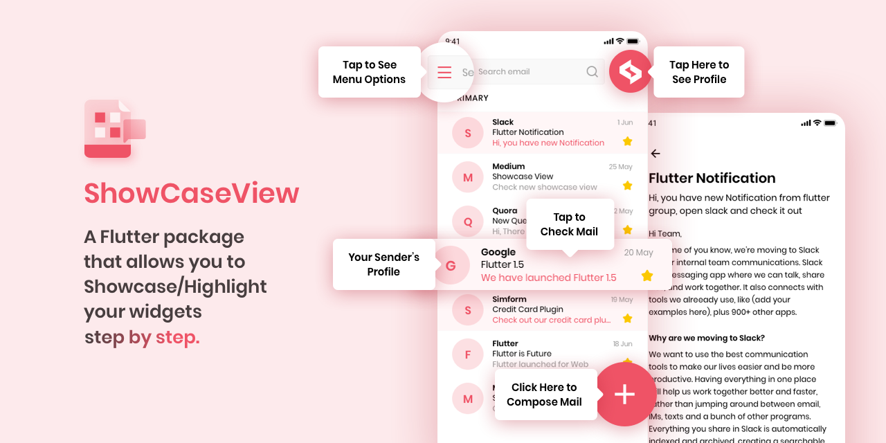
ShowCaseView 是一个允许您逐步高亮/展示小部件的 Flutter 包。
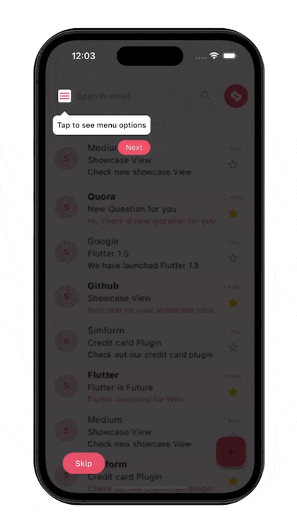
预览
迁移指南
对于版本 2.0.0 的迁移指南:
| Before | After |
|---|---|
| autoPlayLockEnable | enableAutoPlayLock |
| shapeBorder | targetShapeBorder |
| showcaseBackgroundColor | tooltipBackgroundColor |
| contentPadding | tooltipPadding |
| overlayPadding | targetPadding |
| radius | targetBorderRadius |
| tipBorderRadius | tooltipBorderRadius |
| disableAnimation | disableMovingAnimation |
| animationDuration | movingAnimationDuration |
移除了以下参数:
- title
- titleAlignment
- titleTextStyle
- description
- descriptionAlignment
- descTextStyle
- textColor
- tooltipBackgroundColor
- tooltipBorderRadius
- tooltipPadding
安装
- 在
pubspec.yaml文件中添加依赖项
dependencies:
    showcaseview: <latest-version>
- 导入包
import 'package:showcaseview/showcaseview.dart';
- 添加
ShowCaseWidget小部件
ShowCaseWidget(
  builder: Builder(
    builder: (context) => SomeWidget()
  ),
),
- 添加
Showcase小部件
GlobalKey _one = GlobalKey();
GlobalKey _two = GlobalKey();
GlobalKey _three = GlobalKey();

...

Showcase(
  key: _one,
  title: 'Menu',
  description: 'Click here to see menu options',
  child: Icon(
    Icons.menu,
    color: Colors.black45,
  ),
),

Showcase.withWidget(
  key: _three,
  height: 80,
  width: 140,
  targetShapeBorder: CircleBorder(),
  container: Column(
    crossAxisAlignment: CrossAxisAlignment.start,
    children: <Widget>[
      // 自定义容器
    ],
  ),
  child: // 自定义子组件
),
- 启动
ShowCase
someEvent() {
  ShowCaseWidget.of(context).startShowCase([_one, _two, _three]);
}
如果希望在构建完成后立即启动 ShowCaseView,可以使用以下代码:
WidgetsBinding.instance.addPostFrameCallback((_) =>
  ShowCaseWidget.of(context).startShowCase([_one, _two, _three])
);
ShowCaseWidget.of(context) 函数
| Function Name | Description |
|---|---|
| startShowCase(List) | 启动展示 |
| next() | 启动下一个展示 |
| previous() | 启动上一个展示 |
| dismiss() | 关闭所有展示 |
ShowCaseWidget 属性
| Name | Type | Default Behaviour | Description |
|---|---|---|---|
| builder | Builder | ||
| blurValue | double | 0 | 提供模糊效果 |
| autoPlay | bool | false | 自动显示下一个展示 |
| autoPlayDelay | Duration | Duration(milliseconds: 2000) | 当启用自动播放时,展示的可见时间 |
| enableAutoPlayLock | bool | false | 在启用自动播放时,阻止用户与覆盖层交互 |
| enableAutoScroll | bool | false | 允许自动滚动到下一个展示,以使给定的目标可见 |
| scrollDuration | Duration | Duration(milliseconds: 300) | 自动滚动的时间 |
| disableBarrierInteraction | bool | false | 禁用屏障交互 |
| disableScaleAnimation | bool | false | 禁用所有展示的初始缩放过渡 |
| disableMovingAnimation | bool | false | 禁用所有展示的移动过渡 |
| onStart | Function(int?, GlobalKey)? | 每个展示开始时触发 | |
| onComplete | Function(int?, GlobalKey)? | 每个展示完成时触发 | |
| onFinish | VoidCallback? | 所有展示完成后触发 | |
| enableShowcase | bool | true | 全局启用或禁用展示 |
Showcase 和 Showcase.withWidget 属性
| Name | Type | Default Behaviour | Description | Showcase | ShowcaseWidget |
|---|---|---|---|---|---|
| key | GlobalKey | 唯一的全局键 | ✅ | ✅ | |
| child | Widget | 要展示的目标小部件 | ✅ | ✅ | |
| title | String? | 默认提示框的标题 | ✅ | ||
| description | String? | 默认提示框的描述 | ✅ | ||
| container | Widget? | 允许创建自定义提示框小部件 | ✅ | ||
| height | double? | 自定义提示框小部件的高度 | ✅ | ||
| width | double? | 自定义提示框小部件的宽度 | ✅ | ||
| titleTextStyle | TextStyle? | 标题的文本样式 | ✅ | ||
| descTextStyle | TextStyle? | 描述的文本样式 | ✅ | ||
| titleAlignment | TextAlign | TextAlign.start | 标题的对齐方式 | ✅ | |
| descriptionAlignment | TextAlign | TextAlign.start | 描述的对齐方式 | ✅ | |
| targetShapeBorder | ShapeBorder | 如果未提供 targetBorderRadius 参数,则应用于目标小部件的形状边界 |
✅ | ✅ | |
| targetBorderRadius | BorderRadius? | 目标小部件的边框半径 | ✅ | ✅ | |
| tooltipBorderRadius | BorderRadius? | BorderRadius.circular(8.0) | 提示框的边框半径 | ✅ | |
| blurValue | double? | ShowCaseWidget.blurValue |
覆盖层上的高斯模糊效果 | ✅ | ✅ |
| tooltipPadding | EdgeInsets | EdgeInsets.symmetric(vertical: 8, horizontal: 8) | 提示框内容的内边距 | ✅ | |
| targetPadding | EdgeInsets | EdgeInsets.zero | 目标小部件的内边距 | ✅ | ✅ |
| overlayOpacity | double | 0.75 | 覆盖层的不透明度 | ✅ | ✅ |
| overlayColor | Color | Colors.black45 | 覆盖层的颜色 | ✅ | ✅ |
| tooltipBackgroundColor | Color | Colors.white | 默认提示框的背景颜色 | ✅ | |
| textColor | Color | Colors.black | 提示框文字的颜色 | ✅ | |
| scrollLoadingWidget | Widget | 加载小部件,当 autoScroll 启用时,在活动展示可见之前出现在覆盖层上 |
✅ | ✅ | |
| movingAnimationDuration | Duration | Duration(milliseconds: 2000) | 移动动画持续时间 | ||
| showArrow | bool | true | 显示带有箭头的提示框 | ||
| disableDefaultTargetGestures | bool | false | 禁用目标小部件的默认手势 | ||
| disposeOnTap | bool? | false | 点击目标/提示框时关闭所有展示 | ||
| disableMovingAnimation | bool? | ShowCaseWidget.disableMovingAnimation |
禁用所有展示的移动过渡 | ||
| disableScaleAnimation | bool? | ShowCaseWidget.disableScaleAnimation |
禁用展示开始和结束时的初始缩放过渡 | ||
| scaleAnimationDuration | Duration | Duration(milliseconds: 300) | 缩放动画持续时间 | ||
| scaleAnimationCurve | Curve | Curves.easeIn | 缩放动画使用的曲线 | ||
| scaleAnimationAlignment | Alignment? | 缩放发生的位置坐标,相对于盒子的大小 | |||
| onToolTipClick | VoidCallback? | 提示框被点击时触发 | |||
| onTargetClick | VoidCallback? | 目标小部件被点击时触发 | |||
| onTargetDoubleTap | VoidCallback? | 目标小部件被双击时触发 | |||
| onTargetLongPress | VoidCallback? | 目标小部件被长按时触发 | |||
| onBarrierClick | VoidCallback? | 屏障被点击时触发 | |||
| tooltipPosition | TooltipPosition? | 提示框相对于目标小部件的垂直位置 | |||
| titlePadding | EdgeInsets? | EdgeInsets.zero | 标题的内边距 | ||
| descriptionPadding | EdgeInsets? | EdgeInsets.zero | 描述的内边距 | ||
| titleTextDirection | TextDirection? | 给标题设置文本方向 | |||
| descriptionTextDirection | TextDirection? | 给描述设置文本方向 | |||
| disableBarrierInteraction | bool | false | 禁用特定展示的屏障交互 | ||
| toolTipSlideEndDistance | double | 7 | 定义提示框滑动动画的运动范围 |
如何使用
请参阅 ‘example’ 目录中的 ‘lib/main.dart’ 文件或在 pub.dartlang.org 上的 ‘Example’ 标签中查看更完整的示例。
滚动到当前激活的展示
自动滚动到当前激活的展示功能在按需渲染小部件的滚动视图(例如 ListView、GridView)中可能无法正常工作。
为了滚动到某个小部件,它需要附加到小部件树。因此,如果您使用的是按需渲染小部件的滚动视图,那么应用了展示的小部件可能尚未附加到小部件树中。因此,Flutter 无法滚动到该小部件。
因此,如果您想使用包含较少数量子小部件的滚动视图,请优先使用 SingleChildScrollView。
如果不允许使用 SingleChildScrollView,则可以为该滚动视图分配一个 ScrollController,并在 ShowCaseWidget 的 onStart 方法中手动滚动到展示小部件渲染的位置。
示例:
// 这个控制器将分配给相应的滚动视图。
final _controller = ScrollController();

ShowCaseWidget(
  onStart: (index, key) {
    if(index == 0) {
      WidgetsBinding.instance.addPostFrameCallback((_) {
        // 如果展示小部件在列表视图中的偏移量为 1000。
        // 如果您不知道展示小部件的确切位置,
        // 可以提供最接近的位置。
        //
        // 在这种情况下,提供 990 而不是 1000 也可以工作。
        _controller.jumpTo(1000);
      });
    }
  },
);
主要贡献者
 Birju Vachhani |
 Devarsh Ranpara |
 Ankit Panchal |
 Kashifa Laliwala |
 Vatsal Tanna |
 Sanket Kachhela |
 Parth Baraiya |
 Shweta Chauhan |
 Dhaval Kansara |
 Happy Makadiya |
 Ujas Majithiya |
 Aditya Chavda |
 Sahil Totala |
许可证
MIT License

Copyright (c) 2021 Simform Solutions

Permission is hereby granted, free of charge, to any person obtaining a copy
of this software and associated documentation files (the "Software"), to deal
in the Software without restriction, including without limitation the rights
to use, copy, modify, merge, publish, distribute, sublicense, and/or sell
copies of the Software, and to permit persons to whom the Software is
furnished to do so, subject to the following conditions:

The above copyright notice and this permission notice shall be included in all
copies or substantial portions of the Software.

THE SOFTWARE IS PROVIDED "AS IS", WITHOUT WARRANTY OF ANY KIND, EXPRESS OR
IMPLIED, INCLUDING BUT NOT LIMITED TO THE WARRANTIES OF MERCHANTABILITY,
FITNESS FOR A PARTICULAR PURPOSE AND NONINFRINGEMENT. IN NO EVENT SHALL THE
AUTHORS OR COPYRIGHT HOLDERS BE LIABLE FOR ANY CLAIM, DAMAGES OR OTHER
LIABILITY, WHETHER IN AN ACTION OF CONTRACT, TORT OR OTHERWISE, ARISING FROM,
OUT OF OR IN CONNECTION WITH THE SOFTWARE OR THE USE OR OTHER DEALINGS IN THE
SOFTWARE.
更多关于Flutter引导展示插件showcaseview_skipbutton的使用的实战教程也可以访问 https://www.itying.com/category-92-b0.html

更多关于Flutter引导展示插件showcaseview_skipbutton的使用的实战系列教程也可以访问 https://www.itying.com/category-92-b0.html
当然,以下是如何在Flutter项目中使用showcaseview_skipbutton插件的一个详细代码示例。这个插件用于在应用内创建引导展示,并允许用户跳过这些展示。
首先,你需要在你的pubspec.yaml文件中添加showcaseview_skipbutton依赖:
dependencies:
  flutter:
    sdk: flutter
  showcaseview_skipbutton: ^最新版本号  # 请替换为当前最新版本号
然后运行flutter pub get来安装依赖。
接下来是一个完整的示例代码,展示了如何使用showcaseview_skipbutton:
import 'package:flutter/material.dart';
import 'package:showcaseview_skipbutton/showcaseview_skipbutton.dart';

void main() {
  runApp(MyApp());
}

class MyApp extends StatelessWidget {
  @override
  Widget build(BuildContext context) {
    return MaterialApp(
      title: 'ShowcaseView SkipButton Demo',
      theme: ThemeData(
        primarySwatch: Colors.blue,
      ),
      home: MyHomePage(),
    );
  }
}

class MyHomePage extends StatefulWidget {
  @override
  _MyHomePageState createState() => _MyHomePageState();
}

class _MyHomePageState extends State<MyHomePage> {
  final GlobalKey _globalKey = GlobalKey();

  @override
  Widget build(BuildContext context) {
    return Scaffold(
      appBar: AppBar(
        title: Text('ShowcaseView SkipButton Demo'),
      ),
      body: Builder(
        builder: (context) {
          return Container(
            key: _globalKey,
            padding: EdgeInsets.all(16.0),
            child: Column(
              mainAxisAlignment: MainAxisAlignment.center,
              children: <Widget>[
                Text(
                  'Welcome to the ShowcaseView SkipButton Demo!',
                  style: TextStyle(fontSize: 24),
                ),
                SizedBox(height: 20),
                ElevatedButton(
                  onPressed: () {},
                  child: Text('Showcase Button'),
                ),
                SizedBox(height: 20),
                ElevatedButton(
                  onPressed: () {},
                  child: Text('Another Button'),
                ),
              ],
            ),
          );
        },
      ),
      floatingActionButton: FloatingActionButton(
        onPressed: () {
          _showShowcase();
        },
        tooltip: 'Show Showcase',
        child: Icon(Icons.directions_run),
      ),
    );
  }

  void _showShowcase() {
    final ShowcaseWidgetController _controller = ShowcaseWidgetController();

    ShowcaseWidget.builder(
      context: context,
      targetKey: _globalKey,
      title: 'Welcome!',
      description: 'This is a showcase view with a skip button.',
      builder: (context) {
        return ElevatedButton(
          onPressed: () {
            _controller.hide();
          },
          child: Text('Next'),
        );
      },
      onTargetTap: () {
        // Navigate to next showcase or end the showcase
        _controller.next(
          context,
          ShowcaseWidget(
            targetKey: _globalKey.currentContext?.findRenderObject()?.paintBounds?.southEast?.copyWith(dy: -80)?.toLocal(),
            title: 'Button Showcase',
            description: 'This is a showcase for the button below.',
            child: ElevatedButton(
              onPressed: () {},
              child: Text('Showcased Button'),
            ),
            showSkipButton: true,
            skipButtonBuilder: (context) {
              return ElevatedButton(
                onPressed: () {
                  _controller.dispose();
                },
                child: Text('Skip'),
              );
            },
            onTargetTap: () {
              _controller.dispose();
            },
          ),
        );
      },
      showSkipButton: true,
      skipButtonBuilder: (context) {
        return ElevatedButton(
          onPressed: () {
            _controller.dispose();
          },
          child: Text('Skip'),
        );
      },
      controller: _controller,
    );
  }
}
在这个示例中,我们创建了一个简单的Flutter应用,其中包含一个浮动操作按钮(FAB)用于触发引导展示。引导展示首先展示了一个包含欢迎信息的页面,然后当用户点击“Next”按钮时,它会导航到下一个展示,这次是对一个按钮的展示,并且包含了一个“Skip”按钮。
注意:
ShowcaseWidget.builder方法用于构建初始的展示页面。onTargetTap回调用于处理点击目标时的行为,这里我们用它来导航到下一个展示。showSkipButton和skipButtonBuilder用于自定义“Skip”按钮。ShowcaseWidgetController用于控制展示的导航和结束。
请确保替换最新版本号为插件的当前最新版本。