


Flutter日期时间选择器插件date_time_picker_ultra的使用
Flutter日期时间选择器插件date_time_picker_ultra的使用
概述
本Flutter插件提供了多种可自定义的日期时间选择器,包括下拉框、对话框以及基于小部件的选择器。使用此插件,开发者可以轻松地将日期和时间选择功能集成到他们的Flutter应用中,并根据UI需求进行各种定制。
特性
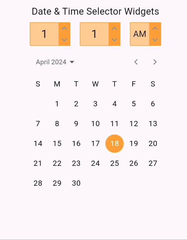
- 下拉日期时间选择器:一个下拉小部件,允许用户方便地选择日期和时间。
- 对话框日期时间选择器:一个弹出窗口,用于日期和时间选择。
- 基于小部件的日期时间选择器:一个基本的小部件,可以自定义并集成到不同的UI布局中用于日期和时间选择。


安装
要在您的Flutter项目中使用该插件,请将其添加到pubspec.yaml文件中:
dependencies:
  date_time_picker_ultra: ^version_number
然后运行以下命令以安装插件:
flutter pub get
使用方法
首先,在您的Dart文件中导入插件:
import 'package:date_time_picker_ultra/date_time_picker_ultra.dart';
下拉日期时间选择器
DateTimePickerUltraDropdown(
  selectedDate: DateTime.now(), // 初始选中的日期
  initialTime: TimeOfDay.now(), // 初始选中的时间
  showDatePicker: true, // 是否显示日期选择器
  showTimePicker: true, // 是否显示时间选择器
  onPress: (DateTime dateTime) { // 用户选择日期和时间时的回调函数
    log(dateTime.toString());
  },
  iconColor: Colors.grey, // 下拉图标颜色
  color: Colors.orangeAccent, // 下拉小部件背景颜色
),
对话框日期时间选择器
DateTimePickerUltraDialog(
  selectedDate: DateTime.now(), // 初始选中的日期
  initialTime: TimeOfDay.now(), // 初始选中的时间
  showDatePicker: true, // 是否显示日期选择器
  showTimePicker: true, // 是否显示时间选择器
  onPress: (DateTime dateTime) { // 用户选择日期和时间时的回调函数
    log(dateTime.toString());
  },
  iconColor: Colors.grey, // 下拉图标颜色
  color: Colors.orangeAccent, // 下拉小部件背景颜色
),
基于小部件的日期选择器
DatePickerUltra(
  selectedDate: DateTime.now(), // 初始选中的日期
  iconColor: Colors.grey, // 下拉图标颜色
  color: Colors.orangeAccent, // 下拉小部件背景颜色
  onChange: (DateTime date) { // 日期改变时的回调函数
    log(date.toString());
  },
),
基于小部件的时间选择器
TimeSelectorUltra(
  selectedHour: 4, // 初始选中的小时
  selectedMinute: 32, // 初始选中的分钟
  isAm: true, // 是否为AM
  iconColor: Colors.grey, // 下拉图标颜色
  color: Colors.orangeAccent, // 下拉小部件背景颜色
  onChange: (TimeOfDay timeOfDay) { // 时间改变时的回调函数
    log(timeOfDay.toString());
  },
),
自定义选项
- showDatePicker (bool):启用或禁用日期选择器。
- showTimePicker (bool):启用或禁用时间选择器。
- title (String):在打开下拉框之前显示的文本。
- titleWidget (Widget):替换标题文本的自定义小部件。
- onChangeDate (Function(DateTime)?):日期更改时的回调函数。
- onChangeTime (Function(DateTime)?):时间更改时的回调函数。
- onPress (Function(DateTime)?):用户选择日期和时间时的回调函数。
- iconColor (Color):下拉图标颜色。
- color (Color):下拉小部件背景颜色。
- textColor (Color):下拉小部件文本颜色。
- borderRadius (double):下拉小部件边框半径。
- textBoxwidth (double):下拉文本框宽度。
- selectedDate (DateTime?):初始选中的日期。
- initialTime (TimeOfDay?):初始选中的时间。
示例代码
以下是完整的示例代码:
import 'dart:log';
import 'package:date_time_picker_ultra/date_time_picker_ultra.dart';
import 'package:flutter/material.dart';

void main() {
  runApp(const MyApp());
}

class MyApp extends StatelessWidget {
  const MyApp({super.key});

  [@override](/user/override)
  Widget build(BuildContext context) {
    return const MaterialApp(
      title: 'Date Time Picker Ultra',
      home: MyHomePage(title: 'Date Time Picker Ultra'),
    );
  }
}

class MyHomePage extends StatefulWidget {
  const MyHomePage({super.key, required this.title});
  final String title;

  [@override](/user/override)
  State<MyHomePage> createState() => _MyHomePageState();
}

class _MyHomePageState extends State<MyHomePage> {
  [@override](/user/override)
  Widget build(BuildContext context) {
    return Scaffold(
      appBar: AppBar(
        backgroundColor: Theme.of(context).colorScheme.inversePrimary,
        title: Text(widget.title),
      ),
      body: Column(
        mainAxisAlignment: MainAxisAlignment.center,
        children: [
          DateTimePickerUltraDialog(
            selectedDate: DateTime.now(),
            initialTime: TimeOfDay.now(),
            showDatePicker: true,
            showTimePicker: true,
            onPress: (DateTime dateTime) {
              log(dateTime.toString());
            },
            iconColor: Colors.grey,
            color: Colors.orangeAccent,
          ),
          DateTimePickerUltraDropdown(
            selectedDate: DateTime.now(),
            initialTime: TimeOfDay.now(),
            showDatePicker: true,
            showTimePicker: true,
            onPress: (DateTime dateTime) {
              log(dateTime.toString());
            },
            iconColor: Colors.grey,
            color: Colors.orangeAccent,
          ),
          TimeSelectorUltra(
            selectedHour: 4,
            selectedMinute: 32,
            isAm: true,
            iconColor: Colors.grey,
            color: Colors.orangeAccent,
            onChange: (TimeOfDay timeOfDay) {
              log(timeOfDay.toString());
            },
          ),
          DatePickerUltra(
            selectedDate: DateTime.now(),
            iconColor: Colors.grey,
            color: Colors.orangeAccent,
            onChange: (DateTime date) {
              log(date.toString());
            },
          ),
        ],
      ),
    );
  }
}
更多关于Flutter日期时间选择器插件date_time_picker_ultra的使用的实战教程也可以访问 https://www.itying.com/category-92-b0.html
1 回复

更多关于Flutter日期时间选择器插件date_time_picker_ultra的使用的实战系列教程也可以访问 https://www.itying.com/category-92-b0.html
当然,以下是如何在Flutter项目中使用date_time_picker_ultra插件的示例代码。这个插件提供了一个灵活的日期和时间选择器,支持多种配置。
首先,你需要在你的pubspec.yaml文件中添加该插件的依赖:
dependencies:
  flutter:
    sdk: flutter
  date_time_picker_ultra: ^x.y.z  # 替换为最新版本号
然后,运行flutter pub get来获取依赖。
以下是一个完整的示例代码,展示了如何使用date_time_picker_ultra插件:
import 'package:flutter/material.dart';
import 'package:date_time_picker_ultra/date_time_picker_ultra.dart';

void main() {
  runApp(MyApp());
}

class MyApp extends StatelessWidget {
  @override
  Widget build(BuildContext context) {
    return MaterialApp(
      title: 'DateTimePickerUltra Example',
      theme: ThemeData(
        primarySwatch: Colors.blue,
      ),
      home: MyHomePage(),
    );
  }
}

class MyHomePage extends StatefulWidget {
  @override
  _MyHomePageState createState() => _MyHomePageState();
}

class _MyHomePageState extends State<MyHomePage> {
  DateTime? selectedDateTime;

  void _selectDateTime() async {
    final DateTimePickerUltraResult result = await DateTimePickerUltra.show(
      context: context,
      initialDateTime: selectedDateTime ?? DateTime.now(),
      datePickerBuilder: (context, state) {
        return DatePickerBuilder(
          state,
          decoration: BoxDecoration(
            color: Colors.white,
            borderRadius: BorderRadius.circular(10.0),
          ),
          headerDecoration: BoxDecoration(
            color: Colors.blue,
            borderRadius: BorderRadius.only(
              topLeft: Radius.circular(10.0),
              topRight: Radius.circular(10.0),
            ),
          ),
          headerTextStyle: TextStyle(color: Colors.white),
          dayTextStyle: TextStyle(color: Colors.black),
          monthTextStyle: TextStyle(color: Colors.black),
          yearTextStyle: TextStyle(color: Colors.black),
          weekdayTextStyle: TextStyle(color: Colors.grey),
          selectedDayTextStyle: TextStyle(color: Colors.blue, fontWeight: FontWeight.bold),
          todayTextStyle: TextStyle(color: Colors.red, fontWeight: FontWeight.bold),
          showWeekdays: true,
          firstDayOfWeek: DateTime.utc(2023).weekday,
          weekdayNames: [
            'Sun',
            'Mon',
            'Tue',
            'Wed',
            'Thu',
            'Fri',
            'Sat',
          ],
          monthNames: [
            'January',
            'February',
            'March',
            'April',
            'May',
            'June',
            'July',
            'August',
            'September',
            'October',
            'November',
            'December',
          ],
        );
      },
      timePickerBuilder: (context, state) {
        return TimePickerBuilder(
          state,
          decoration: BoxDecoration(
            color: Colors.white,
            borderRadius: BorderRadius.circular(10.0),
          ),
          headerDecoration: BoxDecoration(
            color: Colors.blue,
            borderRadius: BorderRadius.only(
              topLeft: Radius.circular(10.0),
              topRight: Radius.circular(10.0),
            ),
          ),
          headerTextStyle: TextStyle(color: Colors.white),
          timeTextStyle: TextStyle(color: Colors.black),
          separatorTextStyle: TextStyle(color: Colors.grey),
          selectedTimeTextStyle: TextStyle(color: Colors.blue, fontWeight: FontWeight.bold),
        );
      },
      locale: Locale('en', 'US'),
    );

    if (result.confirmed && result.dateTime != null) {
      setState(() {
        selectedDateTime = result.dateTime;
      });
    }
  }

  @override
  Widget build(BuildContext context) {
    return Scaffold(
      appBar: AppBar(
        title: Text('DateTimePickerUltra Example'),
      ),
      body: Center(
        child: Column(
          mainAxisAlignment: MainAxisAlignment.center,
          children: <Widget>[
            Text(
              selectedDateTime == null
                  ? 'No date and time selected'
                  : '${selectedDateTime!.toLocal()}',
              style: TextStyle(fontSize: 20),
            ),
            SizedBox(height: 20),
            ElevatedButton(
              onPressed: _selectDateTime,
              child: Text('Select Date and Time'),
            ),
          ],
        ),
      ),
    );
  }
}
这个示例展示了如何使用DateTimePickerUltra插件来显示一个日期和时间选择器,并处理用户的选择。你可以根据需要调整日期和时间选择器的样式和配置。
DateTimePickerUltra.show方法用于显示选择器。DatePickerBuilder和TimePickerBuilder允许你自定义日期和时间选择器的外观。Locale参数允许你设置选择器的语言。
希望这个示例能帮助你快速上手date_time_picker_ultra插件的使用。