


Flutter响应式UI构建插件responsive_ui_builder的使用
Flutter 响应式UI构建插件 responsive_ui_builder 的使用
概述
responsive_ui_builder 包包含了一些帮助你创建响应式UI的组件。
安装
在 pubspec.yaml 文件中添加 responsive_ui_builder 作为依赖项。
dependencies:
  responsive_ui_builder:
使用
该包提供了一个名为 ResponsiveUiBuilder 的小部件,它提供了一个生成器函数,返回当前的 ResponsiveUiSize。
响应式构建器
ResponsiveUiBuilder 可以像其他构建器小部件一样使用。
// 导入包
import 'package:responsive_ui_builder/responsive_ui_builder.dart';

// 使用小部件
ResponsiveUiBuilder(
  small: (context, sm) {
    return Container(
      color: Colors.red,
    );
  },
  medium: (context, md) {
    return Container(
      color: Colors.yellow,
    );
  },
  large: (context, lg) {
    return Container(
      color: Colors.green,
    );
  },
);
这将根据设备的不同显示不同颜色的容器。一个简单的测试方法是运行你的代码在 Flutter Web上并调整窗口大小。
自定义屏幕断点
如果你希望定义自己的自定义断点,可以通过向 ResponsiveUiBuilder 小部件提供 breakpoints 参数来实现。
// 导入包
import 'package:responsive_ui_builder/responsive_ui_builder.dart';

// 使用小部件
ResponsiveUiBuilder(
  breakpoints: const ScreenBreakpoints(medium: 600, large: 950, small: 300),
  small: Container(color: Colors.blue),
  medium: Container(color: Colors.yellow),
  large: Container(color: Colors.red),
);
示例代码
以下是一个完整的示例代码,展示了如何在 Flutter 应用程序中使用 ResponsiveUiBuilder。
import 'package:flutter/material.dart';
import 'package:responsive_ui_builder/responsive_ui_builder.dart';
import 'package:responsive_ui_builder/sizing_information.dart';
void main() {
runApp(const MyApp());
}
class MyApp extends StatefulWidget {
const MyApp({Key? key}) : super(key: key);
[@override](/user/override)
State<MyApp> createState() => _MyAppState();
}
class _MyAppState extends State<MyApp> {
[@override](/user/override)
Widget build(BuildContext context) {
return MaterialApp(
debugShowCheckedModeBanner: false,
home: Scaffold(
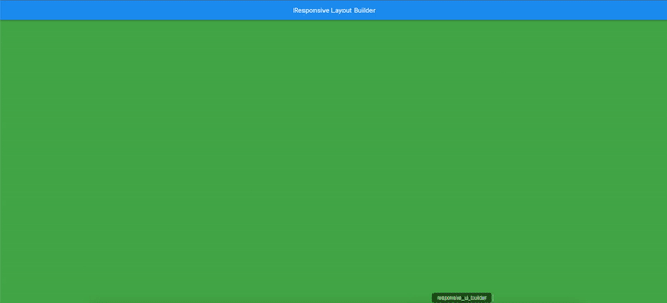
appBar: AppBar(
title: const Text('响应式布局构建器'),
),
body: Center(
// 应至少传递一个参数或更多参数给 ResponsiveUiBuilder
child: ResponsiveUiBuilder(
breakpoints: const ScreenBreakpoints(medium: 600, large: 950, small: 300),
small: Container(color: Colors.blue),
medium: Container(color: Colors.yellow),
large: Container(color: Colors.red),
),
),
),
);
}
}
更多关于Flutter响应式UI构建插件responsive_ui_builder的使用的实战教程也可以访问 https://www.itying.com/category-92-b0.html

更多关于Flutter响应式UI构建插件responsive_ui_builder的使用的实战系列教程也可以访问 https://www.itying.com/category-92-b0.html
当然,responsive_ui_builder 是一个用于 Flutter 的强大插件,它能够帮助开发者轻松构建响应式用户界面。以下是一个使用 responsive_ui_builder 的代码示例,展示了如何创建一个简单的响应式布局。
首先,确保你已经在 pubspec.yaml 文件中添加了 responsive_ui_builder 依赖:
dependencies:
  flutter:
    sdk: flutter
  responsive_ui_builder: ^0.0.1  # 请注意版本号,这里只是一个示例,请检查最新的版本
然后,运行 flutter pub get 来获取依赖。
接下来,我们来看一个具体的代码示例:
import 'package:flutter/material.dart';
import 'package:responsive_ui_builder/responsive_ui_builder.dart';

void main() {
  runApp(MyApp());
}

class MyApp extends StatelessWidget {
  @override
  Widget build(BuildContext context) {
    return MaterialApp(
      title: 'Responsive UI Builder Demo',
      theme: ThemeData(
        primarySwatch: Colors.blue,
      ),
      home: ResponsiveScaffold(
        builder: (context, screenType) {
          return Scaffold(
            appBar: AppBar(
              title: Text('Responsive UI Builder Demo'),
            ),
            body: ResponsiveBuilder(
              builder: (context, sizingInformation) {
                return LayoutBuilder(
                  builder: (context, constraints) {
                    if (sizingInformation.deviceScreenType == DeviceScreenType.mobile) {
                      return _buildMobileLayout(constraints);
                    } else {
                      return _buildTabletOrDesktopLayout(constraints);
                    }
                  },
                );
              },
            ),
          );
        },
      ),
    );
  }

  Widget _buildMobileLayout(BoxConstraints constraints) {
    return Column(
      crossAxisAlignment: CrossAxisAlignment.center,
      children: <Widget>[
        Expanded(
          flex: 2,
          child: Container(
            color: Colors.blue,
            child: Center(
              child: Text(
                'Mobile Layout',
                style: TextStyle(color: Colors.white),
              ),
            ),
          ),
        ),
        Expanded(
          flex: 1,
          child: Container(
            color: Colors.green,
            child: Center(
              child: Text(
                'Section 2',
                style: TextStyle(color: Colors.white),
              ),
            ),
          ),
        ),
      ],
    );
  }

  Widget _buildTabletOrDesktopLayout(BoxConstraints constraints) {
    return Row(
      crossAxisAlignment: CrossAxisAlignment.center,
      children: <Widget>[
        Expanded(
          flex: 1,
          child: Container(
            color: Colors.blue,
            child: Center(
              child: Text(
                'Tablet/Desktop Layout - Left',
                style: TextStyle(color: Colors.white),
              ),
            ),
          ),
        ),
        Expanded(
          flex: 2,
          child: Container(
            color: Colors.green,
            child: Center(
              child: Text(
                'Tablet/Desktop Layout - Right',
                style: TextStyle(color: Colors.white),
              ),
            ),
          ),
        ),
      ],
    );
  }
}
代码解释
-
依赖导入:
- 导入
flutter/material.dart和responsive_ui_builder。
- 导入
-
主应用入口:
- 使用
MaterialApp包装整个应用。 - 使用
ResponsiveScaffold包装主页面,它根据屏幕类型(如手机、平板或桌面)来构建不同的布局。
- 使用
-
ResponsiveBuilder:
ResponsiveBuilder根据设备的屏幕类型返回不同的布局。- 使用
sizingInformation.deviceScreenType来判断当前的设备类型。
-
布局构建:
_buildMobileLayout和_buildTabletOrDesktopLayout方法分别构建手机和平板/桌面的布局。LayoutBuilder用于根据可用空间调整布局。
-
布局内容:
- 示例中,手机和平板/桌面的布局分别使用
Column和Row来展示不同的内容区域。
- 示例中,手机和平板/桌面的布局分别使用
这个示例展示了如何使用 responsive_ui_builder 插件来根据设备类型构建响应式布局。你可以根据自己的需求进一步扩展和定制这些布局。