




Flutter UI框架集成插件flutter_bootstrap5的使用
Flutter UI框架集成插件flutter_bootstrap5的使用
简介
FlutterBootstrap5 是一个用于支持使用 Flutter 创建响应式 Web 应用程序的插件。它基于知名的 CSS 框架 Bootstrap 5,并提供了许多在 Bootstrap 中可以找到的功能。
如果您喜欢这个插件,希望您可以给它一个赞 ❤️ 和一个星 ⭐ 来支持该项目!
如果您想快速了解最重要的功能并直接进行测试,可以访问以下网站:
小示例
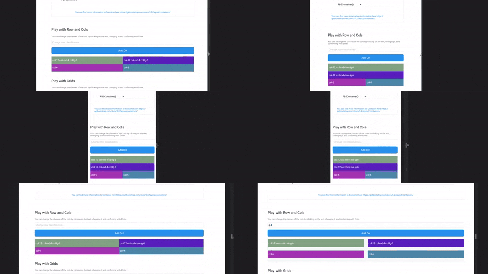
开始使用
配置 Flutter Bootstrap5
要在您的应用程序中使用 FlutterBootstrap5,只需将您的 MaterialApp 包裹在一个 FlutterBootstrap5 组件中即可。
FlutterBootstrap5(
    builder: (ctx) => MaterialApp(...),
);
设置主题
您可以自定义 FlutterBootstrap5 以满足您的需求。您可以保持默认值以获得默认的 Bootstrap 5 应用程序行为。
断点(BreakPoints)
要设置自己的断点,可以直接传递 BreakPoints 类到 FlutterBootstrap5 组件。默认情况下,它会使用当前 Bootstrap 5 CSS 的断点。
class _BootstrapBreakPoints {
  static const BreakPoint xs = BreakPoint(minWidth: 0, maxWidth: 576);
  static const BreakPoint sm = BreakPoint(minWidth: 576, maxWidth: 768);
  static const BreakPoint md = BreakPoint(minWidth: 768, maxWidth: 992);
  static const BreakPoint lg = BreakPoint(minWidth: 992, maxWidth: 1200);
  static const BreakPoint xl = BreakPoint(minWidth: 1200, maxWidth: 1400);
  static const BreakPoint xxl = BreakPoint(minWidth: 1400, maxWidth: double.infinity);
}
容器断点(Container BreakPoints)
除了标准断点外,还可以为 FB5Container 定义自己的断点。这些断点决定了 FB5Container 在特定断点下的宽度。
class _BootstrapContainerBreakPoints {
  static const double xs = double.infinity;
  static const double sm = 540;
  static const double md = 720;
  static const double lg = 960;
  static const double xl = 1140;
  static const double xxl = 1320;
}
默认字体大小(Default FontSize)
通过 defaultFontSize 参数可以指定默认字体大小,用于计算 rem 值。Bootstrap CSS 使用 rem 来计算边距、填充和字体大小。同样地,在 Flutter Bootstrap5 中也会根据默认字体大小来计算这些值。
默认值为 16.0。
字体排版(Typography)
Flutter Bootstrap5 使用基于 Bootstrap CSS 的字体大小计算机制。因此,字体大小会根据屏幕尺寸动态变化。可以通过传递 FB5Typography 类来自定义此行为。
在 MaterialApp 中使用主题
配置好 FlutterBootstrap5 后,可以将其主题传递给 MaterialApp 以充分利用 Flutter Bootstrap 5。
MaterialApp(
    title: 'Flutter Bootstrap5 Demo',
    theme: BootstrapTheme.of(ctx).toTheme(
        theme: ThemeData(
            scaffoldBackgroundColor: BootstrapTheme.of(ctx).colors.white,
            appBarTheme: AppBarTheme(
                backgroundColor: BootstrapTheme.of(ctx).colors.primary,
                foregroundColor: BootstrapTheme.of(ctx).colors.white,
                elevation: 0.0,
            ),
            fontFamily: GoogleFonts.roboto().fontFamily,
        ),
    ),
    home: const Home(),
),
功能介绍
目前支持的 Bootstrap 类
注意:响应式支持表示是否支持使用 -xs, -sm, -md, -lg, -xl, 和 -xxl
| 描述 | 基础类 | 变体 | 响应式支持 |
|---|---|---|---|
| 列宽 | col |
col-{1-12} |
✓ |
| 每行列数 | row-cols |
row-cols-{1-*} |
✓ |
| 填充 | p |
p-{1-5}, p{t,b,s,e,x,y}-{1-5}, p{t,b,s,e,x,y}-custom-{0.0-*} |
✓ |
| 边距 | m |
m-{1-5}, m{t,b,s,e,x,y}-{1-5}, m{t,b,s,e,x,y}-custom-{0.0-*} |
✓ |
| 间距 | g |
g-{1-5}, g{x,y}-{1-5}, g{x,y}-custom-{0.0-*} |
✓ |
| 排序 | order |
order-{0-*} |
✓ |
| 显示 | d |
d-none, d-block |
✓ |
| 对齐项目 | align-items |
align-items-{start, center, end} |
✓ |
| 自对齐 | align-self |
align-self-{start, center, end} |
✓ |
| 对齐内容 | justify-content |
justify-content-{start, around, between, evenly, center, end} |
✓ |
组件
FB5Container
FB5Container 是 Bootstrap Container 的 Flutter 实现。可以在 FLUTTER BOOTSTRAP 5 示例网站 上测试容器的缩放行为。
支持的容器类型有:
FB5Container(child: child);
FB5Container.sm(child: child);
FB5Container.md(child: child);
FB5Container.lg(child: child);
FB5Container.xl(child: child);
FB5Container.xxl(child: child);
FB5Container.fluid(child: child);
FB5Row
FB5Row 是 Bootstrap 行的 Flutter 实现。它们接收一个 FB5Col 列列表,并根据类名进行排列和展示。
FB5Row(
    classNames: 'mt-5 px-xs-3 px-lg-0 gx-4',
    children: [
        FB5Col(
            classNames: 'col-12',
            child: const GettingStarted(),
        ),
        FB5Col(
            classNames: 'col-12 mt-5',
            child: const Containers(),
        ),
        FB5Col(
            classNames: 'mt-5',
            child: const TestingArea(),
        ),
        FB5Col(
            classNames: 'my-5',
            child: const GridArea(),
        ),
   ],
),
FB5Col
FB5Col 是 Bootstrap 列的 Flutter 实现。它们应在 FB5Row 内部使用,并根据类名更改其表现形式。
FB5Col(
    classNames: 'col-12 col-lg-6 col-xl-4 m-3 m-xl-2 d-none d-sm-block',
    child: child,
),
FB5Grid
FB5Grid 用于表示子组件的网格系统。它们不应包含 FB5Cols。FB5Grid 会自动调整子组件的大小,使得一行中的子组件始终保持相同的高度。
FB5Grid(
  classNames: 'row-cols-3',
  children: [
      ...
  ],
),
辅助工具
BootstrapTheme
BootstrapTheme 返回有关当前屏幕大小和断点的信息。只需要执行以下函数即可:
final screenData = BootstrapTheme.of(context);
它还提供了一些有用的功能。例如,查询当前断点是否大于或小于某个断点。
final screenData = BootstrapTheme.of(context);
screenData.currentBreakPoint.isBreakPointOrSmaller(screenData.breakPoints.xl);

screenData.currentBreakPoint.isBreakPointOrLarger(screenData.breakPoints.xl);
函数
还有一些辅助函数可以向 Flutter 组件添加 Bootstrap 功能:
// 例如,为 Container 添加 4rem 的上边距
Container(
  margin: margin(context, 'mt-4'),
);

// 例如,为 Container 添加 2rem 的内边距
Container(
  margin: padding(context, 'p-2'),
);

// 为 Container 添加圆角
Container(
  decoration: BoxDecoration(
    borderRadius: rounded(context), // rounded1 rounded2 rounded3 rounded4 rounded5 roundedPill
  ),
);

// 为 Container 添加边框
Container(
  decoration: BoxDecoration(
    border: borderPrimary(context), // borderSecondary, borderSuccess, borderDanger, 等等
  ),
);

// responsiveValue & responsiveValueOrNull
// 如果需要在不同断点下使用不同的值
final width = responsiveValue<double>(context, defaultValue: 300.0, md: 350.0, xl: 400.0);
完整示例
下面是完整的示例代码:
import 'package:example/cubits/app_cubit.dart';
import 'package:example/cubits/app_state.dart';
import 'package:example/profil.dart';
import 'package:flutter/material.dart';
import 'package:flutter_bloc/flutter_bloc.dart';
import 'package:flutter_bootstrap5/flutter_bootstrap5.dart';
import 'package:google_fonts/google_fonts.dart';

void main() {
  runApp(const MyApp());
}

class MyApp extends StatefulWidget {
  const MyApp({Key? key}) : super(key: key);

  [@override](/user/override)
  State<MyApp> createState() => _MyAppState();
}

class _MyAppState extends State<MyApp> {
  late final AppCubit appCubit;

  [@override](/user/override)
  void initState() {
    appCubit = AppCubit();
    super.initState();
  }

  [@override](/user/override)
  void dispose() {
    appCubit.close();
    super.dispose();
  }

  [@override](/user/override)
  Widget build(BuildContext context) {
    return BlocProvider<AppCubit>.value(
      value: appCubit,
      child: BlocBuilder<AppCubit, AppState>(
        bloc: appCubit,
        builder: (context, state) {
          return FlutterBootstrap5(
            fontSize: state.defaultFontSize,
            builder: (ctx) => MaterialApp(
              title: 'Flutter Bootstrap5 Demo',
              theme: BootstrapTheme.of(ctx).toTheme(
                theme: ThemeData(
                  scaffoldBackgroundColor: BootstrapTheme.of(ctx).colors.white,
                  appBarTheme: AppBarTheme(
                    backgroundColor: BootstrapTheme.of(ctx).colors.primary,
                    foregroundColor: BootstrapTheme.of(ctx).colors.white,
                    elevation: 0.0,
                  ),
                  fontFamily: GoogleFonts.roboto().fontFamily,
                ),
              ),
              home: const Profile(),
            ),
          );
        },
      ),
    );
  }
}
更多关于Flutter UI框架集成插件flutter_bootstrap5的使用的实战教程也可以访问 https://www.itying.com/category-92-b0.html

更多关于Flutter UI框架集成插件flutter_bootstrap5的使用的实战系列教程也可以访问 https://www.itying.com/category-92-b0.html
当然,关于在Flutter UI框架中集成flutter_bootstrap5插件(需要注意的是,实际上并不存在一个官方的flutter_bootstrap5插件,但我们可以模拟类似的集成过程,通过自定义组件或使用类似的Bootstrap风格的Flutter包,如flutter_bootstrap),以下是一个如何集成和使用类似Bootstrap风格组件的示例。
假设我们使用的是flutter_bootstrap包,这个包提供了一些Bootstrap风格的UI组件。以下是如何在Flutter项目中集成并使用这些组件的代码示例。
1. 添加依赖
首先,在你的pubspec.yaml文件中添加flutter_bootstrap依赖:
dependencies:
  flutter:
    sdk: flutter
  flutter_bootstrap: ^x.y.z  # 请替换为实际版本号
然后运行flutter pub get来安装依赖。
2. 导入包
在你的Dart文件中导入flutter_bootstrap包:
import 'package:flutter/material.dart';
import 'package:flutter_bootstrap/flutter_bootstrap.dart';
3. 使用Bootstrap风格的组件
下面是一个使用flutter_bootstrap包中的组件创建简单UI的示例:
void main() {
  runApp(MyApp());
}

class MyApp extends StatelessWidget {
  @override
  Widget build(BuildContext context) {
    return BootstrapApp(
      home: HomeScreen(),
    );
  }
}

class HomeScreen extends StatelessWidget {
  @override
  Widget build(BuildContext context) {
    return BootstrapScaffold(
      appBar: BootstrapAppBar(
        title: Text('Flutter Bootstrap Example'),
      ),
      body: BootstrapContainer(
        padding: EdgeInsets.all(16.0),
        child: Column(
          crossAxisAlignment: CrossAxisAlignment.start,
          children: <Widget>[
            BootstrapButton(
              child: Text('Primary Button'),
              color: BootstrapColors.primary,
              onPressed: () {
                // 按钮点击事件处理
                ScaffoldMessenger.of(context).showSnackBar(
                  SnackBar(content: Text('Button Clicked!')),
                );
              },
            ),
            SizedBox(height: 16.0),
            BootstrapInputField(
              hintText: 'Enter your name',
              onChanged: (value) {
                // 输入框内容变化处理
                print('Input changed to: $value');
              },
            ),
            SizedBox(height: 16.0),
            BootstrapAlert(
              message: 'This is an alert message!',
              type: BootstrapAlertType.info,
            ),
          ],
        ),
      ),
    );
  }
}
注意事项
flutter_bootstrap包可能不是官方或广泛使用的,上述代码示例基于假设存在一个提供Bootstrap风格组件的Flutter包。如果flutter_bootstrap包不存在或版本有更新,请查找类似的替代包,如flutter_bootstrap_ui或flutter_bootstrap4(如果存在)。- 如果确实需要集成Bootstrap 5的样式和功能,可能需要通过其他方式,如使用WebView加载Bootstrap 5的HTML/CSS/JS,但这通常不是Flutter推荐的做法,因为它牺牲了Flutter的性能和原生能力。
- 在实际项目中,确保使用的第三方包是活跃维护的,并且与你的Flutter SDK版本兼容。
希望这个示例能帮助你理解如何在Flutter中集成和使用类似Bootstrap风格的UI组件。如果有更多具体需求或问题,欢迎继续提问!
