


Flutter文本输入处理插件on_text_input_widget的使用
Flutter文本输入处理插件on_text_input_widget的使用
On Text Input Widget
一个具有多种功能的文本输入字段。
注意事项
现在启用了Material 3主题。
开始使用
要将on_text_input_widget小部件添加到项目中,请遵循以下步骤:
-
根据安装页面上的说明安装该小部件。
-
在项目中添加以下代码:
OnTextInputWidget() -
为了更好地理解,可以参考示例。
文本字段的用法
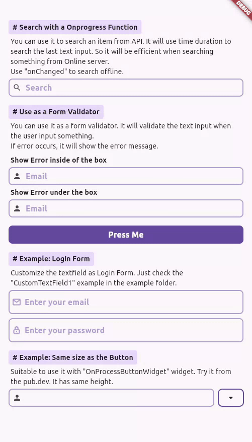
从在线或本地服务器进行搜索操作
您可以使用它从API中搜索项目。它将使用时间间隔来搜索最后的文本输入。因此,在从在线服务器搜索时会更有效率。使用onChanged进行离线搜索。
OnTextInputWidget(
    hintText: "Search",
    prefixIcon: Icon(Icons.search),
    showPrefixLoadingIcon: true,
    // showSuffixLoadingIcon: true,
    onChanged: (value) {
        // 使用它进行离线搜索
    },
    onChangedProcessing: (value) async {
        // 在线搜索操作
        await Future.delayed(const Duration(seconds: 2));
        setState(() {
            result = value;
        });
    },
),
示例 - 从在线或本地服务器进行搜索操作
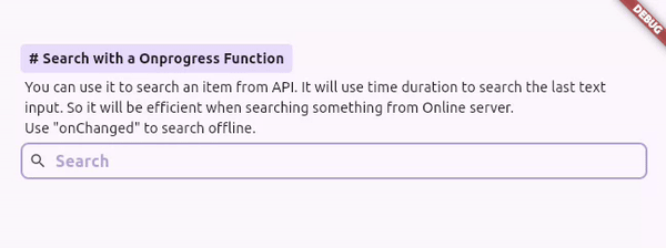
表单验证
您可以将其用作表单验证器。当用户输入某些内容时,它将验证文本输入。如果发生错误,它将显示错误消息。
class __Validator extends StatelessWidget {
    __Validator();
    final GlobalKey<FormState> _formKey = GlobalKey<FormState>();

    String v(String? value) {
        if (value?.isNotEmpty == true) {
            return "You entered username: $value";
        } else {
            return "Please enter your username";
        }
    }

    @override
    Widget build(BuildContext context) {
        return Form(
            key: _formKey,
            child: Column(
                children: [
                    ______Details(
                        heading: "Use as a Form Validator",
                        text: "You can use it as a form validator. It will validate the text input when the user input something. If error occurs, it will show the error message.",
                        child: Column(
                            crossAxisAlignment: CrossAxisAlignment.start,
                            children: [
                                ______Text("Show Error inside of the box", boldText: true),
                                OnTextInputWidget(
                                prefixIcon: Icon(Icons.person),
                                hintText: "Email",
                                validator: v,
                                ),
                                ______Text("Show Error under the box", boldText: true),
                                OnTextInputWidget(
                                prefixIcon: Icon(Icons.person),
                                hintText: "Email",
                                showDetailError: true, //?
                                validator: v,
                                ),
                            ],
                        ),
                    ),

                    // 按钮
                    OnProcessButtonWidget(
                        onDone: (isSuccess) {
                        _formKey.currentState?.validate();
                        },
                        child: Text("Press Me"),
                    ),

                    ______Space(),
                    ______Space(),
                ],
            ),
        );
    }
}
示例 - 表单验证
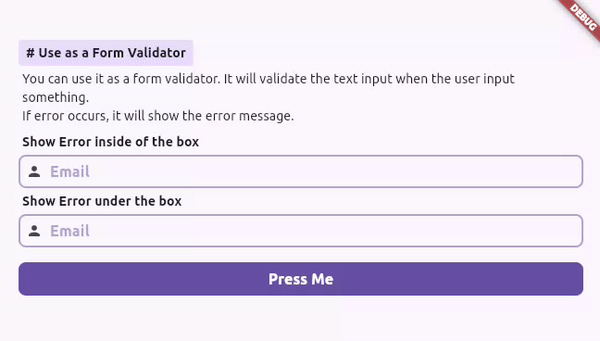
登录表单
自定义文本字段作为登录表单。只需检查示例文件夹中的"CustomTextField1"示例即可。
CustomTextField1
class CustomTextField1 extends StatefulWidget {
  final bool autofocus;
  final String hintText;
  final String svg;
  final Widget? prefixChild;
  final TextEditingController? textEditingController;
  final void Function(String value)? onChanged;
  final Future<void>? Function(String)? onChangedProcessing;
  final String? Function(String? value)? validator;
  final TextInputType keyboardType;
  final bool obscureText;
  final String? initialValue;
  final int? maxLine;
  final int? minLine;
  final bool enable;
  final bool readOnly;
  final InputBorder? border;
  final bool isCollapsed;
  final bool isDense;
  final BoxConstraints? boxConstraints;
  final EdgeInsetsGeometry? contentPadding;
  final List<String>? autofillHints;
  final Widget? suffixIcon;

  const CustomTextField1({
    super.key,
    this.autofocus = false,
    this.hintText = "",
    this.svg = "",
    this.textEditingController,
    this.onChanged,
    this.validator,
    this.keyboardType = TextInputType.text,
    this.obscureText = false,
    this.initialValue,
    this.onChangedProcessing,
    this.maxLine = 1,
    this.minLine = 1,
    this.prefixChild,
    this.enable = true,
    this.readOnly = false,
    this.border,
    this.isCollapsed = false,
    this.boxConstraints,
    this.isDense = false,
    this.contentPadding,
    this.autofillHints,
    this.suffixIcon,
  });

  @override
  State<CustomTextField1> createState() => _CustomTextField1State();
}

class _CustomTextField1State extends State<CustomTextField1> {
  final RxString s = "".obs;
  final RxBool errorStatus = false.obs;
  late final RxBool showText = true.obs;

  @override
  initState() {
    super.initState();
    s.value = widget.textEditingController?.text ?? "";
    showText.value = !widget.obscureText;
  }

  Widget? setSuffixIcon() {
    if (widget.suffixIcon != null) return widget.suffixIcon;

    if (widget.obscureText) {
      return s.isEmpty
          ? null
          : GestureDetector(
              onTap: () => showText.value = !showText.value,
              child: SvgPicture.asset(
                showText.value ? "lib/assets/icons/eye_opened_icon.svg" : "lib/assets/icons/eye_closed_icon.svg",
                colorFilter: ColorFilter.mode(Theme.of(context).colorScheme.primary, BlendMode.srcIn),
              ),
            );
    }

    return null;
  }

  @override
  Widget build(BuildContext context) {
    return Obx(
      () => OnTextInputWidget(
        autofillHints: widget.autofillHints,
        contentPadding: widget.contentPadding,
        isDense: widget.isDense,
        isCollapsed: widget.isCollapsed,
        readOnly: widget.readOnly,
        enabled: widget.enable,
        autofocus: widget.autofocus,
        textEditingController: widget.textEditingController,
        initialValue: widget.initialValue,
        hintText: widget.hintText,
        keyboardType: widget.keyboardType,
        obscureText: !showText.value,
        maxLines: widget.maxLine,
        minLines: widget.minLine,
        boxConstraints: widget.boxConstraints,
        onFocusChange: (isFocused) => {
          if (widget.obscureText && !isFocused) showText.value = false
        },
        //! 眼睛按钮
        suffixIcon: setSuffixIcon(),
        validator: widget.validator,
        errorCheck: (error, message) {
          s.value = "";
          errorStatus.value = error;
        },
        onChanged: (value) {
          s.value = value;
          if (widget.onChanged != null) widget.onChanged!(value.trim());
        },
        errorBorder: widget.border,
        enabledBorder: widget.border,
        focusedBorder: widget.border,
        disabledBorder: widget.border,
        focusedErrorBorder: widget.border,

        onChangedProcessing: widget.onChangedProcessing,
        showPrefixLoadingIcon: widget.onChangedProcessing != null,
        prefixIcon: widget.svg.isEmpty && widget.prefixChild == null
            ? null
            : Row(
                mainAxisSize: MainAxisSize.min,
                mainAxisAlignment: MainAxisAlignment.center,
                children: [
                  if (widget.svg.isNotEmpty)
                    SvgPicture.asset(
                      widget.svg,
                      height: defaultPadding / 1.5,
                      colorFilter: ColorFilter.mode(
                        errorStatus.value
                            ? Theme.of(context).colorScheme.error
                            : s.isEmpty
                                ? Theme.of(context).colorScheme.primary.withOpacity(0.5)
                                : Theme.of(context).colorScheme.primary,
                        BlendMode.srcIn,
                      ),
                    ),
                  if (widget.svg.isNotEmpty && widget.prefixChild != null) SizedBox(width: (widget.contentPadding?.horizontal ?? 0) / 2),
                  if (widget.prefixChild != null) widget.prefixChild!,
                ],
              ),
      ),
    );
  }
}
现在在项目中添加它:
Column(
    children: [
        // 用户名字段
        CustomTextField1(
            keyboardType: TextInputType.emailAddress,
            hintText: "Enter your email",
            svg: "lib/assets/icons/message_icon.svg",
        ),
        ______Space(),
        // 密码字段
        CustomTextField1(
            obscureText: true,
            keyboardType: TextInputType.visiblePassword,
            hintText: "Enter your password",
            svg: "lib/assets/icons/lock_icon.svg",
        ),
    ],
),
示例 - 登录表单
与按钮同大小
适合与"OnProcessButtonWidget"小部件一起使用。它具有相同的高度。
Row(
    children: [
        // 输入字段
        Flexible(
            child: OnTextInputWidget(
                prefixIcon: Icon(Icons.person),
            ),
        ),
        ______Space(),

        // 按钮
        OnProcessButtonWidget(
            backgroundColor: Colors.transparent,
            border: Border.all(
                width: 2,
                color: Theme.of(context).colorScheme.primary,
                strokeAlign: BorderSide.strokeAlignCenter,
            ),
            child: Icon(Icons.arrow_drop_down_rounded),
        ),
    ],
),
更多关于Flutter文本输入处理插件on_text_input_widget的使用的实战教程也可以访问 https://www.itying.com/category-92-b0.html

更多关于Flutter文本输入处理插件on_text_input_widget的使用的实战系列教程也可以访问 https://www.itying.com/category-92-b0.html
当然,以下是如何在Flutter项目中使用on_text_input_widget插件的一个简单示例。请注意,on_text_input_widget并非一个官方或广泛知名的Flutter插件,因此我将基于一个假设的API设计来展示其可能的用法。如果你提到的插件有特定的API或文档,请务必参考其官方文档。
假设on_text_input_widget提供了一个简单的文本输入组件,并且具有一些回调来处理文本输入事件。以下是一个可能的实现示例:
- 首先,在
pubspec.yaml文件中添加依赖项(注意:这里的依赖项名称是假设的,请根据实际情况替换):
dependencies:
  flutter:
    sdk: flutter
  on_text_input_widget: ^1.0.0  # 假设的版本号
-
运行
flutter pub get来获取依赖项。 -
在你的Dart文件中使用
on_text_input_widget:
import 'package:flutter/material.dart';
import 'package:on_text_input_widget/on_text_input_widget.dart'; // 假设的包导入路径

void main() {
  runApp(MyApp());
}

class MyApp extends StatelessWidget {
  @override
  Widget build(BuildContext context) {
    return MaterialApp(
      title: 'Flutter Demo',
      theme: ThemeData(
        primarySwatch: Colors.blue,
      ),
      home: MyHomePage(),
    );
  }
}

class MyHomePage extends StatefulWidget {
  @override
  _MyHomePageState createState() => _MyHomePageState();
}

class _MyHomePageState extends State<MyHomePage> {
  String _inputText = '';

  void _handleTextInput(String text) {
    setState(() {
      _inputText = text;
    });
    print('Input text: $text');
  }

  @override
  Widget build(BuildContext context) {
    return Scaffold(
      appBar: AppBar(
        title: Text('Text Input Demo'),
      ),
      body: Padding(
        padding: const EdgeInsets.all(16.0),
        child: Column(
          crossAxisAlignment: CrossAxisAlignment.start,
          children: <Widget>[
            OnTextInputWidget(
              hintText: 'Enter some text',
              onChanged: _handleTextInput,  // 当文本变化时调用此回调
            ),
            SizedBox(height: 16.0),
            Text('You entered: $_inputText'),
          ],
        ),
      ),
    );
  }
}
在这个示例中,我们假设OnTextInputWidget是一个自定义的文本输入组件,它接受一个hintText参数来显示占位符文本,以及一个onChanged回调来处理文本输入事件。每当用户输入文本时,_handleTextInput方法会被调用,并更新内部状态_inputText,同时在控制台上打印出输入的文本。
请注意,由于on_text_input_widget并非一个真实存在的Flutter插件(至少在我最后的知识更新时是这样),上述代码是基于假设的API设计。如果你正在使用一个具体的、真实存在的插件,请参考其官方文档以获取正确的用法和API参考。