


Flutter点指示器插件easy_dot_indicator的使用
Flutter点指示器插件easy_dot_indicator的使用
easy_dot_indicator
easy_dot_indicator 是一个简单的点样式指示器 Flutter 小部件。
开始使用
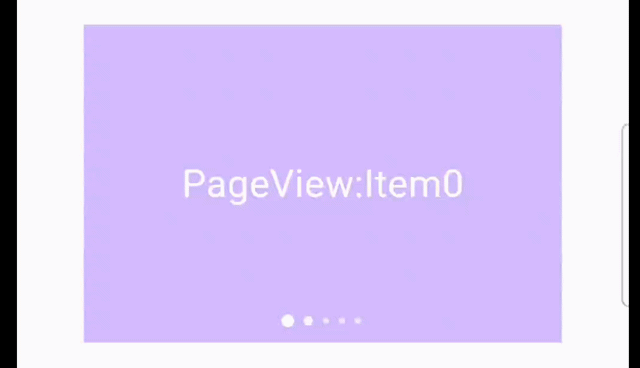
结合 PageView 使用
class _PageViewExampleState extends State<PageViewExample> {
  EasyDotIndicatorController indicatorController = EasyDotIndicatorController();

  [@override](/user/override)
  Widget build(BuildContext context) {
    return SizedBox(
      width: 300,
      height: 200,
      child: Stack(
        alignment: Alignment.center,
        children: <Widget>[
          Positioned.fill(
            child: PageView.builder(
              // itemBuilder: (_, index) => ...,
              itemCount: 10,
              onPageChanged: (index) {
                indicatorController.updateIndex(index);
              },
            ),
          ),
          Positioned(
            bottom: 10,
            child: EasyDotIndicator(
              visibleNum: 5, // 可见的点的数量
              count: 10, // 总共的点的数量
              controller: indicatorController, // 控制器
            ),
          ),
        ],
      ),
    );
  }
}
结合 CarouselSlider 使用
class _CarouselSliderExampleState extends State<CarouselSliderExample> {
  EasyDotIndicatorController indicatorController = EasyDotIndicatorController();

  [@override](/user/override)
  Widget build(BuildContext context) {
    return SizedBox(
      width: 300,
      height: 200,
      child: Stack(
        alignment: Alignment.center,
        children: <Widget>[
          Positioned.fill(
            child: CarouselSlider(
              items: List.generate(
                10,
                (index) => Container(
                  alignment: Alignment.center,
                  color: Colors.grey,
                  child: Text(
                    'CarouselSlider:Item$index',
                    style: const TextStyle(fontSize: 24, color: Colors.white),
                  ),
                ),
              ),
              options: CarouselOptions(
                viewportFraction: 1,
                onPageChanged: (index, _) {
                  indicatorController.updateIndex(index);
                },
              ),
            ),
          ),
          Positioned(
            bottom: 10,
            child: EasyDotIndicator(
                visibleNum: 5,
                count: 10,
                controller: indicatorController,
                ),
          ),
        ],
      ),
    );
  }
}
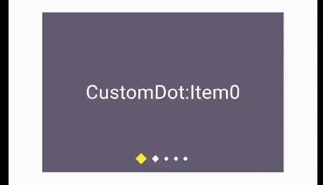
自定义点样式
class _CustomDotExampleState extends State<CustomDotExample> {
  EasyDotIndicatorController indicatorController = EasyDotIndicatorController();

  [@override](/user/override)
  Widget build(BuildContext context) {
    return SizedBox(
      width: 300,
      height: 200,
      child: Stack(
        alignment: Alignment.center,
        children: <Widget>[
          // ...
          Positioned(
            bottom: 10,
            child: EasyDotIndicator(
              visibleNum: 5,
              count: 10,
              controller: indicatorController,
              dotConfig: EasyDotIndicatorCustomConfig(
                big: _getDotStyle(Dot.big),
                middle: _getDotStyle(Dot.middle),
                small: _getDotStyle(Dot.small),
                animDuration: const Duration(milliseconds: 200),
                gap: 6,
                customDotBuilder: (anim, cur, pre) {
                  final preSize = _getDotStyle(pre).size;
                  final curSize = _getDotStyle(cur).size;
                  return CustomPaint(
                    painter: IndicatorCustomDotPainter(),
                    size: Size.lerp(preSize, curSize, anim.value)!,
                  );
                },
              ),
            ),
          ),
        ],
      ),
    );
  }

  DotStyle _getDotStyle(Dot dot) {
    return switch (dot) {
      Dot.big => const DotStyle(size: Size.square(12)),
      Dot.middle => const DotStyle(size: Size.square(9)),
      Dot.small => const DotStyle(size: Size.square(6)),
    };
  }
}

class IndicatorCustomDotPainter extends CustomPainter {
  [@override](/user/override)
  void paint(Canvas canvas, Size size) {
    Paint paint = Paint()
      ..color = Colors.white
      ..style = PaintingStyle.fill;

    Path path = Path();
    path.moveTo(size.width / 2, (size.height - size.width) / 2); // 顶部点
    path.lineTo(size.width, size.height / 2); // 右侧点
    path.lineTo(size.width / 2, (size.height + size.width) / 2); // 底部点
    path.lineTo(0, size.height / 2); // 左侧点
    path.close();

    canvas.drawPath(path, paint);
  }

  [@override](/user/override)
  bool shouldRepaint(covariant CustomPainter oldDelegate) {
    return false;
  }
}
更多关于Flutter点指示器插件easy_dot_indicator的使用的实战教程也可以访问 https://www.itying.com/category-92-b0.html
1 回复

更多关于Flutter点指示器插件easy_dot_indicator的使用的实战系列教程也可以访问 https://www.itying.com/category-92-b0.html
当然,以下是如何在Flutter中使用easy_dot_indicator插件的一个简单示例代码。这个插件通常用于分页指示器,比如在图片轮播组件中显示当前页的位置。
首先,确保你已经在pubspec.yaml文件中添加了easy_dot_indicator依赖:
dependencies:
  flutter:
    sdk: flutter
  easy_dot_indicator: ^x.x.x  # 请将x.x.x替换为最新版本号
然后,运行flutter pub get来安装依赖。
接下来是一个简单的使用示例,包括一个图片轮播组件和底部的点指示器:
import 'package:flutter/material.dart';
import 'package:carousel_slider/carousel_slider.dart';
import 'package:easy_dot_indicator/easy_dot_indicator.dart';

void main() {
  runApp(MyApp());
}

class MyApp extends StatelessWidget {
  @override
  Widget build(BuildContext context) {
    return MaterialApp(
      title: 'Flutter Demo',
      theme: ThemeData(
        primarySwatch: Colors.blue,
      ),
      home: MyHomePage(),
    );
  }
}

class MyHomePage extends StatefulWidget {
  @override
  _MyHomePageState createState() => _MyHomePageState();
}

class _MyHomePageState extends State<MyHomePage> with SingleTickerProviderStateMixin {
  final List<String> imgList = [
    'https://via.placeholder.com/600x300.png?text=Image+1',
    'https://via.placeholder.com/600x300.png?text=Image+2',
    'https://via.placeholder.com/600x300.png?text=Image+3',
  ];
  int _current = 0;

  @override
  Widget build(BuildContext context) {
    return Scaffold(
      appBar: AppBar(
        title: Text('Easy Dot Indicator Example'),
      ),
      body: Column(
        children: <Widget>[
          Expanded(
            child: CarouselSlider.builder(
              itemCount: imgList.length,
              itemBuilder: (BuildContext context, int index, int realIndex) {
                return Container(
                  child: Center(
                    child: Image.network(imgList[index]),
                  ),
                );
              },
              options: CarouselOptions(
                autoPlay: true,
                enlargeCenterPage: true,
                aspectRatio: 2.0,
                autoPlayInterval: Duration(seconds: 3),
                autoPlayAnimationDuration: Duration(milliseconds: 800),
                autoPlayCurve: Curves.fastOutSlowIn,
                pauseAutoPlayOnTouch: true,
              ),
              onPageChanged: (index, reason) {
                setState(() {
                  _current = index;
                });
              },
            ),
          ),
          SizedBox(height: 10.0),
          EasyDotIndicator(
            dotsCount: imgList.length,
            position: _current,
            decorator: DotDecorator(
              activeColor: Colors.blue,
              dotSize: 10.0,
              spacing: 5.0,
            ),
          ),
        ],
      ),
    );
  }
}
解释
-
依赖导入:
carousel_slider:用于图片轮播,你可以根据需要安装它。easy_dot_indicator:用于显示点指示器。
-
图片列表:
imgList:包含图片的URL列表。
-
CarouselSlider:
- 使用
CarouselSlider.builder构建图片轮播组件。 itemCount:图片总数。itemBuilder:构建每个图片项。options:轮播组件的配置,比如自动播放、中心页放大等。onPageChanged:当页面改变时的回调函数,用于更新当前选中点的位置。
- 使用
-
EasyDotIndicator:
dotsCount:点的总数。position:当前选中的点位置。decorator:点的样式配置,比如激活颜色、点的大小和间距。
这个示例展示了如何将easy_dot_indicator与carousel_slider结合使用,以实现一个简单的图片轮播组件,并在底部显示当前页的位置指示器。你可以根据需要进一步自定义样式和功能。