


Flutter插件bs_flutter的使用_bs_flutter是一个用于简化从HTML迁移到Dart创建Web界面的Flutter插件
Flutter插件bs_flutter的使用_bs_flutter是一个用于简化从HTML迁移到Dart创建Web界面的Flutter插件
bs_flutter 是一个用于简化从HTML迁移到Dart创建Web界面的Flutter插件。它包含了一些Bootstrap v5组件的简单实现,例如响应式网格布局。
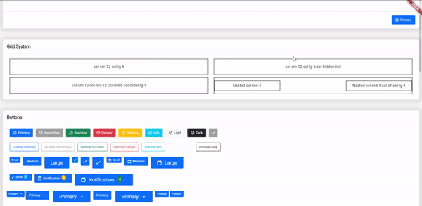
示例截图
可用组件
- ✅ 容器
- ✅ 按钮(包括按钮大小、前缀或后缀图标、徽章、下拉按钮)
- ✅ 模态框(包括不同大小和对齐方式)
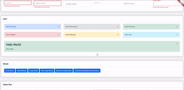
- ✅ 输入文本(包括验证器和错误信息)
- ✅ 警告框
- ✅ 卡片
- ✅ 数据表格(支持搜索、排序、分页和自定义样式)
- ✅ 选择框
- ❌ 复选框
- ❌ 单选按钮
工具
- ✅ 响应式网格系统(包括嵌套列、列排序、自定义间距、列偏移、响应式隐藏和显示)
- ❌ 多重验证
使用说明
获取开始
在 pubspec.yaml 文件中添加依赖:
dependencies:
  ...
  bs_flutter: any
响应式网格/网格系统
网格系统在创建Web应用程序时非常重要,特别是在创建响应式布局方面。该插件帮助解决这个问题。
要创建响应式布局,必须使用 BsRow 和 BsCol 组件。
BsRow(
  gutter: EdgeInsets.only(left: 10.0, right: 10.0, top: 5.0, bottom: 5.0),
  children: <BsCol>[
    // 添加列
  ]
);
创建行容器:
BsRow(
  // ...
  children: <BsCol>[
    BsCol(
      decoration: BoxDecoration(
        border: Border.all(color: Colors.black),
      ),
      padding: EdgeInsets.all(20.0),
      sizes: ColScreen(sm: Col.col_12, lg: Col.col_6),
      child: Center(child: Text('col-sm-12 col-lg-6')),
    ),
    BsCol(
      decoration: BoxDecoration(
        border: Border.all(color: Colors.black),
      ),
      visibility: BsVisibility.hiddenMd,
      padding: EdgeInsets.all(20.0),
      sizes: ColScreen(sm: Col.col_12, lg: Col.col_6),
      child: Center(child: Text('col-sm-12 col-lg-6 col-hidden-md')),
    ),
    BsCol(
      decoration: BoxDecoration(border: Border.all(color: Colors.black)),
      padding: EdgeInsets.all(20.0),
      sizes: ColScreen(sm: Col.col_12, md: Col.col_12, lg: Col.col_6),
      order: ColOrder(md: 1),
      child: Center(child: Text('col-sm-12 col-md-12 col-md-6 col-order-lg-1')),
    ),
    BsCol(
      decoration: BoxDecoration(border: Border.all(color: Colors.black)),
      padding: EdgeInsets.only(top: 10.0, bottom: 10.0),
      sizes: ColScreen(md: Col.col_6),
      child: BsRow(
        children: [
          BsCol(
            decoration: BoxDecoration(
              color: Colors.white,
              border: Border.all(color: Colors.black),
            ),
            padding: EdgeInsets.all(10.0),
            sizes: ColScreen(md: Col.col_4),
            child: Center(child: Text('Nested col-md-4')),
          ),
          BsCol(
            decoration: BoxDecoration(
              color: Colors.white,
              border: Border.all(color: Colors.black),
            ),
            padding: EdgeInsets.all(10.0),
            sizes: ColScreen(md: Col.col_4),
            offset: ColScreen(lg: Col.col_4),
            child: Center(child: Text('Nested col-md-4 col-offset-lg-4')),
          ),
        ],
      ),
    ),
  ]
  // ...
)
注意:
sizes属性在BsCol中默认值为Col.col_12或 100% 的屏幕宽度。- 如果需要排列列,可以使用
order属性并设置BsScreen类型的值。 - 如果需要定制列的偏移量,可以使用
offset属性并设置BsScreen类型的值。 BsVisibility.hiddenMd将在最大屏幕尺寸为中等或小于 768px 时隐藏小部件,在此之上显示。
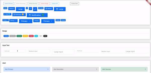
Bootstrap Flutter 按钮
示例文件:example_buttons.dart
我们有 15 种按钮样式和 3 种按钮大小,但你可以通过 BsButtonSize 创建自定义大小,并通过 BsButtonStyle 创建自定义样式。
static const BsButtonStyle primary = BsButtonStyle(
  color: Colors.white,
  borderColor: BsColor.primary,
  backgroundColor: BsColor.primary,
  borderRadius: BorderRadius.all(Radius.circular(3.0))
);
static const BsButtonSize btnIconSm = BsButtonSize(
  iconSize: 12.0,
  padding: EdgeInsets.only(left: 10.0, right: 10.0, top: 10.0, bottom: 10.0),
  minimumSize: Size(30.0, 30.0),
);
创建按钮:
BsButton(
  margin: EdgeInsets.only(right: 10.0, bottom: 10.0),
  onPressed: () {},
  style: BsButtonStyle.primary,
  size: BsButtonSize.btnIconMd,
  prefixIcon: Icons.check,
),
创建徽章:
BsBadge(
  style: BsBadgeStyle.primary,
  size: BsBadgeSize.rounded,
  child: Text('Primary'),
),
默认下拉按钮:
BsDropdownButton(
  margin: EdgeInsets.only(right: 5.0),
  toggleMenu: (_) => BsButton(
    onPressed: () => _.toggle(),
    style: BsButtonStyle.primary,
    suffixIcon: Icons.arrow_drop_down,
    label: Text('Primary'),
  ),
  dropdownMenu: BsDropdownMenu(
    children: [
      BsDropdownHeader(child: Text('Dropdown Header')),
      BsDropdownItem(child: Text('Action')),
      BsDropdownItem(child: Text('Another Action')),
      BsDropdownItem(child: Text('Something else here')),
      BsDropdownItem(child: Text('Separate link')),
    ],
  ),
)
配置最大/最小宽度和高度:
BsDropdownButton(
  // ...
  dropdownMenuSize: BsDropdownMenuSize(
    minWidth: 150,
    maxWidth: 300,
    minHeight: 150,
    maxHeight: 300
  ),
  // ...
)
如果要将下拉菜单放在按钮的左侧或右侧,可以使用 dropdownDirection 属性。
BsDropdownButton(
  // ...
  dropdownDirection: Axis.horizontal,
  // ...
),
如果要自定义下拉菜单的样式,可以使用 dropdownMenuStyle 属性。
BsDropdownButton(
  // ...
  dropdownMenuStyle: BsDropdownMenuStyle(
    backgroundColor: Colors.red,
    boxShadow: [
      BoxShadow(
        color: Color(0xffd9d9d9),
        spreadRadius: 2.0,
        blurRadius: 5.0
      )
    ]
  ),
  // ...
),
可以将下拉项设置为 active 或 disabled。如果需要自定义 active 或 disabled 样式,可以使用 activeStyle、activeTextStyle、disabledStyle 和 disabledTextStyle 属性。
BsDropdownButton(
  // ...
  dropdownMenu: BsDropdownMenu(
    children: [
      BsDropdownItem(
        child: Text('Action'),
        active: true,
        activeStyle: ButtonStyle(),
        activeTextStyle: TextStyle(),
      ),
      BsDropdownItem(
        child: Text('Another Action'),
        disabled: true,
        disabledStyle: ButtonStyle(),
        disabledTextStyle: TextStyle(),
      ),
      BsDropdownItem(child: Text('Something else here')),
      BsDropdownDivider(),
      BsDropdownItem(child: Text('Separate link')),
    ],
  )
  // ...
),
Bootstrap Flutter 输入文本
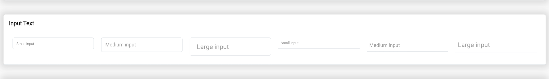
创建小型带边框输入框:
BsInput(
  size: BsInputSize.sm,
  hintText: 'Small input',
  controller: TextEditingController(),
  validators: [
    BsValidator.required
  ],
),
创建小型带底部边框输入框:
BsInput(
  style: BsInputStyle.outlineBottom,
  size: BsInputSize.outlineBottomSm,
  hintTextLabel: 'Small input',
  controller: TextEditingController(),
),
BsValidator 是自定义验证器,你可以通过 BsValidator 创建自己的验证器。
static BsValidator get required => BsValidator(
  validator: (value) {
    String valueValidate = value.toString().trim();
    if(valueValidate.isEmpty) return "Field tidak boleh kosong";

    return null;
  },
);
validator 属性将在表单验证时调用。
Bootstrap Flutter 警告框
示例文件:example_alert.dart
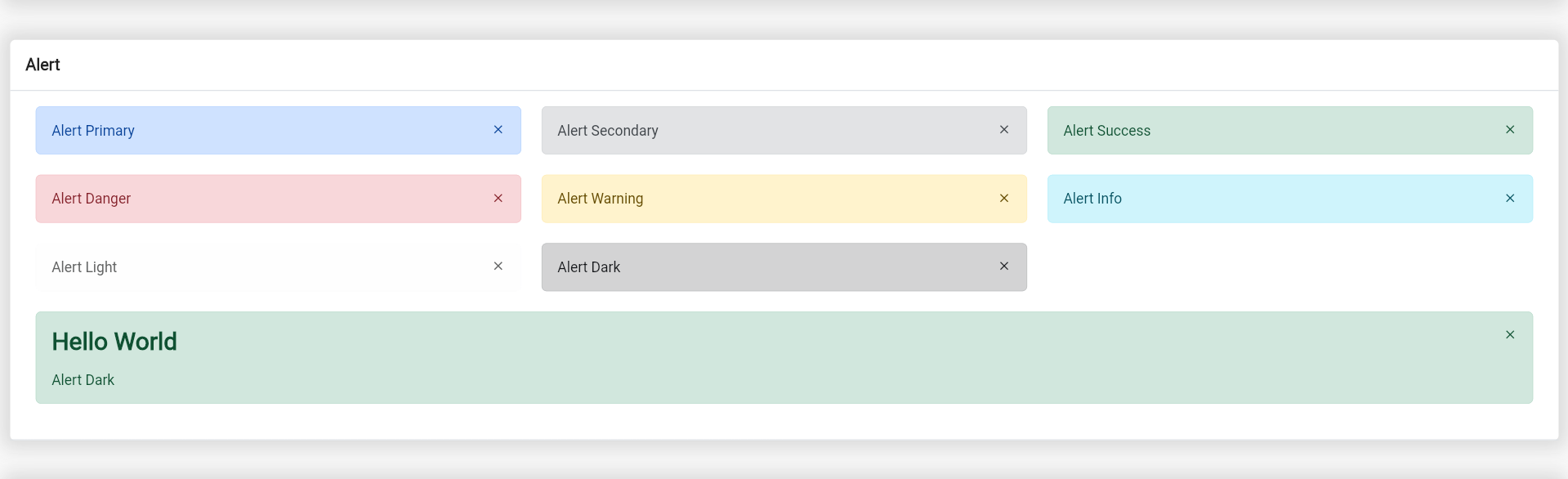
创建成功警告框:
BsAlert(
  closeButton: true,
  margin: EdgeInsets.only(bottom: 10.0),
  child: Text('Alert Primary'),
),
创建带有标题的警告框:
BsAlert(
  closeButton: true,
  margin: EdgeInsets.only(bottom: 10.0),
  style: BsAlertStyle.success,
  heading: Text('Hello World'),
  child: Column(
    crossAxisAlignment: CrossAxisAlignment.start,
    children: [
      Text('Alert Dark'),
    ],
  ),
)
可以使用 BsAlertStyle 创建自定义警告框样式,使用 BsAlertColor 设置警告框颜色。
static const BsAlertColor primary = BsAlertColor(
  color: Color(0xff084298),
  backgroundColor: Color(0xffcfe2ff),
  borderColor: Color(0xffb6d4fe),
);
static const BsAlertStyle primary = BsAlertStyle(
  color: BsAlertColor.primary,
  borderRadius: BorderRadius.all(Radius.circular(5.0)),
);
Bootstrap Flutter 模态框
示例文件:example_modal.dart
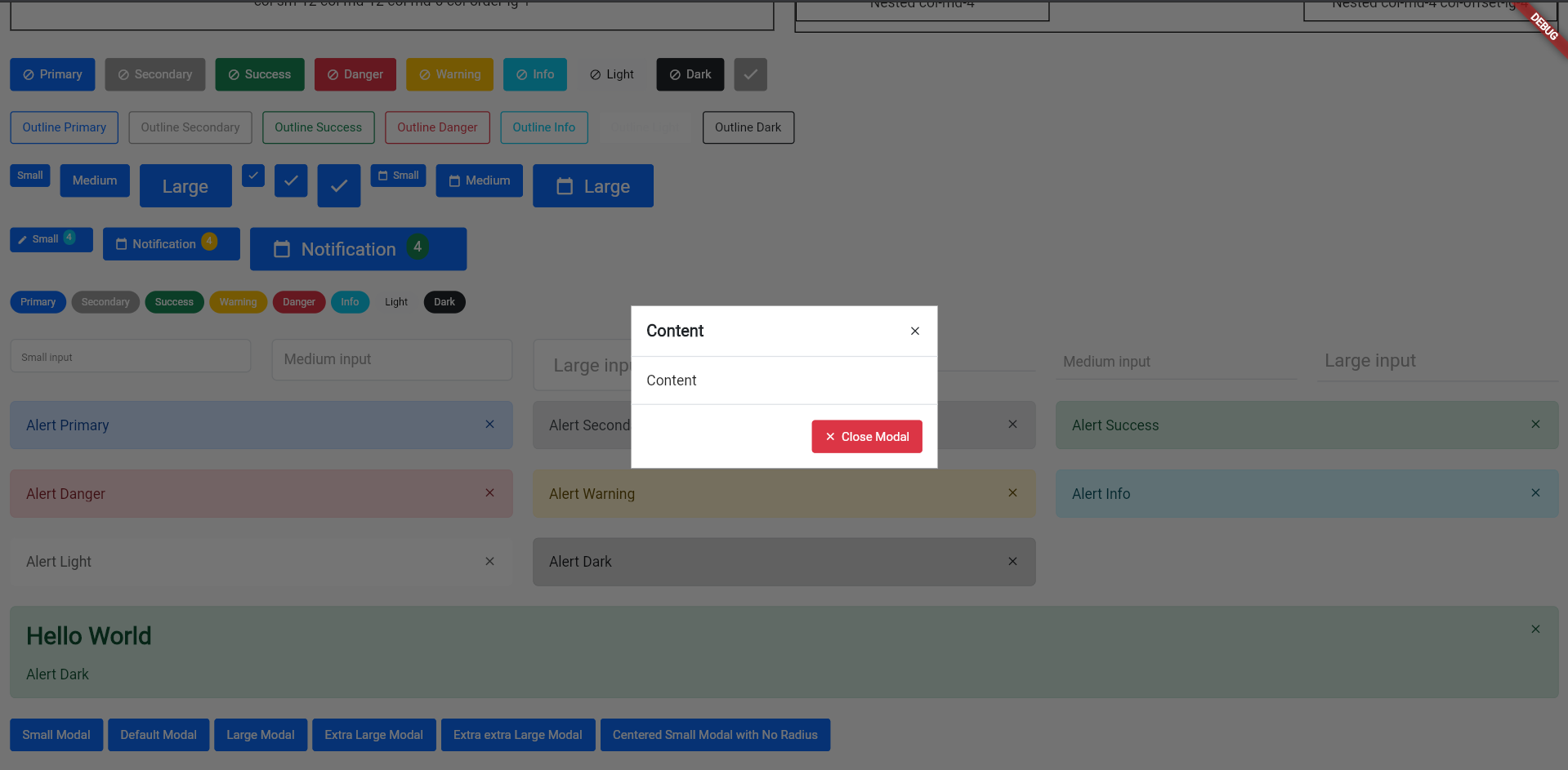
模态框将通过 showDialog 显示,因为 BsModal 是 Dialog 小部件。
BsButton(
  style: BsButtonStyle.primary,
  margin: EdgeInsets.only(right: 5.0, bottom: 10.0),
  label: Text('Centered Small Modal with No Radius'),
  onPressed: () => showDialog(context: context, builder: (context) => BsModal(
    context: context,
    dialog: BsModalDialog(
      size: BsModalSize.sm,
      crossAxisAlignment: CrossAxisAlignment.center,
      child: BsModalContent(
        decoration: BoxDecoration(
          color: Colors.white,
        ),
        children: [
          BsModalContainer(title: Text('Content'), closeButton: true),
          BsModalContainer(
            child: Column(
                children: [
                  Text('Content')
                ]
            ),
          ),
          BsModalContainer(
            crossAxisAlignment: CrossAxisAlignment.end,
            actions: [
              BsButton(
                style: BsButtonStyle.danger,
                label: Text('Close Modal'),
                prefixIcon: Icons.close,
                onPressed: () {
                  Navigator.pop(context);
                },
              )
            ],
          )
        ],
      ),
    ),
  )),
)
注意:
BsModalDialog是背景布局。BsModalContent是模态框的内容。BsModalContainer是BsModalContent的子元素。- 更改
size属性以改变模态框的大小。 BsModalContainer可以用作模态框头部、主体和尾部。- 若要使
BsModalContent居中,可以在BsModalDialog属性中修改crossAxisAlignment。
Bootstrap Flutter 卡片
示例文件:example_card.dart
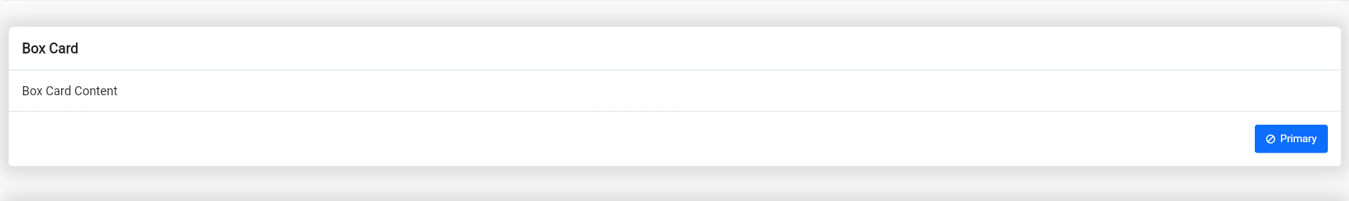
创建卡片:
BsCard(
  children: [
    BsCardContainer(title: Text('Box Card')),
    BsCardContainer(child: Container(
      child: Text('Box Card Content'),
    )),
    BsCardContainer(actions: [
      BsButton(
        onPressed: () {},
        style: BsButtonStyle.primary,
        prefixIcon: Icons.block,
        label: Text('Primary'),
      )
    ])
  ],
)
注意:
- 若要自定义卡片样式,可以使用
BsCardContainerStyle或BsCardStyle。
Bootstrap Flutter 选择框
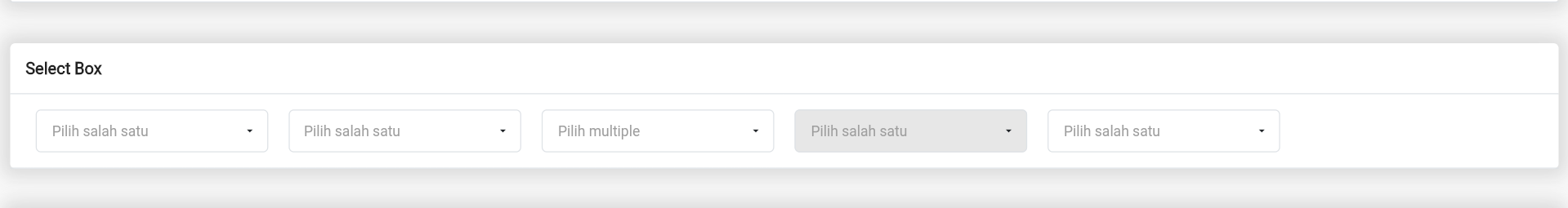
创建选择框需要导入:
import 'package:bs_flutter_selectbox/bs_flutter_selectbox.dart';
创建控制器:
BsSelectBoxController _select1 = BsSelectBoxController(
  options: [
    BsSelectBoxOption(value: 1, text: Text('1')),
    BsSelectBoxOption(value: 2, text: Text('2')),
    BsSelectBoxOption(value: 3, text: Text('3')),
  ]
);
复制以下代码:
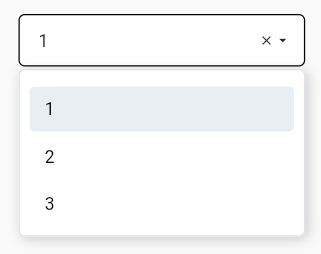
BsSelectBox(
  hintText: 'Pilih salah satu',
  selectBoxController: _select1,
),
如果需要自定义大小和样式,可以使用 style 和 size 属性。可以通过 BsSelectBoxSize 或 BsSelectBoxStyle 类创建自定义大小。
static const BsSelectBoxSize customSize = BsSelectBoxSize(
  fontSize: 14.0,
  optionFontSize: 14.0,
  searchInputFontSize: 14.0,
  labelX: 15.0,
  labelY: 13.0,
  transitionLabelX: -15.0,
  transitionLabelY: 5.0,
  padding: EdgeInsets.only(left: 15.0, right: 15.0, top: 12.0, bottom: 12.0)
);
static const BsSelectBoxStyle outline = BsSelectBoxStyle(
  borderRadius: BorderRadius.all(Radius.circular(5.0))
);
注意:
labelX和labelY用于设置使用hintTextLabel时的标签位置。transitionLabelX和transitionLabelY用于设置使用hintTextLabel且已选择值时的标签位置。BsSelectBoxStyle具有borderRadius、color、placeholderColor、selectedBackgroundColor、selectedColor、disabledBackgroundColor、backgroundColor、borderColor、fontSize、arrowIcon等属性。
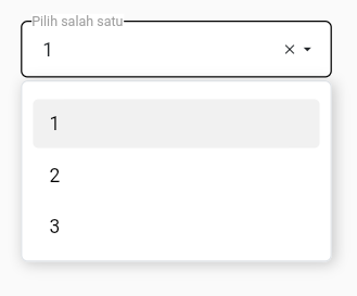
使用 hintTextLabel 的选择框:
BsSelectBox(
  hintTextLabel: 'Pilih salah satu',
  selectBoxController: _select1,
),
要创建允许多选的选择框,可以将 multiple 属性设置为 true:
BsSelectBoxController _select2 = BsSelectBoxController(
  multiple: true,
  options: [
    BsSelectBoxOption(value: 1, text: Text('1')),
    BsSelectBoxOption(value: 2, text: Text('2')),
    BsSelectBoxOption(value: 3, text: Text('3')),
    BsSelectBoxOption(value: 4, text: Text('4')),
    BsSelectBoxOption(value: 5, text: Text('5')),
    BsSelectBoxOption(value: 6, text: Text('6')),
  ]
);
注意:
- 要获取所选项,可以使用
getSelected或getSelectedAll。 - 如果需要返回字符串形式的结果,可以使用
getSelectedAsString,它将以逗号分隔的字符串形式返回结果。 - 要设置所选项,可以使用
setSelected或setSelectedAll。
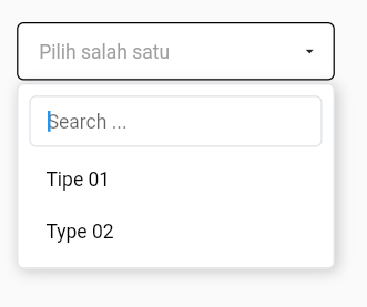
创建服务器端数据的选择框:
BsSelectBox(
  hintText: 'Pilih salah satu',
  searchable: true,
  selectBoxController: _select3,
  serverSide: selectApi,
)
注意:
- 要启用可搜索选项,可以将
searchable属性设置为true。 serverSide属性需要返回Future<BsSelectBoxResponse>。
selectApi 函数:
Future<BsSelectBoxResponse> selectApi(Map<String, String> params) async {
  Uri url = Uri.http('localhost', 'api-json.php', params);
  Response response = await http.get(url);
  if(response.statusCode == 200) {
    List json = convert.jsonDecode(response.body);
    return BsSelectBoxResponse.createFromJson(json);
  }

  return BsSelectBoxResponse(options: []);
}
JSON 响应数据:
[
  {
    "value":"1",
    "text":"Tipe 01",
    "typecd":"TP01"
  },
  {
    "value":"2",
    "text":"Type 02",
    "typecd":"TP02"
  }
]
注意:
createFromJson自动将响应数据中的value放入,但你可以通过定义手动更改它。- 如果你想将
typecd作为选项的value,可以使用createFromJson的value参数。
if(response.statusCode == 200) {
  List json = convert.jsonDecode(response.body);
  return BsSelectBoxResponse.createFromJson(json,
    value: (data) => data['typecd'],
  );
}
- 如果你想将
typecd作为选项的text,可以使用createFromJson的renderText参数。 renderText函数需要返回Widget。
if(response.statusCode == 200) {
  List json = convert.jsonDecode(response.body);
  return BsSelectBoxResponse.createFromJson(json,
    value: (data) => data['typecd'],
    renderText: (data) => Text(data['typecd'])
  );
}
服务器端数据表格(与数据表格响应)
示例文件:main.dart
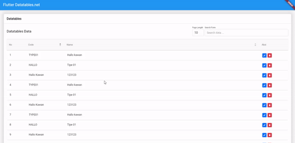
创建数据源:
class ExampleSource extends BsDatatableSource {
static List<BsDataColumn> get columns => <BsDataColumn>[
BsDataColumn(label: Text('No'), orderable: false, searchable: false, width: 100.0),
BsDataColumn(label: Text('Code'), columnName: 'typecd', width: 200.0),
BsDataColumn(label: Text('Name'), columnName: 'typenm'),
];
[@override](/user/override)
BsDataRow getRow(int index) {
return BsDataRow(index: index, cells: <BsDataCell>[
BsDataCell(Text('${controller.start + index + 1}')),
BsDataCell(Text('${response.data[index]['typecd']}')),
BsDataCell(Text('${response.data[index]['typenm']}')),
]);
}
}
创建行事件监听器,必须在数据源中定义监听器:
class ExampleSource extends BsDatatableSource {
ValueChanged<dynamic> onEditListener = (value) {};
ValueChanged<dynamic> onDeleteListener = (value) {};
[@override](/user/override)
BsDataRow getRow(int index) {
return BsDataRow(index: index, cells: <BsDataCell>[
// ...
BsDataCell(Row(
children: [
TextButton(
onPressed: () => onEditListener(response.data[index]['typeid']),
child: Container(child: Text('Edit'))
),
TextButton(
onPressed: () => onDeleteListener(response.data[index]['typeid']),
child: Container(child: Text('Edit'))
)
],
))
// ...
]);
}
}
处理这些监听器,可以在请求数据成功后设置:
Future loadApi(Map<String, dynamic> params) {
  return http.post(
    // ..
  ).then((value) {
    // ...
    setState(() {
      // ...
      _source.onEditListener = (typeid) {
        /// Do edit
      };
      _source.onDeleteListener = (typeid) {
        /// Do delete
      };
    });
  });
}
声明数据源和控制器数据表格:
class _MyAppState extends State<MyApp> {

  ExampleSource _source = ExampleSource();

  [@override](/user/override)
  void initState() {
    _source.controller = BsDatatableController();
    super.initState();
  }

  // ...
}
创建表格视图:
BsDatatable(
  source: _source,
  title: Text('Datatables Data'),
  columns: ExampleSource.columns,
  serverSide: loadApi,
)
服务器端函数以获取数据表格响应:
Future loadApi(Map<String, dynamic> params) {
  return http.post(
    Uri.parse('http://localhost/flutter_crud/api/public/types/datatables'),
    body: params,
  ).then((value) {
    Map<String, dynamic> json = jsonDecode(value.body);
    setState(() {
      _source.response = BsDatatableResponse.createFromJson(json['data']);
      _source.onEditListener = (typeid) {
        /// Do edit
      };
      _source.onDeleteListener = (typeid) {
        /// Do delete
      };
    });
  });
}
注意:
- 请求服务器数据成功后,需要更新数据源的
response数据。
Future loadApi(Map<String, dynamic> params) {
  return http.post(
    // ...
  ).then((value) {
    // ...
    setState(() {
      /// 更新数据源响应数据
      _source.response = BsDatatableResponse.createFromJson(json['data']);
      // ...
    });
  });
}
要重新加载数据,可以使用 reload 函数:
_source.controller.reload();
如果想从列表变量显示数据,可以在构造函数中添加 data:
class ExampleSource extends BsDatatableSource {

  ExampleSource({
    List? data,
  }) : super(data: data);

  // ...
}
现在你可以在你的小部件中设置列表变量:
class Datatables extends StatefulWidget {
  [@override](/user/override)
  _DatatablesState createState() => _DatatablesState();
}

class _DatatablesState extends State<Datatables> {

  ExampleSource _source1 = ExampleSource(
    data: [
      {'typecd': 'TP1', 'typenm': 'Type 1'},
      {'typecd': 'TP2', 'typenm': 'Type 2'},
      {'typecd': 'TP3', 'typenm': 'Type 3'},
      {'typecd': 'TP4', 'typenm': 'Type 4'},
      {'typecd': 'TP5', 'typenm': 'Type 5'},
    ]
  );

  // ...

}
如果想从按钮或其他地方动态添加数据,可以调用 add 或 addAll 方法。如果想更新数据,可以调用 put 方法;如果想删除数据,可以调用 remove 或 removeAt 方法。
TextButton(
  onPressed: () {
    _source1.add({'typecd': 'TP1', 'typenm': 'Type ${_source1.datas.length}'});
  },
  child: Text('Add Row'),
)
完整示例
import 'package:bs_flutter/bs_flutter.dart';
import 'package:bs_flutter_example/example_alert.dart';
import 'package:bs_flutter_example/example_badge.dart';
import 'package:bs_flutter_example/example_buttons.dart';
import 'package:bs_flutter_example/example_card.dart';
import 'package:bs_flutter_example/example_datatables.dart';
import 'package:bs_flutter_example/example_grid.dart';
import 'package:bs_flutter_example/example_inputtext.dart';
import 'package:bs_flutter_example/example_modal.dart';
import 'package:bs_flutter_example/example_selectbox.dart';
import 'package:flutter/material.dart';

void main() {
  runApp(MyApp());
}

class MyApp extends StatefulWidget {
  [@override](/user/override)
  _MyAppState createState() => _MyAppState();
}

class _MyAppState extends State<MyApp> {
  [@override](/user/override)
  void initState() {
    super.initState();
  }

  [@override](/user/override)
  Widget build(BuildContext context) {
    return MaterialApp(
      home: GestureDetector(
        onTap: () {
          SelectBoxOverlay.removeAll();
          OverlayDropdownButton.removeAll();
        },
        child: Scaffold(
          body: Scrollbar(
              child: SingleChildScrollView(
            child: Column(
              children: [
                BsNavbar(
                  margin: EdgeInsets.only(bottom: 20.0),
                  brand: BsNavBrand(
                    onPressed: () {},
                    child: Container(
                      child: Text('Brand'),
                    ),
                  ),
                ),
                ExampleCard(),
                ExampleGrid(),
                ExampleButtons(),
                ExampleBadge(),
                ExampleInputText(),
                ExampleAlert(),
                ExampleModal(),
                ExampleSelectBox(),
                ExampleDatatables(),
              ],
            ),
          )),
        ),
      ),
    );
  }
}
更多关于Flutter插件bs_flutter的使用_bs_flutter是一个用于简化从HTML迁移到Dart创建Web界面的Flutter插件的实战教程也可以访问 https://www.itying.com/category-92-b0.html

更多关于Flutter插件bs_flutter的使用_bs_flutter是一个用于简化从HTML迁移到Dart创建Web界面的Flutter插件的实战系列教程也可以访问 https://www.itying.com/category-92-b0.html
在探索和使用Flutter的未知功能插件,如bs_flutter时,重要的是先查阅官方文档或源代码来理解其功能和用法。由于bs_flutter并非一个广为人知的插件(可能是一个特定团队或个人开发的插件),我无法提供确切的官方文档链接,但我可以展示一个如何集成和使用Flutter插件的一般过程,并给出一个假设性的代码示例来展示可能的用法。
步骤 1: 添加依赖
首先,你需要在pubspec.yaml文件中添加bs_flutter插件的依赖。请注意,这里的依赖名和版本号是假设的,你需要根据实际情况替换。
dependencies:
  flutter:
    sdk: flutter
  bs_flutter: ^1.0.0  # 假设的版本号
然后运行flutter pub get来安装依赖。
步骤 2: 导入插件
在你的Dart文件中导入bs_flutter插件。
import 'package:bs_flutter/bs_flutter.dart';
步骤 3: 使用插件功能
由于bs_flutter的具体功能未知,我将提供一个假设性的使用案例。假设bs_flutter提供了一个用于显示自定义对话框的组件。
import 'package:flutter/material.dart';
import 'package:bs_flutter/bs_flutter.dart';  // 导入插件

void main() {
  runApp(MyApp());
}

class MyApp extends StatelessWidget {
  @override
  Widget build(BuildContext context) {
    return MaterialApp(
      title: 'Flutter Demo',
      theme: ThemeData(
        primarySwatch: Colors.blue,
      ),
      home: MyHomePage(),
    );
  }
}

class MyHomePage extends StatefulWidget {
  @override
  _MyHomePageState createState() => _MyHomePageState();
}

class _MyHomePageState extends State<MyHomePage> {
  void _showCustomDialog() {
    // 假设bs_flutter提供了一个名为BsDialog的组件
    showDialog(
      context: context,
      builder: (BuildContext context) {
        return BsDialog(
          title: Text('自定义对话框'),
          content: Text('这是bs_flutter插件提供的一个自定义对话框。'),
          actions: <Widget>[
            FlatButton(
              child: Text('取消'),
              onPressed: () {
                Navigator.of(context).pop();
              },
            ),
            FlatButton(
              child: Text('确定'),
              onPressed: () {
                // 处理确定按钮点击事件
                Navigator.of(context).pop();
              },
            ),
          ],
        );
      },
    );
  }

  @override
  Widget build(BuildContext context) {
    return Scaffold(
      appBar: AppBar(
        title: Text('探索bs_flutter插件'),
      ),
      body: Center(
        child: ElevatedButton(
          onPressed: _showCustomDialog,
          child: Text('显示自定义对话框'),
        ),
      ),
    );
  }
}
注意事项
- 查阅文档:务必查阅
bs_flutter的官方文档或源代码,了解其具体功能和用法。 - 版本兼容性:确保
bs_flutter插件与你的Flutter SDK版本兼容。 - 错误处理:在实际开发中,添加适当的错误处理逻辑,以处理插件可能引发的异常。
由于bs_flutter的具体实现和功能未知,上述代码仅作为假设性示例。在实际使用中,你需要根据插件的实际文档和API进行调整。