


Flutter数学运算插件division的使用
Flutter数学运算插件division的使用
分割(Division)

简单易用且功能强大的样式小部件,语法灵感来自CSS。
请查看styled_widget,它是Division的替代品!
Flutter小部件设计时通常会将样式和结构结合在一起。此包试图将样式与结构分离,从而使得代码更易于阅读。该包的另一个强项在于动画的简便性。
⚠️ 如果您遇到问题或有任何反馈,认为可以改进Division,请在此处打开一个issue。
构建使用Division的应用
| 应用设计师 | 代码 |
|---|---|
| App designer | Code |
| Code |
|  |
|  |
|
入门指南
这是Division包含的两个主要小部件:
Parent(
  child: Widget,
  style: ParentStyle,
  gesture: Gestures,
);
Txt(
  String,
  style: TxtStyle,
  gesture: Gestures,
);
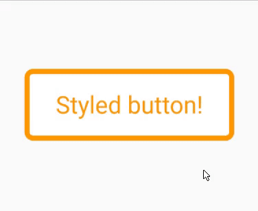
基本示例
导入
import 'package:division/division.dart';
代码
bool pressed = false;

final buttonStyle = (pressed) => TxtStyle()
  ..alignment.center()
  ..background.color(pressed ? Colors.orange : Colors.white)
  ..textColor(pressed ? Colors.white : Colors.orange)
  ..borderRadius(all: 5)
  ..border(all: 3, color: Colors.orange)
  ..padding(vertical: 10, horizontal: 15)
  ..ripple(true)
  ..animate(150, Curves.easeOut);

Gestures buttonGestures() =>
    Gestures()..isTap((isPressed) => setState(() => pressed = isPressed));

@override
Widget build(BuildContext context) {
  return Txt(
    'Styled button!',
    style: buttonStyle(pressed),
    gesture: buttonGestures(),
  );
}
结果
文档
所有当前和未来的Division小部件共享一个共同的基础样式。
核心样式方法
动画
..animate([int duration, Curve curve = Curves.linear])
这是一个强大的样式方法。每当样式属性发生变化时,小部件将在两种状态之间进行动画(前提是样式属性兼容动画)。
duration 单位为毫秒。
对齐方式
..alignment.[alignment] // alignment.topCenter()
小部件的对齐方式。
内容对齐方式
..alignmentContent.[alignment] // alignment.topCenter()
子元素的对齐方式。
内边距
..padding({double all,
      double horizontal,
      double vertical,
      double top,
      double bottom,
      double left,
      double right})
所有属性协同工作。padding(all: 10, top: 30) 相当于 padding(top: 30, bottom: 10, left: 10, right: 10)。
外边距
..margin({double all,
      double horizontal,
      double vertical,
      double top,
      double bottom,
      double left,
      double right})
所有属性协同工作。margin(all: 10, top: 30) 相当于 margin(top: 30, bottom: 10, left: 10, right: 10)。
背景颜色
..background.color(Color)
..background.hex(xxxxxx)
..background.rgba(int, int, int, [double])
color 格式选项:hex(’#xxxxxx’)、rgba(int, int, int, double) 或 [Color]。
背景图像
..background.image(
      {String url,
      String path,
      ColorFilter colorFilter,
      ImageProvider<dynamic> imageProveder,
      BoxFit fit,
      AlignmentGeometry alignment = Alignment.center,
      ImageRepeat repeat = ImageRepeat.noRepeat})
要么指定 [url] 或 [path]。
[url] 用于网络图片,[path] 用于本地图片。
背景模糊
..background.blur(double blur)
模糊背景。例如,实现“磨砂玻璃”效果:
StyleClass()
  ..background.blur(10)
  ..background.rgba(255,255,255,0.15)
不能与 rotate() 一起使用。
背景混合模式
..background.blendMode(BlendMode blendMode)
背景混合算法。
线性渐变
..linearGradient({AlignmentGeometry begin = Alignment.left,
      AlignmentGeometry end = Alignment.right,
      @required List<Color> colors,
      TileMode tileMode = TileMode.clamp,
      List<double> stops})
径向渐变
..radialGradient(
    {AlignmentGeometry center = Alignment.center,
    @required double radius,
    @required List<Color> colors,
    TileMode tileMode = TileMode.clamp,
    List<double> stops})
扫描渐变
..sweepGradient(
    {AlignmentGeometry center = Alignment.center,
    double startAngle = 0.0,
    @required double endAngle,
    @required List<Color> colors,
    TileMode tileMode = TileMode.clamp,
    List<double> stops})
在样式小部件构造函数中,指定您想要使用的角度计算格式。
不透明度
..opacity(double opacity)
应用于整个小部件的不透明度。
值必须非负。
边框
..border(
      {double all,
      double left,
      double right,
      double top,
      double bottom,
      Color color = const Color(0xFF000000),
      BorderStyle style = BorderStyle.solid})
选择 all、left、right、top 和 bottom 中的一个。all 可以与其他属性一起使用。
color 格式选项:hex(’#xxxxxx’)、rgb(int, int, int)、rgba(int, int, int, double) 或 [Color]。
圆角
..borderRadius(
      {double all,
      double topLeft,
      double topRight,
      double bottomLeft,
      double bottomRight})
可以使用 all 与单边属性一起使用。单边属性优先于 all 属性。
还可以参见 [circle] 创建圆形小部件。
圆形
..circle([bool enable = true])
使小部件成为圆形。
阴影
..boxShadow(
      {Color color = const Color(0x33000000),
      double blur = 0.0,
      Offset offset = Offset.zero,
      double spread = 0.0})
参见 [elevation] 使用不同的方式定义阴影。
抬高
..elevation(
      double elevation,
      {double angle = 0.0,
      Color color = const Color(0x33000000),
      double opacity = 1.0})
抬升小部件并添加阴影。
opacity 是相对常量。
缩放
..scale(double ratio)
缩放小部件。
偏移
..offset([double dx, double dy])
偏移小部件。
旋转
..rotate(double angle)
旋转小部件。
默认情况下,一圈等于值 1.0。要改为弧度:StyleClass(useRadians: true)。
水波纹效果
..ripple(bool enable, {dynamic splashColor, dynamic highlightColor})
材料水波纹效果应用于点击。
溢出
..overflow.visible({Axis direction = Axis.vertical})
..overflow.scrollable({Axis direction = Axis.vertical})
..overflow.hidden()
更改子元素溢出行为。
使用 [direction] 参数选择溢出方向。
宽度、最小宽度、最大宽度、高度、最小高度、最大高度
..[type](double dimension)
Parent
Parent(
  style: ParentStyle,
  gesture: Gestures,
  child: Widget
)
顾名思义,这个小部件是一个简单的带有样式的容器,它接受一个子元素。
ParentStyle
// 格式
ParentStyle()
  ..[style method]

// 示例
ParentStyle()
  ..width(100)
  ..padding(all: 10)
  ..elevation(5)
添加
..add(ParentStyle parentStyle, {bool override = false})
组合两个样式小部件的样式。
克隆
..ParentStyle().clone()
这将克隆 ParentStyle 小部件。这在您想在不修改初始样式的情况下为小部件添加更多样式时非常有用。
Txt
Txt(
  String,
  style: TxtStyle,
  gesture: Gestures,
)
顾名思义,这个小部件是一个简单的带有样式的容器,它接受一个 String 作为其子元素。
此小部件通过 TxtStyle 小部件启用文本样式。它还具有使其可编辑的可能性。
TxtStyle
// 格式
TxtStyle()
  ..[style method]

// 示例
TxtStyle()
  ..width(100)
  ..padding(all: 10)
  ..textColor(Colors.blue)
  ..bold()
可编辑
..editable(bool enable,
      {TextInputType keyboardType,
      String placeholder,
      bool obscureText = false,
      int maxLines,
      void Function(String) onChange,
      void Function(bool focus) onFocusChange,
      void Function(TextSelection, SelectionChangedCause) onSelectionChanged,
      void Function() onEditingComplete,
      FocusNode focusNode})
这使得小部件可编辑,就像一个 TextField,只是更容易样式化。
文本对齐
..textAlign.center()
字体粗细
..fontWeight(FontWeight fontWeight)
一种使文本加粗的简便方法:
..bold([bool enable])
斜体
..italic([bool enable])
字体族
..fontFamily(String font, {List<String> fontFamilyFallback})
文本颜色
..textColor(Color textColor)
最大行数
..maxLines(int maxLines)
字母间距
..letterSpacing(double space)
词间距
..wordSpacing(double space)
文本装饰
..textDecoration(TextDecoration decoration)
文本阴影
..textShadow({Color color = const Color(0x33000000),
    double blur = 0.0,
    Offset offset = Offset.zero})
文本抬高
..textElevation(double elevation,
    {double angle = 0.0,
    Color color = const Color(0x33000000),
    double opacity = 1.0})
添加
..add(TxtStyle txtStyle, {bool override = false})
这将两个 TxtStyle 合并。override 属性指定是否应覆盖已定义的属性。
克隆
..TxtStyle().clone()
这将克隆 TxtStyle 小部件。这在您想在不修改初始样式的情况下为小部件添加更多样式时非常有用。
Gestures
isTap
..isTap((isTapped) => setState(() => pressed = isTapped))
每当小部件上的点击状态发生变化时调用。
这取代了 onTapDown、onTapUp 和 onTapCancel 的联合使用。
其他
..onTap()
..onTapUp()
..onTapCancel()
..onDoubleTap()
..onTapDown()
..onLongPress()
..onLongPressStart()
..onLongPressEnd()
..onLongPressMoveUpdate()
..onLongPressUp()
..onVerticalDragStart()
..onVerticalDragEnd()
..onVerticalDragDown()
..onVerticalDragCancel()
..onVerticalDragUpdate()
..onHorizontalDragStart()
..onHorizontalDragEnd()
..onHorizontalDragCancel()
..onHorizontalDragUpdate()
..onHorizontalDragDown()
..onForcePressStart()
..onForcePressEnd()
..onForcePressPeak()
..onForcePressUpdate()
..onPanStart()
..onPanEnd()
..onPanCancel()
..onPanDown()
..onPanUpdate()
..onScaleStart()
..onScaleEnd()
..onScaleUpdate()
示例和最佳实践
解耦样式与结构
final ParentStyle cardStyle = ParentStyle()
  ..height(175)
  ..padding(horizontal: 20.0, vertical: 10)
  ..alignment.center()
  ..background.hex('#3977FF')
  ..borderRadius(all: 20.0)
  ..elevation(10, color: hex('#3977FF'));

Widget build(BuildContext context) {
  return Parent(
    style: cardStyle,
    child: Widget,
  );
}
变量依赖样式
final Color color = Colors.blue;

final cardStyle = (color) => ParentStyle()
  ..height(175)
  ..padding(horizontal: 20.0, vertical: 10)
  ..alignment.center()
  ..background.color(color)
  ..borderRadius(all: 20.0)
  ..elevation(10, color: color);

Widget build(BuildContext context) {
  return Parent(
    style: cardStyle(color),
    child: Widget,
  );
}
动画小部件
bool pressed = false;

final cardStyle = (pressed) => ParentStyle()
  ..height(175)
  ..padding(horizontal: 20.0, vertical: 10)
  ..alignment.center()
  ..borderRadius(all: 20.0)
  ..animate(200, Curves.easeOut)
  ..background.color(pressed ? Colors.white : Colors.black)
  ..elevation(pressed ? 10 : 20);

Widget build(BuildContext context) {
  return Parent(
    style: cardStyle(pressed),
    gesture: Gestures()
      ..isTap((isPressed) => setState(() => pressed = isPressed)),
    child: Widget,
  );
}
或者
更多关于Flutter数学运算插件division的使用的实战教程也可以访问 https://www.itying.com/category-92-b0.html

更多关于Flutter数学运算插件division的使用的实战系列教程也可以访问 https://www.itying.com/category-92-b0.html
当然,下面是一个关于如何在Flutter中使用division插件(假设你指的是进行除法运算的功能,因为Flutter本身并没有一个名为division的官方插件,但我们可以展示如何在Flutter中进行除法运算)的示例代码。
在Flutter中,进行数学运算(包括除法)通常不需要额外的插件,因为Dart语言本身就提供了完整的数学运算支持。以下是一个简单的Flutter应用示例,它展示了如何进行除法运算并在界面上显示结果。
1. 创建Flutter项目
首先,确保你已经安装了Flutter SDK,然后创建一个新的Flutter项目:
flutter create math_operations
cd math_operations
2. 修改main.dart文件
打开lib/main.dart文件,并替换其内容为以下代码:
import 'package:flutter/material.dart';

void main() {
  runApp(MyApp());
}

class MyApp extends StatelessWidget {
  @override
  Widget build(BuildContext context) {
    return MaterialApp(
      title: 'Flutter Division Example',
      theme: ThemeData(
        primarySwatch: Colors.blue,
      ),
      home: DivisionPage(),
    );
  }
}

class DivisionPage extends StatefulWidget {
  @override
  _DivisionPageState createState() => _DivisionPageState();
}

class _DivisionPageState extends State<DivisionPage> {
  final TextEditingController _num1Controller = TextEditingController();
  final TextEditingController _num2Controller = TextEditingController();
  String _result = '';

  void _performDivision() {
    setState(() {
      double num1 = double.tryParse(_num1Controller.text) ?? 0.0;
      double num2 = double.tryParse(_num2Controller.text) ?? 0.0;
      if (num2 == 0.0) {
        _result = 'Error: Division by zero is not allowed.';
      } else {
        _result = '${num1} / ${num2} = ${num1 / num2}';
      }
    });
  }

  @override
  Widget build(BuildContext context) {
    return Scaffold(
      appBar: AppBar(
        title: Text('Division Example'),
      ),
      body: Padding(
        padding: const EdgeInsets.all(16.0),
        child: Column(
          crossAxisAlignment: CrossAxisAlignment.start,
          children: <Widget>[
            TextField(
              controller: _num1Controller,
              decoration: InputDecoration(labelText: 'Number 1'),
              keyboardType: TextInputType.number,
            ),
            SizedBox(height: 16.0),
            TextField(
              controller: _num2Controller,
              decoration: InputDecoration(labelText: 'Number 2'),
              keyboardType: TextInputType.number,
            ),
            SizedBox(height: 16.0),
            ElevatedButton(
              onPressed: _performDivision,
              child: Text('Divide'),
            ),
            SizedBox(height: 16.0),
            Text(
              _result,
              style: TextStyle(fontSize: 20.0),
            ),
          ],
        ),
      ),
    );
  }

  @override
  void dispose() {
    _num1Controller.dispose();
    _num2Controller.dispose();
    super.dispose();
  }
}
3. 运行应用
在终端中运行以下命令来启动Flutter应用:
flutter run
代码解释
MyApp类是应用的根组件,它设置了应用的主题并指定了主页为DivisionPage。DivisionPage是一个有状态的组件,它包含两个TextField用于输入两个数字,以及一个ElevatedButton用于触发除法运算。_performDivision方法解析两个TextField中的文本为double类型,执行除法运算,并更新结果字符串_result。如果第二个数字为零,则显示错误信息。- 界面使用
Column布局,包含输入字段、按钮和结果显示文本。
这个示例展示了如何在Flutter应用中处理用户输入、执行数学运算,并在UI中显示结果。希望这对你有所帮助!