


Flutter可自定义卡片滑动插件customizable_cards_slider的使用
Flutter可自定义卡片滑动插件customizable_cards_slider的使用
自定义滑块
CustomizableSlider 是一个功能齐全的画廊滑块小部件。它包括背景颜色渐变和可自定义按钮及动画。
开始使用
在你的 Flutter 项目的 pubspec.yaml 文件中添加以下依赖:
dependencies:
  customizable_cards_slider: ^1.0.0
然后导入该包:
import 'package:customizable_cards_slider/customizable_cards_slider.dart';
使用示例
基本滑块
pages 参数接受一个包含要显示页面的小部件列表。在这个例子中,我们将使用基本的文本小部件:
CustomizableSlider(
  pages: const [Text("Page 0"), Text("Page 1"), Text("Page 2"), Text("Page 3"), Text("Page 4")],
)
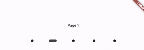
滑块会调整大小以填充父级小部件并居中显示页面小部件。默认背景是透明的。
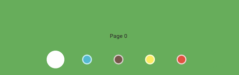
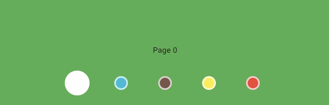
背景颜色
为了实现平滑的背景颜色渐变,你可以通过 backgroundColors 参数提供一个 Color 列表。pages 的长度应该与 backgroundColors 的长度匹配:
CustomizableSlider(
  pages: const [Text("Page 0"), Text("Page 1"), Text("Page 2"), Text("Page 3"), Text("Page 4")],
  backgroundColors: [
    Colors.green,
    Colors.cyan,
    Colors.brown,
    Colors.yellow,
    Colors.red,
  ]
)

自定义按钮动画
你可以通过 buttonBuilder 函数为滑块提供自定义按钮。这是一个强大的方式来定制滑块的按钮。该函数应在动画期间被调用,并且可以访问一些滑块的状态参数。
anim: 一个范围从 0 到 1 的双精度浮点数。当当前显示的页面与按钮的索引相同时,该值为 1。即使页面只是在过渡过程中经过,该值也会改变,因此可以用于创建漂亮的波浪动画。backgroundColors: 按钮的背景颜色,如在小部件中定义的。如果没有提供背景颜色,则backgroundColors将是一个透明颜色的列表。index: 当前按钮的索引。currPage: 当前显示的页面。
示例
在这个示例中,我们使用 anim 参数来调整按钮的大小和颜色。我们还使用 backgroundColors 参数来给按钮上色:
CustomizableSlider(
  pages: const [Text("Page 0"), Text("Page 1"), Text("Page 2"), Text("Page 3"), Text("Page 4")],
  backgroundColors: const [
    Colors.green,
    Colors.cyan,
    Colors.brown,
    Colors.yellow,
    Colors.red,
  ],
  buttonBuilder: (anim, backgroundColors, index, currPage) {
    return Container(
      width: 80,
      height: 80,
      color: Colors.transparent,
      child: Center(
        child: Container(
          width: 25 + 20 * anim,
          height: 25 + 20 * anim,
          decoration: BoxDecoration(
            shape: BoxShape.circle,
            color: Color.lerp(backgroundColors[index], Colors.white, anim),
            border: Border.all(color: const Color.fromARGB(186, 255, 255, 255), width: 3),
          ),
        ),
      ),
    );
  },
)
结果:
如果我们不希望大小动画影响所有按钮,我们可以使用 index 和 currPage 来实现所需的效果:
buttonBuilder: (anim, backgroundColors, index, currPage) {
  return Container(
    width: 80,
    height: 80,
    color: Colors.transparent,
    child: Center(
      child: Container(
        width: 25 + (currPage == index ? 20 * anim : 0),
        height: 25 + (currPage == index ? 20 * anim : 0),
        decoration: BoxDecoration(
          shape: BoxShape.circle,
          color: Color.lerp(backgroundColors[index], Colors.white, anim),
          border: Border.all(color: const Color.fromARGB(186, 255, 255, 255), width: 3),
        ),
      ),
    ),
  );
}
结果:
在这个示例中,我们禁用了按钮大小动画,其中 index 不等于 currPage。颜色渐变保持不变,动画会通过所有按钮。
更多示例
在这个示例中,我们使用 anim 参数配合 Transform 小部件来旋转按钮。注意我们还给每个按钮添加了一个底部边距 140,以便将按钮放置在页面上方。
CustomizableSlider(
  backgroundColors: [
    Colors.yellow.shade900,
    Colors.yellow.shade800,
    Colors.yellow.shade700,
    Colors.yellow.shade600,
    Colors.yellow.shade500
  ],
  pages: const [Text("Page 0"), Text("Page 1"), Text("Page 2"), Text("Page 3"), Text("Page 4")],
  buttonBuilder: (anim, backgroundColors, index, currPage) => Container(
    width: 50,
    height: 50,
    color: Colors.transparent, // 注册点击事件
    margin: const EdgeInsets.fromLTRB(0, 0, 0, 140),
    child: Center(
      child: Transform.rotate(
        origin: const Offset(0, -10),
        angle: anim * pi / 4 - 2,
        child: Container(
          width: 10,
          height: 30,
          decoration: BoxDecoration(
            color: Colors.black87,
            borderRadius: BorderRadius.circular(10)
          ),
        ),
      ),
    ),
  ),
)
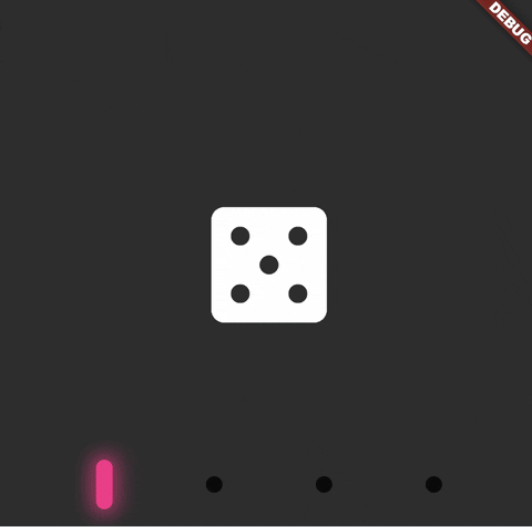
使用 buttonBuilder 可以让你发挥创意,这里是一个额外的例子:
SizedBox(
  height: 400,
  width: 600,
  child: CustomizableSlider(
    backgroundColors: const [
      Color.fromARGB(255, 45, 45, 45),
      Color.fromARGB(255, 74, 74, 74),
      Color.fromARGB(255, 84, 84, 84),
      Color.fromARGB(255, 123, 123, 123),
    ],
    pages: const [
      Icon(Icons.casino_rounded, color: Colors.white, size: 112),
      Icon(Icons.yard_rounded, color: Colors.white, size: 112),
      Icon(Icons.wine_bar, color: Colors.white, size: 112),
      Icon(Icons.whatshot_rounded, color: Colors.white, size: 112),
    ],
    buttonBuilder: (anim, backgroundColors, index, currPage) {
      late Color btnColor;

      switch (index) {
        case 0:
          btnColor = Color.fromARGB(255, 255, 35, 138);
          break;
        case 1:
          btnColor = Color.fromARGB(255, 105, 218, 255);
          break;
        case 2:
          btnColor = Color.fromARGB(255, 86, 255, 125);
          break;
        case 3:
          btnColor = Color.fromARGB(255, 244, 255, 86);
          break;
      }

      return Container(
        width: 80,
        height: 80,
        color: Colors.transparent, // 注册点击事件
        child: Center(
          child: Container(
            width: 12,
            height: 12 + anim * 24,
            transformAlignment: Alignment.center,
            decoration: BoxDecoration(
              color: Color.lerp(Color.fromARGB(199, 0, 0, 0), btnColor, anim),
              borderRadius: BorderRadius.circular(12),
              boxShadow: [
                BoxShadow(
                  color: btnColor.withAlpha((anim * 150).toInt()),
                  blurRadius: 10,
                  spreadRadius: anim * 5,
                ),
              ],
            ),
          ),
        ),
      );
    },
  ),
)
结果:
完整示例
以下是一个完整的示例代码,展示了如何使用 CustomizableSlider 创建不同样式的滑块。
import 'dart:math';
import 'dart:ui';

import 'package:customizable_cards_slider/customizable_cards_slider.dart';
import 'package:flutter/cupertino.dart';
import 'package:flutter/material.dart';

void main() {
  runApp(const MyApp());
}

class MyApp extends StatelessWidget {
  const MyApp({super.key});

  [@override](/user/override)
  Widget build(BuildContext context) {
    return const MaterialApp(
      title: 'Customizable Slider Example',
      home: MainPage(),
    );
  }
}

class MainPage extends StatelessWidget {
  const MainPage({super.key});

  [@override](/user/override)
  Widget build(BuildContext context) {
    return Scaffold(
      body: SingleChildScrollView(
        child: Column(
          children: [
            SizedBox(
              height: 200,
              child: CustomizableSlider(
                pages: pages,
              ),
            ),
            SizedBox(
              height: 200,
              child: CustomizableSlider(
                pages: pages,
                backgroundColors: const [
                  Colors.green,
                  Colors.cyan,
                  Colors.brown,
                  Colors.yellow,
                  Colors.red,
                ],
                buttonBuilder: (anim, backgroundColors, index, currPage) {
                  return Container(
                    width: 80,
                    height: 80,
                    color: Colors.transparent,
                    child: Center(
                      child: Container(
                        width: 25 + (currPage == index ? 20 * anim : 0),
                        height: 25 + (currPage == index ? 20 * anim : 0),
                        decoration: BoxDecoration(
                          shape: BoxShape.circle,
                          color: Color.lerp(backgroundColors[index], Colors.white, anim),
                          border: Border.all(color: const Color.fromARGB(186, 255, 255, 255), width: 3),
                        ),
                      ),
                    ),
                  );
                },
              ),
            ),
            SizedBox(
              height: 200,
              child: CustomizableSlider(
                backgroundColors: [
                  Colors.grey.shade600,
                  Colors.grey.shade500,
                  Colors.grey.shade400,
                  Colors.grey.shade300,
                ],
                pages: pages2,
                buttonBuilder: (anim, backgroundColors, index, currPage) =>
                    SizedBox(
                      width: 50,
                      height: 50,
                      child: Center(
                        child: Container(
                          width: 20,
                          height: 20 + anim * 20,
                          decoration: BoxDecoration(
                              border: Border.all(
                                width: index == currPage ? 5 : 3,
                                color: index == currPage
                                    ? const Color.fromARGB(221, 22, 22, 22)
                                    : const Color.fromARGB(96, 26, 26, 26),
                              ),
                              color: index == currPage ? Colors.white : Colors.grey.shade100,
                              borderRadius: BorderRadius.circular(10)),
                        ),
                      ),
                    ),
              ),
            ),
            SizedBox(
              height: 200,
              child: CustomizableSlider(
                backgroundColors: [
                  Colors.yellow.shade900,
                  Colors.yellow.shade800,
                  Colors.yellow.shade700,
                  Colors.yellow.shade600,
                  Colors.yellow.shade500
                ],
                pages: pages,
                buttonBuilder: (anim, backgroundColors, index, currPage) =>
                    Container(
                      width: 50,
                      height: 50,
                      color: Colors.transparent, // 注册点击事件
                      margin: const EdgeInsets.fromLTRB(0, 0, 0, 140),
                      child: Center(
                        child: Transform.rotate(
                          origin: const Offset(0, -10),
                          angle: anim * pi / 4 - 2,
                          child: Container(
                            width: 10,
                            height: 30,
                            decoration: BoxDecoration(color: Colors.black87, borderRadius: BorderRadius.circular(10)),
                          ),
                        ),
                      ),
                    ),
              ),
            ),
            SizedBox(
              height: 400,
              width: 600,
              child: CustomizableSlider(
                backgroundColors: const [
                  Color.fromARGB(255, 45, 45, 45),
                  Color.fromARGB(255, 74, 74, 74),
                  Color.fromARGB(255, 84, 84, 84),
                  Color.fromARGB(255, 123, 123, 123),
                ],
                pages: const [
                  Icon(Icons.casino_rounded, color: Colors.white, size: 112),
                  Icon(Icons.yard_rounded, color: Colors.white, size: 112),
                  Icon(Icons.wine_bar, color: Colors.white, size: 112),
                  Icon(Icons.whatshot_rounded, color: Colors.white, size: 112),
                ],
                buttonBuilder: (anim, backgroundColors, index, currPage) {
                  late Color btnColor;

                  switch (index) {
                    case 0:
                      btnColor = Color.fromARGB(255, 255, 35, 138);
                      break;
                    case 1:
                      btnColor = Color.fromARGB(255, 105, 218, 255);
                      break;
                    case 2:
                      btnColor = Color.fromARGB(255, 86, 255, 125);
                      break;
                    case 3:
                      btnColor = Color.fromARGB(255, 244, 255, 86);
                      break;
                  }
                  return Container(
                    width: 80,
                    height: 80,
                    color: Colors.transparent, // 注册点击事件
                    child: Center(
                      child: Container(
                        width: 12,
                        height: 12 + anim * 24,
                        transformAlignment: Alignment.center,
                        decoration: BoxDecoration(
                          color: Color.lerp(Color.fromARGB(199, 0, 0, 0), btnColor, anim),
                          borderRadius: BorderRadius.circular(12),
                          boxShadow: [
                            BoxShadow(
                                color: btnColor.withAlpha((anim * 150).toInt()),
                                blurRadius: 10,
                                spreadRadius: anim * 5),
                          ],
                        ),
                      ),
                    ),
                  );
                },
              ),
            ),
          ],
        ),
      ),
    );
  }
}

List<Widget> pages = const [Text("Page 0"), Text("Page 1"), Text("Page 2"), Text("Page 3"), Text("Page 4")];
List<Widget> pages2 = [
  Container(
    color: Colors.lightBlueAccent.shade400,
    child: const Center(
      child: Text("Full size widget"),
    ),
  ),
  const Icon(
    Icons.access_time_rounded,
    size: 50,
    color: Colors.white,
  ),
  const Icon(
    Icons.home_rounded,
    size: 50,
    color: Colors.white,
  ),
  MovingBall(),
];
List<Color> backgroundColors = [
  Colors.blueAccent,
  Colors.cyan.shade300,
  Colors.green,
  Colors.orange,
  Colors.red,
];
更多关于Flutter可自定义卡片滑动插件customizable_cards_slider的使用的实战教程也可以访问 https://www.itying.com/category-92-b0.html

更多关于Flutter可自定义卡片滑动插件customizable_cards_slider的使用的实战系列教程也可以访问 https://www.itying.com/category-92-b0.html
当然,以下是如何在Flutter项目中集成和使用customizable_cards_slider插件的示例代码。这个插件允许你创建自定义的卡片滑动效果。首先,你需要确保你的Flutter项目中已经添加了这个插件。
1. 添加依赖
在你的pubspec.yaml文件中添加以下依赖:
dependencies:
  flutter:
    sdk: flutter
  customizable_cards_slider: ^最新版本号  # 请替换为实际最新版本号
然后运行flutter pub get来安装依赖。
2. 导入插件
在你的Dart文件中导入插件:
import 'package:customizable_cards_slider/customizable_cards_slider.dart';
3. 使用插件
下面是一个完整的示例,展示如何使用customizable_cards_slider来创建一个自定义卡片滑动效果:
import 'package:flutter/material.dart';
import 'package:customizable_cards_slider/customizable_cards_slider.dart';

void main() {
  runApp(MyApp());
}

class MyApp extends StatelessWidget {
  @override
  Widget build(BuildContext context) {
    return MaterialApp(
      title: 'Customizable Cards Slider Demo',
      theme: ThemeData(
        primarySwatch: Colors.blue,
      ),
      home: MyHomePage(),
    );
  }
}

class MyHomePage extends StatefulWidget {
  @override
  _MyHomePageState createState() => _MyHomePageState();
}

class _MyHomePageState extends State<MyHomePage> {
  final List<String> cardTitles = [
    'Card 1',
    'Card 2',
    'Card 3',
    'Card 4',
  ];

  final List<String> cardImages = [
    'https://via.placeholder.com/350x150',
    'https://via.placeholder.com/350x150/FF0000',
    'https://via.placeholder.com/350x150/00FF00',
    'https://via.placeholder.com/350x150/0000FF',
  ];

  @override
  Widget build(BuildContext context) {
    return Scaffold(
      appBar: AppBar(
        title: Text('Customizable Cards Slider Demo'),
      ),
      body: Padding(
        padding: const EdgeInsets.all(16.0),
        child: CustomizableCardsSlider(
          cards: cardTitles.map((title, index) {
            return CustomizableCard(
              title: Text(title),
              image: Image.network(cardImages[index]),
              onTap: () {
                print('Card $title tapped');
              },
            );
          }).toList(),
          cardWidth: 300,
          cardHeight: 150,
          cardMargin: 16,
          cardElevation: 8,
          cardShadowColor: Colors.grey.withOpacity(0.5),
          cardBorderRadius: 16,
          indicatorColor: Colors.blue,
          indicatorSize: 6,
          indicatorActivePadding: 4,
          autoplay: true,
          autoplayDuration: 3000,
          autoplayCurve: Curves.easeInOutQuad,
          dotPosition: DotPosition.bottom,
          dotContainerPadding: 8,
          dotActiveColor: Colors.blue,
          dotInactiveColor: Colors.grey.withOpacity(0.5),
          dotActiveSize: 8,
          dotInactiveSize: 6,
        ),
      ),
    );
  }
}
解释
- 依赖导入:确保在
pubspec.yaml中添加了customizable_cards_slider依赖。 - 插件导入:在Dart文件中导入
customizable_cards_slider。 - 数据准备:准备了一些卡片标题和图片URL。
- 构建UI:
- 使用
CustomizableCardsSlider组件。 - 使用
map函数将标题和图片映射为CustomizableCard对象列表。 - 配置了卡片的宽度、高度、边距、阴影颜色、圆角半径等属性。
- 启用了自动播放功能,并设置了相关参数。
- 配置了点位指示器的位置、颜色、大小等属性。
- 使用
这样,你就可以在你的Flutter应用中集成并使用customizable_cards_slider插件来创建自定义的卡片滑动效果了。