


Flutter UI组件库插件flutter_ui_toolkit的使用
Flutter UI组件库插件flutter_ui_toolkit的使用
Flutter UI Toolkit 是一个预构建的常用小部件集合,用于创建应用。其中包括按钮、输入框、标题、对话框等基本组件。
该包中的小部件可以接收一个名为 as 的参数来携带样式。这种方式的优势在于我们无需每次创建新小部件时重复相同的样式。此外,该包还提供了原生外观的小部件,适用于希望根据平台展示正确外观的应用。
小部件
路线图
| 小部件 | 状态 |
|---|---|
| Modals | 进行中 |
示例
| iOS | Android |
|---|---|
 |
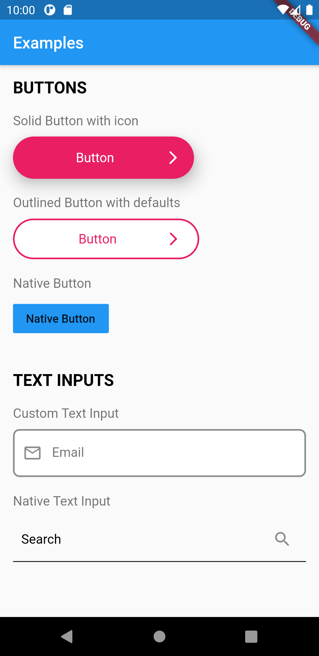 |
UIButton
此小部件提供了一个完全可定制的按钮。
你可以从以下三种类型的按钮中选择:
UIButton.solid(),
UIButton.outlined(),
UIButton.native(),
要为按钮创建默认样式,需要创建一个类型为 UIButtonDefaults 的类。
你可以在单独的目录中添加所有默认样式。
// styles/buttons.dart

final primaryButton = UIButtonDefaults(
  elevation: 10.0,
  borderRadius: 50.0,
  borderColor: Colors.purple,
  borderWidth: 2.0,
  labelColor: Colors.purple,
  bgColor: Colors.white,
  widthFactor: 0.5, // 设置按钮宽度
);
然后在应用程序的任何地方使用按钮。
import 'styles/buttons.dart';

// Outlined Button
UIButton.outlined(
    as: primaryButton,
    label: "Outlined Button",
    onPressed: () => print('Call API'),
),

// Solid Button
UIButton.solid(
    as: primaryButton,
    label: "Solid Button",
    onPressed: () => print('Call API'),
),

// Native Button
UIButton.native(
    label: "Button",
    onPressed: () => print('Call API'),
),
UIHeading
此小部件可用于创建自定义标题或文本内容。
要为标题创建默认样式,需要创建一个类型为 UIHeadingDefaults 的类。
你可以在单独的目录中添加所有默认样式。
// styles/headings.dart

final articleTitle = UIHeadingDefaults(
    heading: 2,
    color: Colors.pink,
    fontWeight: FontWeight.bold,
);

// 使用 Google Fonts 设置字体族并扩展样式
final articleTitleLato = UIHeadingDefaults(
    color: Colors.pink,
    style: GoogleFonts.lato(
      fontSize: 40.0,
    ),
);
然后在应用程序的任何地方使用标题。
import 'styles/headings.dart'

// 使用 articleTitle
UIHeading(
    as: articleTitle,
    text: 'Article Title',
),

// 使用 articleTitleLato
UIHeading(
    as: articleTitleLato,
    text: 'Big title using font Lato',
),
UIBottomSheet
当需要显示底部弹出窗口时,可以使用 UIBottomSheet。
如果需要底部弹出窗口浮起(四周有边距,类似于某些iOS底部弹出窗口),可以设置 floatted: true。
你还可以有一个 trailing 小部件,当 enableDrag 设置为 false 时,可以作为关闭按钮。
| 全宽 | 浮起 |
|---|---|
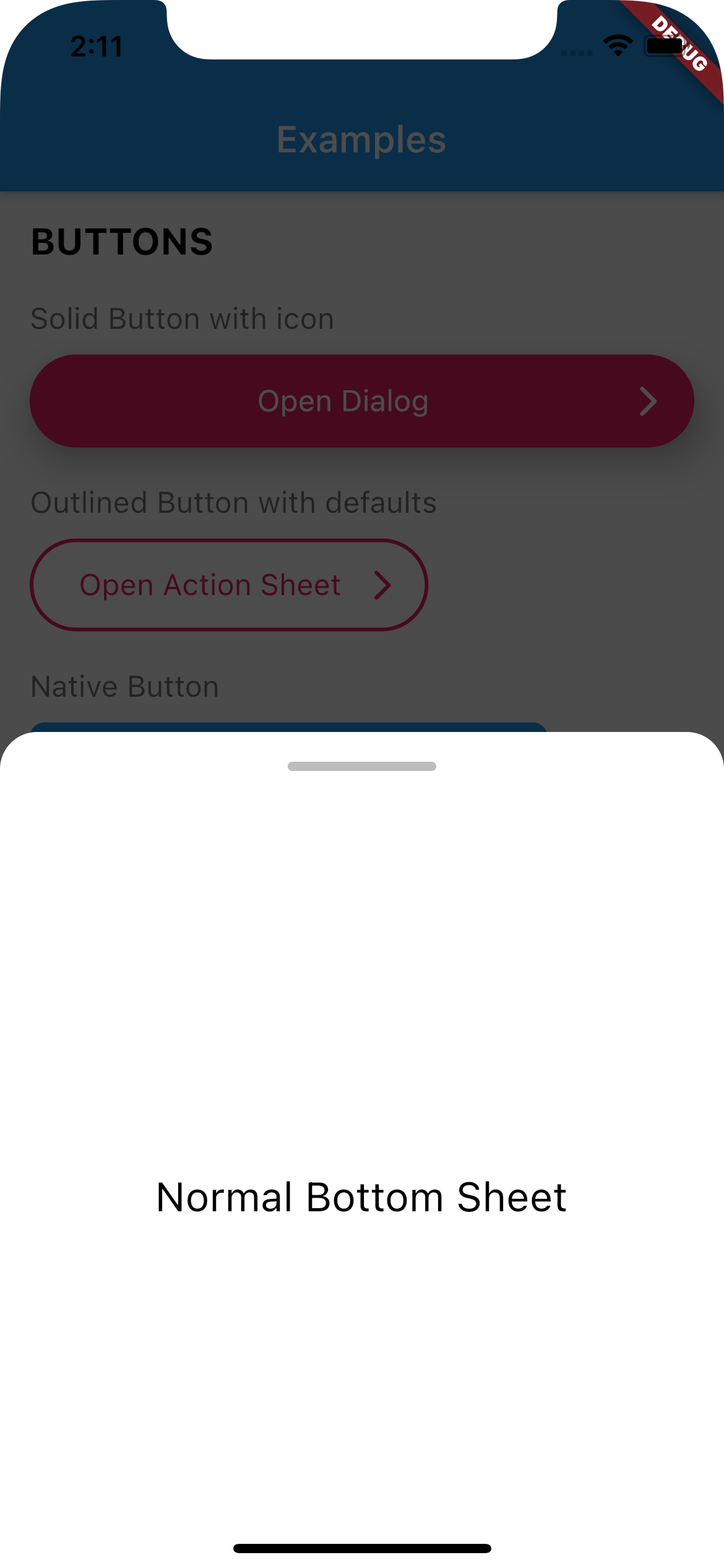 |
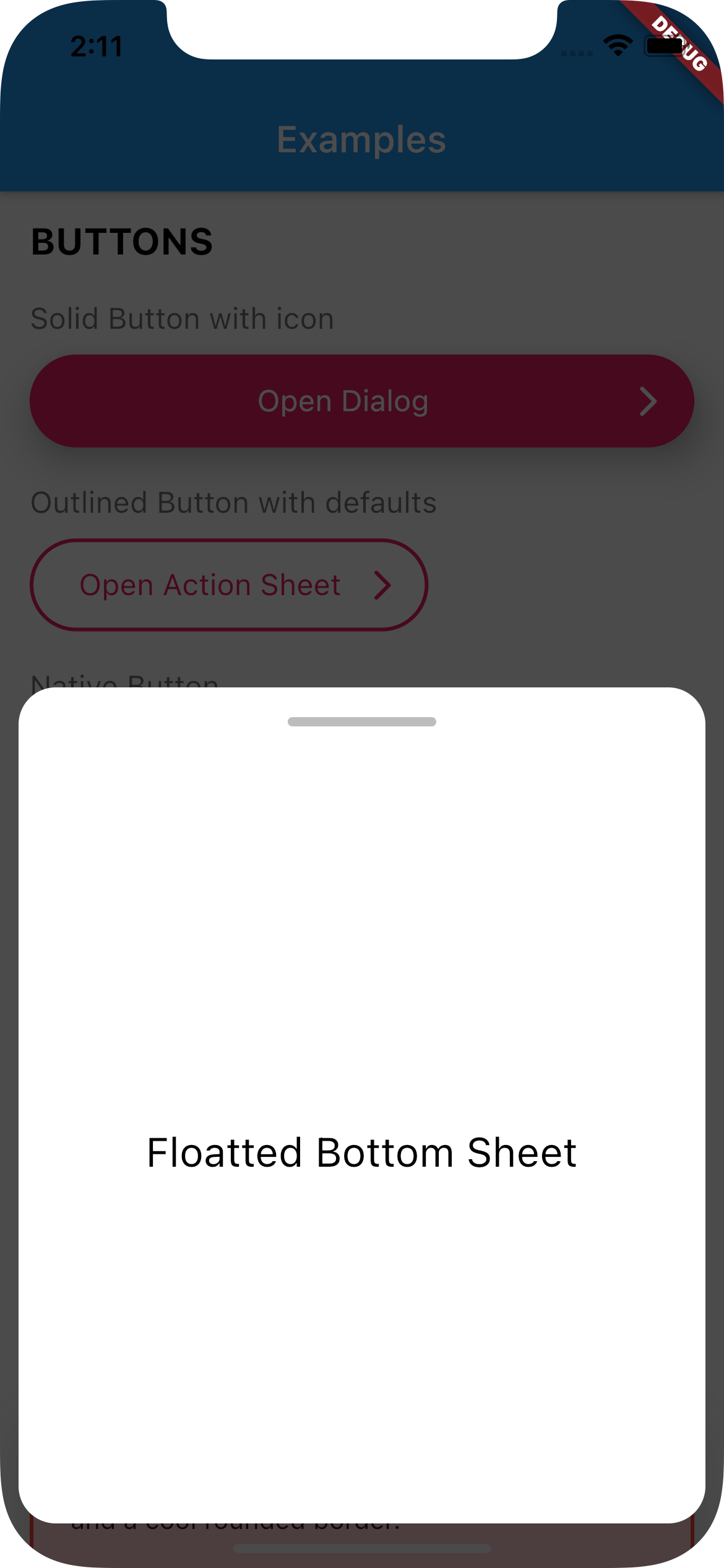 |
如何使用
创建一个调用 UIBottomSheet.show() 的函数。
在需要时调用该函数(例如:点击按钮时)。
// 设置底部弹出窗口

Future<void> _openBottomSheet(BuildContext context) async {
  await UIBottomSheet.show(
    context: context,
    floatted: true,
    hideHead: false,
    content: Container(
      alignment: Alignment.center,
      height: 400,
      child: UIHeading(
        heading: 3,
        text: 'Some cool content',
      ),
    ),
  );
}

// 打开底部弹出窗口

UIButton.native(
  label: 'Open Bottom Sheet',
  onPressed: () async {

    // 打开底部弹出窗口
    // 并等待其关闭
    await _openBottomSheet(context);

    // 继续执行
    print('Bottom sheet closed');
  },
),
UITextField
此小部件渲染一个输入文本字段。
你可以选择以下两种类型的文本字段之一:
UITextField(),
UITextField.native(),
要为文本字段创建默认样式,需要创建一个类型为 UITextFieldDefaults 的类。
你可以在单独的目录中添加所有默认样式。
// styles/inputs.dart

final primaryInput = UITextFieldDefaults(
  borderColor: Colors.black45,
  borderRadius: 8,
  borderType: UIBorderType.outlineBorder,
  borderWidth: 2.0,
  hintColor: Colors.black54,
  bgColor: Colors.white,
);
然后在应用程序的任何地方使用输入框。
import 'styles/inputs.dart'

UITextField(
    as: primaryInput,
    hint: 'Email',
),

// 原生文本字段
UITextField.native(
    hint: 'Email',
),
UIContainer
此小部件渲染一个可自定义的容器。
要为容器创建默认样式,需要创建一个类型为 UIContainerDefaults 的类。
你可以通过使用 widthFactor 参数来设置容器的大小。
你可以在单独的目录中添加所有默认样式。
// styles/containers.dart

final errorContainer = UIContainerDefaults(
  padding: EdgeInsets.all(20),
  borderRadius: 10,
  widthFactor: 1.0, // 使容器全宽
  borderColor: Colors.red,
  borderWidth: 2.0,
  color: Colors.red.shade100,
);
然后在应用程序的任何地方使用容器。
import 'styles/containers.dart';

// 显示带有错误样式的容器
UIContainer(
  as: errorContainer,
  child: Text('This is a box with a nice shadow\nand a cool rounded border.'),
),
UIActionSheet
此小部件创建一个原生操作表。
与该包中的其他类相比,UIActionSheet 更为冗长。但是你只需编写一次即可适用于所有平台。
如何使用
创建一个调用 UIActionSheet.show() 的函数。
动作需要是 UIAction 类型。
在需要时调用该函数(例如:点击按钮时)
// 创建一个原生操作表工厂

void _openActionSheet(BuildContext context) {
  UIActionSheet.show(
    context,

    /// 标题
    title: UIHeading(
      text: 'Select you favorite color',
      color: Colors.blue,
      textAlign: TextAlign.center,
      heading: 5,
    ),

    /// 内容
    content: Text('We will use the color on your profile.'),

    /// 动作
    actions: [
      UIAction(
        child: Text('Red'),
        onPressed: () => Navigator.of(context).pop(),
      ),
      UIAction(
        child: Text('Green'),
        onPressed: () => Navigator.of(context).pop(),
      ),
      UIAction(
        child: Text('Bue'),
        onPressed: () => Navigator.of(context).pop(),
      ),
      UIAction(
        child: Text('Pink'),
        onPressed: () => Navigator.of(context).pop(),
      ),
    ],

    /// 取消按钮
    cancel: UIAction(
      child: UIHeading(
        text: 'Cancel',
        color: Colors.red,
        heading: 4,
      ),
      onPressed: () => print('Cancel'),
    ),
  );
}

// 将基于当前操作系统打开操作表

UIButton.solid(
    as: solidButtonStyles,
    label: "Open Action SHeet",
    onPressed: () => _openActionSheet(context),
),
UIDialog
此小部件创建一个原生对话框。
与其他包中的类相比,UIDialog 更为冗长。但是你只需编写一次即可适用于所有平台。
如何使用
创建一个调用 UIDialog.show() 的函数。
动作需要是 UIAction 类型。
在需要时调用该函数(例如:点击按钮时)
// 创建一个原生对话框工厂

void _openDialog(BuildContext context) {
  UIDialog.show(
    context,

    /// 标题
    title: Text('Are you sure?'),

    /// 内容
    content: Text('You cannot reverse this action.'),

    /// 动作
    actions: [
      UIAction(
        child: Text('YES'),
        onPressed: () => print('YES'),
      ),
      UIAction(
        child: Text('NO'),
        onPressed: () => Navigator.of(context).pop(),
      ),
    ],
  );
}

// 将基于当前操作系统打开对话框

UIButton.solid(
    as: solidButtonStyles,
    label: "Open Dialog",
    onPressed: () => _openDialog(context),
),
更多关于Flutter UI组件库插件flutter_ui_toolkit的使用的实战教程也可以访问 https://www.itying.com/category-92-b0.html

更多关于Flutter UI组件库插件flutter_ui_toolkit的使用的实战系列教程也可以访问 https://www.itying.com/category-92-b0.html
当然,下面是一个关于如何在Flutter项目中使用flutter_ui_toolkit插件的示例代码。flutter_ui_toolkit是一个丰富的UI组件库,可以帮助开发者快速构建美观的用户界面。
首先,确保你已经在pubspec.yaml文件中添加了flutter_ui_toolkit依赖:
dependencies:
  flutter:
    sdk: flutter
  flutter_ui_toolkit: ^最新版本号  # 请替换为实际的最新版本号
然后运行flutter pub get来安装依赖。
接下来,下面是一个简单的示例,展示了如何使用flutter_ui_toolkit中的一些组件。
import 'package:flutter/material.dart';
import 'package:flutter_ui_toolkit/flutter_ui_toolkit.dart'; // 导入插件

void main() {
  runApp(MyApp());
}

class MyApp extends StatelessWidget {
  @override
  Widget build(BuildContext context) {
    return MaterialApp(
      title: 'Flutter UI Toolkit Demo',
      theme: ThemeData(
        primarySwatch: Colors.blue,
      ),
      home: HomeScreen(),
    );
  }
}

class HomeScreen extends StatelessWidget {
  @override
  Widget build(BuildContext context) {
    return Scaffold(
      appBar: AppBar(
        title: Text('Flutter UI Toolkit Demo'),
      ),
      body: Padding(
        padding: const EdgeInsets.all(16.0),
        child: Column(
          crossAxisAlignment: CrossAxisAlignment.start,
          children: <Widget>[
            // 使用UIToolkitButton
            UIToolkitButton(
              text: 'Click Me',
              color: Colors.blue,
              textColor: Colors.white,
              onPressed: () {
                ScaffoldMessenger.of(context).showSnackBar(
                  SnackBar(content: Text('Button Clicked!')),
                );
              },
            ),
            SizedBox(height: 20),

            // 使用UIToolkitTextField
            UIToolkitTextField(
              labelText: 'Enter your name',
              hintText: 'Name...',
              onChanged: (value) {
                print('Text Field Value: $value');
              },
            ),
            SizedBox(height: 20),

            // 使用UIToolkitCheckbox
            UIToolkitCheckbox(
              value: true,
              onChanged: (newValue) {
                print('Checkbox Value: $newValue');
              },
              label: Text('Accept Terms and Conditions'),
            ),
            SizedBox(height: 20),

            // 使用UIToolkitRadioGroup
            UIToolkitRadioGroup(
              label: Text('Choose an Option'),
              options: [
                UIToolkitRadioOption(value: 'Option 1', label: Text('Option 1')),
                UIToolkitRadioOption(value: 'Option 2', label: Text('Option 2')),
                UIToolkitRadioOption(value: 'Option 3', label: Text('Option 3')),
              ],
              onChanged: (newValue) {
                print('Selected Option: $newValue');
              },
            ),
            SizedBox(height: 20),

            // 使用UIToolkitCard
            UIToolkitCard(
              child: Column(
                children: <Widget>[
                  ListTile(
                    leading: Icon(Icons.person),
                    title: Text('User Profile'),
                    onTap: () {},
                  ),
                  ListTile(
                    leading: Icon(Icons.settings),
                    title: Text('Settings'),
                    onTap: () {},
                  ),
                ],
              ),
            ),
          ],
        ),
      ),
    );
  }
}
在这个示例中,我们展示了如何使用flutter_ui_toolkit中的几个组件,包括按钮(UIToolkitButton)、文本字段(UIToolkitTextField)、复选框(UIToolkitCheckbox)、单选按钮组(UIToolkitRadioGroup)和卡片(UIToolkitCard)。
请注意,flutter_ui_toolkit的具体组件和API可能会随着版本的更新而变化,因此建议查阅最新的官方文档以获取最准确的信息。