


HarmonyOS 鸿蒙Next 基于ArkUI及Stage模型,我开发图案密码锁+本地库图表组件
HarmonyOS 鸿蒙Next 基于ArkUI及Stage模型,我开发图案密码锁+本地库图表组件 前言: 通过此项目,可以学习到PatternLock图案密码锁组件,preferences首选项使用,如何创建三方库图表和使用。包含两个页面,一个是Login.ets,、一个是Index.ets,一个本地库图表组件。
开发环境: DevEco Studio 3.1 Canary1 构建版本:3.1.0.100,构建 November 3, 2022
效果演示:
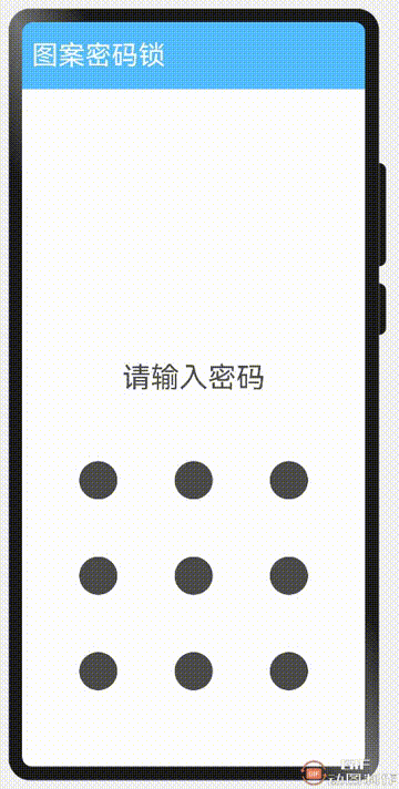
登录界面: 把数据管理->首选项,封装为一个公共类PerferencesUtil,代码如下:
import dataPreferences from '@ohos.data.preferences';
import {Logger} from '../utils/Logger';
const TAG = '[PreferencesUtil]';
const PREFERENCES_NAME = 'myPreferences';       // 首选项名字
const PASSWORD_KEY = 'appPatternLockPassword';  // 首选项Key字段
export class PreferencesUtil{
    createPatternLockPreferences(context) {
        globalThis.getPatternLockPreferences = (() => {
            let preferences: Promise<dataPreferences.Preferences> = dataPreferences.getPreferences(context, PREFERENCES_NAME);
            return preferences;
        });
    }
    async getPassword() {
        Logger.info(TAG, `get passworld start`)
        let password: string = 'null';
        const preferences = await globalThis.getPatternLockPreferences();
        password = await preferences.get(PASSWORD_KEY, password);
        return password;
        Logger.info(TAG, `get passworld start`)
    }
    async setPassword(passWorld: string) {
        Logger.info(TAG, `set passworld start`)
        globalThis.getPatternLockPreferences().then(async (preferences) => {
            await preferences.put(PASSWORD_KEY, passWorld);
            preferences.flush();
        }).catch((err) => {
            Logger.error(TAG, 'put the preferences failed, err: ' + err);
        });
        Logger.debug(TAG, `set password end`)
    }
}
export default new PreferencesUtil();
PatternLock 图案密码锁组件,以九宫格图案的方式输入密码,用于密码验证场景。手指在PatternLock组件区域按下时开始进入输入状态,手指离开屏幕时结束输入状态完成密码输入。
接口: PatternLock(controller?: PatternLockController)
参数:
| 参数名 | 参数类型 | 必填 | 描述 |
|---|---|---|---|
| controller | PatternLockController | 否 | 设置PatternLock组件控制器,可用于控制组件状态重置。 |
属性: 不支持除backgroundColor以外的通用属性设置。
| 名称 | 参数类型 | 描述 |
|---|---|---|
| sideLength | Length | 设置组件的宽度和高度(宽高相同)。设置为0或负数等非法值时组件不显示。 默认值:300vp |
| circleRadius | Length | 设置宫格中圆点的半径。 默认值:14vp |
| regularColor | ResourceColor | 设置宫格圆点在“未选中”状态的填充颜色。 默认值:Color.Black |
| selectedColor | ResourceColor | 设置宫格圆点在“选中”状态的填充颜色。 默认值:Color.Black |
| activeColor | ResourceColor | 设置宫格圆点在“激活”状态的填充颜色(“激活”状态为手指经过圆点但还未选中的状态)。 默认值:Color.Black |
| pathColor | ResourceColor | 设置连线的颜色。 默认值:Color.Blue |
| pathStrokeWidth | number | string | 设置连线的宽度。设置为0或负数等非法值时连线不显示。 默认值:34vp |
| autoReset | boolean | 设置在完成密码输入后再次在组件区域按下时是否重置组件状态。设置为true,完成密码输入后再次在组件区域按下时会重置组件状态(即清除之前输入的密码);反之若设置为false,则不会重置组件状态。 默认值:true |
事件: 除支持通用事件外,还支持以下事件:
| 名称 | 描述 |
|---|---|
| onPatternComplete(callback: (input: Array<number>) => void) | 密码输入结束时触发该回调。 input: 与选中宫格圆点顺序一致的数字数组,数字为选中宫格圆点的索引值(第一行圆点从左往右依次为0,1,2,第二行圆点依次为3,4,5,第三行圆点依次为6,7,8)。 |
PatternLockController PatternLock组件的控制器,可以通过它进行组件状态重置。
导入对象 patternLockController: PatternLockController = new PatternLockController()
reset reset(): void 重置组件状态。
代码如下:
// 图案密码锁组件PatternLock(this.patternLockController)
.sideLength(300)
.circleRadius(20)
.pathStrokeWidth(20)
.autoReset(true)
.margin({ top: 30, bottom: 50 })
.onPatternComplete((input: Array<number>) => {
    console.info('xx-PatternLock: ' + input)
    // 判断密码长度不能为空,长度要大于或等于5位
    if (input === null || input === undefined || input.length < 5) {
        this.message = $r('app.string.message_password_length_insufficient')
        return
    }
    if (this.isHasPass) {
        if (this.defaultPassword === input.toString()) {
            if (this.isReset) {
                this.message = $r('app.string.message_input_new')
                this.defaultPassword = 'null'
                this.patternLockController.reset()
                this.password = []
                this.isHasPass = false
                return
            }
            router.replace({
                url: 'pages/Index'
            })
        } else {
            this.message = $r('app.string.message_incorrect')
            this.password = []
            return
        }
    }
    // 密码判断
    if (this.password.length > 0) {
        // 密码匹配
        if (this.password.toString() === input.toString()) {
            this.password = input
            this.message = $r('app.string.message_correct')
            this.isShowSetting = true
        } else {
            this.message = $r('app.string.message_not_match')
            this.patternLockController.reset()
        }
    } else {
        // 密码长度不对
        this.password = input
        this.message = $r('app.string.message_input_again')
        this.patternLockController.reset()
    }
})
if (this.isShowSetting) {
    Button($r('app.string.message_set_password'))
        .margin(30)
        .width('60%')
        .onClick(() => {
            this.setPassword()
        })
}
.width('100%').justifyContent(FlexAlign.End)
主界面: 引用本地库图表组件,代码如下:
import { CustomChart, PicChartElement } from '@ohos/library'
图表组件关键代码:
Index.ets
export { CustomChart, PicChartElement } from './src/main/ets/components/mainpage/CustomChart'
CustomChart.ets
@Componentexport struct CustomChart {
    // 饼图数据
    private picChartElements: PicChartElement[]
    // 圆半径
    @State circle_radius:number = 80
    // 单位
    @State unit: string = "克"
    // 获取上下文
    private settings: RenderingContextSettings = new RenderingContextSettings(true)
    private context: CanvasRenderingContext2D = new CanvasRenderingContext2D(this.settings)
    aboutToAppear() {
        let total = 0
        // 统计总数量
        this.picChartElements.forEach((value) => {
            total += value.quantity
        })
        // 初始化 弧线的终止弧度
        let lastEndAngle = -0.5 * Math.PI
        // 封装饼图数据
        this.picChartElements.forEach((value) => {
            // 占用百分比
            let percent = value.quantity / total
            // 四舍五入,获取整数
            value.percent = Math.round(percent * 100)
            // 初始化终止弧度为 弧线的起始弧度
            value.beginAngle = lastEndAngle
            // 计算弧线的终止弧度
            value.endAngle = (percent * 2 * Math.PI) + lastEndAngle
            // 赋值终止弧度为变量,作为下次的起始弧度
            lastEndAngle = value.endAngle
            // 返回封装好的对象
            return value
        })
    }
    build() {
        Column({space: 30}) {
            Canvas(this.context)
                // 高度为半径2倍
                .height(this.circle_radius * 2)
                // 纵横比,宽度和高度一样
                .aspectRatio(1)
                // 画布组件的事件回调,可以在此时进行绘制
                .onReady(() => {
                    this.picChartElements.forEach((item) => {
                        // 创建一个新的控制路径
                        this.context.beginPath()
                        // 路径从当前点移动到指定点
                        this.context.moveTo(this.circle_radius, this.circle_radius)
                        // 绘制弧线路径(弧线圆心的x坐标值,弧线圆心的y坐标值,弧线的圆半径,弧线的起始弧度,弧线的终止弧度)
                        this.context.arc(this.circle_radius, this.circle_radius, this.circle_radius, item.beginAngle, item.endAngle)
                        // 指定绘制的填充色
                        this.context.fillStyle = item.color
                        // 对封闭路径进行填充
                        this.context.fill()
                    })
                })
            Flex({direction: FlexDirection.Row, wrap: FlexWrap.Wrap, justifyContent: FlexAlign.SpaceAround}) {
                ForEach(this.picChartElements, (item: PicChartElement) => {
                    Row({ space: 4 }) {
                        // 标注圆点颜色
                        Circle({ width: 8, height: 8 }).fill(item.color)
                        // 标注文本
                        Text(item.element).fontSize(12)
                        // 标注数量
                        Text(item.quantity + ' ' + this.unit).fontSize(12)
                    }
                    .height(30)
                })
            }
            .width('100%')
        }
        .width('100%')
    }
}
export class PicChartElement {
    element: Resource | string  // 显示文本
    quantity: number            // 数量
    percent: number             // 百分比
    beginAngle: number          // 弧线的起始弧度
    endAngle: number            // 弧线的终止弧度
    color: string               // 颜色
    constructor(element: Resource | string, quantity: number, color: string) {
        this.element = element
        this.quantity = quantity
        this.color = color
    }
}
总结 参考《HarmonyOS第一课》保存应用数据实例,初始化Preferences,是在entryAbility的onCreate方法获取首选项实例,而Import时,提示不允许
Importing ArkTS files to JS and TS files is not allowed. <etsLint>
后来我在Login.ets的aboutToAppear获取首选项实例,可能是现在开发工具目前还不支持吧! 源码已经开源,感兴趣的小伙伴,可以克隆下来运行看看效果。
更多关于HarmonyOS 鸿蒙Next 基于ArkUI及Stage模型,我开发图案密码锁+本地库图表组件的实战教程也可以访问 https://www.itying.com/category-93-b0.html

学习了
更多关于HarmonyOS 鸿蒙Next 基于ArkUI及Stage模型,我开发图案密码锁+本地库图表组件的实战系列教程也可以访问 https://www.itying.com/category-93-b0.html

针对帖子标题“HarmonyOS 鸿蒙Next 基于ArkUI及Stage模型,我开发图案密码锁+本地库图表组件”的问题,以下是专业回答:
在HarmonyOS鸿蒙Next系统中,利用ArkUI框架和Stage模型开发图案密码锁及本地库图表组件时,你需要关注以下几点:
-
图案密码锁:
- 利用ArkUI的声明式UI编程特性,设计并实现图案绘制与识别逻辑。
- 通过事件监听机制,捕捉用户输入的图案轨迹。
- 实现图案匹配算法,验证用户输入的图案是否与预设图案一致。
-
本地库图表组件:
- 利用ArkUI提供的组件库,结合Stage模型的数据绑定与状态管理机制,实现图表组件的渲染。
- 若需使用自定义图表库,需确保该库与HarmonyOS兼容,并将其集成到项目中。
- 实现数据动态更新与图表重绘的逻辑,确保图表组件能够实时反映数据变化。
在开发过程中,建议参考HarmonyOS官方文档与示例代码,以深入了解ArkUI与Stage模型的使用方法与最佳实践。
如果问题依旧没法解决请联系官网客服,官网地址是:https://www.itying.com/category-93-b0.html,