


Flutter底部导航栏插件advn_bottom_nav_bar的使用
Flutter底部导航栏插件advn_bottom_nav_bar的使用
advn_bottom_nav_bar 是一个高度可定制的 Flutter 底部导航栏插件。它提供了17种预设样式供选择,并且可以自定义任何样式,而不会丢失任何功能。
概览
目录
样式 #
预设样式
| Style1 | Style2 | Style3 |
|---|---|---|
| [style1] | [style2] | [style3] |
| Style4 | Style5 | Style6 |
|---|---|---|
| [style4] | [style5] | [style6] |
| Style7 | Style8 | Style9 |
|---|---|---|
| [style7] | [style8] | [style9] |
| Style10 | Style11 | Style12 |
|---|---|---|
| [style10] | [style11] | [style12] |
| Style13 | Style14 | Style15 |
|---|---|---|
| [style13] | [style14] | [style15] |
| Style16 | Neumorphic |
|---|---|
| [style16] | [neumorphic] |
注意:这些样式不包含所有可能的变化。
特性 #
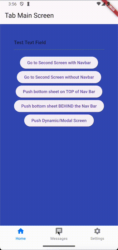
- 可以在显示或不显示导航栏的情况下推送新页面。
- 提供了17种预设的底部导航栏样式。
- 每个样式都可以完全自定义。
- 支持自定义导航栏。
- 持久标签页 - 切换标签页时不会丢弃导航栈。
- 支持透明度和模糊效果。
- 处理硬件/软件Android返回按钮。
- 支持
go_router以利用 Flutter 的路由API。
开始使用 #
1. 安装包 #
安装 advn_bottom_nav_bar 包:
dependencies:
  advn_bottom_nav_bar: ^x.y.z
2. 导入包 #
import 'package:advn_bottom_nav_bar/advn_bottom_nav_bar.dart';
3. 使用 PersistentTabView #
PersistentTabView 是你的顶级容器,它将包含你的导航栏和所有的页面(就像一个 Scaffold)。因此,不建议将 PersistentTabView 包裹在 Scaffold.body 中,因为它会为你完成这一切。所以只需创建每个标签页的配置并插入 PersistentTabView 即可:
import 'package:flutter/material.dart';
import 'package:advn_bottom_nav_bar/advn_bottom_nav_bar.dart';

void main() => runApp(PersistenBottomNavBarDemo());

class PersistenBottomNavBarDemo extends StatelessWidget {
  @override
  Widget build(BuildContext context) {
    return MaterialApp(
      title: 'Persistent Bottom Navigation Bar Demo',
      home: PersistentTabView(
        tabs: [
          PersistentTabConfig(
            screen: YourFirstScreen(),
            item: ItemConfig(
              icon: Icon(Icons.home),
              title: "Home",
            ),
          ),
          PersistentTabConfig(
            screen: YourSecondScreen(),
            item: ItemConfig(
              icon: Icon(Icons.message),
              title: "Messages",
            ),
          ),
          PersistentTabConfig(
            screen: YourThirdScreen(),
            item: ItemConfig(
              icon: Icon(Icons.settings),
              title: "Settings",
            ),
          ),
        ],
        navBarBuilder: (navBarConfig) => Style1BottomNavBar(
          navBarConfig: navBarConfig,
        ),
      ),
    );
  }
}
样式化 #
你可以通过传递一个 NavBarDecoration 实例来定制导航栏。这个实例继承自 BoxDecoration,因此它提供了 BoxDecoration 所有的功能。例如,你可以通过传递 BorderRadius.circular(8) 来设置不同的圆角半径。
PersistentTabView(
  tabs: [
    PersistentTabConfig(
      screen: YourFirstScreen(),
      item: ItemConfig(
        icon: Icon(Icons.home),
        title: "Home",
      ),
    ),
  ],
  navBarBuilder: (navBarConfig) => Style1BottomNavBar(
    navBarConfig: navBarConfig,
    decoration: NavBarDecoration(
      borderRadius: BorderRadius.circular(8),
    ),
  ),
);
使用自定义导航栏 #
你可以替换 Style1BottomNavBar 小部件为自己的自定义小部件。navBarBuilder 给你一个 navBarConfig,这是构建自定义导航栏所需的一切。以下是一个自定义导航栏小部件的例子:
class CustomNavBar extends StatelessWidget {
  final NavBarConfig navBarConfig;
  final NavBarDecoration navBarDecoration;

  const CustomNavBar({
    super.key,
    required this.navBarConfig,
    this.navBarDecoration = const NavBarDecoration(),
  });

  Widget _buildItem(ItemConfig item, bool isSelected) {
    final title = item.title;
    return Column(
      mainAxisAlignment: MainAxisAlignment.center,
      children: [
        Expanded(
          child: IconTheme(
            data: IconThemeData(
              size: item.iconSize,
              color: isSelected
                      ? item.activeForegroundColor
                      : item.inactiveForegroundColor,
            ),
            child: isSelected ? item.icon : item.inactiveIcon,
          ),
        ),
        if (title != null)
          Padding(
            padding: const EdgeInsets.only(top: 15.0),
            child: Material(
              type: MaterialType.transparency,
              child: FittedBox(
                child: Text(
                  title,
                  style: item.textStyle.apply(
                    color: isSelected
                            ? item.activeForegroundColor
                            : item.inactiveForegroundColor,
                  ),
                ),
              ),
            ),
          ),
      ],
    );
  }

  @override
  Widget build(BuildContext context) {
    return DecoratedNavBar(
      decoration: navBarDecoration,
      height: navBarConfig.navBarHeight,
      child: Row(
        mainAxisAlignment: MainAxisAlignment.spaceAround,
        crossAxisAlignment: CrossAxisAlignment.center,
        children: [
          for (final (index, item) in navBarConfig.items.indexed)
            Expanded(
              child: InkWell(
                onTap: () => navBarConfig.onItemSelected(index),
                child: _buildItem(item, navBarConfig.selectedIndex == index),
              ),
            ),
        ],
      ),
    );
  }
}
在你的 PersistentTabView 中,你可以像使用预定义样式一样使用它:
PersistentTabView(
  tabs: ...,
  navBarBuilder: (navBarConfig) => CustomNavBar(
    navBarConfig: navBarConfig,
  ),
),
编程控制导航栏 #
内部,PersistentTabView 使用了一个 PersistentTabController。因此,你可以传递一个控制器给 PersistentTabView,以便稍后通过编程更改标签页:
PersistentTabController _controller = PersistentTabController(initialIndex: 0);

PersistentTabView(
  controller: _controller,
  ...
);

_controller.jumpToTab(2);

// 跳转到上一个选中的标签页
_controller.jumpToPreviousTab();
页面切换时自定义过渡动画 #
当从一个标签页切换到另一个标签页时,默认行为是一个滑动过渡,当前页面向左或向右滑动,目标页面滑入屏幕。你可以通过构建自己的动画来自定义这种行为,例如,淡出当前页面并淡入新页面。要控制动画,你可以传递一个函数给 PersistentTabView.animatedTabBuilder。这个函数是一个构建器,同时构建旧页面和新页面。这就是为什么它得到了 BuildContext 作为参数,当前构建的标签页的索引,动画进度,新索引,旧索引和实际页面内容作为子组件。
默认动画构建器如下所示:
final double yOffset = newIndex > index
    ? -animationValue
    : (newIndex < index
        ? animationValue
        : (index < oldIndex ? animationValue - 1 : 1 - animationValue));
return FractionalTranslation(
  translation: Offset(yOffset, 0),
  child: child,
);
导航 #
每个标签页都会获得自己的 Navigator,这样它们就不会相互干扰。这意味着调用 Navigator.of(context).push()(这将在当前标签页内推送一个新的屏幕)和 Navigator.of(context, rootNavigator: true).push()(这将在整个 PersistentTabView 上方推送一个新的屏幕,最终隐藏导航栏)之间会有区别。
该包包括以下实用导航函数:
pushScreen(
  context,
  screen: MainScreen(),
  withNavBar: true/false,
);
pushWithNavBar(
  context,
  MaterialPageRoute(builder: (context) => ...)
);
pushWithoutNavBar(
  context,
  MaterialPageRoute(builder: (context) => ...)
);
默认情况下,每个标签页的 Navigator 将继承根 Navigator 的所有设置。因此,对根 Navigator 的命名路由等配置所做的任何更改,在每个标签页中都会生效。如果你需要每个 Navigator 的特定设置(如额外的路由、NavigatorObservers 等),可以通过传递一个 NavigatorConfig 到相应的 PersistentTabConfig 来实现。
PersistentTabView 可以记住每个标签页的导航栈,所以当你切换回它时,你会看到离开时的内容。这种行为可以通过 PersistentTabView.stateManagement 参数来切换。
路由API #
要结合此插件使用 Flutter 的路由 API,必须使用 go_router。按照 go_router 文档中的设置开始使用声明式路由。要集成持久导航栏,你必须设置一个 StatefulShellRoute.indexedStack 作为你的一个路由,它将包含 PersistentTabView。以下是完整的代码示例或代码片段:
StatefulShellRoute.indexedStack(
  builder: (context, state, navigationShell) =>
      PersistentTabView.router(
    tabs: [
      PersistentRouterTabConfig(
        item: ItemConfig(
          icon: const Icon(Icons.home),
          title: "Home",
        ),
      ),
      PersistentRouterTabConfig(
        item: ItemConfig(
          icon: const Icon(Icons.message),
          title: "Messages",
        ),
      ),
      PersistentRouterTabConfig(
        item: ItemConfig(
          icon: const Icon(Icons.settings),
          title: "Settings",
        ),
      ),
    ],
    navBarBuilder: (navBarConfig) => Style1BottomNavBar(
      navBarConfig: navBarConfig,
    ),
    navigationShell: navigationShell,
  ),
  branches: [
    // 第一个标签页的路由分支
    StatefulShellBranch(
      routes: <RouteBase>[
        GoRoute(
          path: "home",
          builder: (context, state) => const MainScreen(
            useRouter: true,
          ),
          routes: [
            GoRoute(
              path: "detail",
              builder: (context, state) => const MainScreen2(
                useRouter: true,
              ),
            ),
          ],
        ),
      ],
    ),

    // 第二个标签页的路由分支
    StatefulShellBranch(
      routes: <RouteBase>[
        GoRoute(
          path: "messages",
          builder: (context, state) => const MainScreen(
            useRouter: true,
          ),
        ),
      ],
    ),

    // 第三个标签页的路由分支
    StatefulShellBranch(
      routes: <RouteBase>[
        GoRoute(
          path: "settings",
          builder: (context, state) => const MainScreen(
            useRouter: true,
          ),
        ),
      ],
    ),
  ],
),
有用的技巧 #
-
尝试官方 git 仓库中的交互示例项目以更好地了解该插件:互动示例项目。
-
弹出到指定标签页的任意屏幕:
Navigator.of(context).popUntil((route) { return route.settings.name == "ScreenToPopBackTo"; }); -
弹出到指定标签页的第一个屏幕:
Navigator.of(context).popUntil(ModalRoute.withName("/"));为了使这起作用,你需要让你的
PersistentNavBarItem被命名为'/':PersistentBottomNavBarItem( title: ("Home"), routeAndNavigatorSettings: RouteAndNavigatorSettings(initialRoute: '/'), )或者,你可以使用非命名路由来执行此操作:
Navigator.of(context).pushAndRemoveUntil( CupertinoPageRoute( builder: (BuildContext context) { return FirstScreen(); }, ), (_) => false, ); -
若要在导航栏上方显示底部弹出窗口,请使用
showModalBottomScreen并将其属性useRootNavigator设置为true。参见示例项目以了解示例。 -
如果你需要在导航栏中的图标上添加通知计数器,可以使用
badges包,例如:PersistentTabConfig( screen: ..., item: ItemConfig( icon: Badge( animationType: BadgeAnimationType.scale, badgeContent: UnreadIndicator(), child: const Icon( Icons.chat_rounded, ), ), title: "Chat", ), ),
更多关于Flutter底部导航栏插件advn_bottom_nav_bar的使用的实战教程也可以访问 https://www.itying.com/category-92-b0.html

更多关于Flutter底部导航栏插件advn_bottom_nav_bar的使用的实战系列教程也可以访问 https://www.itying.com/category-92-b0.html
当然,以下是一个关于如何使用 advn_bottom_nav_bar 插件的 Flutter 代码示例。这个插件允许你创建一个高度可定制的底部导航栏。
首先,你需要在你的 pubspec.yaml 文件中添加 advn_bottom_nav_bar 依赖:
dependencies:
  flutter:
    sdk: flutter
  advn_bottom_nav_bar: ^0.6.0  # 请确保版本号是最新的
然后运行 flutter pub get 来获取依赖。
接下来,你可以在你的 Flutter 应用中使用 AdvnBottomNavBar。以下是一个完整的示例代码,展示如何设置和使用这个插件:
import 'package:flutter/material.dart';
import 'package:advn_bottom_nav_bar/advn_bottom_nav_bar.dart';

void main() {
  runApp(MyApp());
}

class MyApp extends StatelessWidget {
  @override
  Widget build(BuildContext context) {
    return MaterialApp(
      title: 'AdvnBottomNavBar Demo',
      theme: ThemeData(
        primarySwatch: Colors.blue,
      ),
      home: MyHomePage(),
    );
  }
}

class MyHomePage extends StatefulWidget {
  @override
  _MyHomePageState createState() => _MyHomePageState();
}

class _MyHomePageState extends State<MyHomePage> with SingleTickerProviderStateMixin {
  int _selectedIndex = 0;
  final List<Widget> _widgetOptions = <Widget>[
    Text('Home Screen'),
    Text('Search Screen'),
    Text('Profile Screen'),
  ];

  void _onItemTapped(int index) {
    setState(() {
      _selectedIndex = index;
    });
  }

  @override
  Widget build(BuildContext context) {
    return Scaffold(
      appBar: AppBar(
        title: Text('AdvnBottomNavBar Demo'),
      ),
      body: Center(
        child: _widgetOptions.elementAt(_selectedIndex),
      ),
      bottomNavigationBar: AdvnBottomNavBar(
        items: [
          AdvnBottomNavBarItem(
            icon: Icons.home,
            title: 'Home',
          ),
          AdvnBottomNavBarItem(
            icon: Icons.search,
            title: 'Search',
          ),
          AdvnBottomNavBarItem(
            icon: Icons.person,
            title: 'Profile',
          ),
        ],
        currentIndex: _selectedIndex,
        onTabSelectedListener: _onItemTapped,
        backgroundColor: Colors.white,
        activeColor: Colors.blue,
        inactiveColor: Colors.grey,
        borderRadius: 25.0,
      ),
    );
  }
}
代码解释
-
依赖添加:在
pubspec.yaml中添加advn_bottom_nav_bar依赖。 -
主应用结构:
MyApp是根组件,使用MaterialApp包裹,设置主题和首页。 -
首页组件:
MyHomePage是一个有状态的组件,包含_selectedIndex来跟踪当前选中的导航项,以及_widgetOptions列表来显示不同的屏幕内容。 -
导航项点击事件:
_onItemTapped方法更新_selectedIndex的值。 -
底部导航栏:
AdvnBottomNavBar组件配置导航项(图标和标题),当前选中索引,点击事件监听器,背景颜色,激活和非激活颜色,以及边框圆角。
自定义选项
AdvnBottomNavBar 提供了许多自定义选项,你可以根据需要调整 icon, title, backgroundColor, activeColor, inactiveColor, borderRadius, animationDuration, shadow 等属性。
希望这个示例能帮助你理解如何在 Flutter 应用中使用 advn_bottom_nav_bar 插件。如果你有其他问题,欢迎继续提问!