


Flutter单选选择器插件single_option_picker的使用
Flutter单选选择器插件single_option_picker的使用
你是否曾经希望有一个小部件来简化在多个选项中进行选择的过程?如果是这样,single_option_picker 就是你需要的小部件 :)
基本用法
该小部件非常简单易用。你需要传递选项的数量、一个选项构建器(用于构建选项)、一个当选项被选中时的回调函数,并且需要告知当前选中的选项索引。
SingleOptionPicker(
    numberOfOptions: 3,
    optionBuilder: (index, isSelected) => Container(
        height: 80,
        child: Center(
            child: Icon(
                getIcon(index),
                color: isSelected ? getIconColor(index) : Colors.black,
            ),
        ),
    ),
    onChangeOption: (index) {
        setState(() {
            selectedIndex = index;
        });
    },
    selectedOptionIndex: selectedIndex,
)
最棒的是,OptionBuilder 可以让你自由地实现自己的选项。你可以实现图标、容器等。
建议与问题报告
对于任何建议或错误报告,请前往 问题跟踪器。
以下是一个完整的示例代码,展示了如何使用 single_option_picker 插件:
import 'package:flutter/material.dart';
import 'package:single_option_picker/single_option_picker.dart';
void main() {
runApp(MyApp());
}
class MyApp extends StatelessWidget {
[@override](/user/override)
Widget build(BuildContext context) {
return MaterialApp(
title: 'Flutter Demo',
debugShowCheckedModeBanner: false,
theme: ThemeData(
primarySwatch: Colors.blue,
),
home: MyHomePage(),
);
}
}
class MyHomePage extends StatefulWidget {
MyHomePage({
Key? key,
}) : super(key: key);
[@override](/user/override)
_MyHomePageState createState() => _MyHomePageState();
}
class _MyHomePageState extends State<MyHomePage> {
int selectedIndex = 0;
[@override](/user/override)
Widget build(BuildContext context) {
return Scaffold(
body: Center(
child: Padding(
padding: const EdgeInsets.all(8),
child: Column(
mainAxisAlignment: MainAxisAlignment.center,
children: <Widget>[
// 示例1
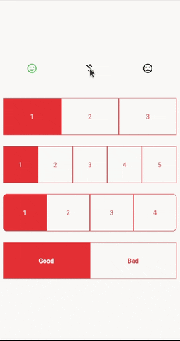
SingleOptionPicker(
numberOfOptions: 3,
optionBuilder: (index, isSelected) => Container(
height: 80,
child: Center(
child: Icon(
getIcon(index),
color: isSelected ? getIconColor(index) : Colors.black,
),
),
),
onChangeOption: (index) {
setState(() {
selectedIndex = index;
});
},
selectedOptionIndex: selectedIndex,
),
const SizedBox(height: 24),
// 示例2
SingleOptionPicker(
numberOfOptions: 3,
optionBuilder: (index, isSelected) => AnimatedContainer(
duration: Duration(milliseconds: 300),
height: 80,
decoration: BoxDecoration(
color: isSelected ? Colors.red : Colors.transparent,
border: Border.all(
color: Colors.red,
),
),
child: Center(
child: Text(
(index + 1).toString(),
style: TextStyle(
color: isSelected ? Colors.white : Colors.red,
),
),
),
),
onChangeOption: (index) {
setState(() {
selectedIndex = index;
});
},
selectedOptionIndex: selectedIndex,
),
const SizedBox(height: 24),
// 示例3
SingleOptionPicker(
numberOfOptions: 5,
optionBuilder: (index, isSelected) => AnimatedContainer(
duration: Duration(milliseconds: 300),
height: 80,
decoration: BoxDecoration(
color: isSelected ? Colors.red : Colors.transparent,
border: Border.all(
color: Colors.red,
),
),
child: Center(
child: Text(
(index + 1).toString(),
style: TextStyle(
color: isSelected ? Colors.white : Colors.red,
),
),
),
),
onChangeOption: (index) {
setState(() {
selectedIndex = index;
});
},
selectedOptionIndex: selectedIndex,
),
const SizedBox(height: 24),
// 示例4
SingleOptionPicker(
numberOfOptions: 4,
optionBuilder: (index, isSelected) => AnimatedContainer(
duration: Duration(milliseconds: 300),
height: 80,
decoration: BoxDecoration(
color: isSelected ? Colors.red : Colors.transparent,
border: Border.all(
color: Colors.red,
),
borderRadius: _getBorderRadius(
isFirst: index == 0,
isLast: index == 3,
),
),
child: Center(
child: Text(
(index + 1).toString(),
style: TextStyle(
color: isSelected ? Colors.white : Colors.red,
),
),
),
),
onChangeOption: (index) {
setState(() {
selectedIndex = index;
});
},
selectedOptionIndex: selectedIndex,
),
const SizedBox(height: 24),
// 示例5
SingleOptionPicker(
numberOfOptions: 2,
optionBuilder: (index, isSelected) => AnimatedContainer(
duration: Duration(milliseconds: 300),
height: 80,
decoration: BoxDecoration(
color: isSelected ? Colors.red : Colors.transparent,
border: Border.all(
color: Colors.red,
),
),
child: Center(
child: Text(
index == 0 ? 'Good' : 'Bad',
style: TextStyle(
fontWeight: FontWeight.bold,
color: isSelected ? Colors.white : Colors.red,
),
),
),
),
onChangeOption: (index) {
setState(() {
selectedIndex = index;
});
},
selectedOptionIndex: selectedIndex,
),
],
),
),
),
);
}
// 获取图标
IconData getIcon(int index) {
if (index == 0) {
return Icons.mood_sharp;
} else if (index == 1) {
return Icons.money_off_csred_sharp;
} else {
return Icons.mood_bad;
}
}
// 获取图标颜色
Color getIconColor(int index) {
if (index == 0) {
return Colors.green;
} else if (index == 1) {
return Colors.blue;
} else {
return Colors.red;
}
}
// 获取圆角边框
BorderRadiusGeometry? _getBorderRadius({
bool? isFirst,
bool? isLast,
}) {
if (isFirst ?? false) {
return const BorderRadius.only(
bottomLeft: Radius.circular(8),
topLeft: Radius.circular(8),
);
} else if (isLast ?? false) {
return const BorderRadius.only(
bottomRight: Radius.circular(8),
topRight: Radius.circular(8),
);
}
return null;
}
}
更多关于Flutter单选选择器插件single_option_picker的使用的实战教程也可以访问 https://www.itying.com/category-92-b0.html

更多关于Flutter单选选择器插件single_option_picker的使用的实战系列教程也可以访问 https://www.itying.com/category-92-b0.html
当然,以下是如何在Flutter项目中使用single_option_picker插件的示例代码。single_option_picker是一个用于创建单选选择器的Flutter插件。
首先,确保你已经在pubspec.yaml文件中添加了single_option_picker依赖:
dependencies:
  flutter:
    sdk: flutter
  single_option_picker: ^最新版本号 # 请替换为最新版本号
然后运行flutter pub get来获取依赖。
接下来是一个简单的示例,展示如何使用single_option_picker:
import 'package:flutter/material.dart';
import 'package:single_option_picker/single_option_picker.dart';

void main() {
  runApp(MyApp());
}

class MyApp extends StatelessWidget {
  @override
  Widget build(BuildContext context) {
    return MaterialApp(
      title: 'Single Option Picker Demo',
      theme: ThemeData(
        primarySwatch: Colors.blue,
      ),
      home: MyHomePage(),
    );
  }
}

class MyHomePage extends StatefulWidget {
  @override
  _MyHomePageState createState() => _MyHomePageState();
}

class _MyHomePageState extends State<MyHomePage> {
  String selectedValue = '';

  @override
  Widget build(BuildContext context) {
    return Scaffold(
      appBar: AppBar(
        title: Text('Single Option Picker Demo'),
      ),
      body: Center(
        child: Column(
          mainAxisAlignment: MainAxisAlignment.center,
          children: <Widget>[
            Text(
              'Selected Value: $selectedValue',
              style: TextStyle(fontSize: 20),
            ),
            SizedBox(height: 20),
            ElevatedButton(
              onPressed: () {
                _showPicker(context);
              },
              child: Text('Show Picker'),
            ),
          ],
        ),
      ),
    );
  }

  void _showPicker(BuildContext context) async {
    final List<String> options = [
      'Option 1',
      'Option 2',
      'Option 3',
      'Option 4',
    ];

    final SingleOptionPickerResult result = await showSingleOptionPicker(
      context: context,
      title: 'Select an Option',
      options: options,
      initialValue: selectedValue,
    );

    if (result.confirmed) {
      setState(() {
        selectedValue = result.selectedValue!;
      });
    }
  }
}
解释
-
依赖添加:确保在
pubspec.yaml文件中添加了single_option_picker依赖。 -
主应用:创建一个简单的Flutter应用,包含一个主页面
MyHomePage。 -
状态管理:在
_MyHomePageState中管理选中的值。 -
显示选中的值:在页面上显示当前选中的值。
-
显示选择器:点击按钮时调用
_showPicker方法,显示单选选择器。 -
处理选择器结果:如果用户确认了选择,更新选中的值。
注意事项
- 确保替换
最新版本号为实际可用的最新版本。 showSingleOptionPicker方法会返回一个SingleOptionPickerResult对象,其中包含用户是否确认选择以及所选的值。
这样,你就可以在Flutter应用中轻松使用single_option_picker插件来创建单选选择器了。