


Flutter自定义选择文本插件custom_selectable_text的使用
Flutter自定义选择文本插件custom_selectable_text的使用
本插件帮助你选择文本并执行复制等功能。你还可以进行自定义选择,例如分享文本。
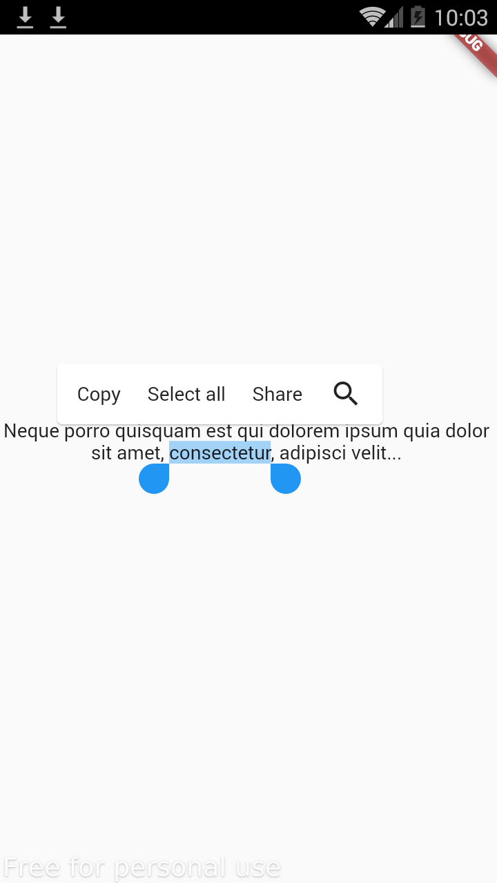
截图
使用
基本用法
CustomSelectableText(
  "Neque porro quisquam est qui dolorem ipsum quia dolor sit amet, consectetur, adipisci velit...",
  textAlign: TextAlign.center,
  items: [
    CustomSelectableTextItem(controlType: SelectionControlType.copy),
    CustomSelectableTextItem(
        controlType: SelectionControlType.selectAll),
    CustomSelectableTextItem(
        label: "Share",
        controlType: SelectionControlType.other,
        onPressed: (text) {
          ScaffoldMessenger.of(context).showSnackBar(SnackBar(
            content: Text("$text is successfully shared"),
          ));
        }),
  ],
)
这段代码展示了如何创建一个可以复制、全选和自定义分享功能的可选择文本组件。items 参数接受一个列表,每个元素都是 CustomSelectableTextItem 类型,用于定义不同的操作项。
使用图标
CustomSelectableText(
  "Neque porro quisquam est qui dolorem ipsum quia dolor sit amet, consectetur, adipisci velit...",
  textAlign: TextAlign.center,
  items: [
    CustomSelectableTextItem.icon(controlType: SelectionControlType.copy, icon: const Icon(Icons.copy)),
    CustomSelectableTextItem.icon(
        controlType: SelectionControlType.selectAll, icon: const Icon(Icons.select_all)),
    CustomSelectableTextItem.icon(
        icon: const Icon(Icons.share),
        onPressed: (text) {
          ScaffoldMessenger.of(context).showSnackBar(SnackBar(
            content: Text("$text is successfully shared"),
          ));
        }),
  ],
)
这段代码展示了如何使用图标来表示不同的操作项。通过 icon 参数传递图标,用户可以更直观地看到每个操作。
示例代码
以下是完整的示例代码,展示了如何在 Flutter 应用程序中使用 custom_selectable_text 插件。
import 'package:custom_selectable_text/custom_selectable_text.dart';
import 'package:flutter/material.dart';

void main() {
  runApp(const MyApp());
}

class MyApp extends StatelessWidget {
  const MyApp({Key? key}) : super(key: key);

  [@override](/user/override)
  Widget build(BuildContext context) {
    return const MaterialApp(
      home: HomePage(),
    );
  }
}

class HomePage extends StatelessWidget {
  const HomePage({Key? key}) : super(key: key);

  [@override](/user/override)
  Widget build(BuildContext context) {
    return Scaffold(
      body: Center(
        child: CustomSelectableText(
          "Lorem Ipsum",
          textAlign: TextAlign.center,
          items: [
            CustomSelectableTextItem.icon(
                icon: const Icon(Icons.copy),
                controlType: SelectionControlType.copy,
                onPressed: (text) {
                  ScaffoldMessenger.of(context).showSnackBar(SnackBar(
                    content: Text("Copied $text text"),
                  ));
                }),
            CustomSelectableTextItem.icon(
              controlType: SelectionControlType.selectAll,
              icon: const Icon(Icons.select_all),
            ),
            CustomSelectableTextItem.icon(
                icon: const Icon(Icons.share),
                onPressed: (text) {
                  ScaffoldMessenger.of(context).showSnackBar(SnackBar(
                    content: Text("Shared $text text"),
                  ));
                }),
            CustomSelectableTextItem.popUpMenuButton(
                child: PopupMenuButton(
              itemBuilder: (context) => [
                const PopupMenuItem(
                  child: Text("Text 1"),
                ),
                const PopupMenuItem(
                  child: Text("Text 2"),
                ),
              ],
            )),
          ],
        ),
      ),
    );
  }
}
更多关于Flutter自定义选择文本插件custom_selectable_text的使用的实战教程也可以访问 https://www.itying.com/category-92-b0.html

更多关于Flutter自定义选择文本插件custom_selectable_text的使用的实战系列教程也可以访问 https://www.itying.com/category-92-b0.html
当然,下面是一个关于如何使用custom_selectable_text插件的Flutter代码示例。这个插件允许你创建可选择的文本,同时提供自定义渲染和交互的能力。
首先,确保你已经在pubspec.yaml文件中添加了custom_selectable_text依赖:
dependencies:
  flutter:
    sdk: flutter
  custom_selectable_text: ^x.y.z  # 请替换为最新的版本号
然后,运行flutter pub get来获取依赖。
接下来,你可以在你的Flutter应用中使用CustomSelectableText。以下是一个简单的示例:
import 'package:flutter/material.dart';
import 'package:custom_selectable_text/custom_selectable_text.dart';

void main() {
  runApp(MyApp());
}

class MyApp extends StatelessWidget {
  @override
  Widget build(BuildContext context) {
    return MaterialApp(
      title: 'Custom Selectable Text Demo',
      theme: ThemeData(
        primarySwatch: Colors.blue,
      ),
      home: MyHomePage(),
    );
  }
}

class MyHomePage extends StatelessWidget {
  @override
  Widget build(BuildContext context) {
    return Scaffold(
      appBar: AppBar(
        title: Text('Custom Selectable Text Demo'),
      ),
      body: Padding(
        padding: const EdgeInsets.all(16.0),
        child: Column(
          crossAxisAlignment: CrossAxisAlignment.start,
          children: <Widget>[
            Text('This is a normal text.'),
            SizedBox(height: 20),
            CustomSelectableText(
              'This is a custom selectable text.',
              style: TextStyle(fontSize: 20, color: Colors.black),
              textDirection: TextDirection.ltr,
              toolbarOptions: const ToolbarOptions(
                copy: true,
                selectAll: true,
              ),
              onSelectionChanged: (TextSelection selection, SelectionChangedCause cause) {
                // Handle selection change if needed
                print('Selection changed: $selection');
              },
              customRender: (BuildContext context, TextSpan span, TextStyle style, TextAlign textAlign) {
                // Custom render logic
                return LayoutBuilder(
                  builder: (BuildContext context, BoxConstraints constraints) {
                    return Container(
                      decoration: BoxDecoration(
                        border: Border.all(color: Colors.grey, width: 1.0),
                        borderRadius: BorderRadius.circular(8),
                      ),
                      constraints: constraints.copyWith(
                        minHeight: 40,
                      ),
                      child: RichText(
                        text: span,
                        textAlign: textAlign,
                      ),
                    );
                  },
                );
              },
            ),
          ],
        ),
      ),
    );
  }
}
代码说明
-
依赖导入:
- 导入
custom_selectable_text包。
- 导入
-
应用结构:
MyApp是应用的根widget。MyHomePage是包含自定义选择文本的主页面。
-
CustomSelectableText:
text:要显示的文本。style:文本的样式。textDirection:文本方向。toolbarOptions:定义工具栏选项,比如复制和选择全部。onSelectionChanged:选择改变时的回调。customRender:自定义渲染逻辑,允许你控制文本的布局和样式。
在这个示例中,customRender方法将文本包裹在一个带有边框和圆角的Container中,并设置了最小高度。你可以根据需求进一步自定义渲染逻辑。
希望这个示例能帮助你理解如何使用custom_selectable_text插件!