


HarmonyOS 鸿蒙Next 怎么做抽屉弹框
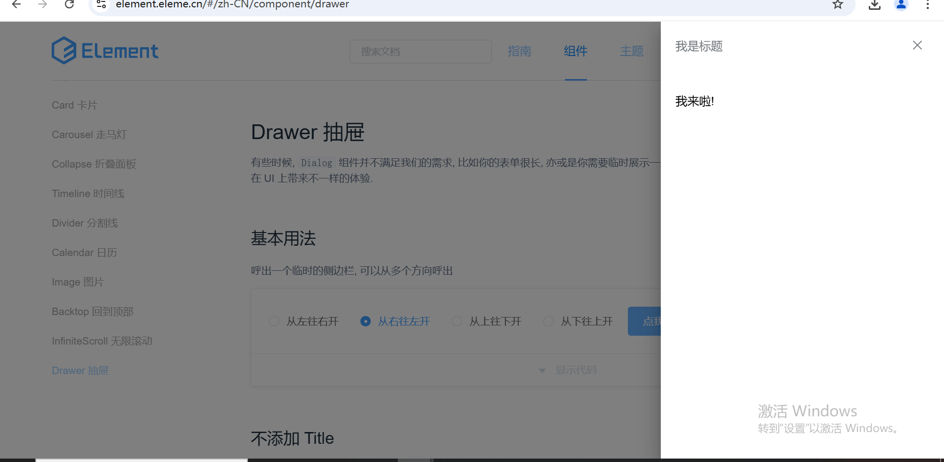
HarmonyOS 鸿蒙Next 怎么做抽屉弹框 鸿蒙官方文档找不到抽屉弹框,类似于element ui的Drawer组件(如图),鸿蒙有类似的组件吗或者是封装的自定义组件
更多关于HarmonyOS 鸿蒙Next 怎么做抽屉弹框的实战教程也可以访问 https://www.itying.com/category-93-b0.html

可以使用transition来实现,transition相关参数说明可参考华为开发者网站。具体demo如下
@Entry
@Component
struct CustomDialogPage {
  @State isAutoCancel: boolean = true;
  dialogController: CustomDialogController = new CustomDialogController({
    builder: CustomDialogExample({ isAutoCancel: this.isAutoCancel }),
    autoCancel: this.isAutoCancel,
    customStyle: true
  })

  build() {
    Row() {
      Column() {
        Button('click me')
          .onClick(() => {
            this.dialogController.open()
          })
      }.width('100%')
    }
    .height('100%')
    .backgroundColor(Color.White)
  }
}

@CustomDialog
export struct CustomDialogExample {
  controller: CustomDialogController
  @State showFlag: Visibility = Visibility.Visible;
  @State isAutoCancel: boolean = false;

  build() {
    Column() {
      Row() {
        Text('this is customDialog').fontSize(20)
      }
      .padding(8)
      .backgroundColor('#FFFFFF')
      .height("100%")
      .margin({ left:200})
      .width("50%")
    }
    .justifyContent(FlexAlign.End)
    .width("100%")
    .height("100%")
    .margin({
      bottom: -15
    })
    .onClick(() => {
      if (this.isAutoCancel) {
        this.cancel();
      }
    })
    .visibility(this.showFlag)
    .transition(TransitionEffect.OPACITY.animation({ duration: 500 })
      .combine(TransitionEffect.translate({ x: 100 })))
  }

  cancel() {
    this.showFlag = Visibility.Hidden
    setTimeout(() => {
      this.controller.close()
    }, 400)
  }
}
更多关于HarmonyOS 鸿蒙Next 怎么做抽屉弹框的实战系列教程也可以访问 https://www.itying.com/category-93-b0.html

在HarmonyOS(鸿蒙)系统中实现抽屉弹框(Drawer Dialog),通常需要使用鸿蒙提供的UI组件和布局机制。以下是一个简要的步骤说明,用于在鸿蒙应用中创建抽屉弹框效果:
-
定义布局: 首先,在
resources/base/layout目录下定义一个布局文件(如drawer_dialog_layout.xml),用于描述抽屉弹框的界面。这个布局可以包含各种UI组件,如文本、按钮等。 -
创建Dialog: 在代码中,通过
Dialog类或其子类来创建一个对话框实例。在创建时,指定刚才定义的布局文件作为对话框的内容。 -
设置Drawer效果: 鸿蒙系统本身可能不直接提供“抽屉”效果的组件,但你可以通过动画和布局管理来实现类似效果。例如,可以使用
Animator类来控制抽屉的滑动动画,同时结合布局参数的动态调整来模拟抽屉的打开和关闭。 -
显示Dialog: 最后,通过调用
show()方法将对话框显示出来。注意,对话框的显示通常需要在UI线程中进行。
请注意,由于鸿蒙系统的API和组件库可能随着版本更新而发生变化,因此上述步骤可能需要根据你使用的鸿蒙SDK版本进行调整。
如果问题依旧没法解决请联系官网客服,官网地址是 https://www.itying.com/category-93-b0.html,