


Flutter UI辅助插件ui_helper的使用
Flutter UI辅助插件ui_helper的使用
UI Helpers来加速您的开发时间!这些工具将帮助您使应用程序具有响应性,并且提供了轻松创建文本、按钮和文本字段小部件的方法。
示例
安装
在pubspec.yaml文件中添加依赖:
dependencies:
  ui_helper: ^1.1.0
示例代码
以下是一个完整的示例代码,展示了如何使用ui_helper插件来创建不同的UI元素。
import 'package:flutter/material.dart';
import 'package:ui_helper/ui_helper.dart';
void main() {
runApp(MyApp());
}
class MyApp extends StatelessWidget {
[@override](/user/override)
Widget build(BuildContext context) {
return MaterialApp(
title: 'UI Helper',
home: Scaffold(
body: ListView(
padding: const EdgeInsets.symmetric(horizontal: 25, vertical: 30),
children: [
TextWidget.headingOne('UI Helper'),
verticalSpaceSmall,
Divider(),
verticalSpaceSmall,
...buttonWidgets,
...textWidgets,
...inputFields,
],
),
),
);
}
}
// 文本小部件列表
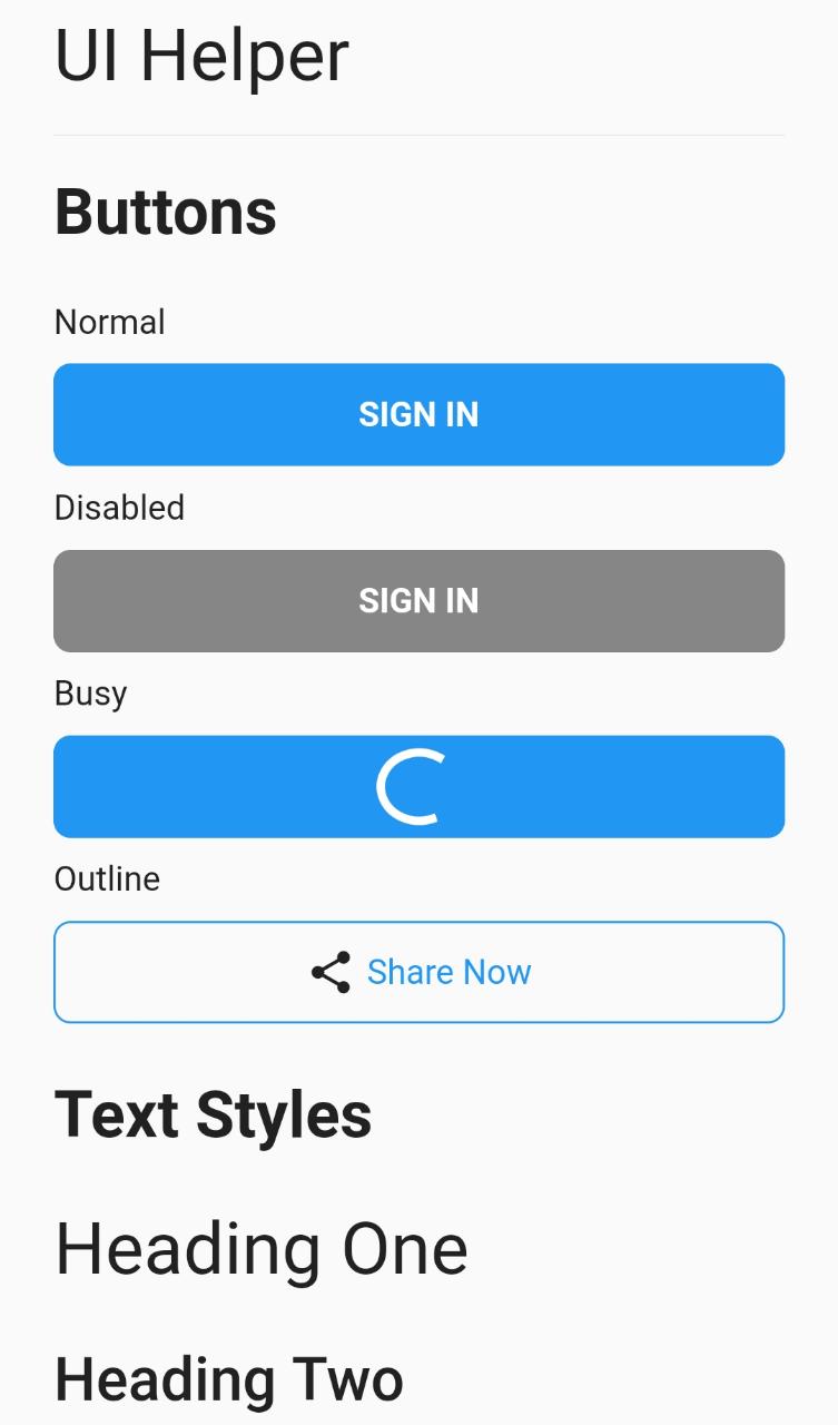
List<Widget> get textWidgets => [
TextWidget.headline('文本样式'),
verticalSpaceMedium,
TextWidget.headingOne('一级标题'),
verticalSpaceMedium,
TextWidget.headingTwo('二级标题'),
verticalSpaceMedium,
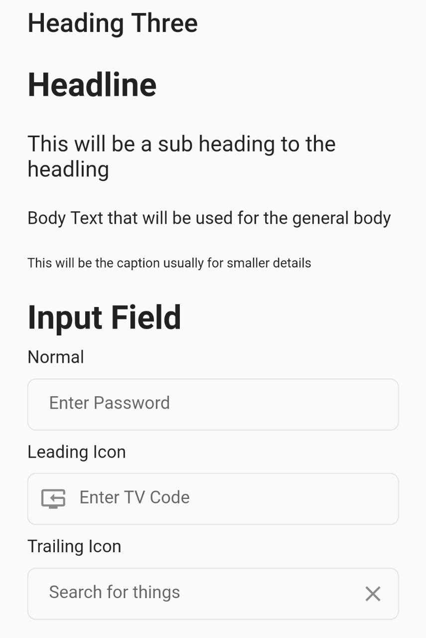
TextWidget.headingThree('三级标题'),
verticalSpaceMedium,
TextWidget.headline('标题'),
verticalSpaceMedium,
TextWidget.subheading('这将是标题的一个子标题'),
verticalSpaceMedium,
TextWidget.body('正文文本,用于一般正文'),
verticalSpaceMedium,
TextWidget.caption('这通常是较小细节的说明'),
verticalSpaceMedium,
];
// 按钮小部件列表
List<Widget> get buttonWidgets => [
TextWidget.headline('按钮'),
verticalSpaceMedium,
TextWidget.body('正常'),
verticalSpaceSmall,
ButtonWidget(
title: '登录',
),
verticalSpaceSmall,
TextWidget.body('禁用'),
verticalSpaceSmall,
ButtonWidget(
title: '登录',
disabled: true,
),
verticalSpaceSmall,
TextWidget.body('忙碌'),
verticalSpaceSmall,
ButtonWidget(
title: '登录',
busy: true,
),
verticalSpaceSmall,
TextWidget.body('轮廓'),
verticalSpaceSmall,
ButtonWidget.outline(
title: '分享',
leading: Icon(
Icons.share,
),
),
verticalSpaceMedium,
];
// 输入字段小部件列表
List<Widget> get inputFields => [
TextWidget.headline('输入字段'),
verticalSpaceSmall,
TextWidget.body('正常'),
verticalSpaceSmall,
InputFieldWidget(
controller: TextEditingController(),
placeholder: '请输入密码',
),
verticalSpaceSmall,
TextWidget.body('前缀图标'),
verticalSpaceSmall,
InputFieldWidget(
controller: TextEditingController(),
leading: Icon(Icons.tv_reset),
placeholder: '请输入电视码',
),
verticalSpaceSmall,
TextWidget.body('后缀图标'),
verticalSpaceSmall,
InputFieldWidget(
controller: TextEditingController(),
trailing: Icon(Icons.clear_outlined),
placeholder: '搜索事物',
),
];
更多关于Flutter UI辅助插件ui_helper的使用的实战教程也可以访问 https://www.itying.com/category-92-b0.html

更多关于Flutter UI辅助插件ui_helper的使用的实战系列教程也可以访问 https://www.itying.com/category-92-b0.html
在Flutter开发中,ui_helper 是一个常用的辅助插件,它可以帮助开发者更高效地构建用户界面。虽然 ui_helper 并不是Flutter官方提供的插件,但它通常是由社区开发者创建的一系列实用工具和扩展方法,用于简化UI开发流程。
以下是一些常见的 ui_helper 功能和用法:
1. 安装 ui_helper 插件
首先,你需要在 pubspec.yaml 文件中添加 ui_helper 插件的依赖项。假设你已经找到了一个合适的 ui_helper 插件,添加方式如下:
dependencies:
  flutter:
    sdk: flutter
  ui_helper: ^1.0.0  # 假设版本为1.0.0
然后运行 flutter pub get 来安装插件。
2. 常用功能
2.1 尺寸和间距工具
ui_helper 通常提供一些尺寸和间距的工具方法,帮助你快速设置常见的间距和尺寸。
import 'package:ui_helper/ui_helper.dart';

class MyWidget extends StatelessWidget {
  @override
  Widget build(BuildContext context) {
    return Column(
      children: [
        Container(
          width: ui.width(0.5), // 屏幕宽度的50%
          height: ui.height(0.2), // 屏幕高度的20%
          color: Colors.blue,
        ),
        SizedBox(height: ui.spacing.small), // 使用预设的小间距
        Container(
          width: ui.width(0.8), // 屏幕宽度的80%
          height: ui.height(0.1), // 屏幕高度的10%
          color: Colors.red,
        ),
      ],
    );
  }
}
2.2 颜色工具
ui_helper 可能还提供了一些颜色工具,帮助你在应用中统一管理颜色。
import 'package:ui_helper/ui_helper.dart';

class MyWidget extends StatelessWidget {
  @override
  Widget build(BuildContext context) {
    return Container(
      color: ui.colors.primary, // 使用预设的主色调
      child: Text(
        'Hello, World!',
        style: TextStyle(color: ui.colors.text), // 使用预设的文本颜色
      ),
    );
  }
}
2.3 文本样式工具
ui_helper 可能还提供了一些文本样式工具,帮助你在应用中统一管理文本样式。
import 'package:ui_helper/ui_helper.dart';

class MyWidget extends StatelessWidget {
  @override
  Widget build(BuildContext context) {
    return Text(
      'Hello, World!',
      style: ui.textStyles.headline, // 使用预设的标题样式
    );
  }
}
2.4 布局工具
ui_helper 可能还提供了一些布局工具,帮助你快速构建复杂的布局。
import 'package:ui_helper/ui_helper.dart';

class MyWidget extends StatelessWidget {
  @override
  Widget build(BuildContext context) {
    return ui.row([
      Container(
        width: ui.width(0.3),
        height: ui.height(0.2),
        color: Colors.blue,
      ),
      Container(
        width: ui.width(0.3),
        height: ui.height(0.2),
        color: Colors.red,
      ),
    ]);
  }
}
3. 自定义和扩展
ui_helper 插件通常是高度可配置的,你可以根据自己的需求扩展或自定义其中的功能。例如,你可以通过继承或组合来创建自己的 ui_helper 工具类。
class MyUIHelper extends UIHelper {
  // 自定义方法或属性
  final Color myCustomColor = Colors.green;
}

void main() {
  final myUI = MyUIHelper();
  runApp(MyApp());
}