


Flutter主题管理插件themer的使用
Flutter主题管理插件themer的使用
Themer
概述
themer 插件为 Flutter 应用程序提供了强大的主题管理解决方案。它允许轻松切换到亮色或暗色主题,并且可以自定义主题颜色。该插件由三个主要组件组成:themer.dart 库文件、ThemeManager 类和 CustomTheme 类。
文件和类
1. themer.dart
这是主库文件,将 ThemeManager 和 CustomTheme 类结合在一起。
library themer;

import 'package:flutter/material.dart';

part 'custom_theme.dart';
part 'manager.dart';
2. manager.dart
此文件包含 ThemeManager 类,用于处理亮色和暗色主题之间的切换。它扩展了 ChangeNotifier 以便观察状态变化。
ThemeManager 类
part of 'themer.dart';

class ThemeManager with ChangeNotifier {
  ThemeMode _themeMode = ThemeMode.light;

  ThemeMode get themeMode => _themeMode;

  void toggleTheme(bool isDark) {
    _themeMode = isDark ? ThemeMode.dark : ThemeMode.light;
    notifyListeners(); // 通知监听器更新
  }

  get currentThemeString =>
      _themeMode == ThemeMode.light ? '亮色主题' : '暗色主题';

  get currentTheme => _themeMode;

  get currentThemeIcons =>
      _themeMode == ThemeMode.light ? Icons.dark_mode : Icons.light_mode;
}
属性
_themeMode: 存储当前主题模式(亮色或暗色)。themeMode: 获取当前主题模式。currentThemeString: 返回当前主题的字符串表示形式。currentTheme: 获取当前主题模式。currentThemeIcons: 返回当前主题对应的图标。
方法
toggleTheme(bool isDark): 根据isDark参数切换主题模式并通知监听器。
3. custom_theme.dart
此文件包含 CustomTheme 类,定义了亮色和暗色主题的颜色方案和主题数据。
CustomTheme 类
part of 'themer.dart';

class CustomTheme {
  Color? primaryColor;
  Color? secondaryColor;
  Color? backgroundColor;
  Color? textColor;
  Color? accentColor;
  Color? cardColor;

  CustomTheme({
    this.primaryColor = Colors.orange,
    this.secondaryColor = Colors.blue,
    this.backgroundColor = Colors.white,
    this.textColor = Colors.black,
    this.accentColor = Colors.green,
    this.cardColor,
  });

  ThemeData lightTheme() {
    return ThemeData(
      brightness: Brightness.light,
      primaryColor: primaryColor,
      appBarTheme: AppBarTheme(
        backgroundColor: primaryColor,
        foregroundColor: Colors.white,
        iconTheme: IconThemeData(
          color: primaryColor!.computeLuminance() > 0.5
              ? Colors.black
              : Colors.white,
        ),
      ),
      scaffoldBackgroundColor: backgroundColor,
      elevatedButtonTheme: ElevatedButtonThemeData(
        style: ButtonStyle(
          backgroundColor: MaterialStateProperty.all(primaryColor),
          foregroundColor: MaterialStateColor.resolveWith(
            (states) => primaryColor!.computeLuminance() > 0.5
                ? Colors.black
                : Colors.white,
          ),
          splashFactory: InkSparkle.splashFactory,
          iconColor: MaterialStateColor.resolveWith(
            (states) => primaryColor!.computeLuminance() > 0.5
                ? Colors.black
                : Colors.white,
          ),
        ),
      ),
      cardColor: cardColor,
    );
  }

  ThemeData darkTheme() {
    return ThemeData(
      brightness: Brightness.dark,
      primaryColor: primaryColor,
      appBarTheme: AppBarTheme(
        backgroundColor: primaryColor,
        foregroundColor: Colors.white,
        iconTheme: IconThemeData(
          color: primaryColor!.computeLuminance() > 0.5
              ? Colors.black
              : Colors.white,
        ),
      ),
      scaffoldBackgroundColor: backgroundColor,
      elevatedButtonTheme: ElevatedButtonThemeData(
        style: ButtonStyle(
          backgroundColor: MaterialStateProperty.all(primaryColor),
          foregroundColor: MaterialStateColor.resolveWith(
            (states) => primaryColor!.computeLuminance() > 0.5
                ? Colors.black
                : Colors.white,
          ),
          splashFactory: InkSparkle.splashFactory,
          iconColor: MaterialStateColor.resolveWith(
            (states) => primaryColor!.computeLuminance() > 0.5
                ? Colors.black
                : Colors.white,
          ),
        ),
      ),
      cardColor: cardColor ?? Colors.grey[900],
    );
  }
}
属性
primaryColor: 主题的主要颜色。secondaryColor: 主题的次要颜色。backgroundColor: 主题的背景颜色。textColor: 主题的文字颜色。accentColor: 主题的强调颜色。cardColor: 主题的卡片颜色。
方法
CustomTheme(): 使用可选参数初始化主题颜色的构造函数。lightTheme(): 返回亮色主题数据。darkTheme(): 返回暗色主题数据。
使用
要使用 themer 插件,请遵循以下步骤:
- 导入
themer.dart库。 - 初始化
ThemeManager和CustomTheme实例。 - 使用
ThemeManager切换主题,并使用CustomTheme定义自定义颜色方案。
示例
import 'package:flutter/material.dart';
import 'themer.dart';
void main() {
runApp(MyApp());
}
class MyApp extends StatelessWidget {
final ThemeManager _themeManager = ThemeManager();
final CustomTheme _customTheme = CustomTheme(
primaryColor: Colors.purple,
secondaryColor: Colors.amber,
backgroundColor: Colors.white,
textColor: Colors.black,
accentColor: Colors.pink,
cardColor: Colors.blueGrey,
);
[@override](/user/override)
Widget build(BuildContext context) {
return MaterialApp(
theme: _customTheme.lightTheme(),
darkTheme: _customTheme.darkTheme(),
themeMode: _themeManager.themeMode,
home: HomeScreen(themeManager: _themeManager),
);
}
}
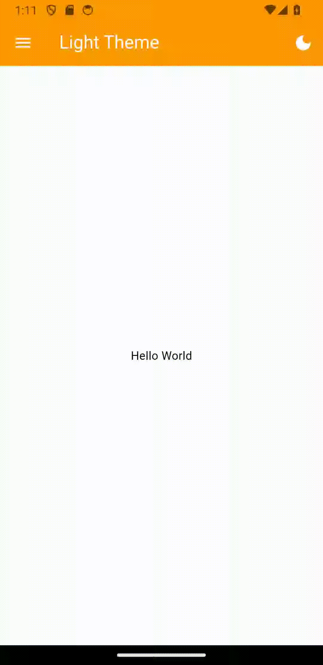
class HomeScreen extends StatelessWidget {
final ThemeManager themeManager;
HomeScreen({required this.themeManager});
[@override](/user/override)
Widget build(BuildContext context) {
return Scaffold(
appBar: AppBar(
title: Text('主题管理示例'),
),
body: Center(
child: Switch(
value: themeManager.themeMode == ThemeMode.dark,
onChanged: (value) {
themeManager.toggleTheme(value);
},
activeThumbImage: themeManager.currentThemeIcons,
inactiveThumbImage: themeManager.currentThemeIcons,
),
),
);
}
}
更多关于Flutter主题管理插件themer的使用的实战教程也可以访问 https://www.itying.com/category-92-b0.html

更多关于Flutter主题管理插件themer的使用的实战系列教程也可以访问 https://www.itying.com/category-92-b0.html
themer 是一个用于管理 Flutter 应用主题的插件,它可以帮助开发者更轻松地管理和切换应用的主题。通过 themer,你可以定义多个主题,并在运行时动态切换它们,而无需手动管理大量的主题相关代码。
安装 themer
首先,你需要在 pubspec.yaml 文件中添加 themer 依赖:
dependencies:
  flutter:
    sdk: flutter
  themer: ^1.0.0  # 请检查最新版本
然后,运行 flutter pub get 来安装依赖。
基本用法
1. 定义主题
你可以通过 Themer 类来定义多个主题。每个主题通常包含颜色、字体、形状等样式。
import 'package:flutter/material.dart';
import 'package:themer/themer.dart';

final ThemeData lightTheme = ThemeData(
  brightness: Brightness.light,
  primaryColor: Colors.blue,
  accentColor: Colors.blueAccent,
);

final ThemeData darkTheme = ThemeData(
  brightness: Brightness.dark,
  primaryColor: Colors.indigo,
  accentColor: Colors.indigoAccent,
);
2. 初始化 Themer
在你的应用的 main.dart 文件中,初始化 Themer 并设置默认主题。
import 'package:flutter/material.dart';
import 'package:themer/themer.dart';

void main() {
  Themer.init(
    themes: {
      'light': lightTheme,
      'dark': darkTheme,
    },
    initialTheme: 'light',  // 设置默认主题
  );

  runApp(MyApp());
}

class MyApp extends StatelessWidget {
  @override
  Widget build(BuildContext context) {
    return ThemedApp(
      child: MaterialApp(
        title: 'Themer Example',
        home: HomeScreen(),
      ),
    );
  }
}
3. 使用主题
在应用的任何地方,你都可以使用 Themer.of(context) 来获取当前的主题,并使用 Themer.setTheme 来切换主题。
import 'package:flutter/material.dart';
import 'package:themer/themer.dart';

class HomeScreen extends StatelessWidget {
  @override
  Widget build(BuildContext context) {
    final theme = Themer.of(context);

    return Scaffold(
      appBar: AppBar(
        title: Text('Themer Example'),
      ),
      body: Center(
        child: Column(
          mainAxisAlignment: MainAxisAlignment.center,
          children: <Widget>[
            Text(
              'Current Theme: ${theme.brightness == Brightness.light ? 'Light' : 'Dark'}',
              style: TextStyle(fontSize: 24),
            ),
            SizedBox(height: 20),
            ElevatedButton(
              onPressed: () {
                Themer.setTheme('dark');  // 切换为深色主题
              },
              child: Text('Switch to Dark Theme'),
            ),
            ElevatedButton(
              onPressed: () {
                Themer.setTheme('light');  // 切换为浅色主题
              },
              child: Text('Switch to Light Theme'),
            ),
          ],
        ),
      ),
    );
  }
}
高级用法
1. 自定义主题数据
你可以通过继承 ThemeData 来创建自定义的主题数据类,并在 Themer 中使用。
class CustomThemeData extends ThemeData {
  final Color customColor;

  CustomThemeData({
    required this.customColor,
    Brightness brightness = Brightness.light,
    Color primaryColor = Colors.blue,
  }) : super(
          brightness: brightness,
          primaryColor: primaryColor,
        );
}

final CustomThemeData customTheme = CustomThemeData(
  customColor: Colors.purple,
  brightness: Brightness.light,
  primaryColor: Colors.purple,
);
2. 监听主题变化
你可以通过 Themer.addListener 来监听主题的变化,并在主题变化时执行某些操作。
Themer.addListener(() {
  print('Theme changed to: ${Themer.currentTheme}');
});