


Flutter UI组件库插件flutter_vant_kit的使用
Flutter UI组件库插件flutter_vant_kit的使用
项目说明
此项目仅供本人学习用,更新频率慢,若在项目中使用请移步到其它成熟的组件库。
Flutter Vant Kit
Flutter Vant Kit 是一个基于 Vant 的 Flutter UI 库。
使用方法
在 pubspec.yaml 文件中添加以下依赖:
dependencies:
  flutter_vant_kit: ^0.3.0
运行示例
- 进入示例目录:
cd example/ - 运行示例应用:
flutter run
API 文档
查看详细的 API 文档:
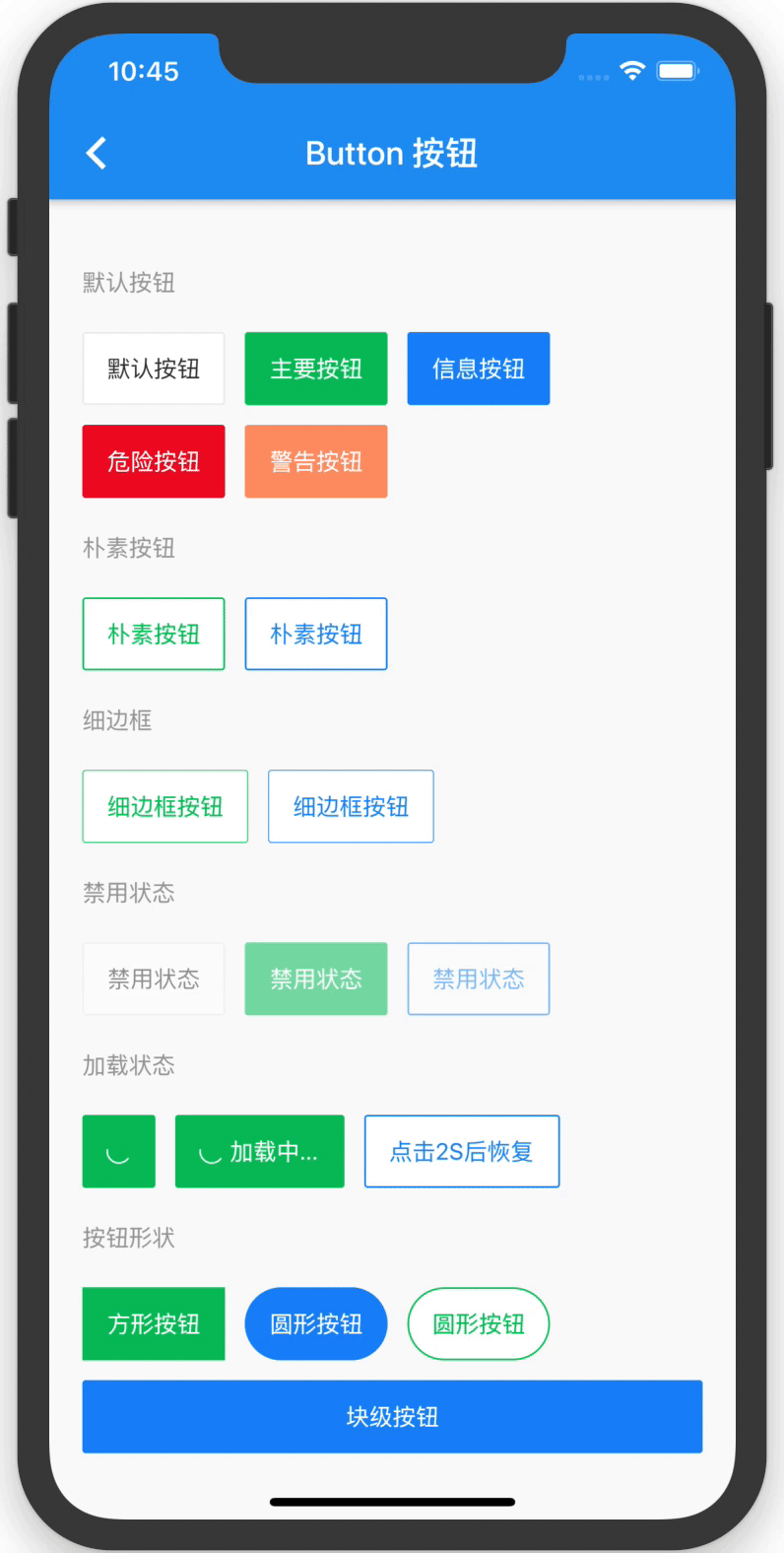
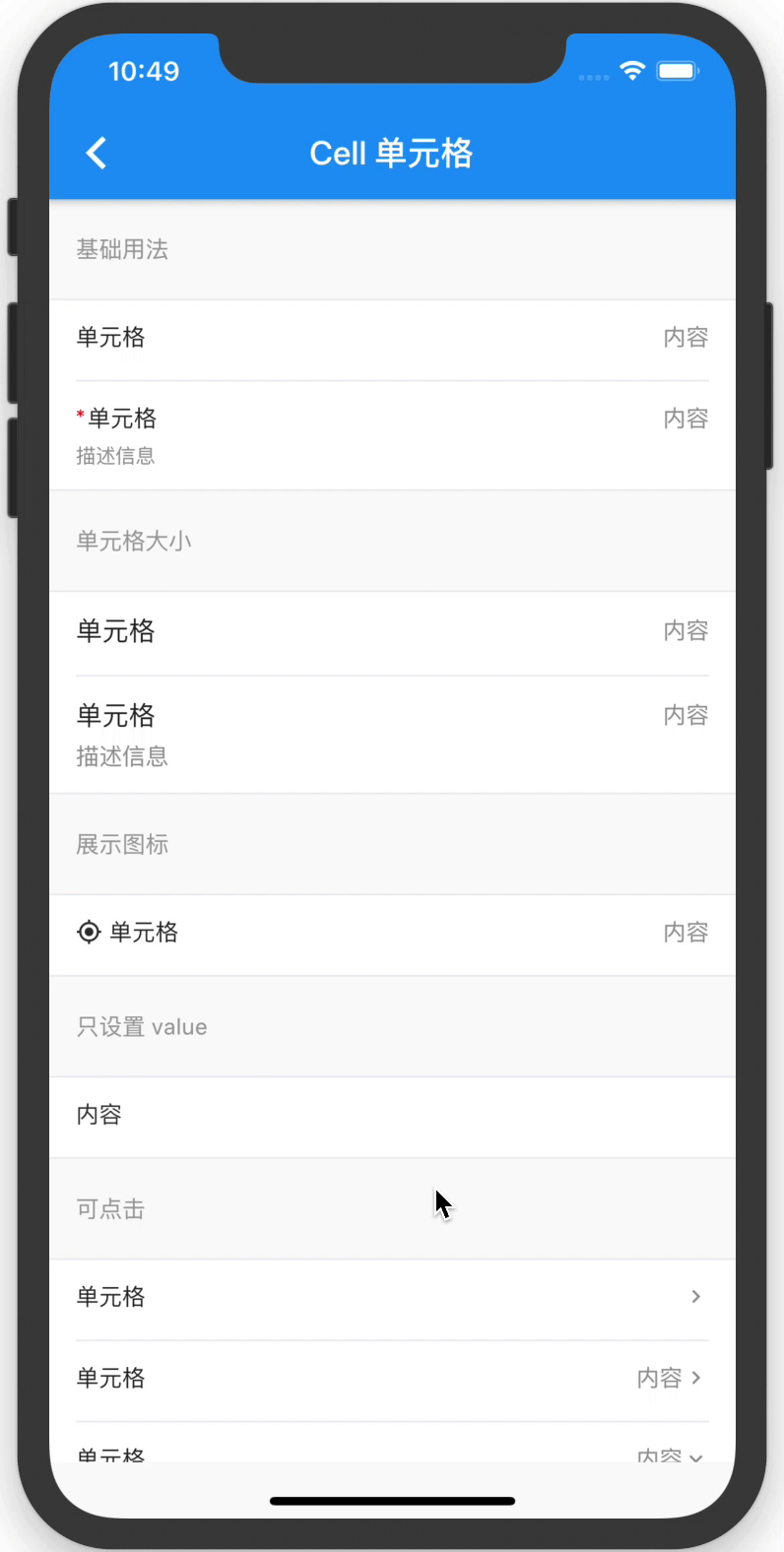
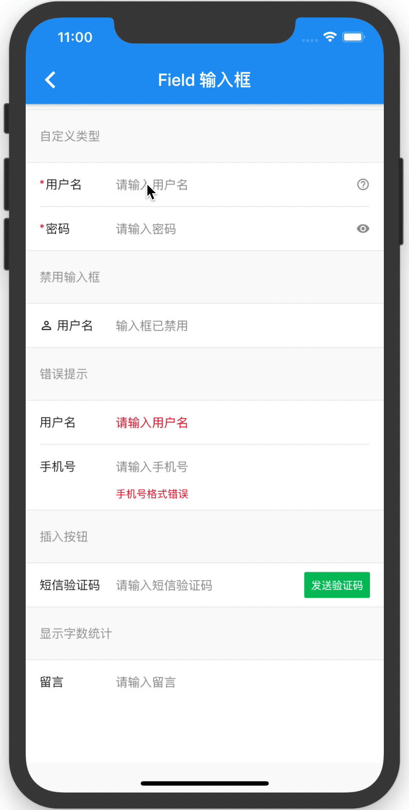
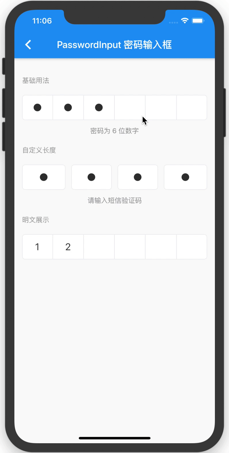
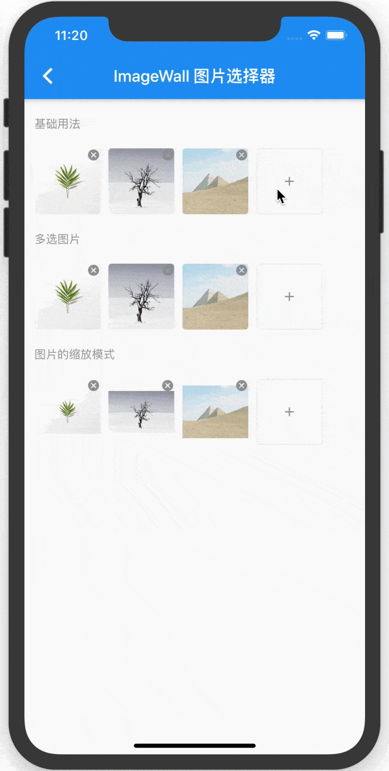
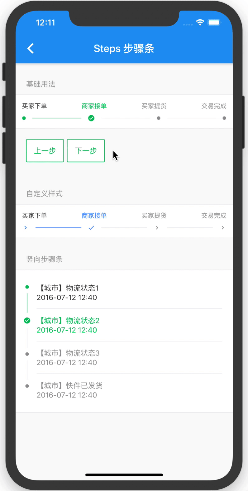
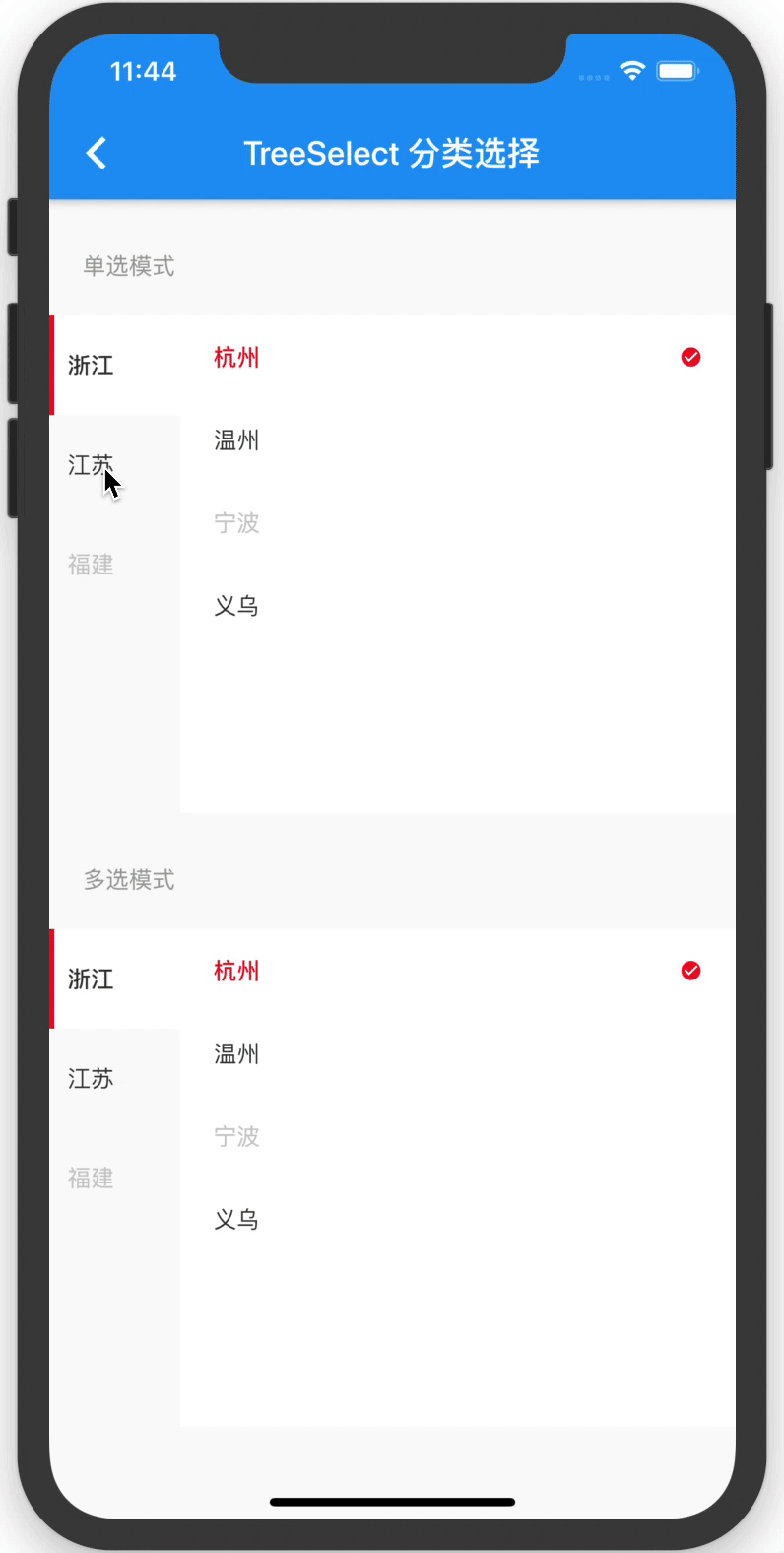
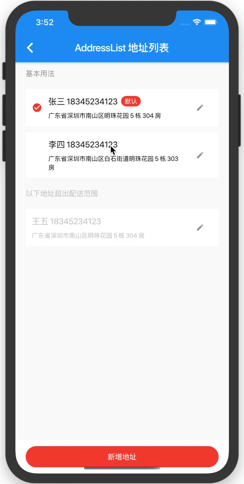
示例截图
完整示例代码
以下是 main.dart 的完整代码示例:
import 'package:flutter/foundation.dart';
import 'package:flutter/material.dart';
import 'package:flutter/rendering.dart';
import './routes/index.dart';
import 'package:flutter_vant_kit/main.dart';

void main() async {
  runApp(MyApp());
}

class MyApp extends StatelessWidget {
  // This widget is the root of your application.

  [@override](/user/override)
  Widget build(BuildContext context) {
    return MaterialApp(
      title: 'Flutter 组件库',
      debugShowCheckedModeBanner: false,
      theme: ThemeData(
        primarySwatch: Colors.blue,
      ),
      home: MyHomePage(),
    );
  }
}

class MyHomePage extends StatefulWidget {
  MyHomePage({Key? key}) : super(key: key);

  [@override](/user/override)
  _MyHomePageState createState() => _MyHomePageState();
}

class _MyHomePageState extends State<MyHomePage> {
  [@override](/user/override)
  Widget build(BuildContext context) {
    return Scaffold(
      appBar: AppBar(
        title: Text("Flutter 组件库"),
        centerTitle: true,
      ),
      body: Container(
        color: Color(0xfff7f8fa),
        child: SafeArea(
          child: Collapse(
            name: ["0"],
            list: [
              CollapseItem(
                customTitle: Text("基础组件", style: TextStyle(fontWeight: FontWeight.bold)),
                isExpanded: true,
                child: CellGroup(
                  border: false,
                  children: [
                    PageCell("Button 按钮", (ctx) => DemoButton(), padding: false),
                    PageCell("Cell 单元格", (ctx) => DemoCell(), padding: false),
                    PageCell("Image 图片", (ctx) => DemoImage(), padding: true),
                    PageCell("Avatar 头像", (ctx) => DemoAvatar(), padding: true),
                  ],
                ),
              ),
              CollapseItem(
                customTitle: Text("表单组件", style: TextStyle(fontWeight: FontWeight.bold)),
                isExpanded: true,
                child: CellGroup(
                  border: false,
                  children: [
                    PageCell("Calendar 日历", (ctx) => DemoCalendar(), padding: false),
                    PageCell("Checkbox 复选框", (ctx) => DemoCheckbox(), padding: true),
                    PageCell("Field 输入框", (ctx) => DemoField(), padding: false),
                    PageCell("NumberKeyboard 数字键盘", (ctx) => DemoNumberKeyboard(), padding: true),
                    PageCell("PasswordInput 密码输入框", (ctx) => DemoPasswordInput(), padding: true),
                    PageCell("Picker 选择器", (ctx) => DemoPicker(), padding: false),
                    PageCell("Radio 单选框", (ctx) => DemoRadio(), padding: true),
                    PageCell("Rate 评分", (ctx) => DemoRate(), padding: false),
                    PageCell("Search 搜索", (ctx) => DemoSearch(), padding: false),
                    PageCell("Stepper 步进器", (ctx) => DemoStepper(), padding: false),
                    PageCell("ImageWall 图片选择器", (ctx) => DemoImageWall(), padding: false),
                  ],
                ),
              ),
              CollapseItem(
                customTitle: Text("反馈组件", style: TextStyle(fontWeight: FontWeight.bold)),
                isExpanded: true,
                child: CellGroup(
                  border: false,
                  children: [
                    PageCell("ActionSheet 上拉菜单", (ctx) => DemoActionSheet(), padding: false),
                    PageCell("Dialog 弹窗", (ctx) => DemoDialog(), padding: false),
                    PageCell("Loading 加载", (ctx) => DemoLoading(), padding: true),
                    PageCell("ShareSheet 分享面板", (ctx) => DemoShareSheet(), padding: false),
                  ],
                ),
              ),
              CollapseItem(
                customTitle: Text("展示组件", style: TextStyle(fontWeight: FontWeight.bold)),
                isExpanded: true,
                child: CellGroup(
                  border: false,
                  children: [
                    PageCell("Badge 徽标", (ctx) => DemoBadge(), padding: true),
                    PageCell("Circle 环形进度条", (ctx) => DemoCircle(), padding: true),
                    PageCell("Collapse 折叠面板", (ctx) => DemoCollapse(), padding: false),
                    // PageCell("CountDown 倒计时", (ctx) => DemoCountDown(), padding: false),
                    PageCell("Divider 分割线", (ctx) => DemoDivider(), padding: true),
                    PageCell("ImagePreview 图片预览", (ctx) => DemoImagePreview(), padding: false),
                    PageCell("List 列表", (ctx) => DemoList(), padding: false, withScaffold: false),
                    PageCell("NoticeBar 通知栏", (ctx) => DemoNoticeBar(), padding: false),
                    PageCell("Panel 面板", (ctx) => DemoPanel(), padding: false),
                    PageCell("Price 商品价格", (ctx) => DemoPrice(), padding: true),
                    PageCell("Progress 进度条", (ctx) => DemoProgress(), padding: true),
                    PageCell("Skeleton 骨架屏", (ctx) => DemoSkeleton(), padding: true),
                    PageCell("Steps 步骤条", (ctx) => DemoSteps(), padding: false),
                    PageCell("Swipe 轮播", (ctx) => DemoSwipe(), padding: false),
                    PageCell("Tag 标签", (ctx) => DemoTag(), padding: true),
                  ],
                ),
              ),
              CollapseItem(
                customTitle: Text("导航组件", style: TextStyle(fontWeight: FontWeight.bold)),
                isExpanded: true,
                child: CellGroup(
                  border: false,
                  children: [
                    PageCell("Pagination 分页", (ctx) => DemoPagination(), padding: true),
                    PageCell("Sidebar 侧边导航", (ctx) => DemoSidebar(), padding: true),
                    PageCell("TreeSelect 分类选择", (ctx) => DemoTreeSelect(), padding: false),
                  ],
                ),
              ),
              CollapseItem(
                customTitle: Text("业务组件", style: TextStyle(fontWeight: FontWeight.bold)),
                isExpanded: true,
                child: CellGroup(
                  border: false,
                  children: [
                    PageCell("AddressEdit 地址编辑", (ctx) => DemoAddressEdit(), padding: false),
                    PageCell("AddressList 地址列表", (ctx) => DemoAddressList(), padding: false),
                    PageCell("Card 商品卡片", (ctx) => DemoCard(), padding: false),
                    PageCell("ContactCard 联系人卡片", (ctx) => DemoContactCard(), padding: false),
                    PageCell("Coupon 优惠券选择器", (ctx) => DemoCoupon(), padding: false),
                    PageCell("GoodsAction 商品导航", (ctx) => DemoGoodsAction(), padding: false),
                    PageCell("SubmitBar 提交订单栏", (ctx) => DemoSubmitBar(), padding: false),
                  ],
                ),
              ),
            ],
          ),
        ),
      ),
    );
  }
}

class PageCell extends StatelessWidget {
  PageCell(
    this.title,
    this.builder, {
    this.withScaffold = true,
    this.padding = true,
  });

  final String title;
  final WidgetBuilder builder;
  final bool withScaffold;
  final bool padding;

  void _openPage(BuildContext context) {
    Navigator.push(context, MaterialPageRoute(builder: (context) {
      if (!withScaffold) {
        return builder(context);
      }
      return PageScaffold(
          title: title, body: builder(context), padding: padding);
    }));
  }

  [@override](/user/override)
  Widget build(BuildContext context) {
    return Cell(
      title: title,
      isLink: true,
      onClick: () => _openPage(context),
    );
  }
}

class PageScaffold extends StatelessWidget {
  PageScaffold({this.title, this.body, this.padding: false});

  final String? title;
  final Widget? body;
  final bool padding;

  [@override](/user/override)
  Widget build(BuildContext context) {
    return Scaffold(
        appBar: AppBar(
          title: Text(title!),
        ),
        body: SafeArea(
            child: Container(
                padding: EdgeInsets.all(padding ? 16.0 : 0),
                decoration: BoxDecoration(
                  color: Color(0xfff7f8fa),
                ),
                child: body)));
  }
}
更多关于Flutter UI组件库插件flutter_vant_kit的使用的实战教程也可以访问 https://www.itying.com/category-92-b0.html
1 回复

更多关于Flutter UI组件库插件flutter_vant_kit的使用的实战系列教程也可以访问 https://www.itying.com/category-92-b0.html
flutter_vant_kit 是一个基于 Flutter 的 UI 组件库,灵感来源于 Vant UI(一个轻量级的移动端 Vue 组件库)。它提供了丰富的组件,帮助开发者快速构建美观且功能齐全的移动应用。
以下是使用 flutter_vant_kit 的基本步骤和示例:
1. 添加依赖
首先,在 pubspec.yaml 文件中添加 flutter_vant_kit 依赖:
dependencies:
  flutter:
    sdk: flutter
  flutter_vant_kit: ^1.0.0  # 请使用最新版本
然后运行 flutter pub get 来安装依赖。
2. 导入库
在你的 Dart 文件中导入 flutter_vant_kit:
import 'package:flutter_vant_kit/flutter_vant_kit.dart';
3. 使用组件
flutter_vant_kit 提供了许多常用的 UI 组件,例如按钮、表单、对话框等。以下是一些常见组件的使用示例:
按钮 (Button)
Button(
  text: "Primary Button",
  type: ButtonType.primary,
  onClick: () {
    print("Button clicked!");
  },
)
对话框 (Dialog)
Dialog(
  title: "提示",
  message: "这是一个对话框示例",
  showCancelButton: true,
  onConfirm: () {
    print("确认");
  },
  onCancel: () {
    print("取消");
  },
).show(context);
表单 (Form)
Form(
  children: [
    FormItem(
      label: "用户名",
      child: TextField(
        decoration: InputDecoration(
          hintText: "请输入用户名",
        ),
      ),
    ),
    FormItem(
      label: "密码",
      child: TextField(
        obscureText: true,
        decoration: InputDecoration(
          hintText: "请输入密码",
        ),
      ),
    ),
  ],
)
滑动单元格 (SwipeCell)
SwipeCell(
  left: [
    Button(
      text: "删除",
      type: ButtonType.danger,
      onClick: () {
        print("删除");
      },
    ),
  ],
  right: [
    Button(
      text: "编辑",
      type: ButtonType.primary,
      onClick: () {
        print("编辑");
      },
    ),
  ],
  child: ListTile(
    title: Text("滑动单元格示例"),
  ),
)
4. 自定义主题
flutter_vant_kit 支持自定义主题颜色。你可以在应用启动时设置主题颜色:
void main() {
  VantTheme.setTheme(VantThemeData(
    primaryColor: Colors.blue,
    dangerColor: Colors.red,
  ));
  runApp(MyApp());
}