


Flutter高性能图表绘制插件speed_chart的使用
Flutter高性能图表绘制插件speed_chart的使用
特性
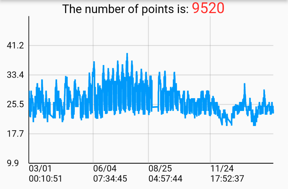
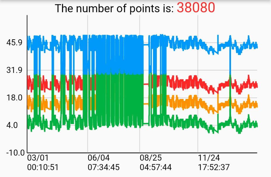
- 在折线图中绘制多个数据系列。
- 横向缩放(捏合放大/缩小)。
- 横向平移。
- 长按事件触发轨道球,包含垂直线和相应数据点。
查看我的演示视频: https://youtu.be/Bh4sUhu9UCM.
支持的平台
- Android
- iOS
- macOS
- Windows
使用方法
准备数据点:DateTime格式X轴
  LineSeries _getChartData({
    required List data,
    required Color color,
    required String name,
    double? maxYAxisValue,
    double? minYAxisValue,
  }) {
    List<ValuePair> dataList = [];
    for (int i = 0; i < data.length; i++) {
      var d = data[i];
      DateTime dateTime = DateTime.parse(d['time'].toString());
      double? value =
          d['value'] == 'null' ? null : double.parse(d['value'].toString());

      dataList.add(ValuePair(x: dateTime, y: value));
    }

    LineSeries lineSeries = LineSeries(
      name: name,
      dataList: dataList,
      color: color,
      maxYAxisValue: maxYAxisValue,
      minYAxisValue: minYAxisValue,
    );

    return lineSeries;
  }
准备数据点:数字格式X轴
  LineSeries _getGenericTypeChartData({
    required List data,
    required Color color,
    required String name,
    double? maxYAxisValue,
    double? minYAxisValue,
  }) {
    List<ValuePair> dataList = [];
    for (int i = 0; i < data.length; i++) {
      var d = data[i];
      int freq = int.parse(d['freq'].toString());
      double? level =
          d['level'] == 'null' ? null : double.parse(d['level'].toString());

      dataList.add(ValuePair(x: freq, y: level));
    }

    LineSeries lineSeries = LineSeries(
      name: name,
      dataList: dataList,
      color: color,
      maxYAxisValue: maxYAxisValue,
      minYAxisValue: minYAxisValue,
    );

    return lineSeries;
  }
LineSeries的数据结构
maxYAxisValue 和 minYAxisValue 是可选参数。如果提供了这些参数,则Y轴的范围将根据给定值显示。如果没有提供,则Y轴的范围会自动调整以适应数据点。
class LineSeries {
  const LineSeries({
    required this.name,
    required this.dataList,
    required this.color,
    this.maxYAxisValue,
    this.minYAxisValue,
  });

  final String name;
  final List<ValuePair> dataList;
  final Color color;
  final double? maxYAxisValue;
  final double? minYAxisValue;
}
showLegend 参数用于显示每个数据系列的名称和颜色,以便识别图表中的相应线系列。
showMultipleYAxises 参数用于显示多个Y轴。
showScaleThumbs 参数用于在图表上显示缩放拇指,用于缩放和平移线系列。建议在桌面平台上使用,作为手势操作的替代方案。
创建单个折线图
List<LineSeries> lineSeriesCollection = [
  _getChartData(
      data: [
        {"time": "2022-09-16 00:41:38", "value": "12.0"},
        {"time": "2022-09-16 00:51:39", "value": "23.0"},
        {"time": "2022-09-16 01:01:38", "value": "65.6"},
      ],
      color: Colors.red,
      name: 'Line0',
  )
];

SpeedLineChart(
  lineSeriesCollection: lineSeriesCollection,
  title: lineSeriesCollection[0].name,
  showLegend: false,
),
创建多个折线图
List<LineSeries> lineSeriesCollection1 = [
  _getChartData(
      data: [
        {"time": "2022-09-16 00:41:38", "value": "12.0"},
        {"time": "2022-09-16 00:51:39", "value": "23.0"},
        {"time": "2022-09-16 01:01:38", "value": "65.6"},
      ],
      color: Colors.red,
      name: 'Line0',
  ),
  _getChartData(
      data: [
        {"time": "2022-09-16 00:41:38", "value": "12.0"},
        {"time": "2022-09-16 00:51:39", "value": "23.0"},
        {"time": "2022-09-16 01:01:38", "value": "65.6"},
      ],
      color: Colors.orange,
      name: 'Line1',
  ),
];

SpeedLineChart(
  lineSeriesCollection: lineSeriesCollection1,
  title: lineSeriesCollection1[0].name,
  showLegend: false,
),
更多关于Flutter高性能图表绘制插件speed_chart的使用的实战教程也可以访问 https://www.itying.com/category-92-b0.html

更多关于Flutter高性能图表绘制插件speed_chart的使用的实战系列教程也可以访问 https://www.itying.com/category-92-b0.html
speed_chart 是一个用于 Flutter 的高性能图表绘制插件,专注于快速渲染大量数据点。它适用于需要展示大量数据且对性能要求较高的场景,如金融图表、实时数据监控等。
以下是如何使用 speed_chart 插件的基本步骤:
1. 添加依赖
首先,在 pubspec.yaml 文件中添加 speed_chart 插件的依赖:
dependencies:
  flutter:
    sdk: flutter
  speed_chart: ^0.1.0  # 请检查最新版本
然后运行 flutter pub get 来安装依赖。
2. 导入库
在需要使用 speed_chart 的 Dart 文件中导入库:
import 'package:speed_chart/speed_chart.dart';
3. 创建图表
speed_chart 提供了多种类型的图表,如折线图、柱状图等。以下是一个简单的折线图示例:
class MyChart extends StatelessWidget {
  [@override](/user/override)
  Widget build(BuildContext context) {
    return SpeedChart(
      chartType: ChartType.line,
      data: [
        SpeedChartData(x: 0, y: 10),
        SpeedChartData(x: 1, y: 20),
        SpeedChartData(x: 2, y: 15),
        SpeedChartData(x: 3, y: 30),
        SpeedChartData(x: 4, y: 25),
      ],
      xAxis: SpeedChartAxis(title: 'X Axis'),
      yAxis: SpeedChartAxis(title: 'Y Axis'),
      title: 'Sample Line Chart',
    );
  }
}
4. 自定义图表
speed_chart 提供了丰富的自定义选项,如颜色、线条样式、轴标签等。以下是一些常见的自定义选项:
class MyCustomChart extends StatelessWidget {
  [@override](/user/override)
  Widget build(BuildContext context) {
    return SpeedChart(
      chartType: ChartType.line,
      data: [
        SpeedChartData(x: 0, y: 10),
        SpeedChartData(x: 1, y: 20),
        SpeedChartData(x: 2, y: 15),
        SpeedChartData(x: 3, y: 30),
        SpeedChartData(x: 4, y: 25),
      ],
      xAxis: SpeedChartAxis(
        title: 'X Axis',
        labelStyle: TextStyle(color: Colors.blue, fontSize: 12),
      ),
      yAxis: SpeedChartAxis(
        title: 'Y Axis',
        labelStyle: TextStyle(color: Colors.red, fontSize: 12),
      ),
      title: 'Custom Line Chart',
      lineColor: Colors.green,
      lineWidth: 2.0,
      pointColor: Colors.orange,
      pointRadius: 4.0,
      backgroundColor: Colors.grey[200],
    );
  }
}
5. 处理大量数据
speed_chart 的一个主要优势是它能够高效地处理大量数据。你可以通过 SpeedChartData 列表来传递数据:
class LargeDataChart extends StatelessWidget {
  final List<SpeedChartData> data = List.generate(1000, (index) => SpeedChartData(x: index.toDouble(), y: sin(index * 0.1) * 100));

  [@override](/user/override)
  Widget build(BuildContext context) {
    return SpeedChart(
      chartType: ChartType.line,
      data: data,
      xAxis: SpeedChartAxis(title: 'X Axis'),
      yAxis: SpeedChartAxis(title: 'Y Axis'),
      title: 'Large Data Chart',
    );
  }
}
6. 其他图表类型
speed_chart 支持多种图表类型,如柱状图、面积图等。你可以通过 chartType 参数来指定图表类型:
class BarChartExample extends StatelessWidget {
  [@override](/user/override)
  Widget build(BuildContext context) {
    return SpeedChart(
      chartType: ChartType.bar,
      data: [
        SpeedChartData(x: 0, y: 10),
        SpeedChartData(x: 1, y: 20),
        SpeedChartData(x: 2, y: 15),
        SpeedChartData(x: 3, y: 30),
        SpeedChartData(x: 4, y: 25),
      ],
      xAxis: SpeedChartAxis(title: 'X Axis'),
      yAxis: SpeedChartAxis(title: 'Y Axis'),
      title: 'Sample Bar Chart',
    );
  }
}
7. 实时更新数据
如果你需要实时更新图表数据,可以使用 SpeedChartController 来控制数据的更新:
class RealTimeChart extends StatefulWidget {
  [@override](/user/override)
  _RealTimeChartState createState() => _RealTimeChartState();
}

class _RealTimeChartState extends State<RealTimeChart> {
  SpeedChartController _controller = SpeedChartController();
  List<SpeedChartData> data = [];

  [@override](/user/override)
  void initState() {
    super.initState();
    _updateData();
  }

  void _updateData() {
    Future.delayed(Duration(seconds: 1), () {
      setState(() {
        data.add(SpeedChartData(x: data.length.toDouble(), y: Random().nextDouble() * 100));
        _controller.updateData(data);
      });
      _updateData();
    });
  }

  [@override](/user/override)
  Widget build(BuildContext context) {
    return SpeedChart(
      controller: _controller,
      chartType: ChartType.line,
      data: data,
      xAxis: SpeedChartAxis(title: 'X Axis'),
      yAxis: SpeedChartAxis(title: 'Y Axis'),
      title: 'Real-Time Chart',
    );
  }
}