


Flutter自定义UI组件插件fancy_element的使用
Flutter自定义UI组件插件fancy_element的使用
通过使用 fancy_element 插件,您可以为您的 Flutter 应用程序实现各种炫酷的元素。当前支持的组件包括:
- 容器
- 卡片容器
- 渐变容器
- 按钮容器(Neumorphism)
更多炫酷的组件将会陆续添加。
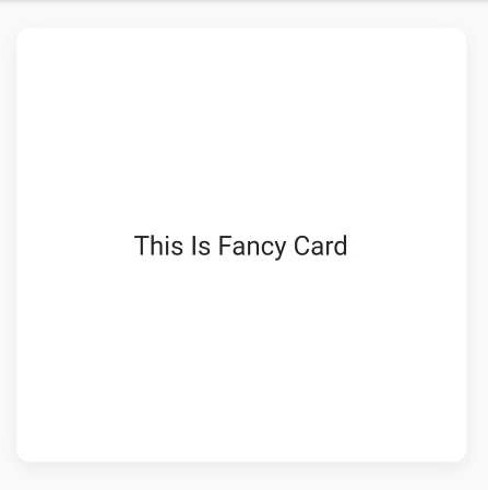
Fancy Card
FancyCard 可以用来创建一个炫酷的卡片。
FancyCard(
  width: Fancy.width(context), // 获取屏幕宽度
  height: Fancy.height(context) * 0.40, // 设置卡片高度为屏幕高度的40%
  redius: 10, // 设置圆角半径
  child: Center(
    child: Container(
      child: const Text(
        "This Is Fancy Card", // 显示在卡片上的文本
        style: TextStyle(fontSize: 20),
      ),
    ),
  ),
),
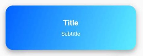
Fancy Container
FancyContainer 可以用来创建一个具有渐变效果的容器,并且可以设置标题和副标题。
FancyContainer(
  color1: const Color(0xff0061ff), // 设置渐变颜色1
  color2: const Color(0xff60efff), // 设置渐变颜色2
  onTap: () {}, // 点击事件
),
Neumorphism Container
NeumorphismContainer 用于创建具有 Neumorphism 效果的容器。
const NeumorphismContainer(),

导航到新页面
如果需要导航到新的页面,可以使用以下代码片段:
Go.to(context, const NewPage()); // 导航到新页面
Go.toNamed(context, "/page", argument: {"name": id}); // 使用命名路由导航到新页面
Go.off(context, const NewPage()); // 关闭当前页面并导航到新页面
Go.offAll(context, const NewPage()); // 关闭所有页面并导航到新页面
Go.back(context); // 返回上一个页面
完整示例代码
以下是一个完整的示例代码,展示了如何使用 fancy_element 插件来创建一个包含上述组件的页面。
import 'package:fancy_element/fancy_element.dart';
import 'package:flutter/material.dart';

class ExampleScreen extends StatefulWidget {
  const ExampleScreen({Key? key}) : super(key: key);

  [@override](/user/override)
  State<ExampleScreen> createState() => _ExampleScreenState();
}

class _ExampleScreenState extends State<ExampleScreen> {
  [@override](/user/override)
  Widget build(BuildContext context) {
    return Scaffold(
      appBar: AppBar(
        title: Text('Fancy Element Demo'),
      ),
      body: Center(
        child: Column(
          mainAxisAlignment: MainAxisAlignment.center,
          children: [
            // 使用FancyCard组件
            FancyCard(
              width: Fancy.width(context),
              height: Fancy.height(context) * 0.40,
              redius: 10,
              child: Center(
                child: Container(
                  child: const Text(
                    "This Is Fancy Card",
                    style: TextStyle(fontSize: 20),
                  ),
                ),
              ),
            ),
            SizedBox(height: 20), // 添加间距
            // 使用FancyContainer组件
            FancyContainer(
              color1: const Color(0xff0061ff),
              color2: const Color(0xff60efff),
              onTap: () {},
            ),
            SizedBox(height: 20), // 添加间距
            // 使用NeumorphismContainer组件
            NeumorphismContainer(),
          ],
        ),
      ),
    );
  }
}
更多关于Flutter自定义UI组件插件fancy_element的使用的实战教程也可以访问 https://www.itying.com/category-92-b0.html

更多关于Flutter自定义UI组件插件fancy_element的使用的实战系列教程也可以访问 https://www.itying.com/category-92-b0.html
fancy_element 是一个假设的 Flutter 自定义 UI 组件插件,用于创建复杂的、自定义的 UI 元素。以下是如何在 Flutter 项目中使用 fancy_element 插件的示例。
1. 添加依赖
首先,你需要在 pubspec.yaml 文件中添加 fancy_element 插件的依赖。
dependencies:
  flutter:
    sdk: flutter
  fancy_element: ^1.0.0  # 请根据实际情况替换版本号
然后运行 flutter pub get 来获取依赖。
2. 导入插件
在你的 Dart 文件中导入 fancy_element 插件。
import 'package:fancy_element/fancy_element.dart';
3. 使用自定义组件
假设 fancy_element 提供了一个名为 FancyButton 的自定义按钮组件。你可以在你的 UI 中使用它。
class MyHomePage extends StatelessWidget {
  @override
  Widget build(BuildContext context) {
    return Scaffold(
      appBar: AppBar(
        title: Text('Fancy Element Example'),
      ),
      body: Center(
        child: FancyButton(
          onPressed: () {
            print('Fancy Button Pressed!');
          },
          text: 'Click Me',
          color: Colors.blue,
          icon: Icons.favorite,
        ),
      ),
    );
  }
}
4. 自定义组件属性
FancyButton 组件可能有一些属性可以自定义,比如按钮的颜色、文本、图标等。你可以根据插件的文档来调整这些属性。
FancyButton(
  onPressed: () {
    print('Fancy Button Pressed!');
  },
  text: 'Submit',
  color: Colors.green,
  icon: Icons.check_circle,
  borderRadius: 20.0,
  textColor: Colors.white,
)
5. 处理事件
FancyButton 组件可能还支持一些事件,比如 onPressed,你可以在事件处理函数中执行自定义逻辑。
FancyButton(
  onPressed: () {
    // 处理按钮点击事件
    ScaffoldMessenger.of(context).showSnackBar(
      SnackBar(content: Text('Button Clicked!')),
    );
  },
  text: 'Click Me',
  color: Colors.red,
  icon: Icons.warning,
)
6. 自定义动画(如果支持)
如果 fancy_element 支持动画,你可以通过传递动画参数来定制按钮的动画效果。
FancyButton(
  onPressed: () {
    print('Fancy Button Pressed!');
  },
  text: 'Animate Me',
  color: Colors.purple,
  icon: Icons.animation,
  animationDuration: Duration(seconds: 1),
  animationCurve: Curves.easeInOut,
)
7. 其他自定义组件
fancy_element 可能还提供了其他自定义组件,比如 FancyCard、FancyTextField 等。你可以根据插件的文档来使用这些组件。
FancyCard(
  child: Column(
    children: [
      Text('This is a fancy card'),
      FancyTextField(
        hintText: 'Enter something',
        icon: Icons.edit,
      ),
    ],
  ),
  elevation: 5.0,
  borderRadius: 10.0,
)
8. 查看插件的文档
为了更好地使用 fancy_element 插件,建议查看插件的官方文档,了解所有可用的组件、属性和方法。
9. 运行项目
最后,运行你的 Flutter 项目,查看 fancy_element 组件的效果。
flutter run