


Flutter自定义对话框插件tb_custom_dialog_box的使用
Flutter 自定义对话框插件 tb_custom_dialog_box 的使用
特性
开始使用
要使用此包,请在 pubspec.yaml 文件中添加 tb_custom_dialog_box 作为依赖项。然后在你的文件中添加以下导入:
import 'package:tb_custom_dialog_box/tb_custom_dialog_box.dart';
使用示例
以下是一个完整的示例,展示如何使用 tb_custom_dialog_box 插件创建一个自定义对话框。
首先,确保你已经安装了 tb_custom_dialog_box 包,并且在你的 pubspec.yaml 文件中添加了相应的依赖项。
dependencies:
  tb_custom_dialog_box: ^1.0.0 # 确保使用正确的版本号
接下来,在你的 Dart 文件中,你可以使用 MTSCustomDialogBox 组件来创建自定义对话框。
import 'package:flutter/material.dart';
import 'package:tb_custom_dialog_box/tb_custom_dialog_box.dart';
void main() => runApp(MyApp());
class MyApp extends StatelessWidget {
[@override](/user/override)
Widget build(BuildContext context) {
return MaterialApp(
home: Scaffold(
appBar: AppBar(
title: Text('自定义对话框示例'),
),
body: Center(
child: ElevatedButton(
onPressed: () {
// 显示对话框
showDialog(
context: context,
builder: (BuildContext context) {
return MTSCustomDialogBox(
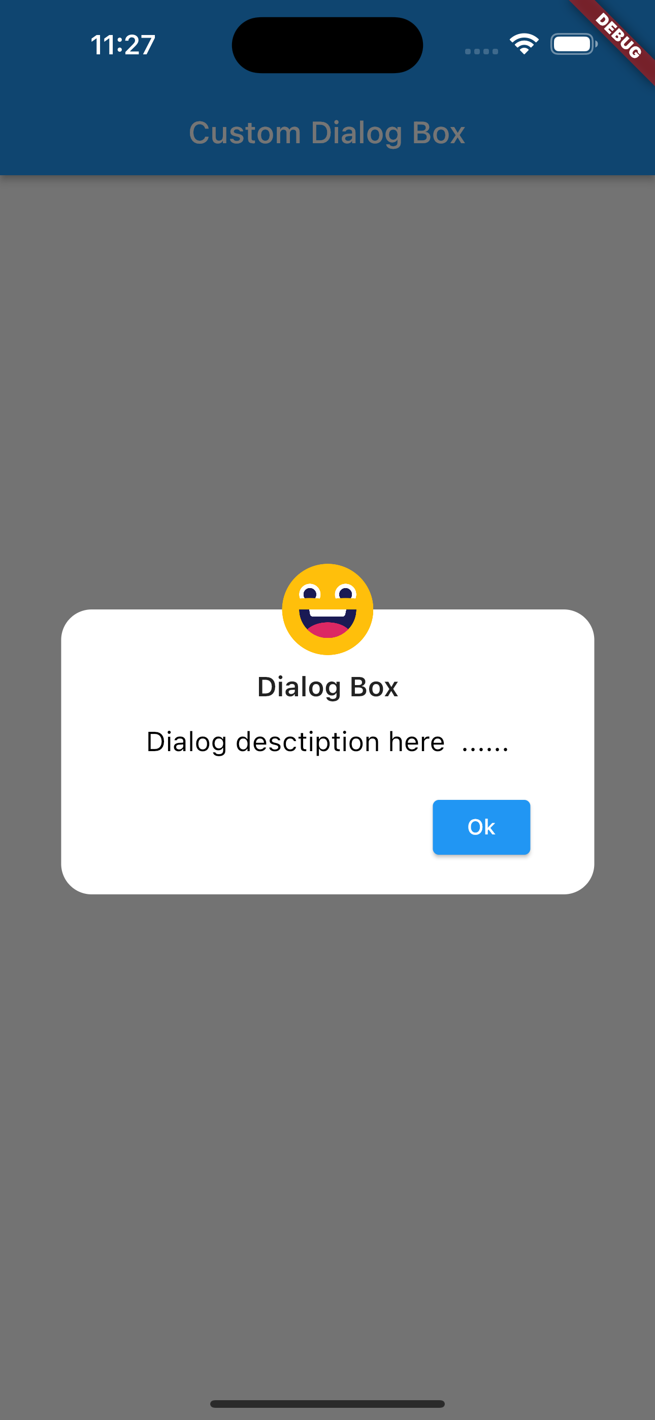
iconImage: const Image(image: AssetImage('assets/icons/smiley_icon.png')),
descriptions: "对话框描述在这里....",
title: "对话框",
okButtonText: "确定",
borderRadius: 20,
padding: 20,
isCancelButtonVisible: false,
cancelButtonText: "取消",
cancelButtononPressed: () {
Navigator.of(context).pop();
},
okButtononPressed: () {
Navigator.of(context).pop();
},
);
},
);
},
child: Text('显示对话框'),
),
),
),
);
}
}
更多关于Flutter自定义对话框插件tb_custom_dialog_box的使用的实战教程也可以访问 https://www.itying.com/category-92-b0.html

更多关于Flutter自定义对话框插件tb_custom_dialog_box的使用的实战系列教程也可以访问 https://www.itying.com/category-92-b0.html
tb_custom_dialog_box 是一个用于 Flutter 的自定义对话框插件,允许开发者创建高度个性化的对话框。使用该插件,你可以轻松地自定义对话框的布局、样式、动画等。
以下是使用 tb_custom_dialog_box 插件的基本步骤:
1. 添加依赖
首先,在 pubspec.yaml 文件中添加 tb_custom_dialog_box 插件的依赖:
dependencies:
  flutter:
    sdk: flutter
  tb_custom_dialog_box: ^1.0.0  # 使用最新版本
然后运行 flutter pub get 来安装依赖。
2. 导入包
在你的 Dart 文件中导入 tb_custom_dialog_box 包:
import 'package:tb_custom_dialog_box/tb_custom_dialog_box.dart';
3. 使用自定义对话框
你可以使用 TbCustomDialogBox 类来创建和显示自定义对话框。以下是一个简单的示例:
import 'package:flutter/material.dart';
import 'package:tb_custom_dialog_box/tb_custom_dialog_box.dart';

void main() {
  runApp(MyApp());
}

class MyApp extends StatelessWidget {
  @override
  Widget build(BuildContext context) {
    return MaterialApp(
      home: HomeScreen(),
    );
  }
}

class HomeScreen extends StatelessWidget {
  @override
  Widget build(BuildContext context) {
    return Scaffold(
      appBar: AppBar(
        title: Text('Custom Dialog Box Example'),
      ),
      body: Center(
        child: ElevatedButton(
          onPressed: () {
            _showCustomDialog(context);
          },
          child: Text('Show Dialog'),
        ),
      ),
    );
  }

  void _showCustomDialog(BuildContext context) {
    TbCustomDialogBox(
      context: context,
      title: "Custom Dialog",
      descriptions: "This is a custom dialog box example. You can customize it as per your needs.",
      text: "OK",
      onPressed: () {
        Navigator.of(context).pop();
      },
    ).show();
  }
}
4. 自定义对话框
TbCustomDialogBox 提供了多个参数来自定义对话框的外观和行为。以下是一些常用的参数:
context: 必填参数,对话框的上下文。title: 对话框的标题。descriptions: 对话框的描述文本。text: 按钮的文本。onPressed: 按钮的点击事件。titleTextStyle: 标题文本的样式。descriptionTextStyle: 描述文本的样式。buttonTextStyle: 按钮文本的样式。dialogWidth: 对话框的宽度。dialogHeight: 对话框的高度。backgroundColor: 对话框的背景颜色。boxShadow: 对话框的阴影效果。borderRadius: 对话框的边框圆角。animationDuration: 对话框的动画持续时间。animationType: 对话框的动画类型。
5. 自定义布局
如果你需要更复杂的布局,可以使用 content 参数来完全自定义对话框的内容:
TbCustomDialogBox(
  context: context,
  content: Column(
    children: [
      Text('Custom Content', style: TextStyle(fontSize: 20)),
      SizedBox(height: 20),
      Image.asset('assets/custom_image.png'),
      SizedBox(height: 20),
      ElevatedButton(
        onPressed: () {
          Navigator.of(context).pop();
        },
        child: Text('Close'),
      ),
    ],
  ),
).show();
6. 处理对话框关闭
你可以通过 onPressed 回调来处理对话框的关闭事件,或者在 onDismissed 回调中处理对话框被用户手动关闭的情况。
TbCustomDialogBox(
  context: context,
  title: "Custom Dialog",
  descriptions: "This is a custom dialog box example.",
  text: "OK",
  onPressed: () {
    Navigator.of(context).pop();
    print('Dialog closed by button');
  },
  onDismissed: () {
    print('Dialog dismissed by user');
  },
).show();
7. 动画效果
TbCustomDialogBox 支持多种动画效果,你可以通过 animationType 参数来设置:
TbCustomDialogBox(
  context: context,
  title: "Custom Dialog",
  descriptions: "This is a custom dialog box example.",
  text: "OK",
  animationType: AnimationType.scale,  // 缩放动画
  onPressed: () {
    Navigator.of(context).pop();
  },
).show();