


Flutter菜单协调插件coordinator_menu的使用
Flutter菜单协调插件coordinator_menu的使用

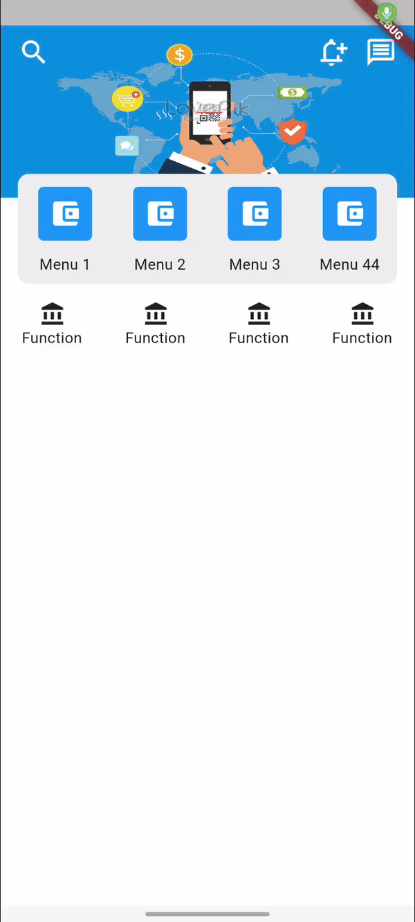
您是否见过电子钱包应用程序的UI/UX菜单?这个库将为您解决这个问题。
示例
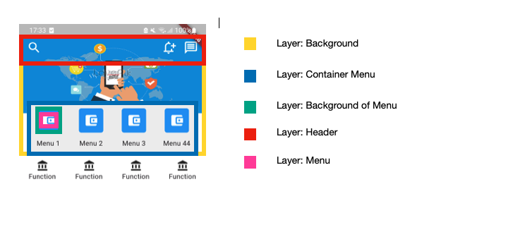
理解布局
使用
要使用此插件,请在pubspec.yaml文件中添加coordinator_menu作为依赖项。
dependencies:
  coordinator_menu: ^x.x.x
基本用法
以下是一个基本示例:
CoordinatorMenuWidget(
  headerView: _getHeaderView(),
  bgHeaderView: _getBgHeaderView(),
  bg: _getBg(),
  colorBgChange: Colors.white,
  containerMenuView: _getContainerView(),
  bgMenu: _getBgMenu(),
  menus: _getMenus(),
  listTitle: _getTitle(),
  paddingMenu: const EdgeInsets.symmetric(horizontal: 16.0, vertical: 12.0),
  functionView: _getListFunction(),
  paddingCollapseMenu: const EdgeInsets.fromLTRB(62, 8, 108, 8),
),
属性
| 名称 | 只读/可写 | 描述 |
|---|---|---|
| bg | R | 此视图是从头部到菜单视图容器的背景。 |
| headerView | R | 固定在顶部的视图。此视图可以根据您的UI/UX包含左侧或右侧的子视图。 |
| menus | R | 列表小部件。它是应用的主要功能。随着视图滚动,菜单会逐渐向上移动头部。 |
| listTitle | R | 列表小部件。每个菜单的标题。它应该是一个文本小部件。 |
| functionView | R | Sliver列表或Sliver网格视图。此视图包含应用的小功能。 |
| bgHeaderView | O | 头部的背景。当用户向上滚动时显示,向下滚动时隐藏。 |
| colorBgChange | O | 背景视图的颜色。随着用户向上滚动逐渐出现,向下滚动时逐渐消失。 |
| containerMenuView | O | 包裹菜单列表和菜单标题的视图。 |
| bgMenu | O | 小部件。它将作为每个菜单的背景显示。 |
| paddingMenu | O | 菜单列表与containerMenuView之间的距离。 |
| paddingCollapseMenu | O | 头部视图上的菜单列表与headerView之间的距离。 |
| paddingTitle | O | 每个菜单项目之间的距离。 |
| colorFillRemain | O | 剩余滚动视图的颜色。 |
| functionViewPaddingTop | O | Sliver列表或Sliver网格视图。此视图包含应用的小功能。 |
| onFinishProgress | O | 当视图滚动时调用。值范围从0到1。 |
完整示例
以下是完整的示例代码:
import 'package:flutter/cupertino.dart';
import 'package:flutter/material.dart';
import 'package:coordinator_menu/coordinator_menu.dart';

void main() {
  runApp(const MyApp());
}

class MyApp extends StatelessWidget {
  const MyApp({super.key});

  [@override](/user/override)
  Widget build(BuildContext context) {
    return MaterialApp(
      title: 'Flutter Demo',
      theme: ThemeData(
        colorScheme: ColorScheme.fromSeed(seedColor: Colors.deepPurple),
        useMaterial3: true,
      ),
      home: const MyHomePage(title: 'Flutter Demo Home Page'),
    );
  }
}

class MyHomePage extends StatefulWidget {
  const MyHomePage({super.key, required this.title});

  final String title;

  [@override](/user/override)
  State<MyHomePage> createState() => _MyHomePageState();
}

class _MyHomePageState extends State<MyHomePage> with SingleTickerProviderStateMixin {
  late AnimationController _controller;

  [@override](/user/override)
  void initState() {
    super.initState();
    _controller = AnimationController(vsync: this);
  }

  [@override](/user/override)
  void dispose() {
    _controller.dispose();
    super.dispose();
  }

  [@override](/user/override)
  Widget build(BuildContext context) {
    return Scaffold(
      backgroundColor: Colors.white,
      body: SafeArea(
        child: Column(
          children: [
            Expanded(
              child: _getBasicStyle()
            ),
          ],
        ),
      )
    );
  }

  Widget _getBasicStyle(){
    return CoordinatorMenuWidget(
      headerView: _getHeaderView(),
      bgHeaderView: _getBgHeaderView(),
      bg: _getBg(),
      colorBgChange: Colors.white,
      containerMenuView: _getContainerView(),
      bgMenu: _getBgMenu(),
      menus: _getMenus(),
      listTitle: _getTitle(),
      paddingMenu: const EdgeInsets.symmetric(horizontal: 16.0, vertical: 12.0),
      functionView: _getListFunction(),
      paddingCollapseMenu: const EdgeInsets.fromLTRB(62, 8, 108, 8),
      onFinishProgress: (value) {
        print("value: ${value}");
      },
    );
  }

  Widget _getBg(){
    return Column(
      mainAxisSize: MainAxisSize.min,
      children: [
        Image.asset("assets/images/bg.png", height: 160.0, width: double.infinity, fit: BoxFit.fill),
        const SizedBox(height: 80)
      ],
    );
  }

  List<Widget> _getMenus(){
    return [
      _getItemMenu(Icons.account_balance_wallet),
      _getItemMenu(Icons.account_balance_wallet),
      _getItemMenu(Icons.account_balance_wallet),
      _getItemMenu(Icons.account_balance_wallet),
    ];
  }

  List<Widget> _getTitle(){
    return [
      _getTextMenu("Menu 1"),
      _getTextMenu("Menu 2"),
      _getTextMenu("Menu 3"),
      _getTextMenu("Menu 44"),
    ];
  }

  Widget _getBgMenu(){
    return Container(
      decoration: BoxDecoration(
        color: Colors.blue,
        borderRadius: BorderRadius.circular(5)
      ),
      width: 50.0,
      height: 50.0,
    );
  }

  Widget _getItemMenu(IconData iconData){
    return Icon(
      iconData,
      color: Colors.white,
      size: 30.0,
    );
  }

  Widget _getTextMenu(String text){
    return Container(
      child: Text(
        text,
        textAlign: TextAlign.center,
      ),
    );
  }

  Widget _getHeaderView(){
    return const SizedBox(
      width: double.maxFinite,
      height: 50.0,
      child: Padding(
        padding: EdgeInsets.symmetric(horizontal: 16.0),
        child: Row(
          mainAxisSize: MainAxisSize.min,
          children: [
            Icon(Icons.search, color: Colors.white, size: 30,),
            Expanded(child: SizedBox()),
            Icon(Icons.notification_add_outlined, color: Colors.white, size: 30),
            SizedBox(width: 16.0,),
            Icon(Icons.message_outlined, color: Colors.white, size: 30,),
          ],
        ),
      ),
    );
  }

  Widget _getBgHeaderView(){
    return Container(
      width: double.maxFinite,
      height: 50.0,
      color: Colors.blue,
    );
  }

  SliverMultiBoxAdaptorWidget _getListFunction() {
    return SliverGrid.builder(gridDelegate: const SliverGridDelegateWithFixedCrossAxisCount(
        crossAxisCount: 4
    ), itemBuilder: (context, index) {
      return Container(
        color: Colors.white,
        child: const Column(
          mainAxisSize: MainAxisSize.min,
          children: [
            Icon(Icons.account_balance),
            Text("Function")
          ],
        ),
      );
    },
    itemCount: 4);
  }

  Widget _getContainerView(){
    return Container(
      padding: const EdgeInsets.symmetric(horizontal: 16.0),
      color: Colors.transparent,
      child: Container(
        decoration: BoxDecoration(
          color: Colors.grey.shade200,
          borderRadius: BorderRadius.circular(10),
        ),
      ),
    );
  }
}
更多关于Flutter菜单协调插件coordinator_menu的使用的实战教程也可以访问 https://www.itying.com/category-92-b0.html

更多关于Flutter菜单协调插件coordinator_menu的使用的实战系列教程也可以访问 https://www.itying.com/category-92-b0.html
coordinator_menu 是一个 Flutter 插件,用于创建协调的菜单动画效果。它可以帮助你实现菜单的展开和折叠动画,使得菜单的展开和折叠过程更加平滑和协调。下面是如何使用 coordinator_menu 插件的基本步骤:
1. 添加依赖
首先,你需要在 pubspec.yaml 文件中添加 coordinator_menu 插件的依赖:
dependencies:
  flutter:
    sdk: flutter
  coordinator_menu: ^0.0.1  # 请根据最新版本号进行替换
然后运行 flutter pub get 来安装依赖。
2. 导入包
在你的 Dart 文件中导入 coordinator_menu 包:
import 'package:coordinator_menu/coordinator_menu.dart';
3. 使用 CoordinatorMenu
CoordinatorMenu 是插件的主要组件,你可以将它添加到你的 UI 树中。以下是一个简单的示例,展示如何使用 CoordinatorMenu:
import 'package:flutter/material.dart';
import 'package:coordinator_menu/coordinator_menu.dart';

void main() {
  runApp(MyApp());
}

class MyApp extends StatelessWidget {
  @override
  Widget build(BuildContext context) {
    return MaterialApp(
      home: Scaffold(
        appBar: AppBar(
          title: Text('Coordinator Menu Example'),
        ),
        body: CoordinatorMenu(
          menu: Container(
            color: Colors.blue,
            height: 200,
            child: Center(
              child: Text('Menu Content'),
            ),
          ),
          child: ListView.builder(
            itemCount: 20,
            itemBuilder: (context, index) {
              return ListTile(
                title: Text('Item $index'),
              );
            },
          ),
        ),
      ),
    );
  }
}
4. 配置 CoordinatorMenu
CoordinatorMenu 提供了一些可选的参数,用于自定义菜单的行为和外观:
menu: 菜单内容,通常是一个Widget。child: 主内容区域,通常是一个可滚动的Widget,比如ListView。menuHeight: 菜单的高度,默认为200.0。menuBackgroundColor: 菜单的背景颜色,默认为Colors.blue。menuElevation: 菜单的阴影高度,默认为4.0。menuPadding: 菜单的内边距,默认为EdgeInsets.zero。menuAnimationDuration: 菜单展开和折叠的动画持续时间,默认为300毫秒。menuAnimationCurve: 菜单展开和折叠的动画曲线,默认为Curves.easeInOut。
5. 控制菜单的展开和折叠
你可以通过 CoordinatorMenuController 来控制菜单的展开和折叠。首先,创建一个 CoordinatorMenuController 实例,并将其传递给 CoordinatorMenu:
class MyApp extends StatelessWidget {
  final CoordinatorMenuController _controller = CoordinatorMenuController();

  @override
  Widget build(BuildContext context) {
    return MaterialApp(
      home: Scaffold(
        appBar: AppBar(
          title: Text('Coordinator Menu Example'),
          actions: [
            IconButton(
              icon: Icon(Icons.menu),
              onPressed: () {
                _controller.toggleMenu();
              },
            ),
          ],
        ),
        body: CoordinatorMenu(
          controller: _controller,
          menu: Container(
            color: Colors.blue,
            height: 200,
            child: Center(
              child: Text('Menu Content'),
            ),
          ),
          child: ListView.builder(
            itemCount: 20,
            itemBuilder: (context, index) {
              return ListTile(
                title: Text('Item $index'),
              );
            },
          ),
        ),
      ),
    );
  }
}
在这个示例中,点击 AppBar 中的菜单图标时,会调用 _controller.toggleMenu() 方法来展开或折叠菜单。
6. 监听菜单状态
你可以通过 CoordinatorMenuController 监听菜单的状态变化:
_controller.addListener(() {
  if (_controller.isMenuOpen) {
    print('Menu is open');
  } else {
    print('Menu is closed');
  }
});