


Flutter占位动画插件simple_shimmer的使用
Flutter占位动画插件simple_shimmer的使用
Simple Shimmer 是一个轻量级的 Flutter 小部件,可以用于创建具有自定义渐变淡入动画的骨架屏幕。该插件允许你在两个颜色之间创建类似于闪动的效果。
特性
- 非常轻量级的小部件
- 易于定制
- 默认根据当前主题(
Theme.of(context).brightness)选择浅色或深色闪动默认动画
使用方法
只需在你的 UI 中添加一个 SimpleShimmer() 小部件即可。
自定义方法
你可以通过 SimpleShimmerTheme 来为任何子 SimpleShimmer 小部件提供主题定制。
SimpleShimmerTheme.merge(
    data: ShimmerThemeData(
        baseColor: Colors.red,
        highlightColor: Colors.red.shade200,
        decoration: ShimmerDecoration(
        borderRadius: BorderRadius.circular(20),
        )
    ),
    // ... 在某处有一个 `SimpleShimmer` 小部件
)
示例代码
以下是一个完整的示例代码,展示了如何在 Flutter 应用程序中使用 simple_shimmer 插件。
import 'package:flutter/material.dart';
import 'package:simple_shimmer/simple_shimmer.dart';
void main() {
runApp(
const MaterialApp(
home: Example(),
),
);
}
class Example extends StatelessWidget {
const Example({super.key});
[@override](/user/override)
Widget build(BuildContext context) {
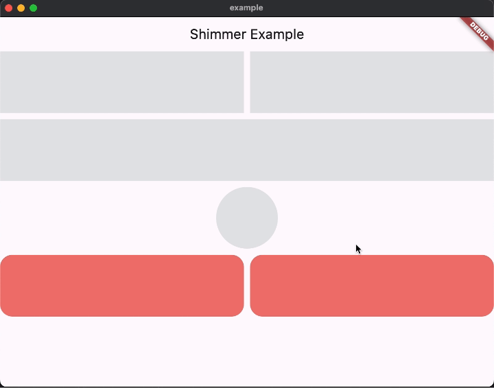
return Scaffold(
appBar: AppBar(
title: const Text('Shimmer 示例'),
),
body: Column(
children: [
// 水平排列的两个闪动小部件
const Row(
children: [
Expanded(
child: SimpleShimmer(
height: 100,
),
),
SizedBox(
width: 10,
),
Expanded(
child: SimpleShimmer(
height: 100,
),
),
],
),
const SizedBox(
height: 10,
),
// 单个闪动小部件
const SimpleShimmer(
height: 100,
),
const SizedBox(
height: 10,
),
// 带有圆形装饰的闪动小部件
const SimpleShimmer(
height: 100,
theme: ShimmerThemeData(
decoration: ShimmerDecoration(
shape: BoxShape.circle,
),
),
),
const SizedBox(
height: 10,
),
// 使用合并主题的闪动小部件
SimpleShimmerTheme.merge(
data: ShimmerThemeData(
baseColor: Colors.red,
highlightColor: Colors.red.shade200,
decoration: ShimmerDecoration(
borderRadius: BorderRadius.circular(20),
)),
child: const Row(
children: [
Expanded(
child: SimpleShimmer(
height: 100,
),
),
SizedBox(
width: 10,
),
Expanded(
child: SimpleShimmer(
height: 100,
),
),
],
),
),
],
),
);
}
}
更多关于Flutter占位动画插件simple_shimmer的使用的实战教程也可以访问 https://www.itying.com/category-92-b0.html

更多关于Flutter占位动画插件simple_shimmer的使用的实战系列教程也可以访问 https://www.itying.com/category-92-b0.html
simple_shimmer 是一个用于在 Flutter 中实现占位动画(Shimmer Effect)的插件。它可以在数据加载时显示一个闪烁的占位符,以提升用户体验。以下是如何使用 simple_shimmer 插件的详细步骤:
1. 添加依赖
首先,你需要在 pubspec.yaml 文件中添加 simple_shimmer 插件的依赖:
dependencies:
  flutter:
    sdk: flutter
  simple_shimmer: ^1.0.0  # 请使用最新版本
然后运行 flutter pub get 来获取依赖。
2. 导入包
在你的 Dart 文件中导入 simple_shimmer 包:
import 'package:simple_shimmer/simple_shimmer.dart';
3. 使用 SimpleShimmer
SimpleShimmer 是一个简单的占位动画组件。你可以将它放在任何需要占位动画的地方。
基本用法
SimpleShimmer(
  child: Container(
    width: 200,
    height: 100,
    color: Colors.grey[300],
  ),
)
在这个例子中,SimpleShimmer 会在 Container 上应用一个闪烁的动画效果。
自定义动画
你可以通过 duration 和 curve 参数来自定义动画的持续时间和曲线:
SimpleShimmer(
  duration: Duration(milliseconds: 1000),
  curve: Curves.easeInOut,
  child: Container(
    width: 200,
    height: 100,
    color: Colors.grey[300],
  ),
)
自定义颜色
你还可以通过 baseColor 和 highlightColor 参数来自定义闪烁的颜色:
SimpleShimmer(
  baseColor: Colors.grey[200],
  highlightColor: Colors.grey[400],
  child: Container(
    width: 200,
    height: 100,
    color: Colors.grey[300],
  ),
)
4. 结合实际场景
通常,SimpleShimmer 会用在数据加载时显示占位符。例如,当从网络获取数据时,你可以使用 SimpleShimmer 来显示一个临时的占位符,直到数据加载完成。
bool isLoading = true; // 假设这是数据加载的状态

@override
Widget build(BuildContext context) {
  return Scaffold(
    appBar: AppBar(
      title: Text('Shimmer Example'),
    ),
    body: isLoading
        ? SimpleShimmer(
            child: ListView.builder(
              itemCount: 5,
              itemBuilder: (context, index) {
                return ListTile(
                  leading: CircleAvatar(backgroundColor: Colors.grey[300]),
                  title: Container(
                    width: double.infinity,
                    height: 16,
                    color: Colors.grey[300],
                  ),
                  subtitle: Container(
                    width: double.infinity,
                    height: 14,
                    color: Colors.grey[300],
                  ),
                );
              },
            ),
          )
        : ListView.builder(
            itemCount: data.length,
            itemBuilder: (context, index) {
              return ListTile(
                leading: CircleAvatar(backgroundColor: Colors.blue),
                title: Text(data[index].title),
                subtitle: Text(data[index].subtitle),
              );
            },
          ),
  );
}
在这个例子中,当 isLoading 为 true 时,SimpleShimmer 会显示一个占位符列表。当数据加载完成后,isLoading 变为 false,真实的列表会显示出来。
5. 其他功能
simple_shimmer 还提供了其他一些功能,例如 SimpleShimmer.fromColors,它允许你通过 baseColor 和 highlightColor 直接创建一个 Shimmer 效果。
SimpleShimmer.fromColors(
  baseColor: Colors.grey[200],
  highlightColor: Colors.grey[400],
  child: Container(
    width: 200,
    height: 100,
    color: Colors.grey[300],
  ),
)