


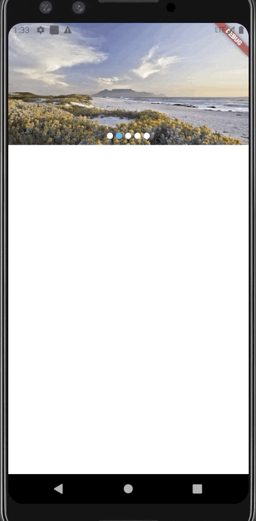
Flutter轮播图展示插件cycle_banner的使用
Flutter轮播图展示插件cycle_banner的使用
cycle_banner
一个用于在Flutter项目中实现轮播图功能的插件。
开始使用
首先,在项目的pubspec.yaml文件中添加该插件:
dependencies:
  cycle_banner: ^0.0.3
然后执行flutter pub get以安装该插件。
使用方法
CycleBanner是一个可以展示图片轮播图的组件。你可以通过以下方式使用它:
CycleBanner(
  images, // 图片列表
  (BuildContext context, int index) {
    return Image.network(images[index % images.length], width: double.maxFinite, fit: BoxFit.cover);
  },
)
参数说明
| 参数名称 | 类型 | 描述 |
|---|---|---|
| bannerHeight | double | 轮播图的高度 |
| normalColor | Color | 普通状态下的颜色 |
| currentColor | Color | 当前选中状态的颜色 |
| indicatorSize | double | 指示器的大小 |
| separatorSize | double | 指示器之间的间隔 |
| indicatorMargin | EdgeInsetsGeometry | 指示器的间距 |
| indicatorAlignment | AlignmentDirectional | 指示器的位置 |
| isAutoRolling | bool | 是否自动滚动 |
| isCycleRolling | bool | 是否无限循环滚动 |
| intervalDuration | Duration | 自动滚动的时间间隔 |
| animationDuration | Duration | 动画持续时间 |
完整示例
以下是一个完整的示例,展示了如何在Flutter应用中使用cycle_banner插件。
import 'package:flutter/material.dart';
import 'package:cycle_banner/cycle_banner.dart';

void main() => runApp(MyApp());

class MyApp extends StatelessWidget {
  [@override](/user/override)
  Widget build(BuildContext context) {
    return MaterialApp(
      home: Scaffold(
        appBar: AppBar(title: Text('CycleBanner Demo')),
        body: Center(
          child: CycleBannerDemo(),
        ),
      ),
    );
  }
}

class CycleBannerDemo extends StatefulWidget {
  [@override](/user/override)
  _CycleBannerDemoState createState() => _CycleBannerDemoState();
}

class _CycleBannerDemoState extends State<CycleBannerDemo> {
  List<String> images = [
    "https://example.com/image1.jpg",
    "https://example.com/image2.jpg",
    "https://example.com/image3.jpg"
  ];

  [@override](/user/override)
  Widget build(BuildContext context) {
    return Column(
      children: <Widget>[
        SizedBox(
          height: 200.0, // 设置轮播图高度
          child: CycleBanner(
            images,
            (BuildContext context, int index) {
              return Image.network(
                images[index % images.length],
                width: double.maxFinite,
                fit: BoxFit.cover,
              );
            },
            bannerHeight: 200.0,
            normalColor: Colors.grey,
            currentColor: Colors.red,
            indicatorSize: 8.0,
            separatorSize: 5.0,
            indicatorMargin: EdgeInsets.all(5.0),
            indicatorAlignment: Alignment.bottomCenter,
            isAutoRolling: true,
            isCycleRolling: true,
            intervalDuration: Duration(seconds: 3),
            animationDuration: Duration(milliseconds: 500),
          ),
        ),
      ],
    );
  }
}
更多关于Flutter轮播图展示插件cycle_banner的使用的实战教程也可以访问 https://www.itying.com/category-92-b0.html
1 回复

更多关于Flutter轮播图展示插件cycle_banner的使用的实战系列教程也可以访问 https://www.itying.com/category-92-b0.html
cycle_banner 是一个用于在 Flutter 应用中展示轮播图的插件。它支持自动轮播、手动滑动、自定义指示器等功能。下面是如何使用 cycle_banner 插件的基本步骤。
1. 添加依赖
首先,在 pubspec.yaml 文件中添加 cycle_banner 插件的依赖:
dependencies:
  flutter:
    sdk: flutter
  cycle_banner: ^1.0.0  # 请确保使用最新版本
然后运行 flutter pub get 以安装依赖。
2. 导入包
在需要使用 cycle_banner 的 Dart 文件中导入包:
import 'package:cycle_banner/cycle_banner.dart';
3. 使用 CycleBanner
CycleBanner 是一个 Widget,你可以在你的应用中使用它来展示轮播图。以下是一个简单的示例:
import 'package:flutter/material.dart';
import 'package:cycle_banner/cycle_banner.dart';

class BannerExample extends StatelessWidget {
  @override
  Widget build(BuildContext context) {
    return Scaffold(
      appBar: AppBar(
        title: Text('CycleBanner Example'),
      ),
      body: Center(
        child: CycleBanner(
          height: 200.0,
          children: [
            Image.network('https://via.placeholder.com/350x150', fit: BoxFit.cover),
            Image.network('https://via.placeholder.com/350x151', fit: BoxFit.cover),
            Image.network('https://via.placeholder.com/350x152', fit: BoxFit.cover),
          ],
          autoPlay: true,
          indicatorColor: Colors.blue,
          selectedIndicatorColor: Colors.red,
          duration: Duration(seconds: 3),
          onPageChanged: (index) {
            print('Page changed to $index');
          },
        ),
      ),
    );
  }
}

void main() {
  runApp(MaterialApp(
    home: BannerExample(),
  ));
}
4. 参数说明
children: 轮播图中展示的子 Widget 列表。height: 轮播图的高度。autoPlay: 是否自动轮播,默认为true。indicatorColor: 默认指示器的颜色。selectedIndicatorColor: 当前选中指示器的颜色。duration: 自动轮播的时间间隔。onPageChanged: 当页面切换时的回调函数。
5. 自定义指示器
如果你想自定义指示器,可以使用 CycleBanner.customIndicator 构造器:
CycleBanner.customIndicator(
  height: 200.0,
  children: [
    Image.network('https://via.placeholder.com/350x150', fit: BoxFit.cover),
    Image.network('https://via.placeholder.com/350x151', fit: BoxFit.cover),
    Image.network('https://via.placeholder.com/350x152', fit: BoxFit.cover),
  ],
  autoPlay: true,
  duration: Duration(seconds: 3),
  onPageChanged: (index) {
    print('Page changed to $index');
  },
  indicatorBuilder: (context, index, isCurrent) {
    return Container(
      margin: EdgeInsets.symmetric(horizontal: 4.0),
      width: 8.0,
      height: 8.0,
      decoration: BoxDecoration(
        shape: BoxShape.circle,
        color: isCurrent ? Colors.red : Colors.grey,
      ),
    );
  },
)