


Flutter渐变按钮插件fancy_gradient_button的使用
Flutter渐变按钮插件fancy_gradient_button的使用
特性
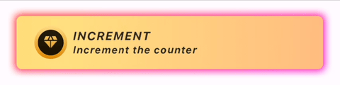
示例
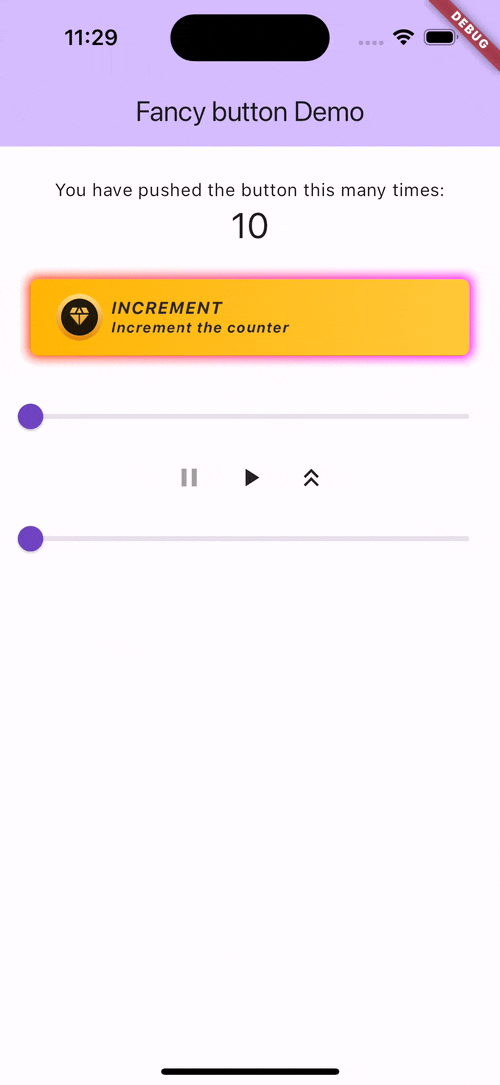
完整示例代码
import 'package:example/theme.dart';
import 'package:fancy_gradient_button/fancy_button.dart';
import 'package:fancy_gradient_button/fancy_icon.dart';
import 'package:fancy_gradient_button/fancy_theme.dart';
import 'package:flutter/material.dart';

void main() {
  runApp(const MyApp());
}

class MyApp extends StatelessWidget {
  const MyApp({super.key});

  [@override](/user/override)
  Widget build(BuildContext context) {
    return MaterialApp(
      title: 'Flutter Demo',
      theme: ThemeData(
        colorScheme: ColorScheme.fromSeed(seedColor: Colors.deepPurple),
        useMaterial3: true,
      ),
      home: const MyHomePage(title: 'Fancy button Demo'),
    );
  }
}

class MyHomePage extends StatefulWidget {
  const MyHomePage({super.key, required this.title});

  final String title;

  [@override](/user/override)
  State<MyHomePage> createState() => _MyHomePageState();
}

class _MyHomePageState extends State<MyHomePage> with TickerProviderStateMixin {
  double _progress = 0;
  bool autoPlay = true;
  bool expanded = false;

  static const layerHeight = 50;

  late final AnimationController _animationController =
      AnimationController(duration: const Duration(seconds: 1), vsync: this);

  [@override](/user/override)
  Widget build(BuildContext context) {
    return Scaffold(
      appBar: AppBar(
        backgroundColor: Theme.of(context).colorScheme.inversePrimary,
        title: Text(widget.title),
      ),
      body: AnimatedBuilder(
        animation: _animationController,
        builder: (context, _) {
          final offsetY = _animationController.value;
          return Center(
            child: Column(
              mainAxisAlignment: MainAxisAlignment.center,
              children: [
                const SizedBox(height: 24),
                Stack(
                  children: [
                    MyButton(
                      _progress,
                      autoPlay,
                      debugOptions: (true, false, false, false),
                      offsetY: offsetY * layerHeight * 2,
                      transformY: offsetY,
                    ),
                    MyButton(
                      _progress,
                      autoPlay,
                      debugOptions: (false, true, false, false),
                      offsetY: offsetY * layerHeight * 1,
                      transformY: offsetY,
                    ),
                    MyButton(
                      _progress,
                      autoPlay,
                      onTap: () {},
                      progressCallback: (progress) {
                        if (autoPlay) {
                          setState(() {
                            _progress = progress;
                          });
                        }
                      },
                      debugOptions: (false, false, true, true),
                      transformY: offsetY,
                    ),
                  ],
                ),
                Slider(
                  value: _progress,
                  onChanged: (value) {
                    setState(() {
                      _progress = value;
                    });
                  },
                ),
                Row(
                  mainAxisAlignment: MainAxisAlignment.center,
                  children: [
                    IconButton(
                      icon: Icon(
                        Icons.pause,
                        color: !autoPlay ? Colors.grey : Colors.black87,
                      ),
                      onPressed: () {
                        setState(() {
                          autoPlay = false;
                        });
                      },
                    ),
                    IconButton(
                      icon: Icon(
                        Icons.play_arrow,
                        color: autoPlay ? Colors.grey : Colors.black87,
                      ),
                      onPressed: () {
                        setState(() {
                          autoPlay = true;
                        });
                      },
                    ),
                    IconButton(
                      icon: Icon(
                        expanded
                            ? Icons.keyboard_double_arrow_down
                            : Icons.keyboard_double_arrow_up,
                        color: Colors.black87,
                      ),
                      onPressed: () {
                        setState(() {
                          expanded = !expanded;
                          if (expanded) {
                            _animationController.forward();
                          } else {
                            _animationController.reverse();
                          }
                        });
                      },
                    ),
                  ],
                ),
                Slider(
                  value: offsetY,
                  onChanged: (value) {
                    setState(() {
                      _animationController.value = value;
                    });
                  },
                ),
                const Spacer(),
              ],
            ),
          );
        },
      ),
    );
  }
}

class MyButton extends StatelessWidget {
  const MyButton(
    this.progress,
    this.autoPlay, {
    this.onTap,
    this.progressCallback,
    this.debugOptions = const (true, true, true, true),
    super.key,
    this.offsetY = 0.0,
    this.transformY = 0.0,
  });

  final VoidCallback? onTap;
  final double progress;
  final double offsetY;
  final double transformY;
  final bool autoPlay;
  final void Function(double progress)? progressCallback;
  final (bool, bool, bool, bool) debugOptions;

  [@override](/user/override)
  Widget build(BuildContext context) {
    return Padding(
      padding: EdgeInsets.fromLTRB(24, 24 + offsetY, 24, 24),
      child: SizedBox(
          height: 60,
          child: Transform(
            transform: Matrix4.identity()
              ..setEntry(3, 2, 0.001)
              ..rotateX(-transformY),
            alignment: FractionalOffset.center,
            child: FancyButton(
              const Text(
                'SHINING TITLE TEXT',
                style: TextStyle(
                  fontStyle: FontStyle.italic,
                  fontSize: 14,
                  fontWeight: FontWeight.bold,
                  height: 1.2,
                ),
              ),
              FancyButtonTheme.elite,
              subtitle: const Text(
                'Shining subtitle text',
                style: TextStyle(
                  fontStyle: FontStyle.italic,
                  fontSize: 12,
                  fontWeight: FontWeight.bold,
                  height: 1.2,
                ),
              ),
              icon: SizedBox(
                width: 37,
                height: 37,
                child: FancyIcon(
                  const Icon(
                    Icons.savings_outlined,
                    color: Colors.white,
                    size: 20,
                  ),
                  iconGradient,
                  progress: autoPlay ? null : progress,
                ),
              ),
              onTap: onTap,
              progress: autoPlay ? null : progress,
              progressCallback: progressCallback,
              debugOptions: debugOptions,
            ),
          )),
    );
  }
}
更多关于Flutter渐变按钮插件fancy_gradient_button的使用的实战教程也可以访问 https://www.itying.com/category-92-b0.html
1 回复

更多关于Flutter渐变按钮插件fancy_gradient_button的使用的实战系列教程也可以访问 https://www.itying.com/category-92-b0.html
fancy_gradient_button 是一个用于 Flutter 的第三方插件,它允许你轻松创建带有渐变背景的按钮。这个插件提供了多种自定义选项,可以让你创建出漂亮的渐变按钮。
安装插件
首先,你需要在 pubspec.yaml 文件中添加 fancy_gradient_button 插件的依赖:
dependencies:
  flutter:
    sdk: flutter
  fancy_gradient_button: ^1.0.0 # 请检查最新版本
然后运行 flutter pub get 来安装插件。
使用 fancy_gradient_button
下面是一个简单的例子,展示了如何使用 fancy_gradient_button 创建一个渐变按钮:
import 'package:flutter/material.dart';
import 'package:fancy_gradient_button/fancy_gradient_button.dart';

void main() {
  runApp(MyApp());
}

class MyApp extends StatelessWidget {
  @override
  Widget build(BuildContext context) {
    return MaterialApp(
      home: Scaffold(
        appBar: AppBar(title: Text('Fancy Gradient Button Example')),
        body: Center(
          child: FancyGradientButton(
            onPressed: () {
              print('Button Pressed!');
            },
            gradient: LinearGradient(
              colors: [Colors.blue, Colors.green],
              begin: Alignment.topLeft,
              end: Alignment.bottomRight,
            ),
            child: Text(
              'Press Me',
              style: TextStyle(color: Colors.white, fontSize: 20),
            ),
            borderRadius: BorderRadius.circular(10),
            padding: EdgeInsets.symmetric(horizontal: 30, vertical: 15),
          ),
        ),
      ),
    );
  }
}
参数说明
onPressed: 按钮点击时的回调函数。gradient: 渐变背景,可以使用LinearGradient或RadialGradient。child: 按钮的内容,通常是一个Text或Icon。borderRadius: 按钮的圆角半径。padding: 按钮的内边距。
自定义按钮样式
你可以通过调整 gradient、borderRadius 和 padding 等参数来创建不同样式的渐变按钮。例如:
FancyGradientButton(
  onPressed: () {
    print('Button Pressed!');
  },
  gradient: RadialGradient(
    colors: [Colors.purple, Colors.orange],
    center: Alignment.center,
    radius: 0.8,
  ),
  child: Text(
    'Custom Button',
    style: TextStyle(color: Colors.white, fontSize: 20),
  ),
  borderRadius: BorderRadius.circular(20),
  padding: EdgeInsets.symmetric(horizontal: 40, vertical: 20),
),