


Flutter未定义功能插件pueprint的使用
Flutter未定义功能插件pueprint的使用
什么是Pueprint?
Pueprint是一个用于简化Flutter应用中流和单个页面布局与样式的插件。它代表Page(页面)+ Blueprint(蓝图),组合起来就是💩Pueprint💩!
目录
动机
流通常由几个具有AppBar和某种类型的Footer的页面组成,这些AppBar和Footer通常被叠加在每个页面的顶部,并位于父组件中。这使得调整这些小部件变得繁琐,需要大量的样板代码和提升状态。
这个插件可以轻松实现以下功能:
- 声明性地定制流中的每个页面,而不牺牲样式能力。
- 通过流轻松更改进度条和页面指示器。
- 更改每个页面上的
onTap行为。 - 根据屏幕大小渲染页面。
- 与任何路由库(如AutoRoute、VRouter等)集成。
- 动画
AppBar和Footer,当在页面之间切换时。 - …更多…
所有这一切都只需少量样板代码和代码。
除了流之外,这个插件还提供了一个简单的页面蓝图,可以让你轻松添加AppBar、Footer和Header到页面。
开始使用
安装插件
在你的pubspec.yaml文件中安装此插件:
dependencies:
  pueprint: [latest-version]
然后导入:
import 'package:pueprint/pueprint.dart';
使用此插件
对于流
- 定义你的父级
Pueprint小部件,作为子页面的容器。你可以将Pueprint视为子页面的骨架。
Widget build(BuildContext context) {
  return Pueprint(
    appBarBuilder: (context, state) {
      return AppBar(
        leading: IconButton(
          icon: Icon(state.icon),
          onPressed: state.onTapLeading,
        )
      );
    },
    footerBuilder: (context, state) {
      return PueFooter(
        child: ElevatedButton(
          child: state.buttonChild,
          onPressed: state.onTap,
        ),
        bottom: AnimatedSmoothIndicator(
          activeStep: state.activeStep,
          count: 3,
        )
      );
    },
    body: DescendantPages(), // 查看此README底部的示例
    // 集成与流行的路由库(如AutoRoute和VRouter)的子页面
  );
}
- 在你的流页面中,使用
PuePage来轻松更改AppBar和Footer的行为。
[@override](/user/override)
Widget build(BuildContext context) {
  return PuePage(
    appBarData: AppBarData(
      onTapLeading: () => context.router.pop(),
      icon: Icons.back_arrow_ios,
    ),
    footerData: FooterData(
      onTap: () => handleGoToNextPage(),
      buttonChild: Text('Submit'),
      activeIndex: 1,
    ),
    body: MyPageBody(),
  );
}
每次你在流中移动到新页面时,调用PuePage小部件以更新AppBar和Footer!
流外的页面
如果你希望使用此库的布局能力,首先在你的widget树的顶部放置一个PueProvider。
PueProvider(
  child: DescendantWidgets(),
  theme: PueTheme(), // 如果你想自定义Pue小部件的主题
);
现在,像这样使用SoloPuePage:
SoloPuePage(
  appBar: AppBar(),
  header: PueHeader(text: "I love me some poo"),
  body: PueBody(
    child: Text("More poo"),
    listView: true,
  ),
  footer: PueFooter(
    floating: true,
    child: ElevatedButton(
      child: Text("Generate poo!"),
      onPressed: () => plopItOut(),
    )
  ),
)
核心概念
这个包围绕着这样一个想法:页面可以分为4个不同的部分:
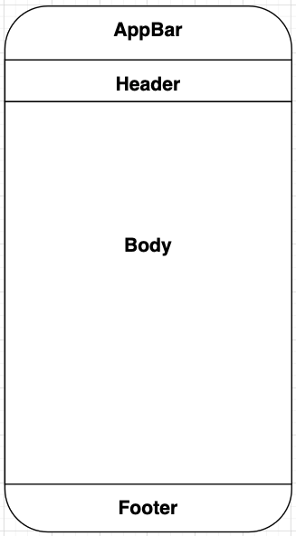
这个包使用这四个不同的元素来绘制页面。
小部件
Pueprint
Pueprint小部件用于包裹流中的所有页面。它负责实际渲染流中的AppBar和Footer。
PuePage
PuePage小部件用于Pueprint的每个后代流页面。你可以声明性地定义AppBar和Footer的属性,它会自动更新在Pueprint中渲染的相应字段。
SoloPuePage
对于不属于流但仍然想要访问此包布局能力的页面。你可以在该小部件中设置页面的所有4个核心区域。
与路由库集成
一个流UI和UX包如果没有理解如何与导航集成,就不能算是完整的,因为这些特性是相互依存的。这里有一些如何将此包与一些流行路由库一起使用的示例。
AutoRoute
- 定义你的包装页面。在此案例中,我们称之为
FlowWrapperPage。
class FlowWrapperPage extends StatelessWidget {
  const FlowWrapperPage({Key key}) : super(key: key);

  [@override](/user/override)
  Widget build(BuildContext context) {
    return Pueprint(
      appBarBuilder: (context, state) {
        return AppBar(
          leading: IconButton(
            icon: Icon(state.icon),
            onPressed: state.onTapLeading,
          )
        );
      },
      footerBuilder: (context, state) {
        return ElevatedButton(
          child: state.buttonChild,
          onPressed: state.onTap,
        );
      },
      body: AutoRouter(),
    );
  }
}
- 将你的
FlowWrapperPage插入到你的路由设置中。
@MaterialAutoRouter(
    replaceInRouteName: 'Page,Route',
    routes: <AutoRoute>[
        // ...你的其他路由
        AutoRoute(
            path: "/flow",
            page: FlowWrapperPage, // 在此处插入你的包装页面!
            children: [
                AutoRoute(path: '1', page: Flow1Page),
                AutoRoute(path: '2', page: Flow2Page),
                AutoRoute(path: '3', page: Flow3Page),
            ],
        ),
    ],
)
class $AppRouter {}
- 现在,在你的流页面中像这样使用
PuePage!
class Flow1Page extends StatelessWidget {

  [@override](/user/override)
  Widget build(BuildContext context) {
    return PuePage(
      appBarData: AppBarData(
        onTapLeading: () => context.router.pop(),
        icon: Icons.back_arrow_ios,
      ),
      footerData: FooterData(
        onTap: () => handleGoToNextPage(),
        buttonChild: Text('Submit'),
      ),
      body: MyPageBody(),
    );
  }
}
VRouter
- 定义你的包装页面。在此案例中,我们称之为
FlowWrapperPage。
class FlowWrapperPage extends StatelessWidget {
  final Widget child;

  const FlowWrapperPage({Key key, required this.child}) : super(key: key);

  [@override](/user/override)
  Widget build(BuildContext context) {
    return Pueprint(
      appBarBuilder: (context, state) {
        return AppBar(
          leading: IconButton(
            icon: Icon(state.icon),
            onPressed: state.onTapLeading,
          )
        );
      },
      footerBuilder: (context, state) {
        return ElevatedButton(
          child: state.buttonChild,
          onPressed: state.onTap,
        );
      },
      body: child,
    );
  }
}
- 将你的
FlowWrapperPage插入到你的路由设置中。
VNester(
 path: '/flow',
 widgetBuilder: (child) => FlowWrapperPage(body: child),
 nestedRoutes: [
    VWidget(path: '1', widget: Flow1Page()),
    VWidget(path: '2', widget: Flow2Page()),
    VWidget(path: '3', widget: Flow3Page()),
 ],
)
- 现在,在你的流页面中像这样使用
PuePage!
class Flow1Page extends StatelessWidget {

  [@override](/user/override)
  Widget build(BuildContext context) {
    return PuePage(
      appBarData: AppBarData(
        onTapLeading: () => context.router.pop(),
        icon: Icons.back_arrow_ios,
      ),
      footerData: FooterData(
        onTap: () => handleGoToNextPage(),
        buttonChild: Text('Submit'),
      ),
      body: MyPageBody(),
    );
  }
}
更多关于Flutter未定义功能插件pueprint的使用的实战教程也可以访问 https://www.itying.com/category-92-b0.html

更多关于Flutter未定义功能插件pueprint的使用的实战系列教程也可以访问 https://www.itying.com/category-92-b0.html
在Flutter中,如果你提到“pueprint”插件,可能是一个笔误或是一个不存在的插件。目前,Flutter的官方插件库(pub.dev)中并没有名为“pueprint”的插件。不过,我猜测你可能是指“blueprint”相关的插件或功能,或者你可能是想了解如何在Flutter中使用自定义插件。
1. 使用Flutter插件
如果你是想使用一个Flutter插件,通常的步骤如下:
1.1 在 pubspec.yaml 中添加依赖
dependencies:
  flutter:
    sdk: flutter
  your_plugin_name: ^version_number
1.2 安装依赖
在终端中运行以下命令来安装依赖:
flutter pub get
1.3 导入插件
在你的Dart文件中导入插件:
import 'package:your_plugin_name/your_plugin_name.dart';
1.4 使用插件
根据插件的文档或示例代码,使用插件的功能。
2. 自定义插件
如果你需要创建一个自定义插件,可以参考以下步骤:
2.1 创建插件
使用Flutter命令行工具创建一个插件:
flutter create --template=plugin your_plugin_name
2.2 实现插件功能
在生成的插件项目中,你可以实现你的功能。通常插件的核心代码在 lib/your_plugin_name.dart 和 android/src/main/kotlin/com/example/your_plugin_name/YourPluginNamePlugin.kt 或 ios/Classes/YourPluginNamePlugin.m 中。
2.3 发布插件
如果你希望将插件发布到 pub.dev,可以按照以下步骤进行:
- 确保你的插件符合发布要求。
- 在终端中运行:
flutter pub publish
3. 使用Blueprint进行UI布局
如果你是指“blueprint”作为一种UI布局工具或库,可能是指使用Flutter的布局组件(如 Row, Column, Stack, Container 等)来构建UI。
3.1 使用Flutter布局组件
import 'package:flutter/material.dart';

void main() {
  runApp(MyApp());
}

class MyApp extends StatelessWidget {
  [@override](/user/override)
  Widget build(BuildContext context) {
    return MaterialApp(
      home: Scaffold(
        appBar: AppBar(
          title: Text('Blueprint Example'),
        ),
        body: Center(
          child: Column(
            mainAxisAlignment: MainAxisAlignment.center,
            children: [
              Text('Hello, Flutter!'),
              SizedBox(height: 20),
              ElevatedButton(
                onPressed: () {
                  print('Button Pressed');
                },
                child: Text('Press Me'),
              ),
            ],
          ),
        ),
      ),
    );
  }
}