


Flutter进度条标签栏插件progress_tab_bar的使用
Flutter进度条标签栏插件progress_tab_bar的使用
progress_tab_bar 是一个用于在序列中显示过程步骤的 Flutter 包。它通过使用 ProgressTabBar 和多个 ProcessTab 来创建标签栏,并允许对标签栏的颜色、文本、轮廓和尺寸进行样式设置。
示例展示
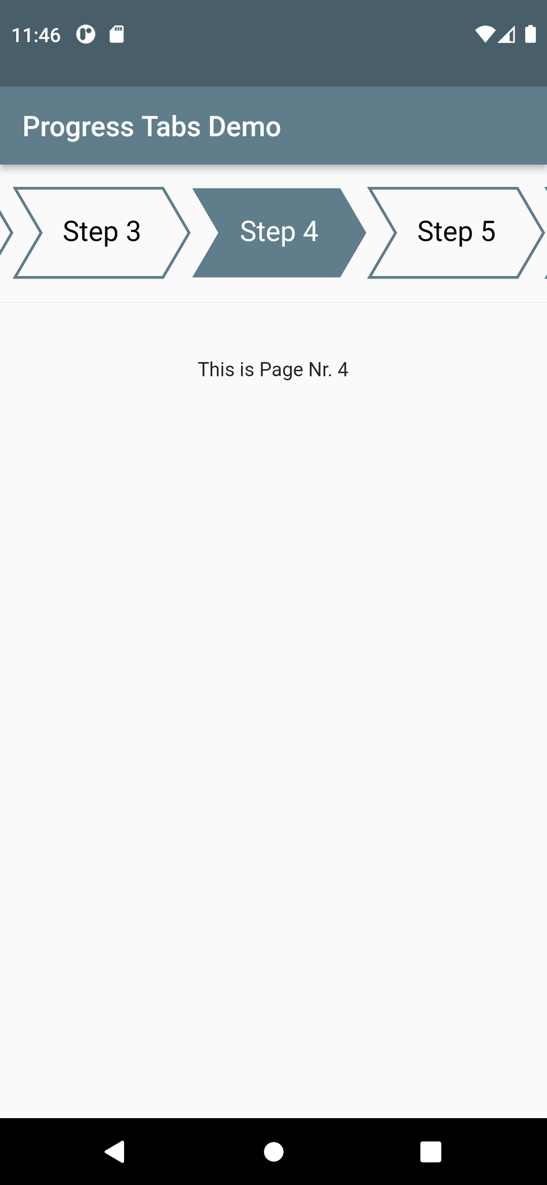 |
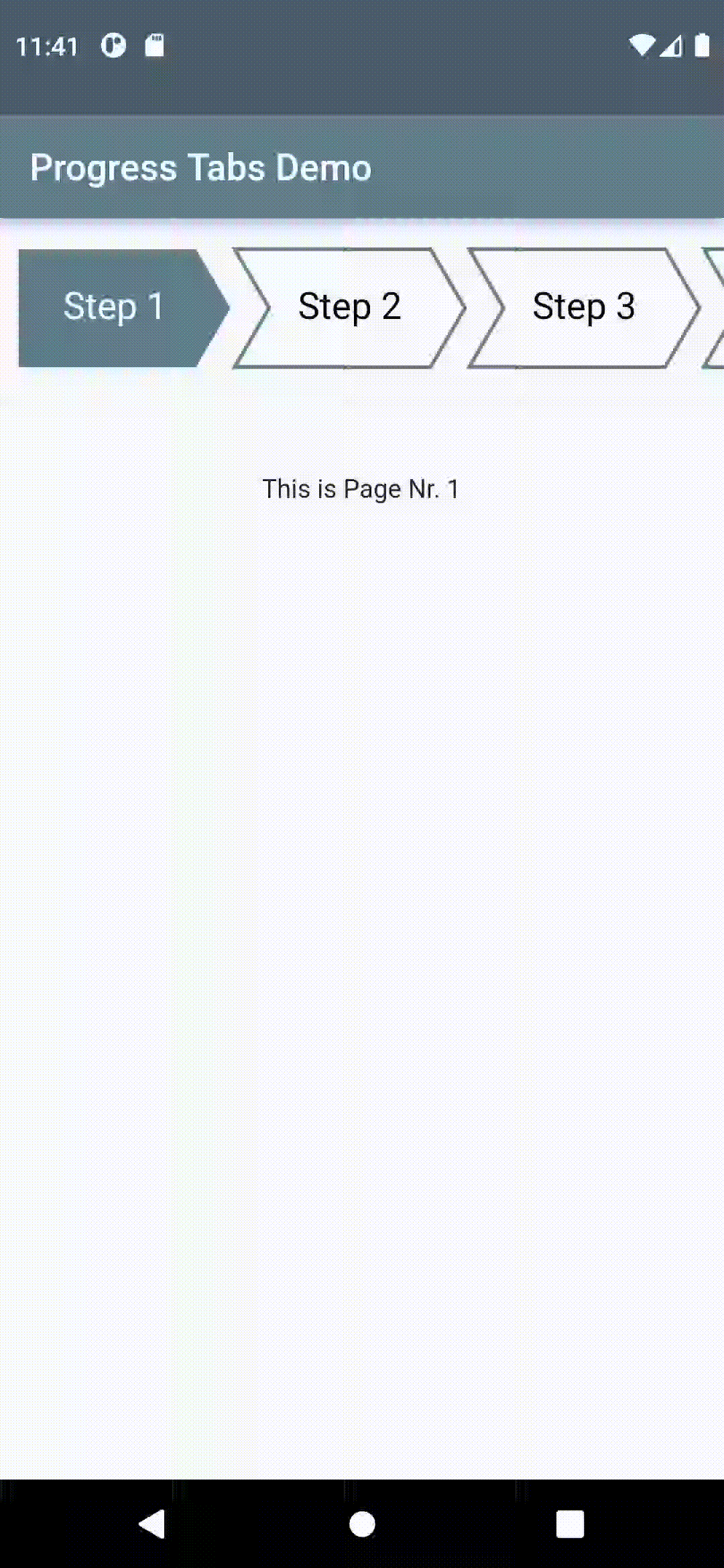 |
|---|---|
| Demo App | Animated Demo |
使用方法
使用此小部件作为在过程中导航不同步骤的一种方式(例如提交、账户创建、应用教程等)。ProgressTabBar 可以通过传递多个 ProcessTab 来创建,并且可以对标签栏进行颜色、文本、轮廓和尺寸的样式设置。
完整示例代码
import 'package:flutter/material.dart';
import 'package:progress_tab_bar/progress_tab_bar.dart';

void main() {
  runApp(const MyApp());
}

class MyApp extends StatelessWidget {
  const MyApp({Key? key}) : super(key: key);

  [@override](/user/override)
  Widget build(BuildContext context) {
    return MaterialApp(
      title: 'Progress Tabs Demo',
      theme: ThemeData(primarySwatch: Colors.red),
      home: const MyHomePage(title: 'Progress Tabs Demo'),
      debugShowCheckedModeBanner: false,
    );
  }
}

class MyHomePage extends StatefulWidget {
  const MyHomePage({Key? key, required this.title}) : super(key: key);
  final String title;

  [@override](/user/override)
  State<MyHomePage> createState() => _MyHomePageState();
}

class _MyHomePageState extends State<MyHomePage> {
  int _selectedTab = 0;
  bool _disabled = false;

  [@override](/user/override)
  Widget build(BuildContext context) {
    return Scaffold(
      appBar: AppBar(
        title: Text(widget.title),
      ),
      body: Column(
        children: [
          Padding(
            padding: const EdgeInsets.only(top: 16, bottom: 8),
            child: ProgressTabBar(
              tabWidth: 125, // 每个标签的宽度
              height: 64, // 标签栏的高度
              spacing: 20, // 标签之间的间距
              selectedTab: _selectedTab, // 当前选中的标签索引
              autoScrollOffset: 135, // 自动滚动偏移量
              disabled: _disabled, // 是否禁用进度条
              children: [
                ProgressTab(
                    label: "Step 1", // 标签文本
                    onPressed: () {
                      setState(() {
                        _selectedTab = 0; // 更新当前选中的标签索引
                      });
                    }),
                ProgressTab(
                    label: "Step 2",
                    onPressed: () {
                      setState(() {
                        _selectedTab = 1;
                      });
                    }),
                ProgressTab(
                    label: "Step 3",
                    onPressed: () {
                      setState(() {
                        _selectedTab = 2;
                      });
                    }),
                ProgressTab(
                    label: "Step 4",
                    onPressed: () {
                      setState(() {
                        _selectedTab = 3;
                      });
                    }),
                ProgressTab(
                    label: "Step 5",
                    onPressed: () {
                      setState(() {
                        _selectedTab = 4;
                      });
                    }),
                ProgressTab(
                    label: "Step 6",
                    onPressed: () {
                      setState(() {
                        _selectedTab = 5;
                      });
                    }),
                ProgressTab(
                    label: "Step 7",
                    onPressed: () {
                      setState(() {
                        _selectedTab = 6;
                      });
                    }),
                ProgressTab(
                    label: "Step 8",
                    onPressed: () {
                      setState(() {
                        _selectedTab = 7;
                      });
                    }),
              ],
            ),
          ),
          const Divider(),
          Container(
            child: content(_selectedTab),
          ),
        ],
      ),
    );
  }

  Widget content(int tabNr) {
    return Column(
      children: [
        Center(
          child: Row(
            mainAxisAlignment: MainAxisAlignment.center,
            children: [
              const Text("Disable tab progress bar"),
              Checkbox(
                value: _disabled,
                onChanged: (bool? value) {
                  setState(() {
                    _disabled = value ?? false;
                  });
                },
              ),
            ],
          ),
        ),
        Padding(
          padding: const EdgeInsets.symmetric(vertical: 32),
          child:
              Center(child: Text("This is Page Nr. ${(++tabNr).toString()}")),
        )
      ],
    );
  }
}
更多关于Flutter进度条标签栏插件progress_tab_bar的使用的实战教程也可以访问 https://www.itying.com/category-92-b0.html
1 回复

更多关于Flutter进度条标签栏插件progress_tab_bar的使用的实战系列教程也可以访问 https://www.itying.com/category-92-b0.html
progress_tab_bar 是一个用于 Flutter 的插件,它允许你创建一个带有进度指示器的标签栏。这个插件非常适合在需要展示进度或分步骤的场景中使用,比如表单填写、教程步骤等。
安装插件
首先,你需要在 pubspec.yaml 文件中添加 progress_tab_bar 插件的依赖:
dependencies:
  flutter:
    sdk: flutter
  progress_tab_bar: ^0.1.0  # 请使用最新版本
然后运行 flutter pub get 来安装插件。
使用 ProgressTabBar
下面是一个简单的示例,展示如何使用 ProgressTabBar:
import 'package:flutter/material.dart';
import 'package:progress_tab_bar/progress_tab_bar.dart';

void main() {
  runApp(MyApp());
}

class MyApp extends StatelessWidget {
  @override
  Widget build(BuildContext context) {
    return MaterialApp(
      home: ProgressTabBarExample(),
    );
  }
}

class ProgressTabBarExample extends StatefulWidget {
  @override
  _ProgressTabBarExampleState createState() => _ProgressTabBarExampleState();
}

class _ProgressTabBarExampleState extends State<ProgressTabBarExample> {
  int _currentIndex = 0;

  final List<String> _tabs = ['Step 1', 'Step 2', 'Step 3', 'Step 4'];

  @override
  Widget build(BuildContext context) {
    return Scaffold(
      appBar: AppBar(
        title: Text('Progress Tab Bar Example'),
      ),
      body: Column(
        children: [
          ProgressTabBar(
            currentIndex: _currentIndex,
            tabs: _tabs,
            onTap: (index) {
              setState(() {
                _currentIndex = index;
              });
            },
          ),
          Expanded(
            child: Center(
              child: Text('Current Step: ${_tabs[_currentIndex]}'),
            ),
          ),
        ],
      ),
    );
  }
}
参数说明
currentIndex: 当前选中的标签索引。tabs: 标签的文本列表。onTap: 当用户点击标签时触发的回调函数,返回点击的索引。
自定义样式
ProgressTabBar 还提供了一些可选的参数来自定义样式:
backgroundColor: 标签栏的背景颜色。indicatorColor: 进度指示器的颜色。indicatorHeight: 进度指示器的高度。labelColor: 选中标签的文本颜色。unselectedLabelColor: 未选中标签的文本颜色。labelStyle: 选中标签的文本样式。unselectedLabelStyle: 未选中标签的文本样式。
例如:
ProgressTabBar(
  currentIndex: _currentIndex,
  tabs: _tabs,
  onTap: (index) {
    setState(() {
      _currentIndex = index;
    });
  },
  backgroundColor: Colors.grey[200],
  indicatorColor: Colors.blue,
  indicatorHeight: 4.0,
  labelColor: Colors.blue,
  unselectedLabelColor: Colors.grey,
  labelStyle: TextStyle(fontSize: 16, fontWeight: FontWeight.bold),
  unselectedLabelStyle: TextStyle(fontSize: 14),
)