


Flutter自定义导航栏插件hs_custom_bar的使用
Flutter自定义导航栏插件hs_custom_bar的使用
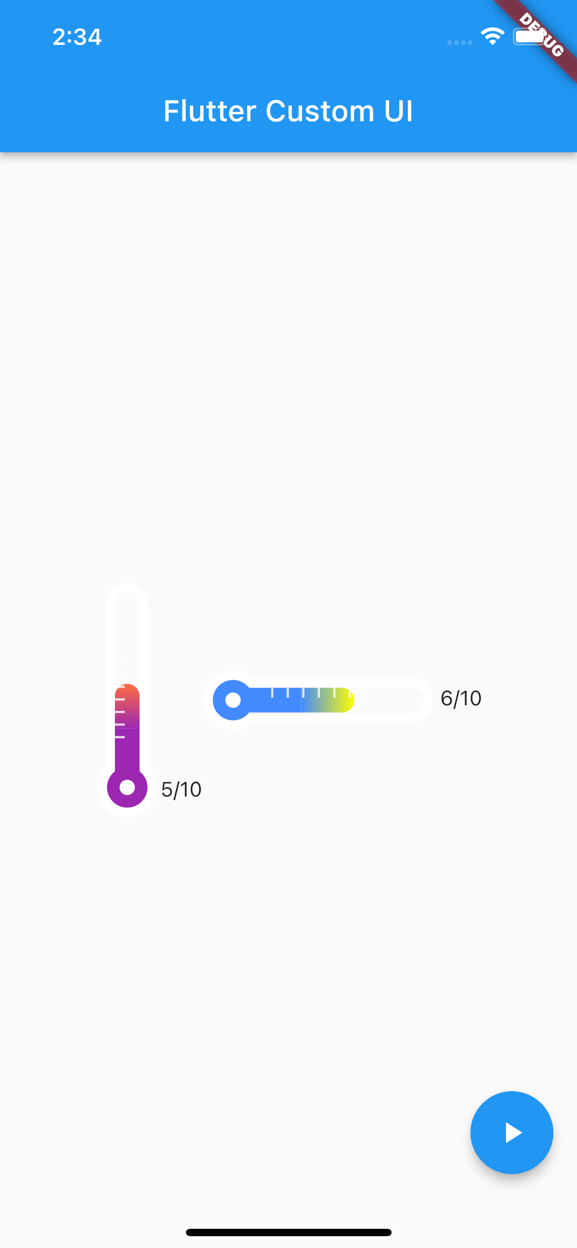
hs_custom_bar 是一个用于实现温度计进度条的小部件。
安装
在你的 pubspec.yaml 文件中添加依赖:
dependencies:
  hs_custom_bar: ^0.0.4
然后在你的 Dart 文件中导入:
import 'package:hs_custom_bar/hs_custom_bar.dart';
基本用法
TemperatureVerticalBar(10, 5),
使用场景
它可以用来展示某个任务或成就的完成率。例如,今天的任务完成了 5/10 个。
如何使用
-
输入进度条的最大值和当前值。(必要)
- 确保当前值不超过最大值。
-
在进度条右侧显示当前完成数量。(可选,默认为不显示)
- 使用
showCountView: true。
- 使用
-
对于进度条的颜色渐变,从底部到顶部、从左到右输入颜色值。(可选,默认有默认值)
- 使用
gradientStartColor: Colors.blueAccent, gradientEndColor: Colors.yellowAccent,。
- 使用
-
调整进度条的上下左右长度和圆角大小。(可选)
自定义用法
| 属性名 | 描述 |
|---|---|
| maxIndex | 进度条的最大值。 |
| currentIndex | 进度条的当前值。 |
| baseBgColor | 进度条周围的默认边框和刻度颜色(默认为白色)。 |
| gradientBottomColor | 进度条渐变颜色的起始颜色。 |
| gradientTopColor | 进度条渐变颜色的结束颜色。 |
| barWidth | 进度条的厚度。 |
| barHeight | 进度条的高度。 |
| barPointCount | 进度条上的刻度数。 |
| showCountView | 是否显示进度条的最大值和最小值(标记位置:右下角)。 |
示例代码
以下是一个完整的示例代码:
import 'dart:math';

import 'package:flutter/material.dart';
import 'package:hs_custom_bar/hs_custom_bar.dart';
import 'package:hs_custom_bar/sample/sample_code.dart';

void main() {
  runApp(const MyApp());
}

class MyApp extends StatelessWidget {
  const MyApp({Key? key}) : super(key: key);

  // This widget is the root of your application.
  [@override](/user/override)
  Widget build(BuildContext context) {
    return MaterialApp(
      title: 'hs_custom_bar',
      theme: ThemeData(
        primarySwatch: Colors.blue,
      ),
      home: const MyHomePage(title: 'hs_custom_bar'),
    );
  }
}

class MyHomePage extends StatefulWidget {
  const MyHomePage({Key? key, required this.title}) : super(key: key);

  final String title;

  [@override](/user/override)
  State<MyHomePage> createState() => _MyHomePageState();
}

class _MyHomePageState extends State<MyHomePage> {
  int? _currentIndex;
  int? _currentIndex2;

  [@override](/user/override)
  void initState() {
    super.initState();
  }

  [@override](/user/override)
  Widget build(BuildContext context) {
    return Scaffold(
      body: Center(
        child: Row(
          mainAxisAlignment: MainAxisAlignment.center,
          children: [
            TemperatureVerticalBar(
              10,
              _currentIndex ?? 1,
              showCountView: true,
            ),
            TemperatureHorizontalBar(
              10,
              _currentIndex2 ?? 1,
              gradientStartColor: Colors.blueAccent,
              gradientEndColor: Colors.yellowAccent,
              showCountView: true,
            )
          ],
        ),
      ),
      floatingActionButton: FloatingActionButton(
        onPressed: () {
          if (mounted) {
            setState(() {
              _currentIndex = Random().nextInt(11);
              _currentIndex2 = Random().nextInt(11);
            });
          }
        },
        child: const Icon(Icons.play_arrow),
      ),
    );
  }
}
更多关于Flutter自定义导航栏插件hs_custom_bar的使用的实战教程也可以访问 https://www.itying.com/category-92-b0.html

更多关于Flutter自定义导航栏插件hs_custom_bar的使用的实战系列教程也可以访问 https://www.itying.com/category-92-b0.html
hs_custom_bar 是一个用于 Flutter 的自定义导航栏插件,允许开发者轻松创建个性化的导航栏。以下是如何使用 hs_custom_bar 的基本步骤:
1. 添加依赖
首先,你需要在 pubspec.yaml 文件中添加 hs_custom_bar 的依赖:
dependencies:
  flutter:
    sdk: flutter
  hs_custom_bar: ^1.0.0  # 请使用最新版本
然后运行 flutter pub get 来获取依赖。
2. 导入包
在你的 Dart 文件中导入 hs_custom_bar:
import 'package:hs_custom_bar/hs_custom_bar.dart';
3. 使用 HsCustomBar
HsCustomBar 是一个高度可定制的导航栏组件。你可以在 Scaffold 的 appBar 属性中使用它。
class MyHomePage extends StatelessWidget {
  [@override](/user/override)
  Widget build(BuildContext context) {
    return Scaffold(
      appBar: HsCustomBar(
        title: Text('自定义导航栏'),
        leading: IconButton(
          icon: Icon(Icons.menu),
          onPressed: () {
            // 处理菜单按钮点击
          },
        ),
        actions: [
          IconButton(
            icon: Icon(Icons.search),
            onPressed: () {
              // 处理搜索按钮点击
            },
          ),
          IconButton(
            icon: Icon(Icons.settings),
            onPressed: () {
              // 处理设置按钮点击
            },
          ),
        ],
        backgroundColor: Colors.blue,
        elevation: 4.0,
      ),
      body: Center(
        child: Text('自定义导航栏示例'),
      ),
    );
  }
}
4. 自定义导航栏
HsCustomBar 提供了多个属性来自定义导航栏的外观和行为:
title: 导航栏的标题,通常是一个Text组件。leading: 导航栏左侧的组件,通常是一个返回按钮或菜单按钮。actions: 导航栏右侧的操作按钮列表。backgroundColor: 导航栏的背景颜色。elevation: 导航栏的阴影高度。centerTitle: 是否将标题居中显示。titleSpacing: 标题与左侧或右侧组件的间距。
5. 更多自定义选项
HsCustomBar 还支持更多的自定义选项,例如自定义高度、添加渐变背景、设置透明度等。你可以查阅插件的文档或源码以了解更多高级用法。
6. 运行应用
完成上述步骤后,运行你的 Flutter 应用,你将看到一个自定义的导航栏。
示例代码
以下是一个完整的示例代码:
import 'package:flutter/material.dart';
import 'package:hs_custom_bar/hs_custom_bar.dart';

void main() {
  runApp(MyApp());
}

class MyApp extends StatelessWidget {
  [@override](/user/override)
  Widget build(BuildContext context) {
    return MaterialApp(
      title: 'HsCustomBar 示例',
      theme: ThemeData(
        primarySwatch: Colors.blue,
      ),
      home: MyHomePage(),
    );
  }
}

class MyHomePage extends StatelessWidget {
  [@override](/user/override)
  Widget build(BuildContext context) {
    return Scaffold(
      appBar: HsCustomBar(
        title: Text('自定义导航栏'),
        leading: IconButton(
          icon: Icon(Icons.menu),
          onPressed: () {
            // 处理菜单按钮点击
          },
        ),
        actions: [
          IconButton(
            icon: Icon(Icons.search),
            onPressed: () {
              // 处理搜索按钮点击
            },
          ),
          IconButton(
            icon: Icon(Icons.settings),
            onPressed: () {
              // 处理设置按钮点击
            },
          ),
        ],
        backgroundColor: Colors.blue,
        elevation: 4.0,
      ),
      body: Center(
        child: Text('自定义导航栏示例'),
      ),
    );
  }
}