


Flutter进度对话框插件scrumlab_progress_dialog的使用
Flutter进度对话框插件scrumlab_progress_dialog的使用
scrumlab_progress_dialog
一个轻量级的包,用于显示进度对话框。由于它是一个状态小部件,您可以动态更改对话框上显示的文本。
感谢您使用此包,由于某些原因,此包已停止维护,请查找其他可以完成此包功能的库,我相信这些库会更有帮助。请在这里找到该库的仓库链接:OTS (Over the screen)


支持的Dart版本
Dart SDK版本 >= 2.12.0 < 4.0.0
示例
安装
在pubspec.yaml文件中添加包:
dependencies:
  scrumlab_progress_dialog: ^2.0.0
如何使用
在您的dart文件中导入包:
import 'package:scrumlab_progress_dialog/scrumlab_progress_dialog.dart';
在build()方法中创建并初始化一个ProgressDialog对象,并传递上下文:
-
初始化
ProgressDialog对象:final ProgressDialog pr = ProgressDialog(context); -
默认情况下,它是一个普通对话框,用于显示一些消息。如果您想用它来显示已完成的进度百分比,请指定可选的
type参数,并指定是否希望当按下返回按钮时对话框消失(可选):// 普通对话框 pr = ProgressDialog(context, type: ProgressDialogType.Normal, isDismissible: true/false, showLogs: true/false); // 显示进度百分比 pr = ProgressDialog(context, type: ProgressDialogType.Download, isDismissible: true/false, showLogs: true/false);注意:请在有上下文可用的地方初始化
ProgressDialog。 -
样式化进度对话框(可选):
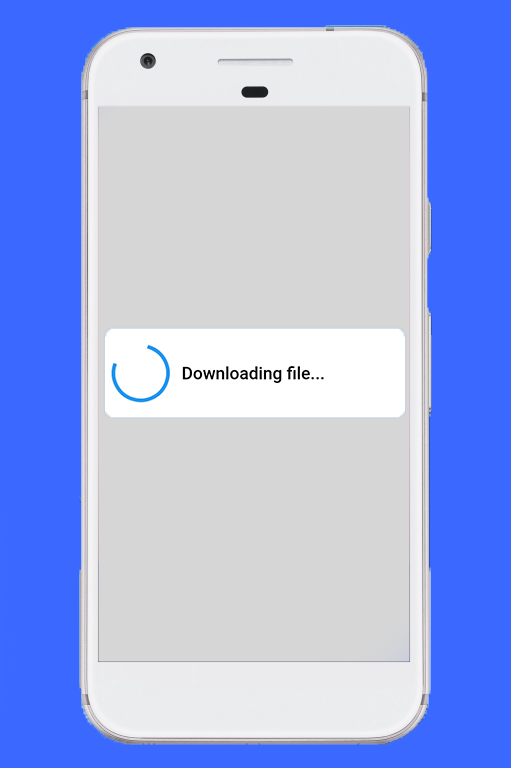
pr.style( message: 'Downloading file...', borderRadius: 10.0, backgroundColor: Colors.white, progressWidget: CircularProgressIndicator(), elevation: 10.0, insetAnimCurve: Curves.easeInOut, progress: 0.0, textDirection: TextDirection.rtl, maxProgress: 100.0, progressTextStyle: TextStyle( color: Colors.black, fontSize: 13.0, fontWeight: FontWeight.w400), messageTextStyle: TextStyle( color: Colors.black, fontSize: 19.0, fontWeight: FontWeight.w600) );注意:不需要使用所有参数,它们都是可选的。
-
显示进度对话框:
await pr.show(); -
动态更新显示的内容:
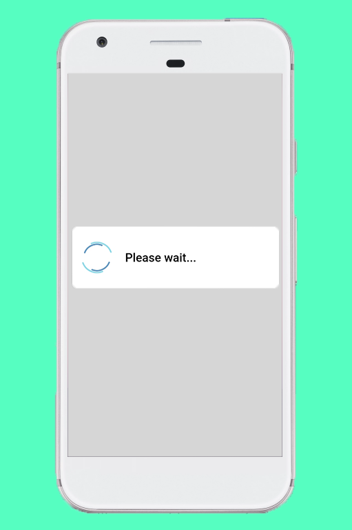
pr.update( progress: 50.0, message: "Please wait...", progressWidget: Container( padding: EdgeInsets.all(8.0), child: CircularProgressIndicator()), maxProgress: 100.0, progressTextStyle: TextStyle( color: Colors.black, fontSize: 13.0, fontWeight: FontWeight.w400), messageTextStyle: TextStyle( color: Colors.black, fontSize: 19.0, fontWeight: FontWeight.w600), );注意:不需要使用所有参数,它们都是可选的。
-
隐藏进度对话框:
pr.hide().then((isHidden) {
  print(isHidden);
});

// 或者
await pr.hide();
导航到下一个屏幕必须在
hide()完成后进行。查看此处的示例。
检查进度对话框是否正在显示
bool isProgressDialogShowing = pr.isShowing();
print(isProgressDialogShowing);
使用自定义主体
pr = ProgressDialog(
  context,
  type: ProgressDialogType.Normal,
  isDismissible: true,
  /// 自定义主体
  customBody: LinearProgressIndicator(
    valueColor: AlwaysStoppedAnimation<Color>(Colors.blueAccent),
    backgroundColor: Colors.white,
  ),
);
示例代码
import 'package:flutter/cupertino.dart';
import 'package:flutter/material.dart';
import 'package:scrumlab_progress_dialog/scrumlab_progress_dialog.dart';

late ProgressDialog pr;

void main() {
  runApp(MaterialApp(
    home: MyApp(),
  ));
}

class MyApp extends StatelessWidget {
  double percentage = 0.0;

  [@override](/user/override)
  Widget build(BuildContext context) {
    pr = ProgressDialog(
      context,
      type: ProgressDialogType.Download,
      textDirection: TextDirection.rtl,
      isDismissible: true,
    );

    pr.style(
      message:
          'Lets dump some huge text into the progress dialog and check whether it can handle the huge text. If it works then not you or me, flutter is awesome',
      borderRadius: 10.0,
      backgroundColor: Colors.white,
      elevation: 10.0,
      insetAnimCurve: Curves.easeInOut,
      progress: 0.0,
      progressWidgetAlignment: Alignment.center,
      maxProgress: 100.0,
      progressTextStyle: TextStyle(
          color: Colors.black, fontSize: 13.0, fontWeight: FontWeight.w400),
      messageTextStyle: TextStyle(
          color: Colors.black, fontSize: 19.0, fontWeight: FontWeight.w600),
    );

    return Scaffold(
      body: Center(
        child: ElevatedButton(
            child: Text(
              'Show Dialog',
              style: TextStyle(color: Colors.white),
            ),
            style: ElevatedButton.styleFrom(
              backgroundColor: Colors.blue,
            ),
            onPressed: () async {
              await pr.show();

              Future.delayed(Duration(seconds: 2)).then((onvalue) {
                percentage = percentage + 30.0;
                print(percentage);

                pr.update(
                  progress: percentage,
                  message: "Please wait...",
                  progressWidget: Container(
                      padding: EdgeInsets.all(8.0),
                      child: CircularProgressIndicator()),
                  maxProgress: 100.0,
                  progressTextStyle: TextStyle(
                      color: Colors.black,
                      fontSize: 13.0,
                      fontWeight: FontWeight.w400),
                  messageTextStyle: TextStyle(
                      color: Colors.black,
                      fontSize: 19.0,
                      fontWeight: FontWeight.w600),
                );

                Future.delayed(Duration(seconds: 2)).then((value) {
                  percentage = percentage + 30.0;
                  pr.update(
                      progress: percentage, message: "Few more seconds...");
                  print(percentage);
                  Future.delayed(Duration(seconds: 2)).then((value) {
                    percentage = percentage + 30.0;
                    pr.update(progress: percentage, message: "Almost done...");
                    print(percentage);

                    Future.delayed(Duration(seconds: 2)).then((value) {
                      pr.hide().whenComplete(() {
                        print(pr.isShowing());
                      });
                      percentage = 0.0;
                    });
                  });
                });
              });

              Future.delayed(Duration(seconds: 10)).then((onValue) {
                print("PR status  ${pr.isShowing()}");
                if (pr.isShowing()) {
                  pr.hide().then((isHidden) {
                    print(isHidden);
                  });
                }
                print("PR status  ${pr.isShowing()}");
              });
            }),
      ),
    );
  }
}

class FirstScreen extends StatefulWidget {
  [@override](/user/override)
  _FirstScreenState createState() => _FirstScreenState();
}

class _FirstScreenState extends State<FirstScreen> {
  late ProgressDialog pr;

  [@override](/user/override)
  Widget build(BuildContext context) {
    pr = ProgressDialog(context, showLogs: true);
    pr.style(message: 'Please wait...');

    return Scaffold(
      body: Center(
        child: ElevatedButton(
          child: Text('Show dialog and go to next screen',
              style: TextStyle(color: Colors.white)),
          style: ElevatedButton.styleFrom(
            backgroundColor: Colors.blueAccent,
          ),
          onPressed: () {
            pr.show();
            Future.delayed(Duration(seconds: 3)).then((value) {
              pr.hide().whenComplete(() {
                Navigator.of(context).push(CupertinoPageRoute(
                    builder: (BuildContext context) => SecondScreen()));
              });
            });
          },
        ),
      ),
    );
  }
}

class SecondScreen extends StatefulWidget {
  [@override](/user/override)
  _SecondScreenState createState() => _SecondScreenState();
}

class _SecondScreenState extends State<SecondScreen> {
  [@override](/user/override)
  Widget build(BuildContext context) {
    return Scaffold(
      body: Center(child: Text('I am second screen')),
    );
  }
}
更多关于Flutter进度对话框插件scrumlab_progress_dialog的使用的实战教程也可以访问 https://www.itying.com/category-92-b0.html

更多关于Flutter进度对话框插件scrumlab_progress_dialog的使用的实战系列教程也可以访问 https://www.itying.com/category-92-b0.html
scrumlab_progress_dialog 是一个用于 Flutter 的简单易用的进度对话框插件。它可以帮助你在应用程序中显示一个加载对话框,通常用于在后台执行耗时操作时向用户提供反馈。
安装
首先,你需要在 pubspec.yaml 文件中添加 scrumlab_progress_dialog 依赖:
dependencies:
  flutter:
    sdk: flutter
  scrumlab_progress_dialog: ^1.0.0
然后运行 flutter pub get 来安装依赖。
基本用法
-
导入包: 在你的 Dart 文件中导入
scrumlab_progress_dialog包:import 'package:scrumlab_progress_dialog/scrumlab_progress_dialog.dart'; -
创建
ProgressDialog实例: 在BuildContext可用的地方(例如在StatefulWidget的build方法中),创建一个ProgressDialog实例:ProgressDialog progressDialog = ProgressDialog(context); -
显示进度对话框: 使用
show()方法显示进度对话框:progressDialog.show(); -
隐藏进度对话框: 使用
hide()方法隐藏进度对话框:progressDialog.hide();
示例代码
以下是一个完整的示例,展示如何在按钮点击时显示进度对话框,并在 3 秒后隐藏它:
import 'package:flutter/material.dart';
import 'package:scrumlab_progress_dialog/scrumlab_progress_dialog.dart';

void main() {
  runApp(MyApp());
}

class MyApp extends StatelessWidget {
  @override
  Widget build(BuildContext context) {
    return MaterialApp(
      home: Scaffold(
        appBar: AppBar(
          title: Text('Progress Dialog Example'),
        ),
        body: Center(
          child: ProgressDialogExample(),
        ),
      ),
    );
  }
}

class ProgressDialogExample extends StatefulWidget {
  @override
  _ProgressDialogExampleState createState() => _ProgressDialogExampleState();
}

class _ProgressDialogExampleState extends State<ProgressDialogExample> {
  ProgressDialog? _progressDialog;

  @override
  Widget build(BuildContext context) {
    _progressDialog = ProgressDialog(context);

    return ElevatedButton(
      onPressed: () async {
        _progressDialog!.show();
        await Future.delayed(Duration(seconds: 3));
        _progressDialog!.hide();
      },
      child: Text('Show Progress Dialog'),
    );
  }
}
自定义选项
scrumlab_progress_dialog 提供了一些自定义选项,例如设置对话框的标题和消息:
progressDialog.show(
  title: 'Loading...',
  message: 'Please wait...',
);
你还可以通过 max 和 progress 参数来实现进度条功能:
progressDialog.show(
  title: 'Loading...',
  message: 'Please wait...',
  max: 100,
  progress: 50, // 当前进度
);