


Flutter底部导航栏插件rolling_nav_bar的使用
Flutter底部导航栏插件rolling_nav_bar的使用
简介
rolling_nav_bar 是一个灵感来源于设计作品集(Dribbble)的设计,并且具有高度可定制动画、颜色和形状的底部导航栏插件。它支持3、4或5个导航元素,并允许用户自定义每个导航项。
开始使用
基本用法
首先,将 RollingNavBar 小部件放置在 Scaffold 的 bottomNavigationBar 槽中,并将其包裹在一个提供最大高度的容器中。例如:
Scaffold(
  bottomNavigationBar: Container(
    height: 95,
    child: RollingNavBar(
      // 导航项配置
    ),
  )
);
或者,也可以直接通过 Stack 小部件放置:
Scaffold(
  body: Stack(
    children: <Widget>[
      Positioned(
        bottom: 0,
        height: 95,
        width: MediaQuery.of(context).size.width,
        child: RollingNavBar(
          // 导航项配置
        ),
      )
    ]
  )
);
自定义
使用图标数据
RollingNavBar 支持通过 iconData 构造函数指定导航项图标和颜色。以下是一个简单的例子:
RollingNavBar.iconData(
  iconData: [
    Icons.home,
    Icons.people,
    Icons.settings,
  ],
  indicatorColors: [
    Colors.red,
    Colors.yellow,
    Colors.blue,
  ],
)
使用小部件构建器
另一种方式是通过 builder 构造函数指定导航项的小部件。这种方式虽然提供了更大的灵活性,但需要手动管理激活状态。
RollingNavBar.builder(
  builder: (context, index, info, update) {
    var textStyle = index == info.nextIndex
      ? TextStyle(color: Colors.white)
      : TextStyle(color: Colors.grey);
    return Text('${index + 1}', style: textStyle);
  },
  indicatorColors: [
    Colors.red,
    Colors.yellow,
    Colors.blue,
  ],
  numChildren: 3,
)
动画类型
Roll 动画
这是默认的滚动动画效果:
RollingNavBar.iconData(
  animationCurve: Curves.easeOut,
  animationType: AnimationType.roll,
  baseAnimationSpeed: 200,
  iconData: [
    Icons.home,
    Icons.people,
    Icons.settings,
  ],
)
Shrink Out In 动画
这种动画效果是缩放和淡出的效果:
RollingNavBar.iconData(
  animationCurve: Curves.linear,
  animationType: AnimationType.shrinkOutIn,
  baseAnimationSpeed: 500,
  iconData: [
    Icons.home,
    Icons.people,
    Icons.settings,
  ],
)
Spin Out In 动画
这种动画效果是旋转并淡出的效果:
RollingNavBar.iconData(
  animationCurve: Curves.linear,
  animationType: AnimationType.spinOutIn,
  baseAnimationSpeed: 500,
  iconData: [
    Icons.home,
    Icons.people,
    Icons.settings,
  ],
)
Snap 动画
这是一种无动画的效果:
RollingNavBar.iconData(
  animationType: AnimationType.snap,
  iconData: [
    Icons.home,
    Icons.people,
    Icons.settings,
  ],
)
钩入动画
为了实现与导航栏进度同步的视觉效果,可以使用 onTap 和 onAnimate 回调。例如,当导航栏切换时同步背景颜色的变化。
图标文字
可以通过 iconText 参数为导航项添加文字描述:
RollingNavBar.iconData(
  iconColors: [Colors.grey[800]],
  iconData: [
    Icons.home,
    Icons.people,
    Icons.settings,
  ],
  iconText: [
    Text('Home', style: TextStyle(color: Colors.grey, fontSize: 12)),
    Text('Friends', style: TextStyle(color: Colors.grey, fontSize: 12)),
    Text('Settings', style: TextStyle(color: Colors.grey, fontSize: 12)),
  ]
)
图标徽章
通过结合 badges 参数和 badges 库,可以轻松为导航栏添加徽章:
RollingNavBar.iconData(
  badges: [
    Text('1', style: TextStyle(Colors.white)),
    Text('1', style: TextStyle(Colors.white)),
    null,
    null,
    Text('1', style: TextStyle(Colors.white)),
  ],
  iconData: [
    Icons.home,
    Icons.people,
    Icons.account_circle,
    Icons.chat,
    Icons.settings,
  ],
)
程序化更改导航栏
可以通过传递新的 activeIndex 来程序化地更改活动的导航栏选项。确保同步更新状态:
class _MyAppState extends State<MyApp> {
  int activeIndex;

  void _onTap(int index) {
    setState(() {
      activeIndex = index;
    });
  }

  void changeActiveIndex(int index) {
    setState(() {
      activeIndex = index;
    });
  }

  Widget build(BuildContext context) {
    return RollingNavBar.iconData(
      activeIndex: activeIndex,
      iconData: iconData,
      onTap: _onTap,
    );
  }
}
完整示例代码
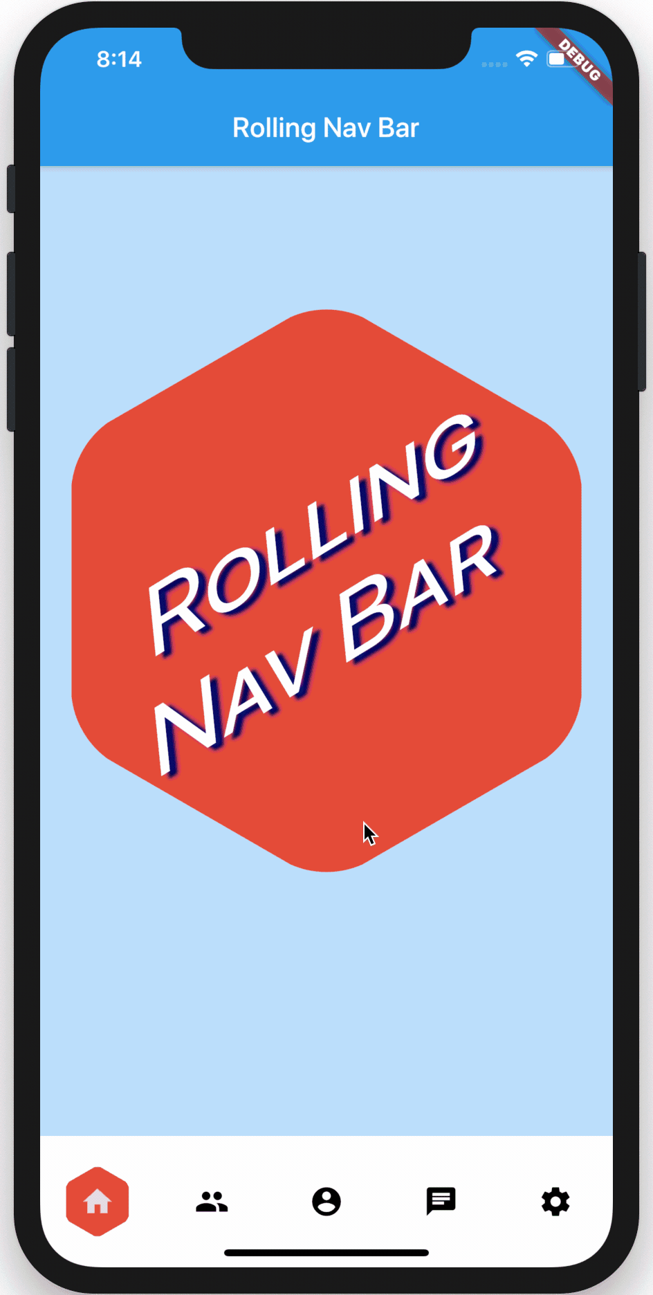
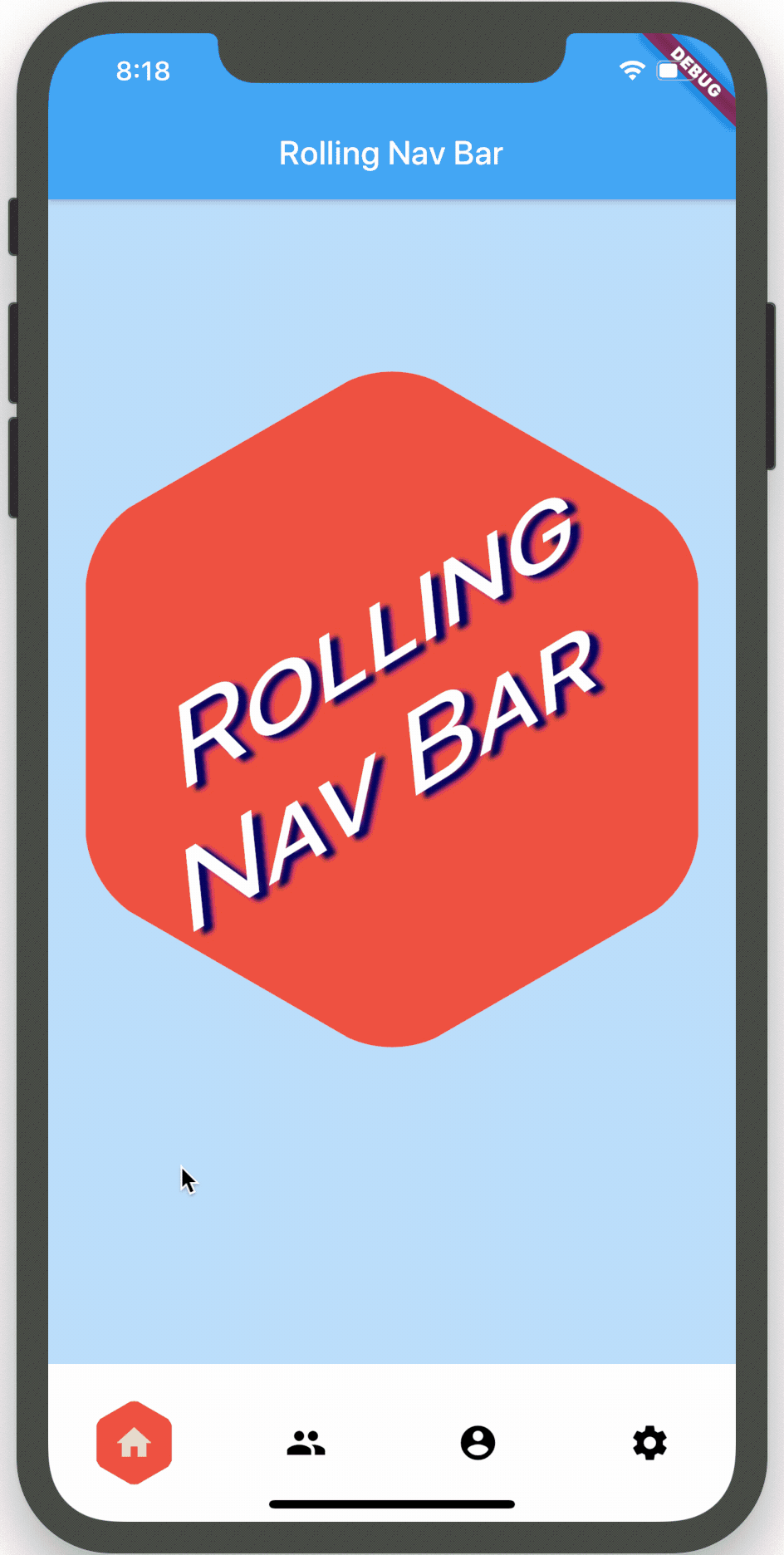
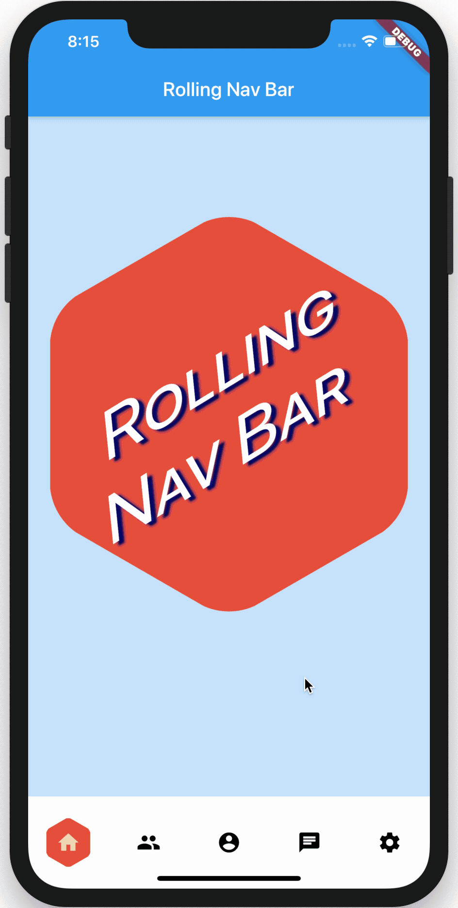
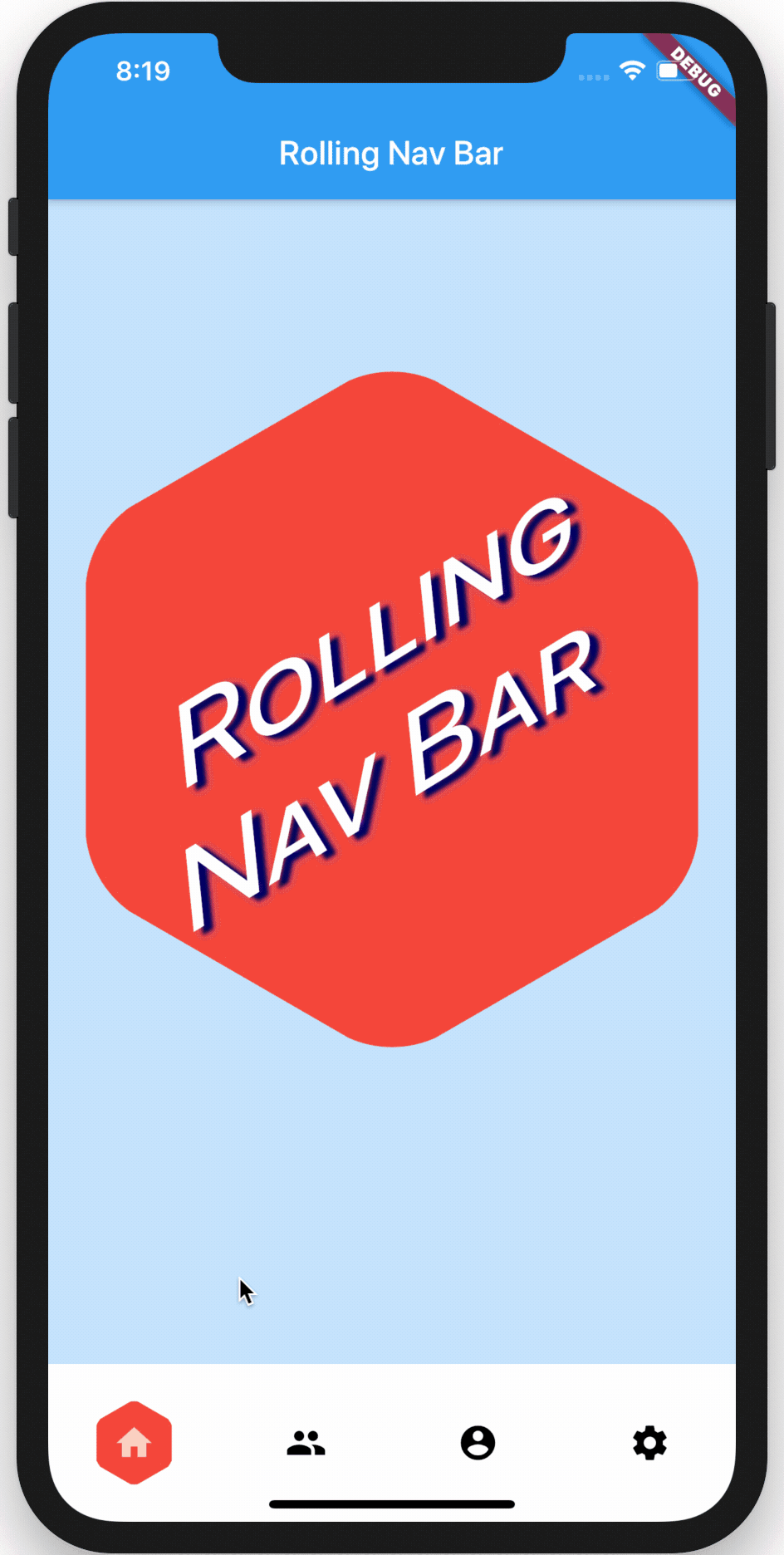
以下是一个完整的示例代码,展示了如何使用 rolling_nav_bar 插件:
import 'dart:ui';
import 'package:flutter/material.dart';
import 'package:polygon_clipper/polygon_clipper.dart';
import 'package:rolling_nav_bar/indexed.dart';
import 'package:rolling_nav_bar/rolling_nav_bar.dart';
void main() => runApp(MyApp());
double scaledHeight(BuildContext context, double baseSize) {
return baseSize * (MediaQuery.of(context).size.height / 800);
}
double scaledWidth(BuildContext context, double baseSize) {
return baseSize * (MediaQuery.of(context).size.width / 375);
}
class MyApp extends StatefulWidget {
[@override](/user/override)
_MyAppState createState() => _MyAppState();
}
class _MyAppState extends State<MyApp> {
Color logoColor;
int activeIndex;
var iconData = [
Icons.home,
Icons.people,
Icons.account_circle,
Icons.chat,
Icons.settings,
];
var badges = [null, null, null, null, null];
var iconText = [
Text('Home', style: TextStyle(color: Colors.grey, fontSize: 12)),
Text('Friends', style: TextStyle(color: Colors.grey, fontSize: 12)),
Text('Account', style: TextStyle(color: Colors.grey, fontSize: 12)),
Text('Chat', style: TextStyle(color: Colors.grey, fontSize: 12)),
Text('Settings', style: TextStyle(color: Colors.grey, fontSize: 12)),
];
var indicatorColors = [
Colors.red,
Colors.orange,
Colors.green,
Colors.blue,
Colors.purple,
];
List<Widget> get badgeWidgets => indexed(badges)
.map((Indexed indexed) =>
indexed.value != null
? Text(indexed.value.toString(),
style: TextStyle(
color: indexed.index == activeIndex
? indicatorColors[indexed.index]
: Colors.white,
))
: null)
.toList();
[@override](/user/override)
void initState() {
logoColor = Colors.red[600];
activeIndex = 0;
super.initState();
}
void incrementIndex() {
setState(() {
activeIndex = activeIndex < (iconData.length - 1) ? activeIndex + 1 : 0;
});
}
_onAnimate(AnimationUpdate update) {
setState(() {
logoColor = update.color;
});
}
_onTap(int index) {
if (activeIndex == index) {
_incrementBadge();
}
activeIndex = index;
setState(() {});
}
void _incrementBadge() {
badges[activeIndex] =
badges[activeIndex] == null ? 1 : badges[activeIndex] + 1;
setState(() {});
}
List<Widget> get builderChildren => const [
Text('1', style: TextStyle(color: Colors.grey)),
Text('2', style: TextStyle(color: Colors.grey)),
Text('3', style: TextStyle(color: Colors.grey)),
];
[@override](/user/override)
Widget build(BuildContext context) {
return MaterialApp(
theme: ThemeData(
scaffoldBackgroundColor: Colors.blue[100],
),
home: Directionality(
textDirection: Directionality.of(context) ?? TextDirection.ltr,
child: Builder(
builder: (BuildContext context) {
double largeIconHeight = MediaQuery.of(context).size.width;
double navBarHeight = scaledHeight(context, 85);
double topOffset = (MediaQuery.of(context).size.height -
largeIconHeight -
MediaQuery.of(context).viewInsets.top -
(navBarHeight * 2)) /
2;
return Scaffold(
floatingActionButton: FloatingActionButton(
backgroundColor: logoColor,
child: Icon(Icons.add),
onPressed: _incrementBadge,
),
appBar: AppBar(
title: Text('Rolling Nav Bar: Tab ${activeIndex + 1}'),
),
body: Stack(
children: <Widget>[
Positioned(
top: topOffset,
height: largeIconHeight,
width: largeIconHeight,
child: GestureDetector(
onTap: incrementIndex,
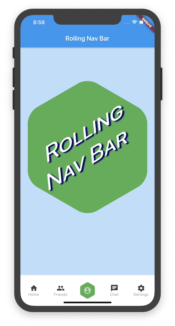
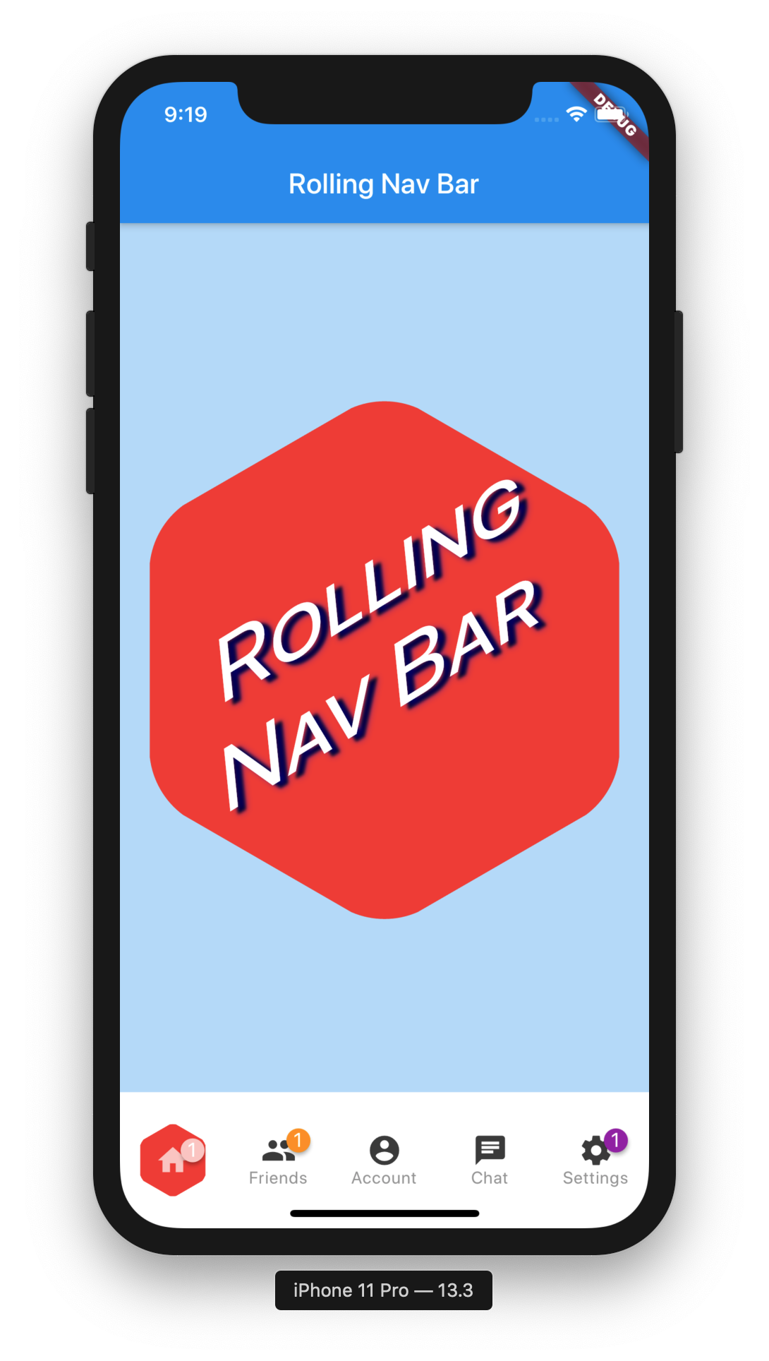
child: ClipPolygon(
sides: 6,
borderRadius: 15,
child: Container(
height: largeIconHeight,
width: largeIconHeight,
color: logoColor,
child: Center(
child: Padding(
padding: EdgeInsets.fromLTRB(0, 100, 30, 0),
child: Transform(
transform: Matrix4.skew(0.1, -0.50),
child: Text(
'Rolling\nNav Bar',
textAlign: TextAlign.center,
style: TextStyle(
color: Colors.white,
fontSize: scaledWidth(context, 63),
fontFeatures: [FontFeature.enable('smcp')],
shadows: [
Shadow(
offset: Offset(5, 5),
blurRadius: 3.0,
color: Color.fromARGB(255, 0, 0, 0),
),
Shadow(
offset: Offset(5, 5),
blurRadius: 8.0,
color: Color.fromARGB(125, 0, 0, 255),
),
],
),
),
),
),
),
),
),
),
),
],
),
bottomNavigationBar: Container(
height: navBarHeight,
width: MediaQuery.of(context).size.width,
child: RollingNavBar.iconData(
activeBadgeColors: [Colors.white],
activeIndex: activeIndex,
animationCurve: Curves.linear,
animationType: AnimationType.roll,
baseAnimationSpeed: 200,
badges: badgeWidgets,
iconData: iconData,
iconColors: [Colors.grey[800]],
iconText: iconText,
indicatorColors: indicatorColors,
iconSize: 25,
indicatorRadius: scaledHeight(context, 30),
onAnimate: _onAnimate,
onTap: _onTap,
),
),
);
},
),
),
);
}
}
更多关于Flutter底部导航栏插件rolling_nav_bar的使用的实战教程也可以访问 https://www.itying.com/category-92-b0.html

更多关于Flutter底部导航栏插件rolling_nav_bar的使用的实战系列教程也可以访问 https://www.itying.com/category-92-b0.html
rolling_nav_bar 是一个 Flutter 插件,用于创建具有滚动效果的底部导航栏。它提供了一种美观的方式来在应用程序的不同部分之间进行导航。以下是使用 rolling_nav_bar 插件的步骤和示例代码。
1. 添加依赖
首先,在 pubspec.yaml 文件中添加 rolling_nav_bar 依赖:
dependencies:
  flutter:
    sdk: flutter
  rolling_nav_bar: ^1.0.0+1  # 请检查最新版本
然后运行 flutter pub get 来安装依赖。
2. 导入包
在需要使用 rolling_nav_bar 的 Dart 文件中导入包:
import 'package:rolling_nav_bar/rolling_nav_bar.dart';
3. 使用 RollingNavBar
下面是一个简单的示例,展示如何在 Flutter 应用中使用 rolling_nav_bar:
import 'package:flutter/material.dart';
import 'package:rolling_nav_bar/rolling_nav_bar.dart';

void main() {
  runApp(MyApp());
}

class MyApp extends StatelessWidget {
  [@override](/user/override)
  Widget build(BuildContext context) {
    return MaterialApp(
      title: 'Rolling Nav Bar Example',
      theme: ThemeData(
        primarySwatch: Colors.blue,
      ),
      home: RollingNavBarExample(),
    );
  }
}

class RollingNavBarExample extends StatefulWidget {
  [@override](/user/override)
  _RollingNavBarExampleState createState() => _RollingNavBarExampleState();
}

class _RollingNavBarExampleState extends State<RollingNavBarExample> {
  int _selectedIndex = 0;

  final List<Widget> _pages = [
    Center(child: Text('Home Page')),
    Center(child: Text('Search Page')),
    Center(child: Text('Profile Page')),
  ];

  [@override](/user/override)
  Widget build(BuildContext context) {
    return Scaffold(
      appBar: AppBar(
        title: Text('Rolling Nav Bar Example'),
      ),
      body: _pages[_selectedIndex],
      bottomNavigationBar: RollingNavBar(
        color: Colors.grey,
        activeColor: Colors.blue,
        iconSize: 24.0,
        animationCurve: Curves.easeInOut,
        animationDuration: Duration(milliseconds: 300),
        items: [
          RollingNavBarItem(Icons.home, 'Home'),
          RollingNavBarItem(Icons.search, 'Search'),
          RollingNavBarItem(Icons.person, 'Profile'),
        ],
        onTap: (index) {
          setState(() {
            _selectedIndex = index;
          });
        },
      ),
    );
  }
}