


Flutter UI组件插件lenore_ui的使用
Flutter UI组件插件lenore_ui的使用
Beautiful、可定制且易于使用的UI小部件,可以帮助我(或者也许是你)更快地开发我的(或者也许是你)的应用程序。这是我个人用来开发应用程序的包之一。它帮助我快速构建它们,而无需担心UI方面的困难。
我在开发这个包并添加小部件,但我只是根据我的需求来做的。我不期望任何人使用它,但如果你确实使用了它,并希望在其中实现某些功能,请联系我添加它们或在GitHub上提出请求(这让我很开心 :))。
已实现的小部件
- LenoreButton
- LenoreDatatable
- LenoreDatePicker
- LenoreDropDown
- LenoreCheckBox
- LenoreFlatButton
- LenoreLoading
- LenoreTextFormField
- LenoreAppBar
- LenoreDrawer 与 LenoreDrawerItem
- LenoreNoDataWidget
- LenoreNoInternetWidget
- LenoreAppTheme 一个示例主题
使用示例
以下是一个完整的示例,展示如何使用lenore_ui包中的多个组件。
示例代码
import 'package:example/widgets/main/core/MainViewModel.dart';
import 'package:flutter/material.dart';
import 'package:lenore_ui/lenore_ui.dart';
import 'package:provider/src/provider.dart';
class MainView extends StatefulWidget {
const MainView({Key? key}) : super(key: key);
@override
_MainViewState createState() => _MainViewState();
}
class _MainViewState extends State<MainView> {
@override
Widget build(BuildContext context) {
return SafeArea(
child: Scaffold(
appBar: LenoreAppBar(
titleText: 'Lenore',
),
drawer: LenoreDrawer(
header: Container(
height: 100,
alignment: Alignment.center,
color: Theme.of(context).disabledColor,
),
drawerItems: [
LenoreDrawerItem(
text: 'First Drawer Item Selected',
icon: Icons.person,
isSelected: true,
),
LenoreDrawerItem(
text: 'Second Drawer Item',
icon: Icons.dashboard,
isSelected: false,
),
],
),
body: Container(
padding: EdgeInsets.only(left: 16, right: 16, top: 16),
child: Scrollbar(
controller: context.read<MainViewModel>().scrollController,
child: ListView(
controller: context.read<MainViewModel>().scrollController,
children: [
// 响应式布局
Text(
Responsive.isDesktop(context)
? "Screen size is DESKTOP size!"
: Responsive.isMobile(context)
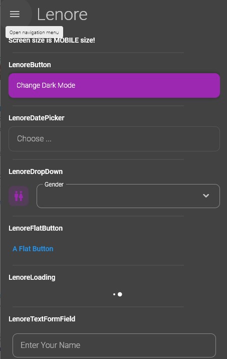
? "Screen size is MOBILE size!"
: "Screen size is TABLET size!",
style: Theme.of(context).textTheme.bodyText1,
),
Padding(
padding: const EdgeInsets.all(8.0),
child: Divider(endIndent: 64),
),
// LenoreButton
Text(
'LenoreButton',
style: Theme.of(context).textTheme.bodyText1,
),
SizedBox(height: 8),
LenoreButton(
caption: 'Change Dark Mode',
onPressed: () {
context.read<MainViewModel>().toggleDarkMode(context);
},
),
Padding(
padding: const EdgeInsets.all(8.0),
child: Divider(endIndent: 64),
),
// LenoreDatePicker
Text(
'LenoreDatePicker',
style: Theme.of(context).textTheme.bodyText1,
),
SizedBox(height: 8),
LenoreDatePicker(
onPressed: () {
context.read<MainViewModel>().pickDate(context);
},
),
Padding(
padding: const EdgeInsets.all(8.0),
child: Divider(endIndent: 64),
),
// LenoreDropDown
Text(
'LenoreDropDown',
style: Theme.of(context).textTheme.bodyText1,
),
SizedBox(height: 16),
LenoreDropDown(
items: context.read<MainViewModel>().genders,
value: context.watch<MainViewModel>().genderValue,
onChange: (newValue) =>
context.read<MainViewModel>().onGenderChange(newValue),
label: 'Gender',
icon: Icons.wc_rounded,
),
Padding(
padding: const EdgeInsets.all(8.0),
child: Divider(endIndent: 64),
),
// LenoreFlatButton
Text(
'LenoreFlatButton',
style: Theme.of(context).textTheme.bodyText1,
),
SizedBox(height: 16),
LenoreFlatButton(
caption: 'A Flat Button',
onPressed: () {},
),
Padding(
padding: const EdgeInsets.all(8.0),
child: Divider(endIndent: 64),
),
// LenoreLoading
Text(
'LenoreLoading',
style: Theme.of(context).textTheme.bodyText1,
),
SizedBox(height: 16),
LenoreLoading(),
Padding(
padding: const EdgeInsets.all(8.0),
child: Divider(endIndent: 64),
),
// LenoreTextFormField
Text(
'LenoreTextFormField',
style: Theme.of(context).textTheme.bodyText1,
),
SizedBox(height: 16),
LenoreTextFormField(
controller: TextEditingController(),
label: 'Enter Your Name',
),
Padding(
padding: const EdgeInsets.all(8.0),
child: Divider(endIndent: 64),
),
// LenoreNoDataWidget
Text(
'LenoreNoDataWidget',
style: Theme.of(context).textTheme.bodyText1,
),
SizedBox(height: 16),
LenoreNoDataWidget(),
Padding(
padding: const EdgeInsets.all(8.0),
child: Divider(endIndent: 64),
),
// LenoreNoInternetWidget
Text(
'LenoreNoInternetWidget',
style: Theme.of(context).textTheme.bodyText1,
),
SizedBox(height: 16),
LenoreNoInternetWidget(
reloadFunction: () {
ScaffoldMessenger.of(context).showSnackBar(SnackBar(
content: Text(
"Refresh Page",
textAlign: TextAlign.center,
),
duration: Duration(seconds: 2),
));
},
),
Padding(
padding: const EdgeInsets.all(8.0),
child: Divider(endIndent: 64),
),
],
),
),
),
),
);
}
}
主题使用示例
MaterialApp(
      title: 'Lenore Demo',
      theme: LenoreAppTheme(isDark: context.watch<MainViewModel>().isDark)
          .themeData,
      initialRoute: '/',
      debugShowCheckedModeBanner: false,
      onGenerateRoute: (RouteSettings settings) {
        switch (settings.name) {
          case '/MainView':
            return MaterialPageRoute(builder: (context) => const MainView());
          case '/':
            return MaterialPageRoute(builder: (context) => const MainView());
          default:
            return MaterialPageRoute(builder: (context) => const MainView());
        }
      },
    )
更多关于Flutter UI组件插件lenore_ui的使用的实战教程也可以访问 https://www.itying.com/category-92-b0.html

更多关于Flutter UI组件插件lenore_ui的使用的实战系列教程也可以访问 https://www.itying.com/category-92-b0.html
lenore_ui 是一个 Flutter UI 组件库,旨在帮助开发者快速构建美观且功能丰富的用户界面。它提供了一系列预定义的组件和样式,可以显著减少开发时间。以下是如何使用 lenore_ui 插件的基本步骤:
1. 添加依赖
首先,你需要在 pubspec.yaml 文件中添加 lenore_ui 依赖:
dependencies:
  flutter:
    sdk: flutter
  lenore_ui: ^1.0.0  # 请使用最新版本
然后运行 flutter pub get 来获取依赖。
2. 导入包
在你的 Dart 文件中导入 lenore_ui 包:
import 'package:lenore_ui/lenore_ui.dart';
3. 使用组件
lenore_ui 提供了多种 UI 组件,你可以直接在项目中使用。以下是一些常见组件的示例:
按钮 (LenoreButton)
LenoreButton(
  text: 'Click Me',
  onPressed: () {
    print('Button Pressed!');
  },
)
输入框 (LenoreTextField)
LenoreTextField(
  hintText: 'Enter your name',
  onChanged: (value) {
    print('Input: $value');
  },
)
卡片 (LenoreCard)
LenoreCard(
  child: Text('This is a card'),
)
对话框 (LenoreDialog)
LenoreDialog(
  title: 'Alert',
  content: Text('This is a dialog'),
  actions: [
    LenoreButton(
      text: 'OK',
      onPressed: () {
        Navigator.of(context).pop();
      },
    ),
  ],
)
加载指示器 (LenoreLoadingIndicator)
LenoreLoadingIndicator()
4. 自定义主题
lenore_ui 允许你自定义主题以适应你的应用风格。你可以通过 LenoreTheme 来设置全局主题:
MaterialApp(
  theme: LenoreTheme.lightTheme,
  home: MyHomePage(),
)
或者自定义主题:
MaterialApp(
  theme: ThemeData(
    primaryColor: Colors.blue,
    accentColor: Colors.green,
    // 其他自定义主题设置
  ),
  home: MyHomePage(),
)
5. 其他组件
lenore_ui 还提供了其他组件,如 LenoreAppBar、LenoreBottomNavigationBar、LenoreListTile 等。你可以根据项目需求选择合适的组件。
6. 示例代码
以下是一个简单的示例,展示了如何使用 lenore_ui 组件构建一个基本的界面:
import 'package:flutter/material.dart';
import 'package:lenore_ui/lenore_ui.dart';

void main() {
  runApp(MyApp());
}

class MyApp extends StatelessWidget {
  [@override](/user/override)
  Widget build(BuildContext context) {
    return MaterialApp(
      theme: LenoreTheme.lightTheme,
      home: Scaffold(
        appBar: LenoreAppBar(
          title: Text('Lenore UI Example'),
        ),
        body: Center(
          child: LenoreCard(
            child: Column(
              mainAxisSize: MainAxisSize.min,
              children: [
                LenoreTextField(
                  hintText: 'Enter your name',
                ),
                SizedBox(height: 16),
                LenoreButton(
                  text: 'Submit',
                  onPressed: () {
                    print('Submitted!');
                  },
                ),
              ],
            ),
          ),
        ),
      ),
    );
  }
}