


Flutter进度条展示插件intervalprogressbar的使用
Flutter进度条展示插件intervalprogressbar的使用
IntervalProgressBar
一个用于Flutter的区间进度条小部件。
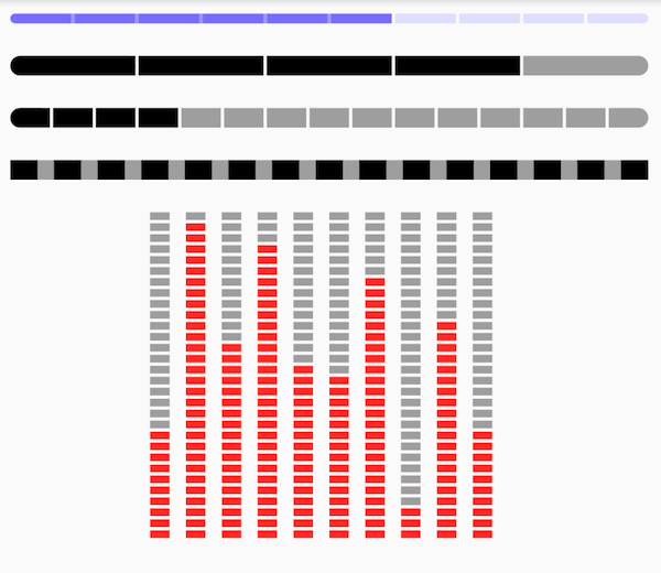
预览

v2.0.1新增功能
添加依赖
https://pub.dev/packages/intervalprogressbar
在项目的pubspec.yaml文件中添加以下依赖:
dependencies:
  intervalprogressbar: ^{last_version}
特性
- 水平方向
- 垂直方向
- 圆形
- 区间进度
- 支持多种颜色
开始使用
使用方法
水平进度条
Widget buildHorizontal() => IntervalProgressBar(
    direction: IntervalProgressDirection.horizontal, // 进度条方向为水平
    max: 30, // 总块数
    progress: 10, // 当前高亮块数
    intervalSize: 2, // 区间块的宽度
    size: Size(400, 10), // 进度条的整体大小
    highlightColor: Colors.red, // 高亮块的颜色
    defaultColor: Colors.grey, // 默认块的颜色
    intervalColor: Colors.transparent, // 区间块的颜色
    intervalHighlightColor: Colors.transparent, // 区间高亮块的颜色
    reverse: true, // 是否反向
    radius: 0); // 圆角半径
垂直进度条
Widget buildVertical() => Row(
    mainAxisAlignment: MainAxisAlignment.center,
    children: [10, 29, 18, 27, 16, 15, 24, 3, 20, 10].map<Widget>((i) {
      return Padding(
          padding: EdgeInsets.only(right: 10),
          child: IntervalProgressBar(
              direction: IntervalProgressDirection.vertical, // 进度条方向为垂直
              max: 30, // 总块数
              progress: i, // 当前高亮块数
              intervalSize: 2, // 区间块的高度
              size: Size(12, 200), // 进度条的整体大小
              highlightColor: Colors.red, // 高亮块的颜色
              defaultColor: Colors.grey, // 默认块的颜色
              intervalColor: Colors.transparent, // 区间块的颜色
              intervalHighlightColor: Colors.transparent, // 区间高亮块的颜色
              reverse: true, // 是否反向
              radius: 0)); // 圆角半径
    }).toList());
圆形进度条
Widget buildCircle() => IntervalProgressBar(
      direction: IntervalProgressDirection.circle, // 进度条方向为圆形
      max: 30, // 总块数
      progress: 10, // 当前高亮块数
      intervalSize: 2, // 区间块的角度
      size: Size(200, 200), // 进度条的整体大小
      highlightColor: Colors.red, // 高亮块的颜色
      defaultColor: Colors.grey, // 默认块的颜色
      intervalColor: Colors.transparent, // 区间块的颜色
      intervalHighlightColor: Colors.transparent, // 区间高亮块的颜色
      reverse: true, // 是否反向
      radius: 0, // 圆角半径
      intervalDegrees: 5, // 区间角度
      strokeWith: 5); // 圆形进度条的线条宽度
属性说明
| 属性 | 类型 | 说明 |
|---|---|---|
| direction | 枚举类型 | 进度条的方向,支持vertical和horizontal |
| max | int | 默认块的数量 |
| progress | int | 高亮块的数量 |
| intervalSize | int | 区间块的尺寸(垂直方向为高度,水平方向为宽度) |
| size | Size | 小部件的大小 |
| highlightColor | Color | 高亮块的颜色 |
| defaultColor | Color | 默认块的颜色 |
| intervalColor | Color | 默认区间的颜色 |
| intervalHighlightColor | Color | 区间高亮块的颜色 |
| reverse | bool | 是否反向 |
| radius | int | 圆角半径 |
| intervalDegrees | double | 支持圆形进度条的区间角度 |
| strokeWith | int | 支持圆形进度条的线条宽度 |
完整示例代码
import 'package:flutter/material.dart';
import 'package:flutter/widgets.dart';
import 'package:intervalprogressbar/intervalprogressbar.dart';

Widget buildProgressBars() {
  return Center(
      child: Padding(
    padding: const EdgeInsets.only(top: 100),
    child: Column(
      children: <Widget>[
        buildHorizontal(),
        SizedBox(height: 20),
        buildVertical(),
        SizedBox(height: 20),
        buildCircle(),
      ],
    ),
  ));
}

Widget buildHorizontal() => IntervalProgressBar(
    direction: IntervalProgressDirection.horizontal,
    max: 30,
    progress: 10,
    intervalSize: 2,
    size: Size(400, 10),
    highlightColor: Colors.red,
    defaultColor: Colors.grey,
    intervalColor: Colors.transparent,
    intervalHighlightColor: Colors.transparent,
    reverse: true,
    radius: 0);

Widget buildVertical() => Row(
    mainAxisAlignment: MainAxisAlignment.center,
    children: [10, 29, 18, 27, 16, 15, 24, 3, 20, 10].map<Widget>((i) {
      return Padding(
          padding: EdgeInsets.only(right: 10),
          child: IntervalProgressBar(
              direction: IntervalProgressDirection.vertical,
              max: 30,
              progress: i,
              intervalSize: 2,
              size: Size(12, 200),
              highlightColor: Colors.red,
              defaultColor: Colors.grey,
              intervalColor: Colors.transparent,
              intervalHighlightColor: Colors.transparent,
              reverse: true,
              radius: 0));
    }).toList());

Widget buildCircle() => IntervalProgressBar(
      direction: IntervalProgressDirection.circle,
      max: 30,
      progress: 10,
      intervalSize: 2,
      size: Size(200, 200),
      highlightColor: Colors.red,
      defaultColor: Colors.grey,
      intervalColor: Colors.transparent,
      intervalHighlightColor: Colors.transparent,
      reverse: true,
      radius: 0,
      intervalDegrees: 5,
      strokeWith: 5,
    );

void main() {
  final app = MaterialApp(home: buildProgressBars());
  runApp(app);
}
更多关于Flutter进度条展示插件intervalprogressbar的使用的实战教程也可以访问 https://www.itying.com/category-92-b0.html
1 回复

更多关于Flutter进度条展示插件intervalprogressbar的使用的实战系列教程也可以访问 https://www.itying.com/category-92-b0.html
IntervalProgressBar 是一个用于展示进度条的 Flutter 插件,它允许你将进度条分成多个区间,并为每个区间设置不同的颜色或样式。这个插件非常适合用于展示多阶段的进度,例如任务完成度、健康指标等。
安装插件
首先,你需要在 pubspec.yaml 文件中添加 intervalprogressbar 插件的依赖:
dependencies:
  flutter:
    sdk: flutter
  intervalprogressbar: ^1.0.0  # 请使用最新版本
然后运行 flutter pub get 来安装插件。
使用 IntervalProgressBar
以下是一个简单的示例,展示如何使用 IntervalProgressBar:
import 'package:flutter/material.dart';
import 'package:intervalprogressbar/intervalprogressbar.dart';

void main() {
  runApp(MyApp());
}

class MyApp extends StatelessWidget {
  [@override](/user/override)
  Widget build(BuildContext context) {
    return MaterialApp(
      home: Scaffold(
        appBar: AppBar(
          title: Text('IntervalProgressBar Example'),
        ),
        body: Center(
          child: IntervalProgressBar(
            intervals: [
              Interval(0.0, 0.3, color: Colors.red),
              Interval(0.3, 0.6, color: Colors.orange),
              Interval(0.6, 1.0, color: Colors.green),
            ],
            progress: 0.5, // 当前进度
            height: 20.0, // 进度条高度
            borderRadius: BorderRadius.circular(10.0), // 圆角
          ),
        ),
      ),
    );
  }
}